React-select: isSelected not working
I am trying to change the font weight to bold when option is being selected but isSelected is not working.
Here is the codesandbox link
https://codesandbox.io/s/react-codesandboxer-example-9gpp4
I try to debug it with react-devtools it's not getting isFocused isDisabled and everything else but not isSelected is not there.
Props
{
  "value": {
    "label": "Off Trade",
    "value": "offTrade",
    "id": 2,
    "questionKey": 3
  },
  "options": [
    "Object",
    "Object",
    "Object",
    "Object"
  ],
  "styles": {
    "control": "control()",
    "option": "option()",
    "indicatorSeparator": "indicatorSeparator()",
    "dropdownIndicator": "dropdownIndicator()"
  },
  "onChange": "fn()",
  "inputValue": "",
  "menuIsOpen": false,
  "onInputChange": "fn()",
  "onMenuClose": "fn()",
  "onMenuOpen": "fn()",
  "backspaceRemovesValue": true,
  "blurInputOnSelect": false,
  "captureMenuScroll": true,
  "closeMenuOnSelect": true,
  "closeMenuOnScroll": false,
  "components": {},
  "controlShouldRenderValue": true,
  "escapeClearsValue": false,
  "filterOption": "fn()",
  "formatGroupLabel": "formatGroupLabel()",
  "getOptionLabel": "getOptionLabel()",
  "getOptionValue": "getOptionValue()",
  "isDisabled": false,
  "isLoading": false,
  "isMulti": false,
  "isRtl": false,
  "isSearchable": true,
  "isOptionDisabled": "isOptionDisabled()",
  "loadingMessage": "loadingMessage()",
  "maxMenuHeight": 300,
  "minMenuHeight": 140,
  "menuPlacement": "bottom",
  "menuPosition": "absolute",
  "menuShouldBlockScroll": false,
  "menuShouldScrollIntoView": true,
  "noOptionsMessage": "noOptionsMessage()",
  "openMenuOnFocus": false,
  "openMenuOnClick": true,
  "pageSize": 5,
  "placeholder": "Select...",
  "screenReaderStatus": "screenReaderStatus()",
  "tabIndex": "0",
  "tabSelectsValue": true
}
State
{
  "ariaLiveSelection": "option Off Trade, selected.",
  "ariaLiveContext": "Select is focused ,type to refine list, press Down to open the menu, ",
  "focusedValue": null,
  "inputIsHidden": false,
  "isFocused": false,
  "menuOptions": {
    "render": "Array[0]",
    "focusable": "Array[0]"
  },
  "selectValue": [
    {
      "label": "Off Trade",
      "value": "offTrade",
      "id": 2,
      "questionKey": 3
    }
  ]
}
 sarabs3
All 8 comments
I would do this by setting the option styles. See this documentation for a little more clarity.
 cutterbl
on 18 Oct 2019
cutterbl
on 18 Oct 2019
@cutterbl I am also doing that way. Have a look at below code.
...
option: (styles, state) => ({
fontWeight: state.isSelected ? 900 : 400
})
But isSelected state is not being changed.
sarabs3
on 22 Oct 2019
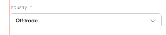
@sarabs3 In your codesandbox you are styling the control, not the option.
i.e. your code looks like:
const customStyles = {
control: (styles, state) => ({ // should be option, not control
...styles,
fontSize: state.isSelected ? 40 : 20
})
};
Making the code like this:
const customStyles = {
option: (styles, state) => ({ // fixed
...styles,
fontSize: state.isSelected ? 40 : 20
})
};
will result in:
Please close issue if this answers your question.
 crhayes
on 29 Oct 2019
crhayes
on 29 Oct 2019
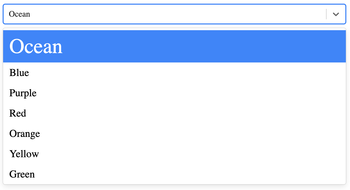
I want to increase the fontSize/fontWeight of the selected option, something like this
After selection
sarabs3
on 29 Oct 2019
@sarabs3 You can inspect the contents of state to see if there is anything useful for your use case.
isSelected exists in the option state but not in the control state, which I think makes, given that the options are what are actually selected.
If you inspect the state in the control method you'll see the property hasValue. That should work for your use case:
control: (styles, state) => ({
...styles,
fontSize: state.hasValue ? 40 : 20
})


crhayes
on 29 Oct 2019
hasValue works!!
Thank you @crhayes
There is no such documentation for this. I suggest all the available states need to be documented.
sarabs3
on 30 Oct 2019
This is still an issue. It works as intended (with isSelected) with multi select. But with a simple single-select neither isSelected nor hasValue actually change for me.
You can use the data property in the style state object to determine if it's selected or not though.
 lexith
on 7 Jan 2020
lexith
on 7 Jan 2020
I suppose that isSelected property doesn't exist in Select not marked as isMultiple. So you can use state.data === state.selectProps.value in single choice Select to apply different style based on state.
Example:
javascript
 option: (provided, state) => {
    return ({
      ...provided,
      color: state.data === state.selectProps.value ? `${theme.colors.primaryText}` : `${theme.colors.disabledText}`,
      '&:hover': {
        color: theme.colors.primaryText,
        background: theme.colors.disabledBackground,
      },
    });
  },
 luksari
on 9 Jan 2020
luksari
on 9 Jan 2020
Related issues
 steida
·
3Comments
steida
·
3Comments
 pashap
·
3Comments
pashap
·
3Comments
 coder-guy22296
·
3Comments
coder-guy22296
·
3Comments
 mjuopperi
·
3Comments
mjuopperi
·
3Comments
 joshualimpj
·
3Comments
joshualimpj
·
3Comments
Most helpful comment
I suppose that
isSelectedproperty doesn't exist inSelectnot marked asisMultiple. So you can usestate.data === state.selectProps.valuein single choiceSelectto apply different style based on state.Example:
javascript
 option: (provided, state) => {
    return ({
      ...provided,
      color: state.data === state.selectProps.value ? `${theme.colors.primaryText}` : `${theme.colors.disabledText}`,
      '&:hover': {
        color: theme.colors.primaryText,
        background: theme.colors.disabledBackground,
      },
    });
  },