React-select: Add alwaysDisplayPlaceholder prop (a Floating Label theme)
Thank you for this library!
Floating Label:
I'd like to create a Floating Label theme for this package (just using CSS), but it expects the placeholder to persist along with the current value.
The alwaysDisplayPlaceholder prop would be an outstanding option for what I'm expecting to see.
Here is my use case:
Initially, in my form, labels are everywhere.
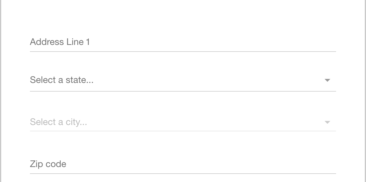
Then it floats the inline label up above the input after the user focuses the select.

Finally, when an option is selected, the inline label disappears entirely.

Cheers!
 carlosbensant
All 24 comments
Also see - #2143 #1126
carlosbensant
on 17 Nov 2017
I'd love this too, please! I don't want to have to fork this repo.
 tiffwu
on 9 Jan 2018
tiffwu
on 9 Jan 2018
To leave an update, I just created a component wrapper which contains the label, then removed the Select built-in label and finally listened to the Select events 'onBlur', 'onChange', 'onFocus' to style the label as desired.
If needed I could share a CodePen with a better explanation, just let me know.
carlosbensant
on 9 Jan 2018
Yes, a CodePen would be fantastic @carlosbensant
tiffwu
on 10 Jan 2018
Just to clarify, my issue is slightly different from yours - I need the placeholder specifically to stick around, not the label:
tiffwu
on 10 Jan 2018
@carlosbensant or @tiffwu, I'd also greatly appreciate a CodePen with your working example(s)!
 kccmcck
on 8 Feb 2018
kccmcck
on 8 Feb 2018
@carlosbensant a CodePen would be greatly appreciated!
 Alonmeytal
on 12 Feb 2018
Alonmeytal
on 12 Feb 2018
@carlosbensant , that's fantastic! I would like to see the codepen as well.
 clovis1122
on 23 Feb 2018
clovis1122
on 23 Feb 2018
@carlosbensant That would be great! Could you please share it with us?
 MaximeNoulin
on 9 Aug 2018
MaximeNoulin
on 9 Aug 2018
+1
 Code-Crash
on 9 Aug 2018
Code-Crash
on 9 Aug 2018
@carlosbensant Hi! Can you please share it?
 vi-vi
on 10 Sep 2018
vi-vi
on 10 Sep 2018
+1
 sahilchopra
on 11 Oct 2018
sahilchopra
on 11 Oct 2018
Please, share it! ;) +1
 dzbiku
on 3 Dec 2018
dzbiku
on 3 Dec 2018
To leave an update, I just created a component wrapper which contains the label, then removed the Select built-in label and finally listened to the Select events 'onBlur', 'onChange', 'onFocus' to style the label as desired.
If needed I could share a CodePen with a better explanation, just let me know.
@carlosbensant Hi! Please share it ? thank you !
 philibea
on 28 Jan 2019
philibea
on 28 Jan 2019
Here's what we do as a gist
If anyone wants to try and make this possible without a wrapper, I think it should be a part of the library. Let me know, with some help, I think we can work out a better solution.
 c-moss-talk
on 4 Mar 2019
c-moss-talk
on 4 Mar 2019
@c-moss-talk Done. Here is the example.
All I did was using the Components Framework react-select provides to customize the ValueContainer in which Placeholder resides.
 Rall3n
on 8 Mar 2019
Rall3n
on 8 Mar 2019
@Rall3n yup, that's perhaps the best approach. Might be a nice example for the docs but I think we can close this (I don't have a role on this repo).
c-moss-talk
on 8 Mar 2019
@c-moss-talk Done. Here is the example.
All I did was using the Components Framework
react-selectprovides to customize theValueContainerin whichPlaceholderresides.
Hi @Rall3n, thanks for the codesandbox! I have tried adding it to my project, but I noticed it's not working on the latest version of react-select (2.4.2 at the time of this comment). As you can see, the placeholder stays inside the container itself and not overriding it.
Do you have any idea how we can modify it to continue working?
Thanks!
 FlavyP
on 27 Mar 2019
FlavyP
on 27 Mar 2019
Seems the sandbox was still on a very old version of the library. This commit added overflow: hidden to the ValueContainer which is the cause for your problem. Changing the style to remove overflow: hidden should make it work again.
Rall3n
on 27 Mar 2019
Seems the sandbox was still on a very old version of the library. This commit added
overflow: hiddento theValueContainerwhich is the cause for your problem. Changing the style to removeoverflow: hiddenshould make it work again.
Thank you, managed to fix it by adding overflow: "visible"
FlavyP
on 28 Mar 2019
I’ve created a solution for floating input using styled-components and react-select components API.
Code is here:
https://github.com/purple-technology/phoenix-components/blob/master/src/SelectBox/index.tsx
It’s a version with outlined border, but it’s easy to change it to any other type. The result look like this:
Thanks @c-moss-talk for inspiration 👍
 chromale
on 17 Sep 2019
chromale
on 17 Sep 2019
Came to a solution with a co-worker based on @Rall3n and @c-moss-talk comments
import Select, {components} from 'react-select';

const styles = {
  placeholder: (base, state) => ({
    ...base,
    display:
      state.isFocused || state.isSelected || state.selectProps.inputValue
      ? 'none'
      : 'block',
  }),
}

export default ({ placeholder }) => {
  const NewValueContainer = (props) => {
    const shouldFloatLabel = props.selectProps.menuIsOpen || props.hasValue;

    return (
      <components.ValueContainer {...props}>
        {shouldFloatLabel && <p>{placeholder}</p>}
        {props.children}
      </components.ValueContainer>
    );
  };

  return (
    <Select
      ...
      styles={styles}
      placeholder={placeholder}
      components={{ ValueContainer: NewValueContainer }}
    />
  );
}
 chrisgem
on 11 Mar 2020
chrisgem
on 11 Mar 2020
Hello -
In an effort to sustain the react-select project going forward, we're closing old issues.
We understand this might be inconvenient but in the best interest of supporting the broader community we have to direct our efforts towards the current major version.
If you aren't using the latest version of react-select please consider upgrading to see if it resolves any issues you're having.
However, if you feel this issue is still relevant and you'd like us to review it - please leave a comment and we'll do our best to get back to you!
 bladey
on 28 May 2020
bladey
on 28 May 2020
You can add a floating label without needing to modify the placeholder at all. Just add a label to a custom control component. This comment explains how.
I was inspired by Rall3n's solution but that only made the placeholder float when we type something and not on click as is expected in most floating labels.
 cseas
on 29 Sep 2020
cseas
on 29 Sep 2020
Related issues
 batusai513
·
3Comments
batusai513
·
3Comments
 yrabinov
·
3Comments
yrabinov
·
3Comments
 x-yuri
·
3Comments
x-yuri
·
3Comments
 Meesam
·
3Comments
Meesam
·
3Comments
 pgoldweic
·
3Comments
pgoldweic
·
3Comments
Most helpful comment
Came to a solution with a co-worker based on @Rall3n and @c-moss-talk comments