This has been discussed across a number of issues and PR so let's collect ideas here.
Replaces #817 #962 #1015 #1950
I'm not a fan of the idea of an isOpen / alwaysOpen / forceOpen prop from a UX perspective, and don't want to complicate react-select more than absolutely necessary. However, it's been such a popular request that I'd like to hear out the arguments and solutions for it.
My concerns are:
UI / UX Consistency and intention
Much of the control's design assumes it's opened in response to user interaction, temporarily; this impacts the styling (e.g. pointer over options), keyboard navigation that expects the input to have focus which would be inconsistent, and the behaviours like closing the menu on esc would have to be rethought if the menu didn't respond to them.
Accessability
A screen-reader would go through the entire list of options in the form, even when the select isn't being interacted with (this is the problem that leads to "skip nav" links being added to sites). I don't have a huge amount of experience with this though, so if anyone knows a way around it let me know.
Unpredictable height
@kajmagnus mentioned a use-case where the select opens over a save button. Having it always open should really inline the control so it takes up space in the layout, otherwise it'll always obscure anything underneath it. Guessing at how much height to leave could be incorrect based on the number of options currently displayed (keep in mind as well that the number of items shrinks as the user types, which would create a really weird UX effect). If this is an issue, just wrap the whole thing in a fixed-height container.
Not how select controls work
All the native select / autocomplete controls I've seen are always only open when they're focused, and they pop over other content. Boxes of things that are selectable have totally different designs and ux rules.
Dev mode is not a valid reason
This was discussed extensively in #927 - just use react dev tools to override the state.
There's really a lot to rethink and redesign for this use-case that no PR yet has worked through.
A valid reason for supporting this prop might be needing to control the open state based on some other state... but at this point we have different options:
- If you want to trigger the select to be open (and then respond to focus / blur / select events as expected) then just set the focus
- If you want the control to always be open (and never close), it needs some nontrivial design updates for that to make sense, and I'd argue should be a different type of component (not a select)
- If you want to control the open / close state of the control based on external state (e.g. redux store) you'd need to also handle a whole bunch of events for when to close it, which would (I think) require a whole lot of additional handlers (maybe a new
onClosefunction prop?) - I just can't understand why this would be necessary but am open to learning why it is
So with all this in mind, I'm going to close the other issues and PRs related to this to reduce noise in the repo. If this is an important and valid feature for react-select, make your case here and if it makes sense then we can work out how it should be designed. Please don't just reply with "this is really important to me" - I need to understand _why_ it is.
Thanks
 JedWatson
All 25 comments
@JedWatson thanks for the update.
On using focus: It is one option though now you'll need to write a checkShouldFocus that is called on componentDidMount and componentDidUpdate to focus the input.
On dev mode: The original dev mode was suggested when react dev tools did not support toggling of props and states.
On controlled component: I feel that in general, it will be ideal for all ui components to support both uncontrolled and controlled versions to keep things flexible. I understand that it will introduce more complexity in the library. At the same time, I feel that application developers should focus on application logic and reduce writing logic for ui level stuff. This is similar to the batteries included philosophy that python has.
On always open as a different component: I feel that react-select has a lot of logic that can be reused for the same component with the same ux except that it has to be always open. Although thinking it as a whole new component make sense, having to rewrite that logic would be counter productive. I wonder we can approach it by structuring the library such that the input box and the menu can be used separately.
Cheers!
 khankuan
on 13 Sep 2017
khankuan
on 13 Sep 2017
@JedWatson first of all, thanks for your time.
I guess that describing my use case will be the best way to explain my argument:
I'm working on chat app which as you can guess one of the feature included in it is creating and editing groups.
We found that react-select is actually meets the needs of our design to add/remove group members.
In fact, our only gap at the moment when working with the library is when the user navigates into the editing screen, he expects to receive the existing contact list even before he focuses on the control field
so he could choose members from the list without being disturbed by the keyboard (relevant for mobile).
 deanbitan
on 27 Sep 2017
deanbitan
on 27 Sep 2017
Personally I want to use this because I am using react-select to overlay a grid cell to provide a context specific / searchable editor. From a clean UI perspective I guess I should be using react-select to render the cell itself, but I am not sure if that's feasible with the grid - it expects separate renderer/editor components.
Right now I am in the situation where it requires three clicks instead of two from the user to get to the dropdown list, and even worse if I use the keyboard I can hit enter to display the react-select control, but I can't find any way to open using the keyboard, I have to switch back to the mouse in order to display the dropdown list, and then go back to the keyboard to move up/down the list.
[edit] after much trial and error I can work with just the keyboard but I have to hit the tab key to activate the dropdown
 jonfreedman
on 18 Oct 2017
jonfreedman
on 18 Oct 2017
Hi @JedWatson - thanks for a great little library.
I'd like to weigh in to the discussion, because I've been using react-select with multiple custom renderers, and have been finding the lack of a permanent "isOpen" option extremely frustrating, because it becomes almost impossible to use chrome dev tools to inspect the dom layout / css of the rendered options. Any click, anywhere on the screen, closes the Select, including clicks _inside_ of devtools. Try this:
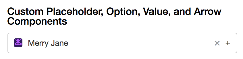
Go to http://jedwatson.github.io/react-select/ and find the "Custom Placeholder, Option, Value, and Arrow Components" example.
Imagine you want to interactively experiment with the background-color of the highlighted option.
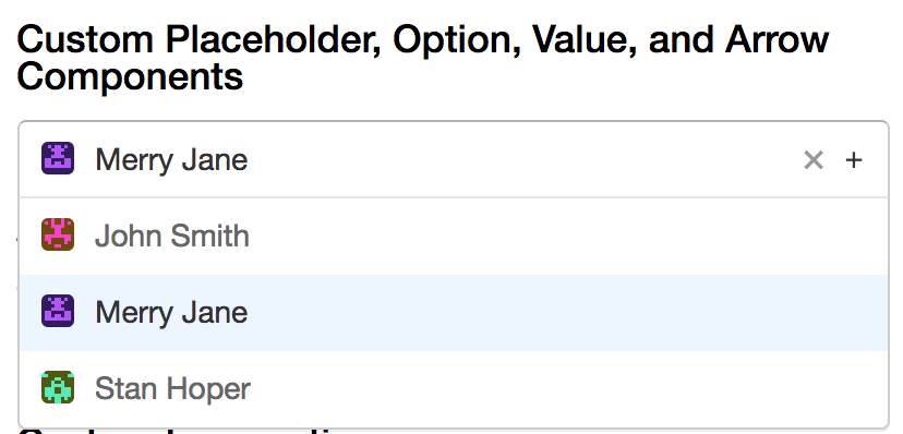
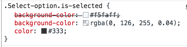
Normally, you'd perhaps right click on the element, or use the devtools selector tool to focus on that dom element. I know it sounds silly, but I'd strongly encourage you to try doing this, now. Unless I'm mistaken, I think you'll find any approach you take (initially) will surprise you by closing the Select and losing focus. In fact, the "on click outside" behaviour is so aggressive that the only way I've been able to investigate the dom of an Option is to _right_-click on the closest available parent in the inspector (usually about 3 or 4 levels up), and descend down using repeated right clicks followed by "Expand All" (which, conveniently, does not expand all). And once you've done all of this, you can now see the treasure you came for - the "background-color" css attribute for the selected option in the inspector.
So you click it.
And the Select box instantly closes, and you're back at square one. Bamboozled again.
Right now, I've modified my local version of Select.js to never close, to ease the above pain in development.
I can see from the numerous discussions that the issue of an "isOpen" prop is contentious, but there is currently a seriously usability issue during development. It _could_ be addressed by an "isOpen" option (that's how I ended up on this thread), but it could just as well be resolved by a slightly more controllable blur / close logic.
I hope this explains why I consider this to be important, and may perhaps add to this discussion.
Once again, thanks for your time and an excellent library.
 benvan
on 26 Oct 2017
benvan
on 26 Oct 2017
Hi Ben,
You can solve your specific problem by putting a break point on DOM modifications into the source, you will then be able to pause rendering with the drop down visible and tweak the css.
Cheers
Jon
jonfreedman
on 26 Oct 2017
@benvan you can utilize as @jonfreedman said the breakpoint function on chrome dev tools to handle the onclick function. https://developers.google.com/web/tools/chrome-devtools/javascript/
You just need to go to Sources -> Event Listener Breakpoints -> Mouse (click) and it will set a debugger on any clicks. You will be able to inspect the dropdown options.
 dongapplyboard
on 27 Oct 2017
dongapplyboard
on 27 Oct 2017
I've commented on #927, at least in the React devtools I have in Electron this method is not workable.
 Slapbox
on 4 Nov 2017
Slapbox
on 4 Nov 2017
@JedWatson, For my application I wanna write a component on top of react-select composed of two react-select that moves options from one select to another just by clicking the options. For this use case I need to have both lists displayed so the user can easily click the options and see which options are in which select.
 C3PablO
on 8 Nov 2017
C3PablO
on 8 Nov 2017
If you want to trigger the select to be open (and then respond to focus / blur / select events as expected) then just set the focus
If I understand correctly, the proposal here is to get a ref and call focus() on it, right? That would be perfect for my case, except that I want to leave the openOnFocus option false, so calling focus() doesn't actually open the input! If triggering the select to be open is recognized as a valid case, maybe just having an imperative open() method on the component would make the most sense?
 ethanresnick
on 10 Nov 2017
ethanresnick
on 10 Nov 2017
Hi! I need to run some action (search, to be specific), when user hits 'enter' on the control. The only option is to catch onInputKeyDown and override the default behaviour of 'enter' (select item from the list) or add the behaviour.
But I need use both conditionally. And it should behave like this:
a) dropdown is open -> user hits 'Enter' -> selection is happened -> no action triggered (search) !important
b) dropdown is closed -> user hits 'Enter' -> no selection is happened -> action triggered (search)
!important
The only option I came in is:
const handleOnInputKeyDown = e => {
        if (e.keyCode === 13) { //enter
            if (!e.target.isOpen) { //wherever this isOpen option is
                e.preventDefault();
                triggerSearch();
            }
        }
    };
Of cause i can do my own state isOpen and change it through events onOpen and onClose. But it sounds more like workaround and forces me convert stateless component to stateful.
Any thoughts?
 gam0ny
on 14 Nov 2017
gam0ny
on 14 Nov 2017
@JedWatson I little bit dove in the react-select code and found some hack which is working fine.
var evt = document.createEvent('MouseEvents')
evt.initMouseEvent('mousedown', true, false, window, 0, 0, 0, 0, 0, false, false, false, false, 0, null);
document.getElementsByClassName('Select-control')['0'].dispatchEvent(evt)
I can open the drop-down programmatically if searchable is not set as true. Is it ok to use this kind of hack? Any thoughts?
 bansalritesh18
on 20 Nov 2017
bansalritesh18
on 20 Nov 2017
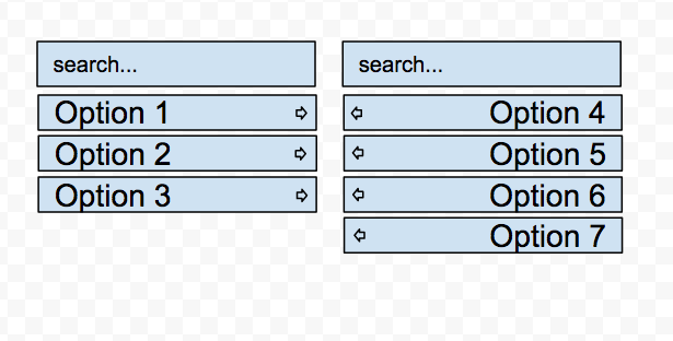
Here is the example of UI that can be accomplished. This is not a select element but rather some sort of unusual UI, but it has multiselect + autocomplete capabilities, so I came to react-select.
Being able to have the list always open is very very wanted!
 pttsky
on 5 Jan 2018
pttsky
on 5 Jan 2018
 <Select
                openOnFocus
                ref={(ref)=>{this.DOMNode = ref}}
/>
componentDidMount() {
        if (this.props.isOpen ) {
               setTimeout(() => {
                   this.DOMNode.focus();
               }, 10)
        }
    }
currently this work well, i describe briefly my case - huge data table, i render selects only on enter/click, any big components affect performance quite hard, so some time is good to have isOpen, thanks to author for his time and efforts
 GlebDolzhikov
on 30 Jan 2018
GlebDolzhikov
on 30 Jan 2018
I think we need it. Our use case is need to open and close all select fields by click/tap (like a trigger).
this.DOMNode.focus(); is not suitable if field is focused already.
 alex-shamshurin
on 7 Feb 2018
alex-shamshurin
on 7 Feb 2018
you always can blur and focus back, but still it is dirty workaround) so prop isOpen is needed
GlebDolzhikov
on 7 Feb 2018
No, I think a much better approach is to listen to 'click' events during catch stage, whereas the component use preventDefault for bubbling stage.
alex-shamshurin
on 7 Feb 2018
This package remains all but impossible to style, largely due to this issue remaining unaddressed.
Slapbox
on 16 Apr 2018
For people interested in this for debugging/styling purposes only:
& @Slapbox (if I understood you correctly.)
You can force open the menu by changing the internal state.isOpen through the React Chrome plugin.
In my case I wanted to tweak the CSS and needed to focus on the container (Select-menu-outer) to play with CSS inside Chrome's inspector.

 abdulrahman-khankan
on 11 May 2018
abdulrahman-khankan
on 11 May 2018
Thanks for a great control!
Adding my 2 cents - for supporting programmatically open.
For our use case - it is a requested feature for a first time user.
- A first time user is given credentials and assigned a set of projects that they are authorized to work on.
- When they first launch the application, the first action they need to do is select a project to work on.
- The UX designs specify the project list should be open for quick access to selecting a project and getting started.
Hoping that the tips above will work otherwise.
 golgistudio
on 16 May 2018
golgistudio
on 16 May 2018
isOpen or alwaysOpen is really important property. Sometimes we need it. We all can make a fork to add this prop, but I think it should be there.
 wamujlb
on 26 Jun 2018
wamujlb
on 26 Jun 2018
any update on this issue?
 dav-sap
on 25 Oct 2018
dav-sap
on 25 Oct 2018
@dav-sap It is available in v2 using the property menuIsOpen.
@JedWatson I believe this can be closed.
abdulrahman-khankan
on 25 Oct 2018
Thanks
dav-sap
on 25 Oct 2018
After spending 20 minutes trying to figure out why state.menuIsOpen wasn't working as expected, I realized it's accessible via state.selectProps.menuIsOpen ... hope this helps someone else.
 andyford
on 29 May 2019
andyford
on 29 May 2019
Hello -
In an effort to sustain the react-select project going forward, we're closing old issues.
We understand this might be inconvenient but in the best interest of supporting the broader community we have to direct our efforts towards the current major version.
If you aren't using the latest version of react-select please consider upgrading to see if it resolves any issues you're having.
However, if you feel this issue is still relevant and you'd like us to review it - please leave a comment and we'll do our best to get back to you!
 bladey
on 28 May 2020
bladey
on 28 May 2020
Related issues
 mjuopperi
·
3Comments
mjuopperi
·
3Comments
 batusai513
·
3Comments
batusai513
·
3Comments
 MindRave
·
3Comments
MindRave
·
3Comments
 joshualimpj
·
3Comments
joshualimpj
·
3Comments
 Meesam
·
3Comments
Meesam
·
3Comments
Most helpful comment
isOpenoralwaysOpenis really important property. Sometimes we need it. We all can make a fork to add this prop, but I think it should be there.