React-select: Setting the height of react-select
I am having a hard time setting the height of react-select. Is there an option to do it with ease? If I have to do it via some CSS magic, is it possible to update the documentation?
 vijayst
All 32 comments
I have the problems too.
 deju
on 31 Oct 2016
deju
on 31 Oct 2016
@vijayst You can see the issue.
deju
on 31 Oct 2016
@vijayst
If you are using LESS, see: this comment (it worked for me).
I am using a slightly different syntax. I am using webpack, with less-loader, and this is what I added to one of my project LESS files.
@import '~react-select/less/select';
@select-input-height: 50px;
 naartjie
on 31 Oct 2016
naartjie
on 31 Oct 2016
I am using SASS. This style worked for me:
.Select-control {
height: 30px;
.Select-placeholder {
line-height: 26px;
}
.Select-value {
line-height: 26px !important;
.Select-value-label {
line-height: 26px;
}
}
.Select-input {
height: 26px;
}
}
thanks @vijayst i used yours but like this in my custom css file
.sectionTest {
:global .Select-control {
height: 30px;
}
:global .Select-placeholder {
line-height: 20px
}
:global .Select-value {
line-height: 26px !important;
}
:global .Select-value-label {
line-height: 26px;
}
:global .Select-input {
height: 26px;
}
}
and then on the select pass the className
<Select
className={cx('sectionTest')}
allowCreate={true}
value={this.state.tags}
name="form-field-name"
multi={true}
onChange={this.handleTagInput.bind(this)}
/>
 foodaka
on 20 Dec 2016
foodaka
on 20 Dec 2016
CSS overwriting did not work for me, the size of Select-value did not change. But overwriting the SCSS variable worked.
$select-item-gutter: 4px;
$select-item-font-size: 11px;
$select-input-height: 30px;
@import "../../node_modules/react-select/scss/default";
It seems that we can overwrite the variables of SCSS by assigning them first and import later.
 gomo
on 9 Aug 2017
gomo
on 9 Aug 2017
The same question for react-select v2.
What is the easiest way to change a controlHeight ?
 pahaz
on 25 Jul 2018
pahaz
on 25 Jul 2018
@pahaz I have found with v2 the simplest and least problematic way is to custom style the valueContainer with a minHeight.
render() {
const customStyles = (width = 100, height = 40) => {
return {
container: (base) => ({
...base,
display:'inline-block',
width: width,
}),
valueContainer: (base) => ({
...base,
minHeight: height,
})
}
}
return (
<Select
styles={customStyles}
options={...}
/>
);
}
If you use height the multi-selects will have problems properly growing the height of the container if they run out of room. (This causes it to become 'fixed' height rather than fluid.) Worth noting that this method will only help with increasing the default size. If your goal is to shrink the default height of the component, there are a couple other places with minHeight already forced to 38px that you'll have to work to override...
I have added the extra styling of container to show the best way to make your selects behave as inline items...which also is the same level that seems to behave the nicest for direct width management.
 shaefer
on 3 Aug 2018
shaefer
on 3 Aug 2018
For anyone else looking to shrink it, you have to set both 'min-height' and 'height' because the default 'min-height' is 38px.
const customStyles = {
control: (base, state) => ({
...base,
height: '34px',
'min-height': '34px',
}),
};
 ZackKnopp
on 13 Sep 2018
ZackKnopp
on 13 Sep 2018
@ZackKnopp
then the height of multi options input will not automatically increase
 7c78
on 16 Sep 2018
7c78
on 16 Sep 2018
If someone still looking for same to match react strap
const colourStyles = {
control: styles => ({
...styles,
boxShadow: '0 1px 3px 0 rgba(65, 75, 108, 0.1), 0 2px 4px 0 rgba(0, 0, 0, 0.03)',
backgroundColor: 'hsl(0, 0%, 100%)',
border: '1px solid var(--gray) !important'
})
};
and need to add the input element css
input#react-select-2-input {
height: 30px !important;
}
 ghost
on 9 Oct 2018
ghost
on 9 Oct 2018
Does not seem to be able to shrink the height. As @7c78 pointed out - if you set minheight it will not work with multi. Anyone know how to reliably make this component height smaller - but allow expand when multi? (version 2)
 waynebrantley
on 2 Nov 2018
waynebrantley
on 2 Nov 2018
At ver 2.1 you can shrink the height of the input with custom theme accompany custom style, but it is not reliable and optimal.
export const customTheme = (theme) => ({
...theme,
spacing: {
controlHeight: 32,
menuGutter: 1,
baseUnit: 2,
},
});
export const customStyles = ({
control: (styles, { isFocused }) => ({
...styles,
"background": "white",
"width": "100% !important",
"padding": "2px 6px",
...style.control,
}),
});
P/s: I end up writing my own minimal select input that suit my need.
7c78
on 5 Nov 2018
"Not reliable" meaning?
waynebrantley
on 5 Nov 2018
Sometime it works, sometime doesn't. It is simply not designed to support this feature.
7c78
on 6 Nov 2018
My hack for shrink MultiSelect but expand when items are selected. By reducing some spacing for dropdownIndicator, clearIndicator etc.
const customStyles = {
        control: base => ({
            ...base,
            minHeight: 30
        }),
        dropdownIndicator: base => ({
            ...base,
            padding: 4
        }),
        clearIndicator: base => ({
            ...base,
            padding: 4
        }),
        multiValue: base => ({
            ...base,
            backgroundColor: variables.colorPrimaryLighter
        }),
        valueContainer: base => ({
            ...base,
            padding: '0px 6px'
        }),
        input: base => ({
            ...base,
            margin: 0,
            padding: 0
        })
};
 Meilan
on 7 Nov 2018
Meilan
on 7 Nov 2018
Using customStyles worked for me like mentioned in the above examples but container reflects the whole dropdown box which did not work. What worked was using minHeight to control size of dropdown:
const customStyles = {
menuList: base => ({
...base,
minHeight: 'fit-content',
}),
};
 shubhankar30
on 15 Nov 2018
shubhankar30
on 15 Nov 2018
To add to the above suggestions adjusting min-height. I solved this by also adjusting the padding in the style keys (https://react-select.com/styles). In particular the clearIndicator, dropdownIndicator, indicatorSeparator and valueContainer since they may otherwise override attempts to reduce the height of the component...
 gustavengstrom
on 20 Nov 2018
gustavengstrom
on 20 Nov 2018
I think I solved this using the following custom styles. I also say "i think" because I thought I had already fixed this and then it seems off, so still to see if these changes stay consistent.
control: (provided, state) => ({
...provided,
height: "2.4rem",
minHeight: 'fit-content'
}),
valueContainer: (base) => ({
...base,
maxHeight: "2.4rem",
}),
 thehme
on 21 Feb 2019
thehme
on 21 Feb 2019
See Style Object docs (V2)
You can set heights or use auto / unset.
const customStyles = {
control: provided => ({
...provided,
minHeight: "30px",
}),
indicatorsContainer: provided => ({
...provided,
height: "30px"
}),
clearIndicator: provided => ({
...provided,
padding: "5px"
}),
dropdownIndicator: provided => ({
...provided,
padding: "5px"
})
};
 j-te
on 6 Mar 2019
j-te
on 6 Mar 2019
For those who are rendering a list of options with their react-select dropdown.
The solution that I found worked for me is:
See what classNames that the react-select generates on the DOM
Look for a deeply nested one that has a div inside it with an input for example:
<div class="css-1g6gooi"(react-select generated className)>
<div class="" style="display: inline-block;">
<input autocapitalize="none" autocomplete="off"
autocorrect="off" id="react-select-7-input" spellcheck="false" tabindex="0" type="text" aria-
autocomplete="list" value="" style="box-sizing: content-box; width: 2px; background: 0px center;
border: 0px; font-size: inherit; opacity: 0; outline: 0px; padding: 0px; color: inherit;">
<div style="position: absolute; top: 0px; left: 0px; visibility: hidden; height: 0px; overflow: scroll;
white-space: pre; font-size: 10.4px; font-family: "Core Sans Regular", "Helvetica
Neue ", Helvetica, Roboto, Arial, sans-serif; font-weight: 400; font-style: normal; letter-
spacing: normal; text-transform: none;">
</div>
</div>
- I zeroed out the margin and padding and set the font-size (very counter-intuitive) according to your needs. This adjusted the height and maintained my font-size integrity. I used sass to target that class.
**This div and class are sitting inside the select element and seem to be responsible for the styling of the component.
 JacobAndrewSmith92
on 25 Apr 2019
JacobAndrewSmith92
on 25 Apr 2019
I think the following is the minimal setting.
const targetHeight = 30;
const styles = {
control: base => ({
...base,
minHeight: 'initial',
}),
valueContainer: base => ({
...base,
height: `${targetHeight - 1 - 1}px`,
padding: '0 8px',
}),
clearIndicator: base => ({
...base,
padding: `${(targetHeight - 20 - 1 - 1) / 2}px`,
}),
dropdownIndicator: base => ({
...base,
padding: `${(targetHeight - 20 - 1 - 1) / 2}px`,
}),
};
 junkboy0315
on 26 Feb 2020
junkboy0315
on 26 Feb 2020
how to make it look like bootstrap?
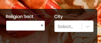
Look City Field is bigger than bootstrap field i.e. Religion Sect
 Muhammadinaam
on 3 Mar 2020
Muhammadinaam
on 3 Mar 2020
@junkboy0315 thanks! this does the trick. Although it would be great, if this could be achieved easier
 laurentsmohr
on 11 Mar 2020
laurentsmohr
on 11 Mar 2020
I think the following is the minimal setting.
const targetHeight = 30; const styles = { control: base => ({ ...base, minHeight: 'initial', }), valueContainer: base => ({ ...base, height: `${targetHeight - 1 - 1}px`, padding: '0 8px', }), clearIndicator: base => ({ ...base, padding: `${(targetHeight - 20 - 1 - 1) / 2}px`, }), dropdownIndicator: base => ({ ...base, padding: `${(targetHeight - 20 - 1 - 1) / 2}px`, }), };
Doesn't work for multiple.
 GlebBigma
on 26 Mar 2020
GlebBigma
on 26 Mar 2020
Spending hours, I end up with this to get exact 30px height of react select with border 1px:
const customStyles = {
control: (provided, state) => ({
...provided,
background: '#fff',
borderColor: '#9e9e9e',
minHeight: '30px',
height: '30px',
boxShadow: state.isFocused ? null : null,
}),
valueContainer: (provided, state) => ({
...provided,
height: '30px',
padding: '0 6px'
}),
input: (provided, state) => ({
...provided,
margin: '0px',
}),
indicatorSeparator: state => ({
display: 'none',
}),
indicatorsContainer: (provided, state) => ({
...provided,
height: '30px',
}),
};
 jivanshr
on 29 Mar 2020
jivanshr
on 29 Mar 2020
Here are some custom styles that work for resizing multi select as well as single select react-select dropdowns. This produces select boxes 31px in height, compatible with the form-control-sm controls from Bootstrap.
const reactSelectStyles = {
container: (provided, state) => ({
...provided,
padding: 0,
height: 'fit-content',
zIndex: 4
}),
control: (provided, state) => ({
...provided,
borderWidth: 0,
minHeight: 'fit-content',
height: 'fit-content'
}),
indicatorsContainer: (provided, state) => ({
...provided,
height: '29px'
}),
input: (provided, state) => ({
...provided,
height: '21px'
})
};
Example:

You need to tell the containers to "fit-content" their height, while hard-coding the heights of the contents of those containers.
 nikolas
on 14 Apr 2020
nikolas
on 14 Apr 2020
Spending hours, I end up with this to get exact 30px height of react select with border 1px:
const customStyles = { control: (provided, state) => ({ ...provided, background: '#fff', borderColor: '#9e9e9e', minHeight: '30px', height: '30px', boxShadow: state.isFocused ? null : null, }), valueContainer: (provided, state) => ({ ...provided, height: '30px', padding: '0 6px' }), input: (provided, state) => ({ ...provided, margin: '0px', }), indicatorSeparator: state => ({ display: 'none', }), indicatorsContainer: (provided, state) => ({ ...provided, height: '30px', }), };
Hi, I made little change if anyone wants to add scroll inside the container so you can still look everything that you choose
valueContainer: (provided, state) => ({
...provided,
height: '30px',
padding: '0 6px',
overflowY: 'scroll',
}),
 irfanandratama
on 23 Apr 2020
irfanandratama
on 23 Apr 2020
If you're using the SASS, the easiest solutions is to set prefix classNamePrefix='Select', then in your stylesheets you need .Select__value-container {
height: 48px;
}
 roberts98
on 19 May 2020
roberts98
on 19 May 2020
Hi all,
Thank you for all the input and solutions to this issue.
Going forward into the next major version, we will take into account the demand for making the height of react-select more easily adjustable.
In an effort to sustain the react-select project, we're closing issues that have been resolved via community comments.
 bladey
on 3 Jun 2020
bladey
on 3 Jun 2020
My hack for shrink MultiSelect but expand when items are selected. By reducing some spacing for dropdownIndicator, clearIndicator etc.
const customStyles = {
        control: base => ({
            ...base,
            minHeight: 30
        }),
        dropdownIndicator: base => ({
            ...base,
            padding: 4
        }),
        clearIndicator: base => ({
            ...base,
            padding: 4
        }),
        multiValue: base => ({
            ...base,
            backgroundColor: variables.colorPrimaryLighter
        }),
        valueContainer: base => ({
            ...base,
            padding: '0px 6px'
        }),
        input: base => ({
            ...base,
            margin: 0,
            padding: 0
        })
};
This worked for me
 bensongathee
on 2 Aug 2020
bensongathee
on 2 Aug 2020
Why can't it simply support the regular react-bootstrap size prop sm/md/lg to avoid so much trouble? That's all I want to make all controls lined up correctly.
 miliu99
on 2 Aug 2020
miliu99
on 2 Aug 2020
Related issues
 mbonaci
·
3Comments
mbonaci
·
3Comments
 pgoldweic
·
3Comments
pgoldweic
·
3Comments
 joshualimpj
·
3Comments
joshualimpj
·
3Comments
 sampatbadhe
·
3Comments
sampatbadhe
·
3Comments
 steida
·
3Comments
steida
·
3Comments
Most helpful comment
My hack for shrink MultiSelect but expand when items are selected. By reducing some spacing for dropdownIndicator, clearIndicator etc.