React-select: Custom multi-select value/"chip" renderer
After researching numerous autocomplete/selection components in the wild, I recently settled on react-select because it supports more of our requirements than any other. The effort of building it is much appreciated!
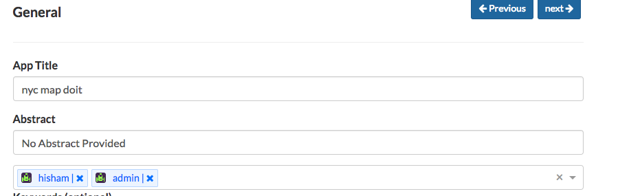
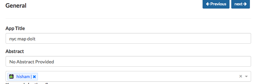
Even the custom renderer options are a great feature to have. However, it seems that there is a key component of react-select that can't be generated with a custom render method: the multi select value "chips". To be clear, I'm talking about the light-blue elements used to display each selected value:

I am aware that the valueRenderer prop can be used to render custom value components, including for multi select mode. While this is a great way to style the text or add an icon (as the examples demonstrate), it breaks down for many other use cases. If I want each chip to have a unique background color, this is all the further valueRenderer gets me:

There are other design treatments I could give the color patch, but nothing ideal. Ideally, I would be able to render something like this:

While aspects of this appearance can be applied with CSS, global styles will not allow customizing an entire chip independently from others. If I had a white option, I would need a light border and a grey delete button for that chip only, which is currently impossible. Further, there are limits on customizing the delete buttons since the only tool available is CSS. Background images and pseudo elements can only go so far.
Implementing material design chips (shown below) might be possible with CSS and valueRenderer, but it would certainly be easier if the developer had full control of the chip markup.

I'm no expert on the codebase of the project (yet). For those who are, is there anything blocking such a feature from being developed? As I see it, such a component would need:
- An
onDeleteprop that could be attached to a custom delete button. - An
optionprop and/or avalueRenderercomponent that could be reused. - An
onValueClickfunction if one is provided to theSelectcomponent.
Such a component would put some responsibility on the developer to wire up existing functionality that react-select would otherwise give them for free, but would offer complete control. Usually that is the tradeoff 😃
This all seems fairly straightforward, I just may be missing something. If I can understand the details well enough, I may be able to find the time for a PR.
 MilllerTime
All 12 comments
:thumbsup:
 balzafin
on 4 Oct 2016
balzafin
on 4 Oct 2016
This would be great. In my case, I simply want to prevent the values from rendering at all (in my scenario I want to render selected items elsewhere), but setting valueRenderer={()=>{}} still results in an empty chip displayed for each item selected.

 gferreri
on 10 Nov 2016
gferreri
on 10 Nov 2016
Forget valueRenderer, you need to supply the valueComponent property. It's a function that renders the whole item so you need to have it return HTML.
<Select
    valueComponent={conf => {
        //conf is an object with the following values you might find interesting
       const {
            id // unique id for the item
            children // an array where the first element ([0])
                     // is the output of the valueRenderer property
            disabled // state of this option
            value // the original option object
            onClick // the function supplied by onValueClick property
            onRemove // internal function to remove the selected item.
                     // If you want to call it you need to also give it the value field.
        } = conf;

        //so, you would do something like this
        return <div id={id}
                    // if you want to implement the handlers
                    // you *need* to bind them to onMouseDown
                    // because when you click on an item
                    // react-select opens the menu and kills the event propagation
                    onMouseDown={e => {
                        if(!disabled) {
                            onClick(e);
                            onRemove(value);
                        }
                        // for sanity's sake
                        e.stopPropagation();
                    }}>{children}</div>
    }},
    //other props
/>
 tonisostrat
on 11 Mar 2017
tonisostrat
on 11 Mar 2017
@tonisostrat That looks pretty good. Accepting the result of valueRenderer as a child is a great idea.
What is the purpose for the id prop, when there is already a unique value?
As for the name, I'd propose chipRenderer. React-select appears to have a convention of suffixing all custom component props with Renderer, and chip avoids conflicting with valueRenderer while still being semantic imo.
MilllerTime
on 12 Mar 2017
@MilllerTime In regards to the id/value, the difference is that value is the actual JS object whereas the id is an auto-generated string (id of the value wrapper div + index of the option) that the default ValueComponent uses as the id of each option's HTML element.
From what I can tell, after digging through the code, it isn't actually used/referenced anywhere so you can probably omit it without any side effects but I personally added it to my custom elements, just in case:
<div class="Select-control">
  <span class="Select-multi-value-wrapper" id="react-select-3--value">
    <span id="react-select3--value-0" /* the id prop */ class="my-custom-value-component">
      // whatever you want
    </span>
    <span id="react-select3--value-1" /* the id prop */ class="my-custom-value-component">
      // whatever you want
    </span>
    <div class="Select-input">
      // default input code
    </div>
  </span>
</div>
I just wrote this component(from examples) which contains remove button for multi
Hope it can be helpful to others. @MilllerTime @tonisostrat @JedWatson
export const GravatarValue = createClass( {
    propTypes: {
        children: PropTypes.node,
        placeholder: PropTypes.string,
        value: PropTypes.object,
        onRemove: PropTypes.func.isRequired,
        disabled: PropTypes.bool.isRequired,
    },
    render( ) {
        let { disabled, value, onRemove } = this.props
        var gravatarStyle = {
            borderRadius: 3,
            display: 'inline-block',
            marginRight: 10,
            position: 'relative',
            top: -2,
            verticalAlign: 'middle',
        };
        return (
            <div className="Select-value" title={this.props.value.title}>

                <span className="Select-value-label">
                    <Gravatar email={this.props.value.email} size={GRAVATAR_SIZE} style={gravatarStyle} />
                    {this.props.children}
                    {` | `}<i onMouseDown={e => {
                        if(!disabled) {
                            onRemove(value)
                        }
                        // for sanity's sake
                        e.stopPropagation()
                    }} className="fa fa-times" aria-hidden="true"></i>
                </span>
            </div>
        )
    }
} )
 hishamkaram
on 19 Sep 2017
hishamkaram
on 19 Sep 2017
@tonisostrat I did not realize valueComponent was a legit thing when I last replied, my apologies for any confusion there. Your suggestion to use it instead of valueRenderer is absolutely the correct answer.
It appears valueComponent was only documented on June 21, which explains why a number of people, myself included, didn't realize this functionality was there.
Closing as I feel this has been sufficiently resolved.
MilllerTime
on 19 Sep 2017
Just wanted to note this here: I've implemented custom styling comprehensively in v2 (preview here https://deploy-preview-2289--react-select.netlify.com/styled)
I'm working to finalise the API at the moment so anyone who's interested, please take a look at the alpha and open issues with feedback.
 JedWatson
on 2 Feb 2018
JedWatson
on 2 Feb 2018
the remove icon on the chips is not working in mobile chrome tho
 AnonymousInt
on 21 Feb 2018
AnonymousInt
on 21 Feb 2018
@JedWatson link doesn't work.
 reyanshmishra
on 11 Oct 2018
reyanshmishra
on 11 Oct 2018
Just wanted to note this here: I've implemented custom styling comprehensively in v2 (preview here https://deploy-preview-2289--react-select.netlify.com/styled)
@JedWatson This link 404's. Thanks in advance.
 dep
on 6 Feb 2019
dep
on 6 Feb 2019
@dep @reyanshmishra a non functioning link does not excuse lazyness.
As you should know, v2 was already released and the feature he mentioned was implemented. There is no need for the "preview" anymore.
You can change the style (and only the style) of the "chips" with the Styling Framework. You can also replace the component with the Components "Framework" to add functionality or change structure. The documentation should have everything you need.
 Rall3n
on 7 Feb 2019
Rall3n
on 7 Feb 2019
Related issues
 yrabinov
·
3Comments
yrabinov
·
3Comments
 mbonaci
·
3Comments
mbonaci
·
3Comments
 jonorogers
·
3Comments
jonorogers
·
3Comments
 MindRave
·
3Comments
MindRave
·
3Comments
 joshualimpj
·
3Comments
joshualimpj
·
3Comments
Most helpful comment
Forget
valueRenderer, you need to supply thevalueComponentproperty. It's a function that renders the whole item so you need to have it return HTML.