React-select: How can I change arrow?
I need another arrow. Example of font-awesome.
How can a change ?
 victorpavlenko
All 29 comments
you can use css on .Select-arrow-zone and .Select-arrow
 CosticaPuntaru
on 28 Dec 2015
CosticaPuntaru
on 28 Dec 2015
Cool thanks
victorpavlenko
on 28 Dec 2015
Would it be possible to allow to pass a custom prop for the arrow so you can for example use svg icons ?
 LoicUV
on 18 May 2016
LoicUV
on 18 May 2016
... or to hide altogether; it's in the same location as bootstrap feedback icon.
 RichardForrester
on 21 Aug 2016
RichardForrester
on 21 Aug 2016
It's been a while already, but for anyone still having issues with this you can pass a custom function to the property arrowRenderer
You can find an example here: https://github.com/JedWatson/react-select/blob/master/docs/examples/CustomDropdownIndicator.js
Update 2020-12-25: Fixed broken link
 MiguelCord
on 15 Mar 2018
MiguelCord
on 15 Mar 2018
How could I change the arrow when it's open?
 matheusalxds
on 3 Jul 2018
matheusalxds
on 3 Jul 2018
@MiguelCord looks like the feature has been taken out? The link doesn't work.
 praveenaj
on 21 Aug 2018
praveenaj
on 21 Aug 2018
Any progress on this issue ?
 Rahulkr204
on 4 Sep 2018
Rahulkr204
on 4 Sep 2018
@Rahulkr204 Came here for the same reason of changing arrow. Maybe this issue could help you: https://github.com/JedWatson/react-select/issues/2926
 Dracontis
on 5 Sep 2018
Dracontis
on 5 Sep 2018
@matheusalxds @praveenaj @Rahulkr204 @Dracontis
See the docs to learn how to replace components. The one you're looking for is DropdownIndicator.
 subnomo
on 10 Sep 2018
subnomo
on 10 Sep 2018
I solved this by using arrowRenderer props
arrowRenderer() {
return <div className={classes.arrowRenderer}><DownChevron/></div>
}
<Select
arrowRenderer={this.arrowRenderer}
optionRenderer={this.props.optionRenderer}
isMulti={false}
closeMenuOnSelect={false}
options={options}
onChange={(props)=>this.editDropdown(props,name)}
value={value}
className={classes.selectOption}
placeholder={placeholder}
disabled={isDisabled}
clearable={false}
style={dropdownStyle}
/>
@subnomo Thanks. I got it working. Here's my code if anyone still trying to do it.
import Select, { components } from 'react-select';

const DropdownIndicator = props => {
  return (
    components.DropdownIndicator && (
      <components.DropdownIndicator {...props}>
        <FontAwesomeIcon icon={props.selectProps.menuIsOpen ? "caret-up" : "caret-down"}/>
      </components.DropdownIndicator>
    )
  );
};


<Select
   components={{ DropdownIndicator }}
    // pass other props
/>
I wanted to remove the dropdown arrow and by seeing this issue I rendered arrowRenderer as an empty div but there is still an annoying border (or divider something) which used to separate clear and arrow. First anyone has any better solution to remove arrow down icon and second if there is not, how to remove that divider?
Thanks :)
 erfoon
on 13 Sep 2018
erfoon
on 13 Sep 2018
@erfansamieyan That's simple. Just do this in your customStyles Object.
 visualcookie
on 19 Sep 2018
visualcookie
on 19 Sep 2018
Here's the link to the example on how you can substitute arrow-down with your image:
https://react-select.com/components
(search for Custom Dropdown Indicator Example)
 AllaSorokina
on 19 Nov 2018
AllaSorokina
on 19 Nov 2018
@praveenaj what is FontAwesomeIcon? I have the following, but passing this in doesn't replace the icon.
const CaretDownIcon = () => {
  return <i className="fas fa-caret-down" />;
};
 brendadev
on 8 Feb 2019
praveenaj
on 11 Feb 2019
brendadev
on 8 Feb 2019
praveenaj
on 11 Feb 2019
I also solved this by passing a function that renders the icon to arrowRenderer props
like so:
const renderIcon = () => (
  // return icon render
)

<Select
  arrowrenderer={renderIcon}
/>
 ninariccimarie
on 17 Apr 2019
ninariccimarie
on 17 Apr 2019
Is there a simple way to just pass id for dropdownIndicator component, so not to create custom to use existing one but to add html id?
 vaske
on 24 Sep 2019
vaske
on 24 Sep 2019
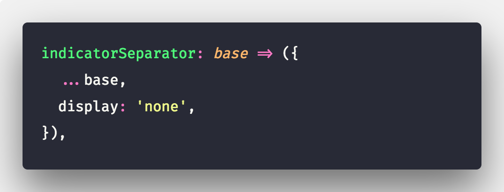
To remove the dropdown indicator in a select add this to your custom styles object.
dropdownIndicator: base => ({
            ...base,
            display: 'none'
        }),
 scrayWC
on 1 Oct 2019
scrayWC
on 1 Oct 2019
@scrayWC I know that one, I was looking for passing html id to dropdownIndicator but that is not possible just like that, so I had to pass whole custom component to render dropdownIndicator it's a bit hassle but still make sense.
vaske
on 1 Oct 2019
how do you change dropdownIndicator icon for
components is not exported in react-select/async
 kandasj
on 15 Oct 2019
kandasj
on 15 Oct 2019
@kandasj I created my own component and pass to react select
something like
export const DropdownIndicator = props => {
    const dropdownClassName = classnames(`dropdownIndicator`, {
        ["disabled"]: props.selectProps.isDisabled,
        ["up"]: props.selectProps.menuIsOpen,
        ["down"]: !props.selectProps.menuIsOpen,
    });
    return (
        components.DropdownIndicator && (
            <components.DropdownIndicator {...props}>
                <DropdownContainer
                    theme={theme}
                    id={`dropdown-${props.selectProps.id}`}
                    className={dropdownClassName}
                />
            </components.DropdownIndicator>
        )
    );
};

const IndicatorsContainer = props => {
    return (
        components.IndicatorsContainer && (
            <components.IndicatorsContainer {...props}>
                <div id={`indicator-${props.selectProps.id}`}>
                    {props.children}
                </div>
            </components.IndicatorsContainer>
        )
    );
};
and then pass it to component as
 <Select
            {...props}
            styles={customStyles(theme)}
            components={{
                IndicatorsContainer,
                DropdownIndicator,
            }}
        >
            {props.children}
        </Select>
In this case IndicatorsContainer contains logic for showing dropdown icon.
Hope that this helps a bit ;)
vaske
on 15 Oct 2019
@scrayWC I know that one, I was looking for passing html id to dropdownIndicator but that is not possible just like that, so I had to pass whole custom component to render
dropdownIndicatorit's a bit hassle but still make sense.
@vaske I'm looking to do something similar. Are you able to use the default child icon when passing a custom component? I'm trying to pass an id attribute to the ClearIndicator, but still take advantage of the default cross svg.
 dunncl15
on 17 Oct 2019
dunncl15
on 17 Oct 2019
@dunncl15 I had same problem as you, my goal was just to add id to dropdown arrow due to testing purpose, and run into issue that it's not possible to pass just id, then I had to create entire component.
If you pass just prop.children it should render default icon ;)
vaske
on 17 Oct 2019
dropdownIndicator: (provided, state) => ({
...provided,
color: '#0D51FF',
cursor:'pointer',
'svg':{
width:'24px',
height:'22px',
'&hover':{
color:'#0D51FF',
},
},
}),
 matabgaryan
on 4 Jun 2020
matabgaryan
on 4 Jun 2020
                    <Select
                       components={{ DropdownIndicator:() => null, IndicatorSeparator:() => null }}
                    />
 BR-Faria-Netto
on 6 Oct 2020
BR-Faria-Netto
on 6 Oct 2020
It's been a while already, but for anyone still having issues with this you can pass a custom function to the property
arrowRendererYou can find an example here https://github.com/JedWatson/react-select/blob/master/examples/src/components/CustomComponents.js
broken link
 GlebBigma
on 25 Dec 2020
GlebBigma
on 25 Dec 2020
@GlebBigma looks like was it likely pointing to V1 code. I updated the link which can be found here:
https://github.com/JedWatson/react-select/blob/master/docs/examples/CustomDropdownIndicator.js
 ebonow
on 25 Dec 2020
ebonow
on 25 Dec 2020
Related issues
 juliensnz
·
3Comments
juliensnz
·
3Comments
 jonorogers
·
3Comments
jonorogers
·
3Comments
 coder-guy22296
·
3Comments
coder-guy22296
·
3Comments
 yrabinov
·
3Comments
yrabinov
·
3Comments
 MalcolmDwyer
·
3Comments
MalcolmDwyer
·
3Comments
Most helpful comment
@subnomo Thanks. I got it working. Here's my code if anyone still trying to do it.