React-native: How to use ART to draw a circle.
Hi, I have 200 * 200 Surface componet
How I can draw a 100 radius with ART arc method and make it centered ?
 Symous
All 8 comments
Make sure you have linked ART library:
import React from 'react'
import {ART} from 'react-native'

export default class Circle extends React.Component {
  render() {
    const {radius, ...rest} = this.props

    const circle = ART.Path()
      .move(radius, 0)
      .arc(0, radius * 2, radius)
      .arc(0, radius * -2, radius)

    return <ART.Shape {...rest} d={circle} />
  }
}
If you have 200 * 200 Surface then:
<ART.Surface width={200} height={200}>
  <ART.Group x={0} y={0}>
    <Circle radius={100} fill={'#000'} />
  </ART.Group>
</ART.Surface>
 octopitus
on 20 May 2017
octopitus
on 20 May 2017
@octopitus Thank u! :-)
Symous
on 25 May 2017
How can I link ART library in Android? There's no info at all.
 TheCapedBaldi
on 4 Feb 2018
TheCapedBaldi
on 4 Feb 2018
@NaseebullahSafi You dont need to link it
 st0ffern
on 1 Mar 2018
st0ffern
on 1 Mar 2018
Hello guys, can you please help me to achieve the same as below.
I have used 'react-native-simple-gauge' library and done some modifications in library. So just replace the below AnimatedGaugeProgress.js and GaugeProgress.js file code given.
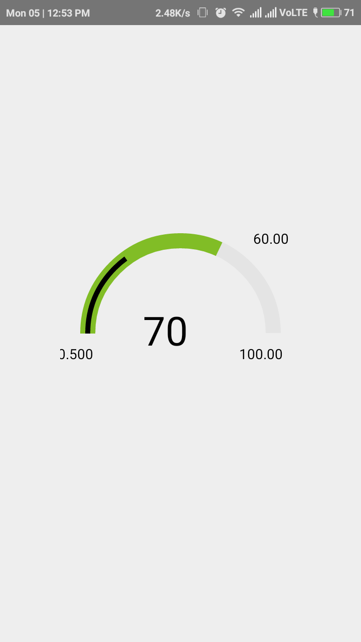
I want to place that 60.00 value exactly above where the inner black line ends.
Here is my code.
App.js
import { AnimatedGaugeProgress, GaugeProgress } from 'react-native-simple-gauge';
import React,{Component} from 'react';
import {View,Text,StyleSheet} from 'react-native';
export default class App extends React.Component{
render(){
return(
width={15}
fill={70}
rotation={90}
cropDegree={180}
tintColor="#81BD26"
fillLine={30}
lineColor={'black'}
  >
  </AnimatedGaugeProgress>
  </View>
)
}
}
const styles=StyleSheet.create({
container:{flex:1, justifyContent:'center', alignItems:'center'},
textView: {
top: 50,
left:80,
flex:1,
position: 'absolute',
alignItems: 'center',
justifyContent: 'center',
},
text: {
fontSize: 40,
},
})
AnimatedGaugeProgess.js
import React from 'react';
import PropTypes from 'prop-types';
import { View, Animated, ViewPropTypes } from 'react-native';
import GaugeProgress from './GaugeProgress';
const AnimatedProgress = Animated.createAnimatedComponent(GaugeProgress);
export default class AnimatedGaugeProgress extends React.Component {
constructor(props) {
super(props);
this.state = {
chartFillAnimation: new Animated.Value(props.prefill || 0)
}
}
componentDidMount() {
this.animateFill();
}
componentDidUpdate(prevProps) {
if (prevProps.fill !== this.props.fill) {
  this.animateFill();
}
}
animateFill() {
const { tension, friction } = this.props;
Animated.spring(
  this.state.chartFillAnimation,
  {
    toValue: this.props.fill,
    tension,
    friction
  }
).start();
}
performLinearAnimation(toValue, duration) {
Animated.timing(this.state.chartFillAnimation, {
  toValue: toValue,
  duration: duration
}).start();
}
render() {
const { fill, prefill, ...other } = this.props;
return (
fill={this.state.chartFillAnimation}
/>
)
}
}
AnimatedGaugeProgress.propTypes = {
style: ViewPropTypes.style,
size: PropTypes.number.isRequired,
fill: PropTypes.number,
prefill: PropTypes.number,
width: PropTypes.number.isRequired,
tintColor: PropTypes.string,
backgroundColor: PropTypes.string,
tension: PropTypes.number,
friction: PropTypes.number
}
AnimatedGaugeProgress.defaultProps = {
tension: 7,
friction: 10
};
GaugeProgress.js
import React from 'react';
import PropTypes from 'prop-types';
import { View, Platform, ViewPropTypes } from 'react-native';
import { Surface, Shape, Path, Group, Text } from '../../react-native/Libraries/ART/ReactNativeART';
import MetricsPath from 'art/metrics/path';
export default class GaugeProgress extends React.Component {
circlePath(cx, cy, r, startDegree, endDegree) {
let p = Path();
p.path.push(0, cx + r, cy);
p.path.push(4, cx, cy, r, startDegree * Math.PI / 180, endDegree * Math.PI / 180, 1);
return p;
}
extractFill(fill) {
if (fill < 0.01) {
return 0;
} else if (fill > 100) {
return 100;
}
return fill;
}
extractFillLine(fillLine) {
if (fillLine < 0.01) {
return 0;
} else if (fillLine > 100) {
return 100;
}
return fillLine;
}
render() {
const { size, width, tintColor, backgroundColor, style, stroke, strokeCap, rotation, cropDegree, children } = this.props;
const backgroundPath = this.circlePath(size / 2, size / 2, size / 2 - width / 2, 0, (360 * 99.9 / 100) - cropDegree);
const fill = this.extractFill(this.props.fill);
const fillLine=this.extractFillLine(this.props.fillLine);
const circlePath = this.circlePath(size / 2, size / 2, size / 2 - width / 2,
0, ((360 * 99.9 / 100) - cropDegree) * fill / 100 );
const linePath = this.circlePath(size / 2, size / 2, size / 2 - width / 2,
0, ((360 * 99.9 / 100) - cropDegree) * fillLine / 100 );
  console.log("LinePath Value",linePath)
return (
  <View style={style}>
    <Surface
      width={size+40}
      height={size}>
      <Group rotation={rotation + cropDegree/2} originX={(size+20)/2} originY={size/2}>
        <Shape d={backgroundPath}
               strokeDash={stroke}
               stroke={backgroundColor}
               strokeWidth={width}
               strokeCap={strokeCap}/>
        <Shape d={circlePath}
               strokeDash={stroke}
               stroke={tintColor}
               strokeWidth={width}
               strokeCap={strokeCap}/>
        <Shape d={linePath}
                stroke="black"
                strokeWidth={5}
                strokeCap={strokeCap}
        >


      </Shape>

      </Group>
      <Text font={`40px "Helvetica Neue", "Helvetica", Arial`}
          fill="#000000" alignment="center" x={(size/2)+width+width-width-10} y={((size/2)- width-width+width-10)}
          >70</Text>
      <Text font={`14px "Helvetica Neue", "Helvetica", Arial`}
          fill="#000000" alignment="center" x={width} y={(size/2- width/2)+20}
          >0.500</Text>

     <Text font={`14px "Helvetica Neue", "Helvetica", Arial`}
          fill="#000000" alignment="center"  x={size} y={(size/2- width/2)+20}
          >100.00</Text>

     <Text font={`14px "Helvetica Neue", "Helvetica", Arial`}
          fill="#000000" alignment="center" x={size+10} y={(width/2-10)}
          >60.00</Text>


    </Surface>
    {
      children && children(fill) //&& children(fillLine)

    }
  </View>
)
}
}
GaugeProgress.propTypes = {
style: ViewPropTypes.style,
size: PropTypes.number.isRequired,
fill: PropTypes.number.isRequired,
fillLine:PropTypes.number.isRequired,
width: PropTypes.number.isRequired,
tintColor: PropTypes.string,
stroke: PropTypes.arrayOf(PropTypes.number),
strokeCap: PropTypes.string,
backgroundColor: PropTypes.string,
rotation: PropTypes.number,
cropDegree: PropTypes.number,
children: PropTypes.func
}
GaugeProgress.defaultProps = {
tintColor: 'black',
backgroundColor: '#e4e4e4',
rotation: 90,
cropDegree: 90,
strokeCap: 'butt',
}
 ShaikhKabeer
on 5 Mar 2018
ShaikhKabeer
on 5 Mar 2018
@ShaikhKabeer Use StackOverflow or YouTube to learn how to program react-native.
I think you should create a custom component for you needs.
st0ffern
on 5 Mar 2018
@stoffern , can you please check code once and help me out ?
ShaikhKabeer
on 7 Mar 2018
@ShaikhKabeer nope, use StackOverflow
st0ffern
on 7 Mar 2018
Related issues
 anchetaWern
·
3Comments
anchetaWern
·
3Comments
 axelg12
·
3Comments
axelg12
·
3Comments
 aniss
·
3Comments
aniss
·
3Comments
 arunabha
·
3Comments
arunabha
·
3Comments
 janmonschke
·
3Comments
janmonschke
·
3Comments
Most helpful comment
Make sure you have linked ART library:
If you have 200 * 200 Surface then: