React-native-ui-kitten: Select menu no longer has scroll view to show large list of options
🐛 Bug Report
The select menu seems to no longer have a scroll view to view large lists of options, the select menu was working fine in version 4.2.0.
Version 4.3.2 seemed to have changed this behaviour.
 jobinmatt
All 13 comments
Hi @jobinmatt 👋
Thanks for report
 artyorsh
on 3 Jan 2020
artyorsh
on 3 Jan 2020
What behavior do you mean when saying displaying large lists? It still scrollable
artyorsh
on 3 Jan 2020
I was trying to describe a select menu with more than 10 options in it, in the current version the select menu goes off screen when the number of options are too many. In the older version mentioned above the select menu was a fixed size with a scrollable list of options.
jobinmatt
on 3 Jan 2020
In both versions automatic positioning should work properly. Can you please provide related code and screencast if possible? Just tried displaying 16 items inside select displayed at the screen bottom, and it works as expected - popup menu shows above the select. Btw, you can try using placement property to pass preferred positioning, e.g:
<Select placement='top' />
Default is bottom
artyorsh
on 3 Jan 2020
This is how my select is setup, using default values:
<Select style={styles.inputRightColumn}
     data={units}
     placeholder='Unit'
     selectedOption={this.state.sizeUnit}
     onSelect={(sizeUnit) => this.setState({ sizeUnit })}/>
Here are two screenshots from both versions:
Version 4.2.0:
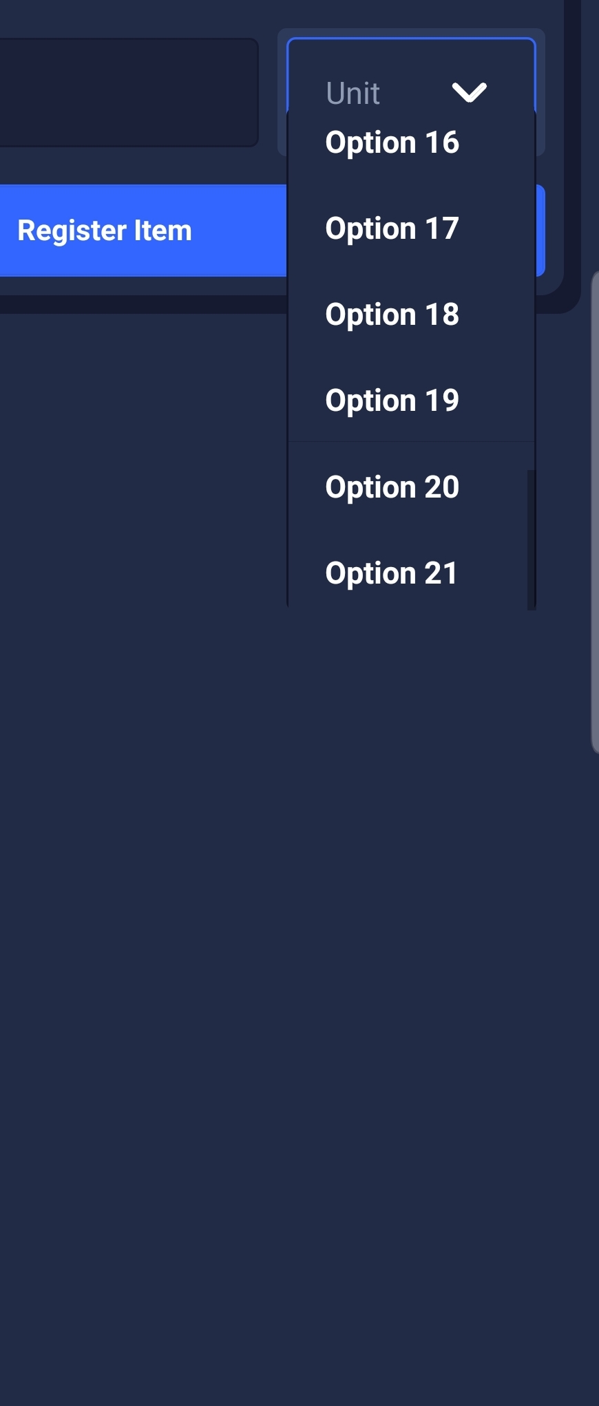
Version 4.3.2:

jobinmatt
on 3 Jan 2020
@jobinmatt thanks. I'll investigate it. I would also appreciate if you can provide your styles.inputRightColumn
artyorsh
on 3 Jan 2020
here is styles.inputRightColumn
inputRightColumn: {
    flex: 1,
    paddingTop: 21,
    paddingLeft: 8,
    paddingVertical: 4,
    minWidth: 60,
  },
I'm experiencing a similar issue. When the list of options is long, I would expect some visual indicator that this is a scroll list. If one of the items in the bottom of the list just happens to peak above the cutoff, that tells the user they can scroll. However, this does not always happen. So, a scroll bar in the list would be very helpful.
Additionally, when the last item in the list (or any one below the cutoff) is selected and then the select list displayed again, it'd be really useful for the selected item to be scrolled into view.
Here's a video showing what I'm talking about.
 calendee
on 4 Jan 2020
calendee
on 4 Jan 2020
Here are the relevant parts of my code:
  return (
    <Select
      controlStyle={style}
      data={options}
      label={label}
      name={name}
      onSelect={option => {
        setSelectedOption(option);
      }}
      placeholder={placeholder}
      selectedOption={selectedOption}
      style={styles.select}
    />
  );
const styles = StyleSheet.create({
  select: {
    width: "100%",
    marginBottom: 10,
  },
});
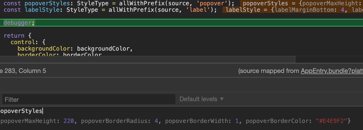
I was debugging this a bit and it seems all the popover styles are undefined in select.component.ts
 popover: {
                    maxHeight: popoverStyles.popoverMaxHeight,
                    borderRadius: popoverStyles.popoverBorderRadius,
                    borderColor: popoverStyles.popoverBorderColor,
                    borderWidth: popoverStyles.popoverBorderWidth,
                },
I am not sure what the permanent solution is, but I was able to work around it by adding this to my custom mapping:
'Select': {
      meta: {
        parameters: {
          popoverBorderColor: {
            type: 'string'
          },
          popoverBorderRadius: {
            type: 'number'
          },
          popoverBorderWidth: {
            type: 'number'
          },
          popoverMaxHeight: {
            type: 'numbe4r'
          }
        }
      },
      appearances: {
        default: {
          mapping: {
            popoverBorderColor: 'border-basic-color-3',
            popoverBorderRadius: 'border-radius',
            popoverBorderWidth: 'border-width',
            popoverMaxHeight: 150,
          }
        }
      }
    },
 jessicarobins
on 12 Jan 2020
jessicarobins
on 12 Jan 2020
@jessicarobins what ui-kitten and eva version you're running?
This is actual styles with no custom mapping
artyorsh
on 13 Jan 2020
@artyorsh I'm on ui-kitten 4.3.2 and eva 1.3.0
if it helps, my select is the accessory inside a ListItem:
const styles = StyleSheet.create({
  select: {
    minWidth: 160,
  },
});

function NotificationTimeSelect(props) {
  const data = reminderHours.map(hour => ({ text: formatReminderHour(hour), value: hour }))

  const renderAccessory = style => (
    <Select
      data={data}
      selectedOption={props.selected}
      onSelect={props.onSelect}
      style={[style, styles.select]}
    />
  );

  return (
    <ListItem
      title="Reminder Time"
      accessory={renderAccessory}
    />
  );
};
The scroll indicator is back now.
@jobinmatt @jessicarobins Tested it in beta with your config and everything looks fine. Could it be customMapping issue?
@calendee A new issue for your feature request is opened #822
artyorsh
on 14 Jan 2020
Related issues
 sarmadkung
·
3Comments
sarmadkung
·
3Comments
 shiqian123
·
3Comments
shiqian123
·
3Comments
 PORA69
·
3Comments
PORA69
·
3Comments
 iosdev-republicofapps
·
3Comments
iosdev-republicofapps
·
3Comments
 RWOverdijk
·
3Comments
RWOverdijk
·
3Comments
Most helpful comment
I'm experiencing a similar issue. When the list of options is long, I would expect some visual indicator that this is a scroll list. If one of the items in the bottom of the list just happens to peak above the cutoff, that tells the user they can scroll. However, this does not always happen. So, a scroll bar in the list would be very helpful.
Additionally, when the last item in the list (or any one below the cutoff) is selected and then the select list displayed again, it'd be really useful for the selected item to be scrolled into view.
Here's a video showing what I'm talking about.
https://www.loom.com/share/3a5d1df5f4b84b2297d27848aa52038b