React-native-paper: "What do you dislike about React Native Paper?" November 2019 Edition
We, the React Native Paper core team, would like to get a current list of all the things that people are having problems with when using React Native Paper. This is first time we are running this community feedback gathering initiative, but we are planning to do it cyclically - twice a year. We hope this will help us better understand our users and prioritize the work for the upcoming 2020 year.
Please reply with all the issues that you are having with React Native Paper. Keep your descriptions short and ideally link to other places with more context. Feel free to mention not just technical things but rather any issue that can be ascribed to the React Native Paper project.
If something has been mentioned already, please use the upvote/emoji buttons instead of repeating the same thing so that it's easier to see how many people care about each issue. Please make one comment per topic so that people can upvote just one thing at a time.
Hypothetical Example:
Some of the animations are not native
That would be really nice if js based animations (e.g. Checkbox or RadioButton) were replaced with native ones. Please consider reimplementing animations with reanimated for better performance.
Simple template with header (feel free to copy and paste)
## Header

### Content
 Trancever
All 107 comments
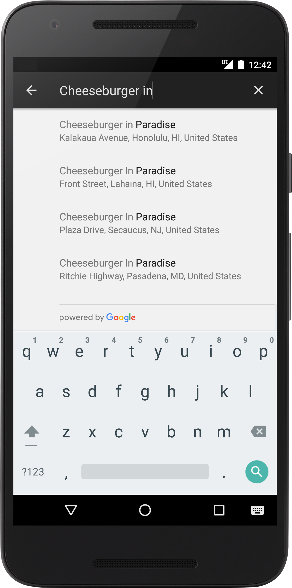
Dropdown/Select Component
Content
I'd love to see a select component from this lib.
 iamclaytonray
on 26 Nov 2019
iamclaytonray
on 26 Nov 2019
Stabilized Components
Content
I've had a rough time getting Menu components (Menu, MenuItem, etc) to properly work. I will file a bug report in the issue tracker but I've had the following happen:
- The Menu briefly appears (< 1s) and then disappears.
- The Menu doesn't seem to exist on top of UI, despite how large my
zIndexvalue is. - When it does appear, it doesn't want to play nicely in it's own space. I've had occasions where the Menu appears in a very different position on the screen. Though, I've mainly been developing with iPad so I'm not sure if that has great support yet or not. If it doesn't, supporting multiple sized devices as far as position would be very nice.
iamclaytonray
on 26 Nov 2019
Theming
Content
I'd love better theming options. For example, I'd love to do:
<Button color="primary">Primary</Button>
<Button color="secondary">Secondary</Button>
instead of:
<Button color="#000">Primary</Button>
<Button color="#fff">Secondary</Button>
Customization
Content
I'd like more customization e.g. 'View' as title
<List.Accordion
      title={titleProps => (
        <View style={{ flexDirection: "row" }}>
          <Text style={titleProps.style} numberOfLines={4}>
            Nice text
          </Text>
          <TouchableRipple>
            <Text>Edit</Text>
          </TouchableRipple>
        </View>
      )}
    />
Now I end up with forking react-native-paper to make some things possible.
https://github.com/callstack/react-native-paper/issues/993 ->
https://github.com/profects/react-native-paper/blob/a18bdcd961e0aa596ed9355cdd0726c4c43e815a/src/components/Menu/MenuItem.tsx


 RichardLindhout
on 26 Nov 2019
RichardLindhout
on 26 Nov 2019
I would love to be able to install individual components without importing the entire library.
 harrisrobin
on 26 Nov 2019
harrisrobin
on 26 Nov 2019
I would love to be able to install individual components without importing the entire library.
We have a babel plugin that removes not used components from bundle. Check this
Trancever
on 27 Nov 2019
Just like there is an error prop in TextInput button that changes the border of the TextInput to red, I would like that there be another success prop that would change the border to green or any colour that I pass. It will make it more flexible. Currently, we've found that the way to change border colour of TextInput is through the theme's color's placeholderColor property, which is very weird.
More than the success prop, we would like to control the borderColor of the TextInputs.
 BalalRaza
on 28 Nov 2019
BalalRaza
on 28 Nov 2019
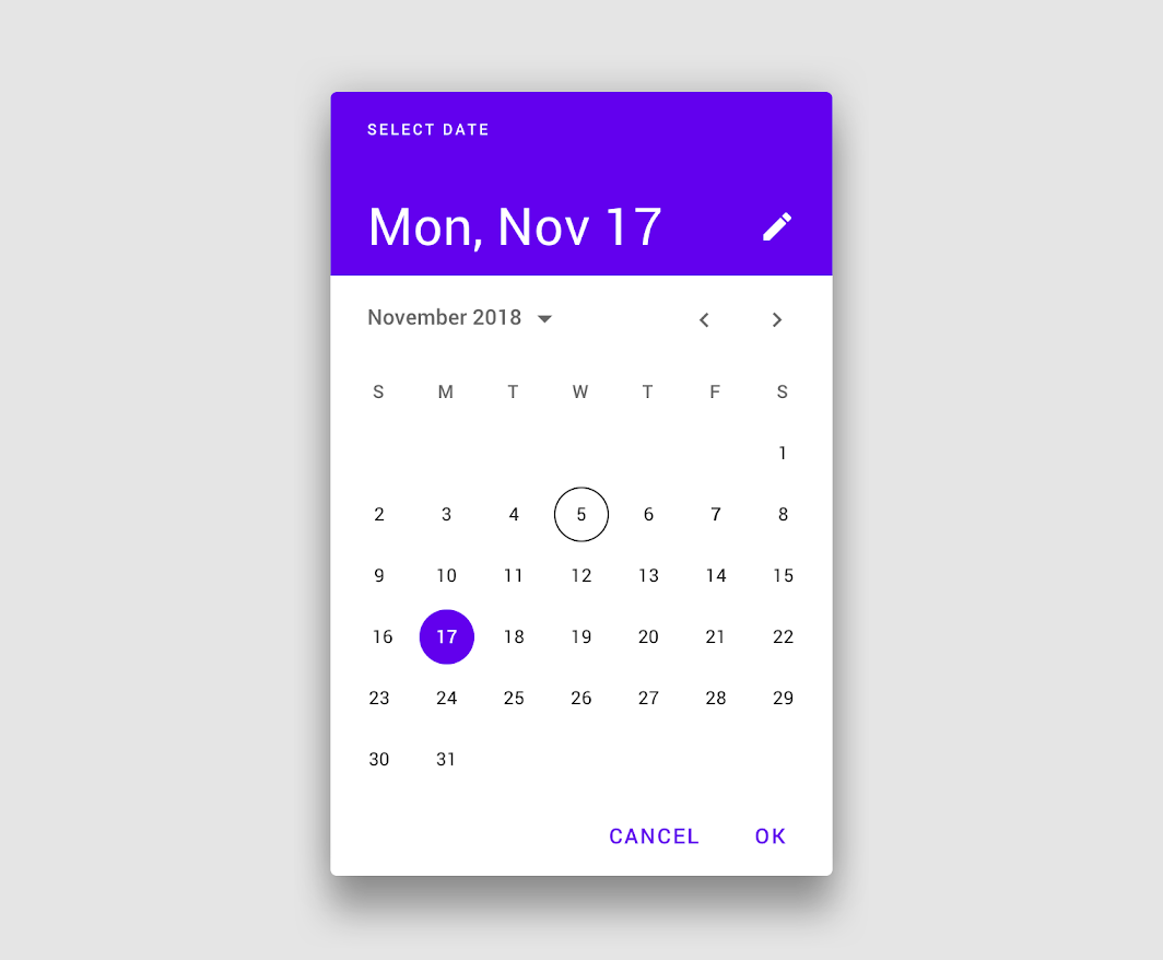
I would like to see a Date and Time Picker Component in this library, which will be compatible on both ios and android platform. It will be very helpful.
 ravics09
on 29 Nov 2019
ravics09
on 29 Nov 2019
I would like to be able to import <Icon/> from react-native-paper
Instead of
import Icon from 'react-native-vector-icons/MaterialCommunityIcons'
I could just
import { Icon } from 'react-native-paper'
 jayu
on 29 Nov 2019
jayu
on 29 Nov 2019
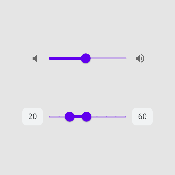
More components, a slider for example! :) Maybe a Grid?
 jonasgroendahl
on 29 Nov 2019
jonasgroendahl
on 29 Nov 2019
Typescript suggestions for icon names
If you give an icon an invalid name, you get an error telling you all of the available icon names:
<Button icon="some-inexistent-name"></Button>

// Invalid prop `name` of value `some-inexistent-name` supplied to `Icon`

It would be useful if the icon prop had Typescript suggestions with the available names.
Also, in the error message, it would be useful to add a link to a website that has the available icon names.
 nandorojo
on 29 Nov 2019
nandorojo
on 29 Nov 2019
Extra
Content
Add auxiliary components. For example, keyboard management, theme change, or self-organizing picture component depending on width or height.
<AutoSizeImage width={120} or height={120} />flexible image component or useGetImageSize(uri)- use(Keyboard,Theme,Statusbar,Dimensions,...)
- BottomSheet
- Collapse Effect
 meftunca
on 2 Dec 2019
meftunca
on 2 Dec 2019
Non-component Snackbar like react-native-snackbar
Custom Picker
 usmansbk
on 2 Dec 2019
usmansbk
on 2 Dec 2019
Non-component Snackbar like react-native-snackbar
Check the docs. We do have a Snackbar component.
Trancever
on 2 Dec 2019
@Trancever Yeah! It's awesome but sometimes I want the option of calling it like Snackbar.show(Message) instead of <Snackbar>Message</Snackbar>
usmansbk
on 2 Dec 2019
I would like to see component Theme overrides to execute in a central spot, like in @material-ui instead of having to create local versions.
 mschipperheyn
on 2 Dec 2019
mschipperheyn
on 2 Dec 2019
@usmansbk that sounds more like program flow. You could implement this using AppContent or redux.
mschipperheyn
on 2 Dec 2019
Dropdown/Select Component
Content
I'd love to see a select component from this lib.
I know a request for a drowdown component has already been posted but i wanted to expand a bit on this...
I would like to call out the dropdown/select component from the react material-ui library for guidance. This is all written in js and is still smooth! (https://material-ui.com/components/selects/)
 jstansbe
on 2 Dec 2019
jstansbe
on 2 Dec 2019
@iamclaytonray @jstansbe Could you point me to the Material Design Guidelines page that describes a select component for Android?
Trancever
on 3 Dec 2019
@Trancever I think there is no specific guideline how to make "select" component, it's more like extension of the "menu" component, which is called "Exposed dropdown menus": https://material.io/components/menus/#exposed-dropdown-menu
There are though guidelines for pickers: https://material.io/components/pickers/#mobile-pickers
Would be nice to have them here as well :)
And maybe sliders? https://material.io/components/sliders/
 zufarzhan
on 3 Dec 2019
zufarzhan
on 3 Dec 2019
@zufarzhan You should be able to implement "Exposed dropdown menu" with Menu component easily. Just use TextInput wrapped with Touchable as an anchor and add some margin/padding to the menu to move it below TextInput. We don't really want to implement all possible cases in this lib. We want to provide building blocks that users can use to build more complex UI.
Trancever
on 3 Dec 2019
@Trancever @zufarzhan I've used the menu component with the text input to create what you're describing... and it does work. But isn't this the equivalent to
Also, If it helps I can work on submitting a starting point (or work on the component throughout the conception=>release process).
jstansbe
on 3 Dec 2019
Can we limit these convos or bring them elsewhere? The RFC is going to get muddied up with convos vs clear points that the community wants. (Plus, I'm getting spammed with emails for an issue I want to subscribe to but not so much on side conversations)
iamclaytonray
on 3 Dec 2019
[Typescript] Some component prop types are not exported
I would like to extend TextInput. To do so, I need the prop type, TextInputProp. As of today, I have to import the types like this:
import { TextInputProps } from 'react-native-paper/lib/typescript/src/components/TextInput/TextInput'
This is very unsatisfying, because this path could change at any time and depends on your build logic. A tool such as api-extractor would rightfully forbid you from not exporting indirect types, as it undermines the clear identification of your library API surface and prevent users from easily extending core features.
Component props are obviously part of the API surface, and as such must be exported.
 jsamr
on 5 Dec 2019
jsamr
on 5 Dec 2019
One of the things I like about material-ui, is that the components are aggregated from sub components and these sub components are easily customizable. Since RN doesn't have the kind of style selectors available to style children '.TextInput > .MuiFormLabel-root' with all sorts of specificity possible.
It would make sense to me to expose these sub container style objects on the api so you can optionally override this. It's kind of an ugly solution though. I guess the overriding theme of my suggestions is: make it possible to easily deviate from default Material Design.
mschipperheyn
on 5 Dec 2019
Have text input adornments to represent states other than error, like success state or warning, etc. Something like this:

BalalRaza
on 6 Dec 2019
because of this https://github.com/callstack/react-native-paper/pull/1061
 x5engine
on 10 Dec 2019
x5engine
on 10 Dec 2019
To Have textinput icon buttons....like password show hide
 deep810
on 10 Dec 2019
deep810
on 10 Dec 2019
Add suffix, prefix, leading and trailing Icon to TextInput https://github.com/callstack/react-native-paper/issues/903

 firede
on 10 Dec 2019
firede
on 10 Dec 2019
@zufarzhan You should be able to implement "Exposed dropdown menu" with
Menucomponent easily. Just use TextInput wrapped with Touchable as an anchor and add some margin/padding to the menu to move it below TextInput. We don't really want to implement all possible cases in this lib. We want to provide building blocks that users can use to build more complex UI.
An example of this implementation would be very helpful. Tried wrapping TextInput with a TouchableWithoutFeedback, but the TextInput gets focused and onPress event does not fire.
 mikedizon
on 11 Dec 2019
mikedizon
on 11 Dec 2019
Add suffix, prefix, leading and trailing Icon to TextInput #903
that issue is pretty old!
mikedizon
on 11 Dec 2019
Hi, i am developing the web app using react native. I found this plugin and it is useful for me. However, my datatable title is too long so i add numberofLines want to solve the problem, it doesn't work. It still showing "..." of my long title. Hope can fix this issue. Thanks
 iamautomaton
on 11 Dec 2019
iamautomaton
on 11 Dec 2019
An example of this implementation would be very helpful. Tried wrapping
TextInputwith aTouchableWithoutFeedback, but theTextInputgets focused andonPressevent does not fire.
@mikedizon You can wrap TextInput in a View with pointerEvents set to none to prevent focus on TextInput.
Trancever
on 11 Dec 2019
An example of this implementation would be very helpful. Tried wrapping
TextInputwith aTouchableWithoutFeedback, but theTextInputgets focused andonPressevent does not fire.@mikedizon You can wrap
TextInputin aViewwithpointerEventsset tononeto prevent focus onTextInput.
Thanks! There's also a down arrow on the right side of the TextInput that indicates that the field is a dropdown. Any plans to support trailing and leading icons in TextInput?
For the sake of expedience, I'm going to see if https://github.com/n4kz/react-native-material-dropdown matches the RNP's inputs and report back. I appreciate all the work!
mikedizon
on 11 Dec 2019
Autocomplete
Content
It would be nice to have an autocomplete search component similar to this one:
 giotiskl
on 16 Dec 2019
giotiskl
on 16 Dec 2019
Autocomplete
Content
It would be nice to have an autocomplete search component similar to this one:
This could be made with the existing components if react-native-paper supported
e.g.
import Highlighter from 'react-native-highlight-words';

<ListItem title={
<Highlighter
  highlightStyle={{backgroundColor: 'yellow'}}
  searchWords={['and', 'or', 'the']}
  textToHighlight='The dog is chasing the cat. Or perhaps they're just playing?'
/>} />
An example of this implementation would be very helpful. Tried wrapping
TextInputwith aTouchableWithoutFeedback, but theTextInputgets focused andonPressevent does not fire.@mikedizon You can wrap
TextInputin aViewwithpointerEventsset tononeto prevent focus onTextInput.Thanks! There's also a down arrow on the right side of the
TextInputthat indicates that the field is a dropdown. Any plans to support trailing and leading icons inTextInput?For the sake of expedience, I'm going to see if https://github.com/n4kz/react-native-material-dropdown matches the RNP's inputs and report back. I appreciate all the work!
Just a quick follow up on this. I wound up using the react-native-material-dropdown component -- as expected, parts of the TextInput don't match the implementation from react-native-paper exactly. I'm willing to live with that for now, but it would be great if this component was available out of the box. Seems like there's enough interest in it.
mikedizon
on 18 Dec 2019
I'd like the review process to be a little faster. Sometimes it takes to long to an important fix or new feature to get merged.
 brunohkbx
on 20 Dec 2019
brunohkbx
on 20 Dec 2019
All theming should be able to be overridden.
Example.... the label of an active TextInput uses colors.primary from the active theme. When the background and primary color is white it's unreadable and there's no way to change it.
Not Editing

Editing (the label and the cursor become white and almost invisible)

I run into issues like this pretty often and end up having to use a non-paper component.
 GollyJer
on 9 Jan 2020
GollyJer
on 9 Jan 2020
An example of this implementation would be very helpful. Tried wrapping
TextInputwith aTouchableWithoutFeedback, but theTextInputgets focused andonPressevent does not fire.@mikedizon You can wrap
TextInputin aViewwithpointerEventsset tononeto prevent focus onTextInput.
This workaround causes another issue, as I want users can typing to reduce the options list, then select one they want. In this way user has to click twice in order to start typing.
 sangdth
on 11 Jan 2020
sangdth
on 11 Jan 2020
@smkhalsa comment:
while I agree that adding FastImage as a dependency and using it by default is not the right way to go, I feel the underlying issue deserves more discussion.
react-native-paper doesn't currently provide a way to override the default Image component within built-in components like Card.Cover and Avatar.Image. This is an issue for certain use cases such as offline caching. Your suggestion above of re-writing the component is not a very maintainable approach.
Any other ideas?
https://github.com/callstack/react-native-paper/pull/932#issuecomment-479946027
 espipj
on 14 Jan 2020
espipj
on 14 Jan 2020
Theme Overrides
Similar to Material UI's prop & styling overrides. We'd like to have global code like that housed in the theme file as well. I see that you mention moving away from that here but seeing if you can reconsider!
In order to promote consistency between components, and manage the user interface appearance as a whole, Material-UI provides a mechanism to apply global changes.
To use something like
const theme = createMuiTheme({
  overrides: {
    MuiButton: {
      root: {
        fontSize: '1rem',
      },
    },
  },
});
So we can still import buttons directly from the library to promote consistency
import Button from 'react-native-paper/Button' // Still use this
import CustomButtonV1 from '../components/buttonv1' // Instead of this
https://material-ui.com/customization/components/#global-theme-override
 KyruCabading
on 1 Feb 2020
KyruCabading
on 1 Feb 2020
I would really like it if there was tooltip support for Appbar.Action, IconButton and perhaps other components.
https://material.io/components/tooltips/
 LuckyLuke19
on 9 Feb 2020
LuckyLuke19
on 9 Feb 2020
Modal wrapped in SafeAreaView
I would really like it if we could disable this on demand to keep the behaviour the same as in 2.x, or at least find out why it was implemented?
 shockdesign
on 13 Feb 2020
shockdesign
on 13 Feb 2020
@sshanzel I would suggest making a separate issue for this with a reproducible example.
nandorojo
on 19 Feb 2020
Hi and thanks for the amazing job done here, I would really like if you could add the following into the core:
More
propsby default and the one I am especially thinking of istag: PropTypes.elementTypeto replace the default rendered component. This is my own preference, and really hope it will be accepted, we have used that widely in @bootstrap-styled/v4 and it gave us a lot of flexibility to reuse the styling (this is especially useful for libs of UI components like RNP)The
DataTable.Cellis truncating the text because this is the guidelines, however, a props could have been used withnumberOfLines={1}=> `numberOfLines={props.lines}. I see my self many times copying your component and proceed to the customization on my side, while this could be directly included, I have already submited a PR for this: https://github.com/callstack/react-native-paper/pull/1764Agree with https://github.com/callstack/react-native-paper/issues/1489#issuecomment-558680060 , adding more default components, such as
<Select />. I saw myself doing one, and many other will, we should group the effort. If you are interested by my Select implementation, it's just below :smiley:
Click to see the SelectField example
```jsx
/* eslint-disable */
import React, { memo, useState } from 'react';
import { StyleSheet, Text, View, Platform } from 'react-native';
import { Menu, withTheme, IconButton } from 'react-native-paper';
import { TextInput, TouchableRipple } from 'react-native-paper';

const SelectField = ({
  t,
  input: { onChange, ...input },
  meta: { data: { data }, ...meta },
  name,
  validate,
  loading,
  error,
  buttonProps,
  theme: { colors },
  label,
  loadData,
  ...rest
}) => {
  const styles = StyleSheet.create({
    container: {
      width: '100%',
      marginVertical: 12,
    },
    error: {
      fontSize: 14,
      color: colors.error,
      paddingHorizontal: 4,
      paddingTop: 4,
    },
    options: {
      width: '100%',
      paddingRight: 0,
      paddingLeft: 0,
      alignItems: 'center',
      paddingBottom: 0,
      flexDirection: 'row',
    },
    caret: {
      position: 'absolute',
      right: 0,
      alignSelf: 'center',
      paddingTop: Platform.select({
        web: 0,
        default: 7,
      }),
    },
    input: {
      width: '100%',
    },
    menu: {
      paddingTop: 60
    },
  });
  const [visible, setVisible] = useState(false);
  const list = data && data.data ? data.data : data;
  return (
    <>
      <View style={styles.container}>
        <Menu
          style={styles.menu}
          visible={visible}
          onDismiss={() => setVisible(false)}
          anchor={
            <TouchableRipple
              onPress={async () => {
                if (list?.length > 0) {
                  setVisible(true);
                } else {
                  await loadData();
                }
              }}
            >
              <View
                style={styles.options}
                pointerEvents="none"
              >
                <TextInput
                  style={styles.input}
                  icon="chevron-down"
                  mode="outlined"
                  label={label}
                  editable={false}
                  disabled={loading > 0}
                  value={data?.find((d) => d.id === input.value)?.description || ''}
                  error={meta.error && meta.touched}
                  {...buttonProps}
                />
                <IconButton
                  color={meta.error && meta.touched ? colors.error : undefined}
                  style={styles.caret}
                  icon={visible ? 'menu-up' : 'menu-down'}
                  size={24}
                />
              </View>
            </TouchableRipple>
          }
        >
          {list?.length > 0 && list.map((item) => (
            <Menu.Item
              key={item.id}
              onPress={() => {onChange(item.id); setVisible(false)}}
              title={item.description}
            />
          ))}
        </Menu>
      </View>
      <View>
        {meta.error && meta.touched && <Text style={styles.error}>{meta.error}</Text>}
      </View>
    </>
  );
};

export default memo(withTheme(SelectField));
```
 kopax
on 27 Mar 2020
kopax
on 27 Mar 2020
Possibility to edit style of components deeper
I'm currently facing the problem of :
- I have a snackbar and I change the backgroundColor depending on the context of displaying
- But I can't change the color of the text inside the Snackbar
I'd like to be able to pass a color key in the style prop of Snackbar to edit the color of the text label.
I've faced this problem only on Snackbar for now, because I use the library not for so long, but I'm pretty sure this problem happens on lots of components
Thanks in advance! :)
 benjaminaudet
on 3 Apr 2020
benjaminaudet
on 3 Apr 2020
@benjaminaudet I am pretty sure such improvement as a PR will be accepted. color is a props widely used in RNP. Will you take care of it?
kopax
on 3 Apr 2020
Modal wrapped in SafeAreaView
I would really like it if we could disable this on demand to keep the behaviour the same as in 2.x, or at least find out why it was implemented?
Hi! this PR solves it!
 ahce
on 13 Apr 2020
ahce
on 13 Apr 2020
Please remove the concept of font icons and passing icons by name in the button. A button component should have a startIcon and endIcon that can be any kind of component (but normally would be a react-native-svg icon).
mschipperheyn
on 14 Apr 2020
Minor gripe: Some components that are added by react-native-paper already exist in regular react-native, but with a different interface (e.g. Button having a title prop vs. accepting children). Would be cool if both had a more similar interface (or at least some overlap) so switching between them would be easier.
 CarpeNecopinum
on 1 May 2020
CarpeNecopinum
on 1 May 2020
Possibility to customize appbar title
I would really like to know if we could customize the title, e.g. render an icon, render colorful title, etc.
 yckbilly1929
on 2 May 2020
yckbilly1929
on 2 May 2020
I would like to easily add an icon component to a Snackbar. Turns out it's not easy, bc the children are wrapped in a Text. Snackbar should prob be optional leftComponent, optional rightComponent (action or something else), text.
mschipperheyn
on 2 May 2020
I would like to easily add an icon component to a Snackbar. Turns out it's not easy, bc the children are wrapped in a Text. Snackbar should prob be optional leftComponent, optional rightComponent (action or something else), text.
@mschipperheyn This is breaking MD Guidelines actually, and that's why it's not supported.
Trancever
on 4 May 2020
Swipeable List Actions
Content
It is a common design and material design itself recommends it. Currently workaround is to wrap List.Item in an animated view with gesture responders, it is also very complicated to style. Would really like react native paper to support this one.
 vicary
on 6 May 2020
vicary
on 6 May 2020
Swipeable List Actions
Content
It is a common design and material design itself recommends it. Currently workaround is to wrap
List.Itemin an animated view with gesture responders, it is also very complicated to style. Would really like react native paper to support this one.
We recommend using Swipeable component that is provided by react-native-gesture-handler. It is very performant and provides native feeling.
Trancever
on 6 May 2020
I can confirm the Swipeable from react-native-gesture-handler is the best available swipeable component available at the moment. We have still found that the iOS version is having some unpredictable swipe jump, it is still faster and better than https://github.com/jemise111/react-native-swipe-list-view.
kopax
on 6 May 2020
Thanks for the alternative, the native approach from react-native-gesture-handler/Swipeable is really performant. But then I, for one, would not try to mix two component packages in one project before I have deep understandings on both (which I don't).
If react native paper is not planning for a solution, it could really embed Swipeable or recommend this one in the docs.
vicary
on 8 May 2020
Remove circular dependencies
Content
Circular dependencies can cause all kind of problems and are usually a sign of sub-optimal component design. Just to disable the yellow box warning is a bad way to solve the problem. I am willing to invest time to remove those dependencies by getting #1851 approved in helping to fix the "docs problem".
 pke
on 11 Jun 2020
pke
on 11 Jun 2020
@Trancever the thing that makes it so hard to customize react-native-paper is exactly that. MD is considered a hard limitation, unlike e.g. @material-ui, which considers it a starting point. react-native-paper is good but incredibly frustrating to work with sometimes. So many things are not customizable in any way bc it's not MD. IMHO it should be possible to have a look and feel completely different from MD easily. You could say: then don't use react-native-paper. But I use a UI lib for its quality, structure, completeness, themeability and customizability. And honestly, in RN, there aren't any options that score high on all. RNP scores high on the first three, ok on themeability and poor on customizability. I hope the direction is to score high on all. That's a choice obviously but it would be good to know.
mschipperheyn
on 12 Jun 2020
@Trancever I am unable to pass in the small property when using FAB.Group. I'd like to be able to make all FABs in my stack smaller, including the first button that opens up the stack.
 mccarthydanielle
on 18 Jun 2020
mccarthydanielle
on 18 Jun 2020
Provider affects layout
Content
People usually expects Providers to be completely transparent in layouts, where all its children works as if the provider itself doesn't exist.
Given a flexbox parent, here is an example.
https://snack.expo.io/@vicary/rnpaper.provider-breaks-layouts
vicary
on 20 Jun 2020
It would be great to have tabs component in React Native Paper.
 DSgogini
on 23 Jun 2020
DSgogini
on 23 Jun 2020
When I use TextInput, and use the error boolean, It's outlines and highlights red and that's great but sometimes, the label and placeholder are overlapping and and looks bad for a UI

 SanchitB23
on 3 Jul 2020
SanchitB23
on 3 Jul 2020
When I use the portal
mccarthydanielle
on 10 Jul 2020
My primary dislike is that you don’t work any of your GitHub issues or even bother responding to most of them.
It makes the use of this actual issue to ask what we dislike rather ironic, don’t you think?
Edit: Before you downvote my comment, take a look at their issues. Before you tell me to contribute, take a look at pending PRs that have been ignored for months.
 methodbox
on 13 Jul 2020
methodbox
on 13 Jul 2020
I don't like and use it. Especially because there are no examples and no documentation for datatable. It's faster to create a table with Views.
 canercak
on 16 Jul 2020
canercak
on 16 Jul 2020
@methodbox I don't disagree with your feedback primarily but with the wording of it and especially this sentence.
It makes the use of this actual issue to ask what we dislike rather ironic, don’t you think?
I still thinks it's cool they gather feedback and even listened to some of the points made! Also bugfixes are mostly going through and some of the PR's are out of the strategy of the library (too much customization or too much props which will harm the library in the long way because there are too many options to look out for)
When you have a quality PR or bugfix they did fix it in days in my experience or my PR was not good enough or out of scope for this library.
RichardLindhout
on 16 Jul 2020
@methodbox I don't disagree with your feedback primarily but with the wording of it and especially this sentence.
It makes the use of this actual issue to ask what we dislike rather ironic, don’t you think?I still thinks it's cool they gather feedback and even listened to some of the points made! Also bugfixes are mostly going through and some of the PR's are out of the strategy of the library (too much customization or too much props which will harm the library in the long way because there are too many options to look out for)
When you have a quality PR or bugfix they did fix it in days in my experience or my PR was not good enough or out of scope for this library.
Okay, but maybe just reply and say that instead of doing nothing?
methodbox
on 17 Jul 2020
Agreed, it would be nice to give Github Issues some love.
Also, the github-actions bot is not helping about that:

 kamui545
on 22 Jul 2020
kamui545
on 22 Jul 2020
Can we have simple flexbox grid system? Like this https://github.com/GeekyAnts/react-native-easy-grid But it seems where this library is not maintaining anymore. So we would like to have it from you. Any thoughts?
 Sampath-Lokuge
on 27 Jul 2020
Sampath-Lokuge
on 27 Jul 2020
Make Web a first-class citizen
The instructions for Using on the Web are burdensome and seem risky (muck around with webpack and babel??!!). And it isn't clear to me if this could be done with an Expo project?
Suggestions:
- make configuration for web (react-native-web?) much more streamlined
- get RNP to be natively supported by Expo, specifically in the Managed Workflow scenario (it likely works today, as is, with the bare workflow
 gregfenton
on 28 Jul 2020
gregfenton
on 28 Jul 2020
Make Web a first-class citizen
The instructions for Using on the Web are burdensome and seem risky (muck around with webpack and babel??!!). And it isn't clear to me if this could be done with an Expo project?
Suggestions:
- make configuration for web (react-native-web?) much more streamlined
- get RNP to be natively supported by Expo
Not sure I agree with this being on the devs to make any different, but maybe take an entirely different approach if they really want to support web. A lot of this configuration is due in part to Webpack (it's just necessary to tell it how to use the module(s)) and part the fact that you're using a library designed to be used with React Native on the web. A different approach would change this, but this approach isn't too uncommon in the React Native lib world.
Maybe the solution would be a separate package entirely for the web. It seems it might be possible to just move the components into a web-appropriate package, or export them in a way that would allow just importing react-paper instead of react-native-paper - in other words, separate concerns.
Last, getting something "natively" supported by Expo isn't exactly an option, but really isn't necessary anymore, either. Expo went "modular" with all of their bits and pieces a while ago and it's possible to leverage Expo with non-Expo libraries. If you're referring to making it work with Expo's Managed Workflow - that's really on Expo.
methodbox
on 29 Jul 2020
I, the "user", am laying out a concern I have with RNP not treating a platform ("Web") as a first class citizen, and that as a user coming from a valid paradigm (Expo) that I am facing some challenges. How RNP decides to react - in terms of accepting the concern and if so then the engineering approach to resolving it - I leave to the RNP team/community to address. (I'll happily contribute some my time if I can be of service).
the fact that you're using a library designed to be used with React Native on the web
RNP's own website touts its use for "iOS + Andoid + Web". Additionally, it is clear that some in the RN community are actively pushing to expand RN to include Web.
Yes, I am specifically thinking about the Expo Managed Workflow - I will update my problem description accordingly. The Expo team might be the ones needed to get RNP adopted. If the RNP community is looking to expand the "market" to include Expo MW developers, then it likely would be best for the RNP community to at least bring that up with Expo, no?
gregfenton
on 29 Jul 2020
I think it's more the build tooling that is too complicated than react-native-paper. We need to have more defaults and easy tooling which I tried to create with (https://github.com/web-ridge/create-react-native-web-application)
Where we use the create-react-app on the web and some low level stuff to make react-native-web working / other modules with this config
https://github.com/web-ridge/create-react-native-web-application/blob/main/dist/template/config-overrides.js
RichardLindhout
on 29 Jul 2020
I, the "user", am laying out a concern I have with RNP not treating a platform ("Web") as a first class citizen, and that as a user coming from a valid paradigm (Expo) that I am facing some challenges. How RNP decides to react - in terms of accepting the concern and if so then the engineering approach to resolving it - I leave to the RNP team/community to address. (I'll happily contribute some my time if I can be of service).
It's not about RNP not treating Web as a first class citizen, Paper has specific components such as TouchableRipple with a completely different implementation for Web, in order for Web to have good support.
Any project you're going to use with Webpack (RNP or not) needs extra configuration. It's sad, but that's how web tooling is. There are many things RNP already does to reduce the steps, such as precompiling code so Babel won't be needed - but other libraries in the ecosystem don't do it so you need to configure Babel, it's not because of RNP. You also need to configure Webpack for your own code, all the steps you see in documentation is just normal Webpack configuration for Web projects, there aren't anything special for RNP (except Babel, which is again for third party libs, not RNP).
So how can we remove the Babel config? Convince react-native-vector-icons to precompile it's code, and any other libs that need extra Babel config. Or, don't use Webpack and use Metro for Web (which might be worse because there's no docs for that).
 satya164
on 29 Jul 2020
satya164
on 29 Jul 2020
I would like to see a Date and Time Picker Component in this library, which will be compatible on both ios and android platform. It will be very helpful.
@ravics09 I'm working on this, will probably be published as a separate package first!
RichardLindhout
on 10 Aug 2020
I would like to see a Date and Time Picker Component in this library, which will be compatible on both ios and android platform. It will be very helpful.
First version is released: https://github.com/web-ridge/react-native-paper-dates
RichardLindhout
on 19 Aug 2020
I think we can greatly improve React Native Paper on the web if we could add support for hover and focus state. I've created some issues to discuss this:
React Native Paper: https://github.com/callstack/react-native-paper/issues/2142
React Native Web: https://github.com/necolas/react-native-web/issues/1708
RichardLindhout
on 20 Aug 2020
DateTimePicker is missing from Paper. I'm currently using our
TextInputwith communityDateTimePicker. It would be nice to have a built-in control from paper!ReadOnlyfeature forTextInput. Currently, indisabledmode I can't click right/left icons hosted. It would be nice to have a 'readOnlyproperty which blocks the user from typing and allows you to clickIcons.
 karthikveeraj
on 25 Aug 2020
karthikveeraj
on 25 Aug 2020
@karthikveeraj I'm working on date and time picker, https://github.com/callstack/react-native-paper/issues/2118. My goal is to implement all specs of the material design: https://material.io/components/time-pickers#specs.
RichardLindhout
on 26 Aug 2020
Correct me if i'm wrong... but it seems like some of the proposed components fall outside the owners/contributes goals:
Trancever mentions this:
We don't really want to implement all possible cases in this lib. We want to provide building blocks that users can use to build more complex UI.
I propose the creation of a library, "react-native-paper-plus" that uses react-native-paper as "building blocks" for the creation of composite components and other key components:
- grid system (material design spacing lib from somewhere?)
- date time picker (@RichardLindhout)
- drop down select (I can use a comp I've thrown together using menu + input)
- other comps I've missed that make sense?
I'm open to start this if I can get one other person to help - with the blessing of rnp team of course!
jstansbe
on 30 Aug 2020
@jstansbe Nice idea. That's somewhat similar to @material-ui/lab, only this will never goes into the core.
But -plus always rings paid plans in my head. If this is meant to be a community effort, I suggest naming it -userland, -community, or at least -components to stay neutral.
vicary
on 31 Aug 2020
TL;DR: Excellent library, could benefit from additional component compilation examples.
I would strongly second the suggestion by @jstansbe as well, although I also see a potential problem with -plus (👍 for -community). One thing I have noticed in this library is that there are a lot of issues where a component is requested but then closed because an alternative exists or a theoretical compilation of existing components is given, etc.
To be clear, I have nothing against this, but an "example components" library to show how these building blocks can be compiled together would be excellent. I know I have been frustrated on occasion because an issue was closed without an example being given, other than a vague reference to existing components. For someone not overly familiar with the library, it may be quite challenging to guess at the necessary combinations to create what they may think is a basic component. Again, I do not think creating every combination in the core library is feasible or even necessarily beneficial, but see this as a potential opening for a community initiative to provide examples, etc.
P.S. IMO a picker (select) component is an integral part of any UI library, and would advocate for its addition here _or_ a promoted alternative (similar to the date picker recommendation).
P.P.S. @jstansbe would you be able to provide a snippet example showing your component from menu + input?
 kendallroth
on 2 Sep 2020
kendallroth
on 2 Sep 2020
I think the Popover, Select, Menu component should be better implemented in the core library.
For the date-pickers I rather keep them in my own organisation for now since I can get some followers / marketing for my company and faster development and less rules.
RichardLindhout
on 2 Sep 2020
One extra point what I dislike about React Native Paper are the extreme strong rules for the format of the git commits (husky) which got in me trouble when I did want to contribute a little while back.
RichardLindhout
on 2 Sep 2020
It would be amazing to have props hint in WebStorm.
I don't know why intellisense is not working for React Native Paper, but sure it would be a big thing for us, developers using WebStorm, so we don't need to go to the docs each time we forget a prop name/options.
If someone can point my to the right direction, I could try to implement/fix it myself.
 jvidalv
on 6 Sep 2020
jvidalv
on 6 Sep 2020
Custom Icons
I'm currently trying to use @iconscout/react-native-unicons by passing a custom Unicon component to settings on an icon key as outlined in the docs. It'd be great if I could remove react-native-vector-icons from my project after migrating completely to unicons. Every time my pods are updated, I have to go into xcode and remove the duplicated font families that it adds to the project.
 joeyfigaro
on 8 Sep 2020
joeyfigaro
on 8 Sep 2020
https://callstack.github.io/react-native-paper/checkbox-ios.html
The unchecked checkbox is really confusing on iOS.
Having no border on the checkbox make it very difficult to see.
See #https://github.com/lesspass/lesspass/issues/553 for an example
edit: A workaround is to use the Android version of the checkbox something like: <Checkbox.Android />
 guillaumevincent
on 9 Sep 2020
guillaumevincent
on 9 Sep 2020
Being able to use modifiers in Theme.
<View flex padding-page>
        <Text heading marginB-s4>My Screen</Text>
They seem to make styles more reusable.
Long story: I started with native-base in my game halfchess (probably because they were available as default in a boilerplate I was using). I really liked their modifier approach in themes also (though its not without issues/pains, esp in case of nested components). However now I want to launch halfchess on fb messenger (instant games). Using modifiers is better for my usecase, because I will be more easily able to maintain my application across web and native.
But I think it offers one more big advantage, the views don't get too tightly coupled with the UI library. No harm in having that flexibility as an end user.
In short, theming support with modifier is the second thing I am looking at (the first being build stability and no weird cross-platform issues).
 flipflopapp
on 11 Sep 2020
flipflopapp
on 11 Sep 2020
Being able to use modifiers in Theme.
I do agree on this one, it would be nice to have something like that to stay consistent when templating.
I quite like the approach of https://magnus-ui.com/
kamui545
on 11 Sep 2020
Easier installation of example app
Content
For greater adoption of React Native Paper I think the Example React Native Paper app needs to be easier to install and run. It's too hard for beginners.
In my experience the snack example linked to from the documentation is often broken, as it is now.
Also there is no standard Expo published app online (this is a different concept to a Snack.) So I created one here for myself:
https://expo.io/@louiechristie/react-native-paper-example
To create the React Native Paper example Expo app locally you need to run an unusual yarn bootstrap command that is in the /example/ subdirectory README.md documentation (but not the root README.md) and is easily missed.
The code is hard to follow and learn from (to do with dependencies) because it is doing something a bit _too clever_ with metro.config.js for beginners to understand. It would be easier if it was in a stand alone repo (or yarn workspace mono repo perhaps?)
It would be great if a Snack, and, Expo published app, were created automatically with each release - by adding this to the continuous integration pipeline.
I myself @louiechristie might be willing to collaborate on this, and on improving the React Native Paper developer experience for beginners.
 louiechristie
on 15 Sep 2020
louiechristie
on 15 Sep 2020
I agree with all of your points would be even nicer if we could have the app in the Play and App store with something like Fastlane! (like Flutter Gallery has)
The code is hard to follow and learn from (to do with dependencies) because it is doing something a bit _too clever_ with metro.config.js for beginners to understand. It would be easier if it was in a stand alone repo (or yarn workspace mono repo perhaps?)
This is needed for developers as we can edit library code and see changes immediately, but perhaps beginners don't even look at the metro.config file? It would be nice if we could have some alternative which was both easy for developers as for users who copy the example directory but I don't think it's possible yet.
RichardLindhout
on 15 Sep 2020
Still no standard bottom sheet component https://material.io/components/sheets-bottom#standard-bottom-sheet
 LRNZ09
on 28 Oct 2020
LRNZ09
on 28 Oct 2020
It would be great if we can pass separate theme for a individual screen..something like
withTheme(Screen, customScreenTheme)
And all the child components used in this component use the provided theme instead of the global one
 ravi-poonia
on 2 Nov 2020
ravi-poonia
on 2 Nov 2020
React Native Paper Dates 0.2.1 is here!
- Time Picker is available :heart_eyes:
- Dark mode added :blush:

RichardLindhout
on 11 Nov 2020
I agree with all of your points would be even nicer if we could have the [Example] app in the Play and App store with something like Fastlane! (like Flutter Gallery has)
@RichardLindhout I agree! Also it would be nice if there was a web build online generated by the CI like this one I made https://keen-haibt-fc92ef.netlify.app/ but with user friendly urls for the different pages.
louiechristie
on 30 Nov 2020

1254
 Angelk90
on 8 Dec 2020
Angelk90
on 8 Dec 2020
Make it possible to change fontSize
Add fontSize to theme object
This enables me to define the fontSize used through all components. Varying font sizes is an issue when using custom fonts. E.g. Google Inter is a bit bigger than Google Roboto. The difference is subtle but annoying, e.g. the Title in List.Item is too big. By changing the fontStyle property I can compensate without wrapping React Native Paper in my own component with style overrides.
 ibovegar
on 16 Dec 2020
ibovegar
on 16 Dec 2020
I noticed something that bothers me on my last PR I opened.
There is no way for me to see what is failing on CircleCI without giving them access to all my repos + organisations (they require me to login to see the details, very sad).
Is there any plan about switching to Github Actions or anything else?
Click to see screenshot

kamui545
on 16 Dec 2020
1971 typescript issue still persist
 proteche
on 21 Dec 2020
proteche
on 21 Dec 2020
Native animations for TextInput
Current implementation for TextInput involves a hack that disables useNativeDriver on iOS
 gabrielmoncea
on 22 Jan 2021
gabrielmoncea
on 22 Jan 2021
It would be amazing to have props hint in WebStorm.
I don't know why intellisense is not working for React Native Paper, but sure it would be a big thing for us, developers using WebStorm, so we don't need to go to the docs each time we forget a prop name/options.
If someone can point my to the right direction, I could try to implement/fix it myself.
I have resolved the issue by adding typescript package
yarn add -D typescript @types/jest @types/react @types/react-native @types/react-test-renderer
& set it up according to https://reactnative.dev/docs/typescript
Now it shows intellisense in Jetbrains Idea & Webstorm
 Awais6
on 26 Jan 2021
Awais6
on 26 Jan 2021
Right now, there is no way to customise or remove the arrow icon on the right. I really like this package but I had to switch only because I couldn't customise the right icon on the

 ghulamhaider1
on 9 Feb 2021
ghulamhaider1
on 9 Feb 2021
There's no Drawer container in React native paper. It depends upon react-navigation for the container. https://github.com/callstack/react-native-paper/issues/2009#issuecomment-648911904 states the same problem but the issue was marked as slate. I mean drawers can do much more than just navigating around.
 aggarwaldev
on 28 Feb 2021
aggarwaldev
on 28 Feb 2021
Feature Requests
Tabs or Segment Components, load HUD component. I think if they powered by Paper, it's a nice thing!
 likeSo
on 9 Mar 2021
likeSo
on 9 Mar 2021
More Material Components
Backdrop
A backdrop appears behind all other surfaces in an app, displaying contextual and actionable content.

Date pickers
Date pickers let users select a date, or a range of dates.
Navigation rail
Navigation rails provide ergonomic movement between primary destinations in apps.
Sliders
Sliders allow users to make selections from a range of values.
Time pickers
Time pickers help users select and set a specific time.
Tooltips
Tooltips display informative text when users hover over, focus on, or tap an element.

 nurmohammed840
on 25 Mar 2021
nurmohammed840
on 25 Mar 2021
Related issues
 tonyxiao
·
3Comments
tonyxiao
·
3Comments
 zachariahtimothy
·
3Comments
zachariahtimothy
·
3Comments
 sritharanpalani
·
4Comments
sritharanpalani
·
4Comments
 ButuzGOL
·
3Comments
ButuzGOL
·
3Comments
 yaronlevi
·
3Comments
yaronlevi
·
3Comments
Most helpful comment
Dropdown/Select Component
Content
I'd love to see a select component from this lib.