React-native-paper: Feature Request: Text field drop down menu
 matotim
All 11 comments
It's being implemented in #485
 cltsang
on 12 Feb 2019
cltsang
on 12 Feb 2019
I really appreciate the work on the menu component but I don't think it quite yet delivers as a drop down menu. As of right now (on iOS anyway), the menu covers the anchor, which isn't terrible but doesn't resemble the drop down in the MD link above.
MD dropdown

Closest I can get to reproducing it using outlined TextInput as anchor (inside view with pointerEvents="none"), List.Icon absolutely positioned on top
Closed
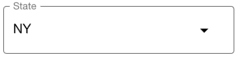
Open (menu covers anchor)

Also, the maxWidth for menu item is a const set to 280, so if anchor item width is anything above 280, it isn't uniform to the anchor width and is positioned in the top left corner of the anchor.

Apologies if I'm missing anything that solves all these issues
 connercms
on 10 Apr 2019
connercms
on 10 Apr 2019
@connercms can you share the details of how you achieved that look? i'm also looking into a decent implementation of the dropdown for the outlined design. Can't seem to find a decent one yet. Kinda destroys the whole look and feel of the app if i use anything else.
 kashifdg
on 23 May 2019
kashifdg
on 23 May 2019
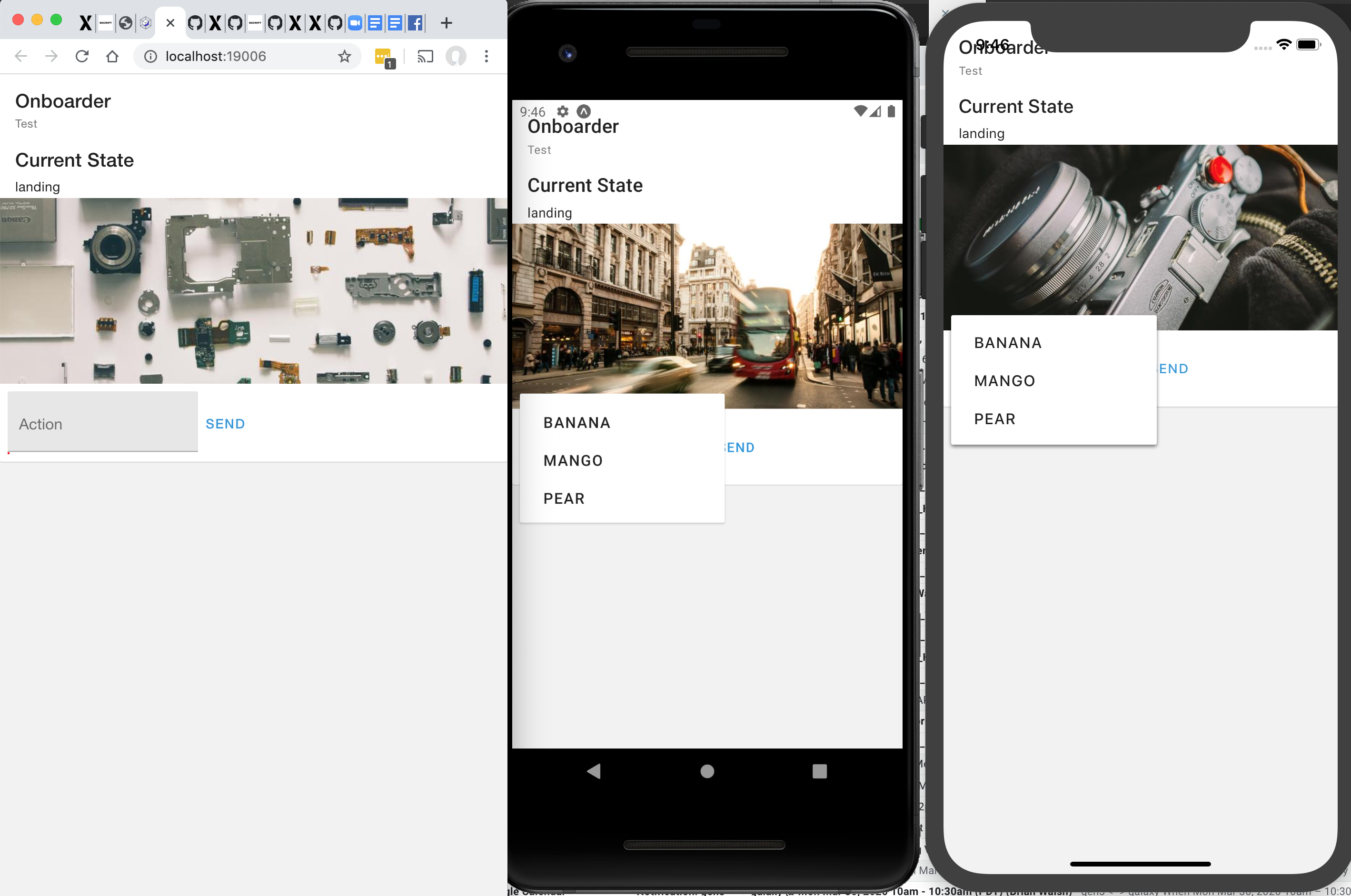
@kashifdg Here is the code I used to get that look. If anyone uses it I would recommend looking over it first as I just threw it together in an attempt to get a similarly styled dropdown working. Hope this at least gets you started.
import React, { Component } from "react";
import { FlatList, TouchableOpacity, View } from "react-native";
import { Divider, List, Menu, TextInput, Text } from "react-native-paper";
import Option from "./Option";

export default class Select extends Component {
  static defaultProps = {
    data: [],

    disabled: false,

    valueExtractor: ({ value } = {}, index) => value,
    labelExtractor: ({ label } = {}, index) => label
  };

  state = {
    error: "",
    itemHeight: 54,
    open: false,
    selected: -1,
    value: this.props.value,
    width: 350
  };

  componentWillReceiveProps({ value }) {
    if (value !== this.props.value) {
      this.setState({ value });
    }
  }

  onPress = () => {
    let selected = this.selectedIndex();

    this.setState({ open: true, selected });
  };

  onClose = () => {
    this.setState({ open: false });
  };

  selectedIndex = () => {
    let { value } = this.state;
    let { data, valueExtractor } = this.props;

    return data.findIndex(
      (item, index) => null != item && value === valueExtractor(item, index)
    );
  };

  onSelect = index => {
    let { data, valueExtractor, onChangeText } = this.props;

    let value = valueExtractor(data[index], index);

    if (typeof onChangeText === "function") {
      onChangeText(value, index, data);
    }

    setTimeout(this.onClose, 250);
  };

  selectedItem = () => {
    let { data } = this.props;

    return data[this.selectedIndex()];
  };

  keyExtractor = (item, index) => {
    let { valueExtractor } = this.props;

    return `${index}-${valueExtractor(item, index)}`;
  };

  renderBase = props => {
    let { value } = this.state;
    let { data, error, labelExtractor, placeholder } = this.props;

    let index = this.selectedIndex();
    let title;

    if (~index) {
      title = labelExtractor(data[index], index);
    }

    if (null == title) {
      title = value;
    }

    title = null == title || "string" === typeof title ? title : String(title);

    return (
      <TextInput
        pointerEvents="none"
        error={error}
        mode="outlined"
        label={placeholder}
        style={{marginVertical: 8}}
        onChangeText={undefined}
        editable={false}
        value={title}
      />
    );
  };

  renderItem = ({ item, index }) => {
    let { selected } = this.state;
    let { valueExtractor, labelExtractor } = this.props;

    let value = valueExtractor(item);
    let label = labelExtractor(item);

    let title = null == label ? value : label;

    return (
      <Option
        width={this.state.width}
        index={index}
        selected={selected === index}
        {...item}
        title={title}
        onPress={this.onSelect}
      />
    );
  };

  render() {
    const { disabled, style } = this.props;
    return (
      <Menu
        visible={this.state.open}
        onDismiss={this.onClose}
        anchor={
          <TouchableOpacity
            onLayout={({
              nativeEvent: {
                layout: { x, y, width, height }
              }
            }) => this.setState({ width })}
            style={[style && style]}
            onPress={!disabled ? this.onPress : null}
          >
            <View pointerEvents="none">{this.renderBase()}</View>
            <List.Icon
              icon={"arrow-drop-down"}
              style={{ position: "absolute", right: 0, bottom: 0, margin: 16 }}
            />
          </TouchableOpacity>
        }
      >
        <FlatList
          style={{ maxHeight: 300 }}
          ItemSeparatorComponent={() => <Divider style={{ marginLeft: 16 }} />}
          data={this.props.data}
          renderItem={this.renderItem}
          keyExtractor={this.keyExtractor}
        />
      </Menu>
    );
  }
}

class Option extends Component {
  onPress = () => {
    const { index, onPress } = this.props;

    if (typeof onPress === "function") {
      onPress(index);
    }
  };

  render() {
    const { selected, title } = this.props;
    return (
      <TouchableOpacity
        style={{
          backgroundColor: selected ? "lightgray" : "white",
          padding: 16,
          width: this.props.width
        }}
        onPress={this.onPress}
      >
        <Text style={{ fontSize: 17}}>{title}</Text>
      </TouchableOpacity>
    );
  }
}
@connercms Thanks mate. Will try it out
kashifdg
on 29 May 2019
Hello 👋, this issue has been open for more than 2 months with no activity on it. If the issue is still present in the latest version, please leave a comment within 7 days to keep it open, otherwise it will be closed automatically. If you found a solution on workaround for the issue, please comment here for others to find. If this issue is critical for you, please consider sending a pull request to fix the issue.
![github-actions[bot] picture](https://avatars.githubusercontent.com/in/15368?v=4&s=40) github-actions[bot]
on 11 Feb 2020
github-actions[bot]
on 11 Feb 2020
Is this being worked on? Would agree with a component matching the MD Guide as very usable feature.
https://material-components.github.io/material-components-web-catalog/#/component/select
 puchesjr
on 12 Feb 2020
puchesjr
on 12 Feb 2020
😂
 mikedizon
on 20 Feb 2020
mikedizon
on 20 Feb 2020
https://github.com/mikedizon/react-native-material-dropdown
Forked react-native-material-dropdown to use react-native-paper’s TextInput component.
mikedizon
on 20 Feb 2020
https://github.com/mikedizon/react-native-material-dropdown
Forked react-native-material-dropdown to use react-native-paper’s TextInput component.
@mikedizon Thank you. Works well in android emulator, but doesn't work on expo's "run on web"?
 bwalsh
on 6 Apr 2020
bwalsh
on 6 Apr 2020
This works fairly well on Web
 dihan
on 16 Oct 2020
dihan
on 16 Oct 2020
Related issues
 cassioseffrin
·
3Comments
cassioseffrin
·
3Comments
 zxccvvv
·
4Comments
zxccvvv
·
4Comments
 tonyxiao
·
3Comments
tonyxiao
·
3Comments
 ButuzGOL
·
4Comments
ButuzGOL
·
4Comments
 scottybo
·
3Comments
scottybo
·
3Comments
Most helpful comment
@kashifdg Here is the code I used to get that look. If anyone uses it I would recommend looking over it first as I just threw it together in an attempt to get a similarly styled dropdown working. Hope this at least gets you started.