React-native-navigation: SideMenu styling issue on IOS with react-native-navigation[V2]
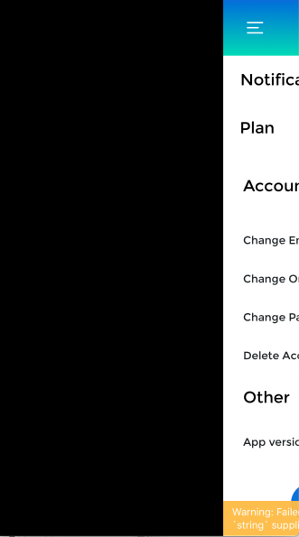
IOS side menu styling issue, its working fine on android but its not behave good in IOS ,Please help me asap
"react-native": "0.57.3",
"react-native-navigation": "^2.1.3",


Navigation.js
Navigation.setRoot({
root: {
sideMenu: {
left: {
component: {
id: "sideDrawer",
name: "SideMenu"
}
},
center: {
stack: {
options: {},
children: [{
component: {
name:"NewCard",
options: {
topBar: {
hideOnScroll: true,
title: {
text: "Homescreen",
color: "white"
},
leftButtons: [
{
id: "buttonOne",
icon: require("../assets/img/menu.png")
}
],
background: {
color: "#05B8CC"
},
drawBehind: false,
visible: true,
animate: true
},
}
}
}]
}
}
}
}
});
Environment
"react-native": "0.57.3",
"react-native-navigation": "^2.1.3",
All 18 comments
What's the problem? @rishabhSmartdata
Problem is like @ItsNoHax that i want sideMenu like android in ios, In ios the sidebar hide under the component(its not drawer like android, its slide the menu component) , I attached the images of both so please reviewed it then you got my point.I given the width for sidebar but it's also not working in ios.
Thanks
It is the shadows on the right, very annoying problem. We have hacked the native code to get rid of it, but it isn't working with the latest upgrade of react-native-navigation yesterday.
Is it possible to disable the shadow on the right of the iOS component?
It is the shadows on the right, very annoying problem. We have hacked the native code to get rid of it, but it isn't working with the latest upgrade of react-native-navigation yesterday.
Is it possible to disable the shadow on the right of the iOS component?
same +1 ,Can you solve it?

When i am giving the custom width to side menu then sideMenu screen is going to black
It is the shadows on the right, very annoying problem. We have hacked the native code to get rid of it, but it isn't working with the latest upgrade of react-native-navigation yesterday.
Is it possible to disable the shadow on the right of the iOS component?same +1 ,Can you solve it?
Yes, with an updated hack on native code.
It's unbelievable to see people constantly brought it up and getting ignored.
When i am giving the custom width to side menu then sideMenu screen is going to black
@rishabhSmartdata Have you find any solution ? I am using the same React Native Navigation v2 in my application.
@uday007 I was removed the custom width for the iphone device , I was handling this issue to increased the width of sidebar component and remove the width properties from navigation.js.
@uday007 I was removed the custom width for the iphone device , I was handling this issue to increased the width of sidebar component and remove the width properties from navigation.js.
Thanks for the reply. Can you demonstrate it with code snippet ??
Yeah sure @uday007 ,
here i was removed the width for iphone only left for Ipad
export const goHome = () =>{
Navigation.setRoot({
root: {
sideMenu: {
left: {
visible:true,
component: {
id: "sideDrawer",
name: "SideMenu",
      },
    },
    center: {
      stack: {
        id:'CENTER_STACK',
        children: [{
          component: {
            name:"NewCard",
          },

        }]
      },

    },
    options: Platform.isPad? {
      sideMenu: {
        left: {
          width: 500,
        },
      }
    }:{}


  }
}
});
}
and i am defining the sidebar component width like
width: Platform.OS == 'ios'? width0.65:width0.75,
Yeah sure @uday007 ,
here i was removed the width for iphone only left for Ipad
export const goHome = () =>{Navigation.setRoot({
root: {
sideMenu: {
left: {
visible:true,
component: {
id: "sideDrawer",
name: "SideMenu",}, }, center: { stack: { id:'CENTER_STACK', children: [{ component: { name:"NewCard", }, }] }, }, options: Platform.isPad? { sideMenu: { left: { width: 500, }, } }:{} } } });}
and i am defining the sidebar component width like
width: Platform.OS == 'ios'? width_0.65:width_0.75,
Thanks, I will try this in my project
Yeah sure @uday007 ,
here i was removed the width for iphone only left for Ipad
export const goHome = () =>{Navigation.setRoot({
root: {
sideMenu: {
left: {
visible:true,
component: {
id: "sideDrawer",
name: "SideMenu",}, }, center: { stack: { id:'CENTER_STACK', children: [{ component: { name:"NewCard", }, }] }, }, options: Platform.isPad? { sideMenu: { left: { width: 500, }, } }:{} } } });}
and i am defining the sidebar component width like
width: Platform.OS == 'ios'? width_0.65:width_0.75,
Hi @rishabhSmartdata ,
I have tried your code. But that is not work for my iPhone application. As custom width comes with black screen issue and custom width for side menu component need different width according to various device.
_getSideMenuWidth = () => {
if (Platform.OS === 'ios') {
if (Dimensions.get('window').height == 568) { // iPhone SE
return Dimensions.get("window").width * 0.90
} else if (Dimensions.get('window').height == 667) { // iPhone 6, iPhone 7, iPhone 8
return Dimensions.get("window").width * 0.75
} else if (Dimensions.get('window').height == 736) { // iPhone 6+, iPhone 7+, iPhone 8+
return Dimensions.get("window").width * 0.70
} else if (Dimensions.get('window').height == 812) { // iPhone Xs, iPhone X
return Dimensions.get("window").width * 0.75
} else if (Dimensions.get('window').height == 896) { // iPhone Xʀ, iPhone Xs Max
return Dimensions.get("window").width * 0.70
} else {
return Dimensions.get("window").width
}
} else {
return Dimensions.get("window").width
}
};
This issue has been automatically marked as stale because it has not had recent activity. It will be closed if no further activity occurs.
If you believe the issue is still relevant, please test on the latest Detox and report back. Thank you for your contributions.
The issue has been closed for inactivity.
still not fixed
this is still an issue
I have this issue as well if i set the width
Still not fixed .Any updates?
Most helpful comment
Problem is like @ItsNoHax that i want sideMenu like android in ios, In ios the sidebar hide under the component(its not drawer like android, its slide the menu component) , I attached the images of both so please reviewed it then you got my point.I given the width for sidebar but it's also not working in ios.
Thanks