React-dates: Accessibility: aria-label doesn't seem configurable
Hi there. Is there any way configure the aria-label of the input element? At the moment it is set to aria-label="Select date". For screen readers this overrides the label associated with the input via the "for" attribute. It would be good if the aria-label was optional and the text configurable.
 dan-mu
All 5 comments
Hi @dan-mu, that particular value is controller by the placeholder props. Specifically, it's startDatePlaceholderText/endDatePlaceholderText for the DRP and just placeholder for the SDP. You can set it to whatever you like, including probably undefined which would remove the tag.
Most other text you can change by overriding the values in the phrases prop. Something like:
import { DateRangePickerPhrases } from 'react-dates/lib/defaultPhrases';
...
const customPhrases = {
  ...DateRangePickerPhrases,
  calendarLabel: 'custom calendar label text',
};
return (
  <DateRangePicker
    phrases={customPhrases}
    ...
  />
);
 majapw
on 19 Mar 2018
majapw
on 19 Mar 2018
Thanks majapw.
Does the placeholder text displayed have to be the same as the aria-label? It would be great if they could be individually set. E.g. Set the placeholder text displayed in the field to be "Select date" and the aria-label to be something else or blank. The purpose of aria-label is to make the screenreader read out extra guidance for those with visual impairments. This simple feature would vastly improve the accessibility of the tool.
Cheers,
Dan
dan-mu
on 21 Mar 2018
@dan-mu that's the purpose of the placeholder too; it actually shouldn't be "select date" - that's something that should go in a label - it should be example input, and the identical input is what should be read out to VO users as well.
 ljharb
on 22 Mar 2018
ljharb
on 22 Mar 2018
What is the status of this issue? I agree with @dan-mu, the placeholder shouldn't be the aria-label, and it should be possible to set them separately. The actual label is not read anymore by the screen reader and it just reads the description in my case: (MM-DD-YYYY). Which is not descriptive.
According to https://www.w3.org/TR/wai-aria/#aria-labelledby
If the label text is visible on screen, authors SHOULD use aria-labelledby and SHOULD NOT use aria-label.
 inginging
on 4 Mar 2019
inginging
on 4 Mar 2019
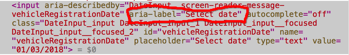
I'm also running into problems with the SingleDatePicker because of this issue. The ariaLabel prop that is provided doesn't seem to be respected. The placeholder text always takes precedent and the text you pass to ariaLabel always seems to be ignored.
https://github.com/airbnb/react-dates/blob/master/src/components/DateInput.jsx#L223
 emilyuhde
on 3 Feb 2020
emilyuhde
on 3 Feb 2020
Related issues
 krissalvador27
·
3Comments
krissalvador27
·
3Comments
 jpollard-cs
·
3Comments
jpollard-cs
·
3Comments
 AsasinCree
·
3Comments
AsasinCree
·
3Comments
 HartiganHM
·
3Comments
HartiganHM
·
3Comments
 yokomizor
·
3Comments
yokomizor
·
3Comments
Most helpful comment
Thanks majapw.
Does the placeholder text displayed have to be the same as the aria-label? It would be great if they could be individually set. E.g. Set the placeholder text displayed in the field to be "Select date" and the aria-label to be something else or blank. The purpose of aria-label is to make the screenreader read out extra guidance for those with visual impairments. This simple feature would vastly improve the accessibility of the tool.
Cheers,
Dan