React-dates: Select multiple dates, but not range.
Hi, is this calendar has option to select multiple dates, but not in range, but with click on each 1 ?
 ghost
ghost
All 14 comments
Nope. That is not currently supported by either of our primary APIs. You could use the DayPicker component with your own inputs, rules, etc., to accomplish this, but there's no out of the box solution in this library for that particular use-case.
 majapw
on 17 Nov 2016
majapw
on 17 Nov 2016
I achieved something reasonably acceptable the following way:
- Don't close calendar on date select
- Add the selected date to an array of selected dates
- Display them as a list of tag outside the component. (This is optional, but I needed it because I also have a time along the date).
- Display them as highlighted in the calendar
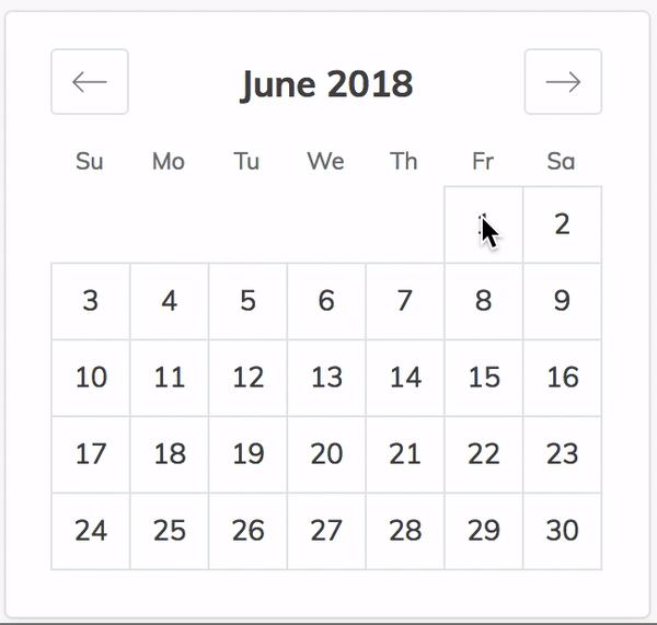
Here's how it looks:

And here's the code:
handleDateChange = date => {
const isPresent = this.state.dates.find(d => date.isSame(d))
this.setState({
dates: this.state.dates
.filter(d => isPresent ? !date.isSame(d) : true)
.concat(isPresent ? [] : [date])
.sort((d1, d2) => d1.isBefore(d2) ? -1 : 1))
})
})
removeDate = date => {
this.setState({dates: this.state.dates.filter(d => !date.isSame(d))})
}
// ...
<ul className='tags'>
{this.state.dates.map(d => (
<span key={d} className='tag is-primary is-medium'>
{d.format('DD/MM/YYYY HH:mm')}
<button className="delete is-small" onClick={e => this.removeDate(d)}></button>
</span>
))}
</ul>
<SingleDatePicker
onDateChange={this.handleDateChange}
focused={this.state.calendarFocused}
onFocusChange={e => this.setState({calendarFocused: !this.state.calendarFocused})}
keepOpenOnDateSelect={true} // highly important
isDayHighlighted={d1 => this.state.dates.some(d2 => d1.isSame(d2, 'day'))}
/>
 augnustin
on 25 May 2018
augnustin
on 25 May 2018
Just in case anyone pops by here (like I did. Thanks @augnustin for the inspiration).
I think I found a good solution. It turns out that each of the days in the code have "modifiers" and that "selected" is the one that gives the "selected" styling. So I present to you the following!
import React from 'react'
import PropTypes from 'prop-types'
import { DayPickerSingleDateController, CalendarDay } from 'react-dates'

export class MultiDatePicker extends React.Component {
  static defaultProps = {
    dates: []
  }

  constructor (props) {
    this.state = {
      dates: props.dates
    }

    this.handleChange = this.handleChange.bind(this)
  }

  handleChange (date) {
    const { dates } = this.state

    const newDates = dates.includes(date) ? dates.filter(d => !date.isSame(d)) : [...dates, d]

    this.setState({ dates: newDates })
    this.props.onChange && this.props.onChange(newDates.toJS())
  }

  render () {
    return (
      <DayPickerSingleDateController
        numberOfMonths={1}
        onDateChange={this.handleChange}
        renderCalendarDay={props => {
          const { day, modifiers } = props

          if (this.state.dates.includes(day)) {
            modifiers && modifiers.add('selected')
          }
          else {
            modifiers && modifiers.delete('selected')
          }

          return (
            <CalendarDay { ...props } modifiers={modifiers} />
          )
        }} />
    )
  }
}

export default MultiDatePicker
With pic:

 Nitemaeric
on 27 May 2018
Nitemaeric
on 27 May 2018
@augnustin How did you add the textfield on the dialog?
 jkanyua
on 5 Jun 2018
jkanyua
on 5 Jun 2018
@andela-jkanyua using the renderCalendarInfo prop:
          renderCalendarInfo={() => (
            <div className='box content'>
              <input onChange={e => setState({time: e.target.value})} />
            </div>
          )}
@augnustin thanks for your solution, I found small problem with your code, after selecting few dates (eg 15 june and 16 june), and move the month to august, the selected modifiers will be gone. How to keep the modifiers intact? thanks
 archansel
on 28 Jun 2018
archansel
on 28 Jun 2018
@archansel What do you call modifiers ?
augnustin
on 28 Jun 2018
This is what I mean, the selected dates styling gone after changing 2 months ahead
archansel
on 28 Jun 2018
Wow, that's weird.
I guess, you should debug by inspecting deeper what happens in isDayHighlighted={d1 => this.state.dates.some(d2 => d1.isSame(d2, 'day'))} : maybe this.state.dates is reset, maybe the comparison goes wrong etc.
augnustin
on 28 Jun 2018
The selection doesn't show on mobile until after you go to the next month and come back
 PerlBug
on 7 Dec 2018
PerlBug
on 7 Dec 2018
@Nitemaeric Thanks for sharing this approach ! I had to change a couple things, otherwise it wont work.
1 - Typo : d is undefined => must append date instead
const newDates = dates.includes(date) ? dates.filter(d => !date.isSame(d)) : [...dates, date]
2 - For modifiers must create a new Set so the object gets a new reference and react knows it must update the component. If not, the clicked dates wont get highlighted unless you change month or reload the entire component :
<CalendarDay { ...props } modifiers={new Set(modifiers)} />
Cheers !
 gloaec
on 9 May 2019
gloaec
on 9 May 2019
renderCalendarDay={props => {
const { day, modifiers } = props
      if (this.props.dates.some( item => item.isSame(day))) { /*Use some with isSame method, as Moments are still objects and includes check by reference*/
        modifiers && modifiers.add('selected')
      }
      else {
        modifiers && modifiers.delete('selected')
      }

      return (
        <CalendarDay { ...props } modifiers={modifiers} />
      )
    }}
 solalgaillard
on 29 Oct 2019
solalgaillard
on 29 Oct 2019
Hey all, Through some trial and error with previous responses I think I've found a somewhat elegant solution.
A word of caution: This is an example using Typescript and Next.js
In case it helps, here it is:
import { useState, useEffect } from "react";
import "react-dates/initialize";
import { DayPickerSingleDateController } from "react-dates";

interface Props {
    dates: Date[];
    onChange: (...args) => any;
}

const MultiDatePicker: React.FC<Props> = ({ onChange }) => {
    const [dates, setDates] = useState<moment.Moment[]>([]);

    function handleDateChange(date: moment.Moment) {
        const wasPreviouslyPicked = dates.some((d) => d.isSame(date));
        if (wasPreviouslyPicked) {
            setDates((previousDates) =>
                previousDates.filter((d) => !d.isSame(date))
            );
        } else {
            setDates((previousDates) => [...previousDates, date]);
        }
    }

    useEffect(() => onChange(dates), [dates]);

    return (
        <DayPickerSingleDateController
            onDateChange={handleDateChange}
            focused={true}
            onFocusChange={console.log}
            date={null}
            isDayHighlighted={(day) => dates.some((d) => d.isSame(day, "day"))}
            keepOpenOnDateSelect
        />
    );
};
export default MultiDatePicker;
 omerdemirkan
on 12 Aug 2020
omerdemirkan
on 12 Aug 2020
@Nitemaeric is there any way i could limit the total number of selected dates upto a specific value? like i want only 3 dates to be selected not more than that. Thanks !
 ratnabh
on 20 May 2021
ratnabh
on 20 May 2021
Related issues
 prztrz
·
3Comments
prztrz
·
3Comments
 Jesus-Gonzalez
·
3Comments
Jesus-Gonzalez
·
3Comments
 mrseanbaines
·
3Comments
mrseanbaines
·
3Comments
 maciej-w
·
3Comments
maciej-w
·
3Comments
 Daniel15
·
3Comments
Daniel15
·
3Comments
Most helpful comment
Just in case anyone pops by here (like I did. Thanks @augnustin for the inspiration).
I think I found a good solution. It turns out that each of the days in the code have "modifiers" and that "selected" is the one that gives the "selected" styling. So I present to you the following!
With pic: