React-datepicker: Make datepicker compatible with redux-form
This is a feature request. Would be great to see react-datepicker to be compatible with redux-form in a way like that:
<Field name="birthdate" component="{DatePicker}" dateFormat="DD.MM.YYYY" showYearDropdown="{true}" />
 delijah
All 38 comments
You could wrap the DatePicker element so that it can be used as a component on "Field".
const renderDatePicker = ({input, placeholder, defaultValue, meta: {touched, error} }) => (
  <div>
        <DatePicker {...input} dateForm="MM/DD/YYYY" selected={input.value ? moment(input.value) : null} />
        {touched && error && <span>{error}</span>}
  </div>
);

export default renderDatePicker
 gregorydrake
on 30 Aug 2016
gregorydrake
on 30 Aug 2016
Thanks for your response. That's what i did. But if react-datepicker would support redux-form in the core that would be awesome!
delijah
on 30 Aug 2016
I personally don't think reusable components like react-datepicker should support redux-form or similar out of the box — they should have a bare minimum functionality. Also it's not really a big deal to wrap this component as it was pointed above.
 mistadikay
on 16 Dec 2016
mistadikay
on 16 Dec 2016
but it's good idea to move this snippet to wiki ;)
 idoo
on 16 Dec 2016
idoo
on 16 Dec 2016
@gregorydrake Thanks. You are saving my life 👍
 thangchung
on 28 Dec 2016
thangchung
on 28 Dec 2016
@mistadikay It isn't actually additional functionality. Simply using the standard prop names / API would go a long way to aid interoperability. (Not just with redux-forms.)
It would break backwards compatibility though...
 aij
on 10 Jan 2017
aij
on 10 Jan 2017
This part of code is not working properly selected={input.value ? moment(input.value) : null}. Locale is broken with this. Format "DD/MM/YYYY" is not working. Moment is displaying warning Deprecation warning: value provided is not in a recognized ISO format.. Manual input is not working.
 vedran-milic
on 11 Feb 2017
vedran-milic
on 11 Feb 2017
Since this topic is not going anywhere, i'll close it.
delijah
on 13 Feb 2017
getting Datepicker not defined error
 Meesam
on 21 Feb 2017
Meesam
on 21 Feb 2017
You need to import the Datepicker component from the node modules ( if you installed through npm install ) , typically --- import DatePicker from 'react-datepicker';
 dyadav123
on 24 Feb 2017
dyadav123
on 24 Feb 2017
Posting this here in case it helps anyone else. In my use case, I had issues with the datepicker trying to insert a moment.js date string into input.value instead of the format I wanted.
import React from 'react'
import PropTypes from 'prop-types'
import DatePicker from 'react-datepicker'
import moment from 'moment'

import 'react-datepicker/dist/react-datepicker.css'

class renderDatePicker extends React.Component {
  static propTypes = {
    input: PropTypes.shape({
      onChange: PropTypes.func.isRequired,
      value: PropTypes.string.isRequired,
    }).isRequired,
    meta: PropTypes.shape({
      touched: PropTypes.bool,
      error: PropTypes.bool,
    }),
    placeholder: PropTypes.string,
  }

  static defaultProps = {
    placeholder: ''
  }

  constructor (props) {
    super(props)
    this.handleChange = this.handleChange.bind(this)
  }

  handleChange (date) {
    this.props.input.onChange(moment(date).format('YYYY-MM-DD'))
  }

  render () {
    const {
      input, placeholder,
      meta: {touched, error}
    } = this.props

    return (
      <div>
        <DatePicker
          {...input}
          placeholder={placeholder}
          dateFormat="YYYY-MM-DD"
          selected={input.value ? moment(input.value, 'YYYY-MM-DD') : null}
          onChange={this.handleChange}
        />
        {touched && error && <span>{error}</span>}
      </div>
    )
  }
}

export default renderDatePicker
 danyim
on 8 May 2017
danyim
on 8 May 2017
Brilliant, thanks danyim!
Used like this (import renderDatePicker):
I'm finding the placeholder is ignored but otherwise works fine with Redux Form.
 aikidoshi
on 31 May 2017
aikidoshi
on 31 May 2017
@danyim
I still got 2 issues
- "Invalid date" issue when clear the input field.
- Cannot clear input by using Delete keyboard nor select more than 1 number to change value via typing.
 viiiprock
on 8 Jun 2017
viiiprock
on 8 Jun 2017
To avoid 'Invalid date' error try following on onChange :
  handleChange(date) {
    if (date._d) {
      this.setState({
        startDate: date,
      });
    }
    else {
      this.setState({
        startDate: '',
      });
    }
  }
along with :
return (
            <div className={className}>
                <DatePicker
                    dateFormat={field.dateFormat}
                    maxDate={field.maxDate}
                    selected={field.selected ? moment(field.selected, field.dateFormat) : null}
                    onChange={field.input.onChange}
                    placeholderText={placeholder}
                    isClearable={true}
                    showMonthDropdown
                    showYearDropdown
                    scrollableMonthDropdown
                    scrollableYearDropdown
                />
                <div className="help-block help-block-error">
                    {touched ? error : ''}
                </div>
            </div>
        )
 Abhijeetjaiswalit
on 3 Aug 2017
Abhijeetjaiswalit
on 3 Aug 2017
@viiiprock
Did you resolve your item 2 issue listed above?
Cannot clear input by using Delete keyboard nor select more than 1 number to change value via typing).
I'm having the very same issue. I'm using the following code:
    <DatePicker
        {...input}
        dateFormat={dateFormat}
        placeholderText={label}
        selected={input.value ? moment(input.value, dateFormat) : null}
        onChange={this.handleChange}/>
If I remove the {...input}, the issue goes away. Of course, I also lose my FOCUS and BLUR redux-form actions as well.
 cpaulit
on 29 Sep 2017
cpaulit
on 29 Sep 2017
If you need to use it with i18n and edit field with delete and backspace keys, than don't use {...input}. I'm using it like this:
import React from 'react';
import PropTypes from 'prop-types';
import moment from 'moment';
import DatePicker from 'react-datepicker';
import 'react-datepicker/dist/react-datepicker.css';

export default class renderDatePicker extends React.Component {
  static propTypes = {
    input: PropTypes.shape({
      onChange: PropTypes.func,
      value: PropTypes.string,
    }).isRequired,
    meta: PropTypes.shape({
      touched: PropTypes.bool,
      error: PropTypes.string,
    }).isRequired,
    inputValueFormat: PropTypes.string,
  };

  static defaultProps = {
    inputValueFormat: null,
  };

  state = {
    selectedDate: null,
  };

  componentWillMount() {
    if (this.props.input.value) {
      this.setState({
        selectedDate: moment(this.props.input.value, this.props.inputValueFormat),
      });
    }
  }

  handleChange = (date) => {
    this.setState({
      selectedDate: date,
    });

    this.props.input.onChange(date);
  }

  render() {
    const {
      meta: { touched, error },
      ...rest
    } = this.props;

    return (
      <div>
        <DatePicker
          {...rest}
          selected={this.state.selectedDate}
          onChange={this.handleChange}
        />
        {touched &&
          error &&
          <span className="datepicker__error">
            {error}
          </span>}
      </div>
    );
  }
}
Than it can be used as a component on Field:
<Field
  name="birthday"
  inputValueFormat="YYYY-MM-DD"
  dateFormat="L"
  dateFormatCalendar="dddd"
  fixedHeight
  showMonthDropdown
  showYearDropdown
  dropdownMode="select"
  normalize={value => (value ? moment(value).format('YYYY-MM-DD') : null)}
  component={renderDatePicker}
/>
I'm using initialValue in "YYYY-MM-DD" format, but you can define any in "inputValueFormat".
 winlx
on 10 Nov 2017
winlx
on 10 Nov 2017
@winlx I'm trying to use your code and it works well except that it does not load the correct initial value when editing an existing item.
This issue has proven difficult because if I do a console.log(this) in componentWillMount then I can clearly see this.props.input.value but if I print out or try to access anything deeper than just the top level of the object, the value disappears. As a result, that if statement fails and the selectedDate never receives its initial value. Do you have any ideas why this might be happening?
 kicker10BOG
on 5 Dec 2017
kicker10BOG
on 5 Dec 2017
@kicker10BOG Maybe you're using an incorrect inputValueFormat. If it's not ISO 8601, then try to define it.
winlx
on 5 Dec 2017
@winlx I changed initialValueFormat and the format in the normalize attribute to match what we use (MM/DD/YYYY). I don't think that is the problem.
Here's a screenshot of my console after these two lines
console.log(this)
console.log(this.props)
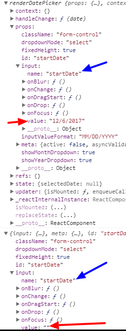
Now if do, console.log(this) again, I can see it again. The name attribute is always accessible, but it isn't provided by redux, so I am thinking redux doesn't like this setup.
If I go back to the more standard way of using datepicker with redux (using {...input} in a functional component), it works, but then users can't do manual text entry.
kicker10BOG
on 5 Dec 2017
@kicker10BOG I repeated this in my app and didn't get this issue. So I do not know why this happens in your case.
winlx
on 5 Dec 2017
@winlx Ok. Thank you for trying. I will continue my search.
kicker10BOG
on 5 Dec 2017
My contribution
import React from 'react'
import { compose, withHandlers, withState, lifecycle, setDisplayName } from 'recompose'
import moment from 'moment'
import { Form, Label } from 'semantic-ui-react'
import DatePickerComponent from 'react-datepicker'

const withLabel = (Component) => setDisplayName('withLabel')(
  ({ id, label, ...props }) => (
    <React.Fragment>
      {label && <label htmlFor={id} >{label}</label>}
      <Component id={id} {...props} />
    </React.Fragment>
  )
)

const withFormField = (Component) => setDisplayName('withFormField')(
  ({ meta: { touched, error }, ...props }) => (
    <Form.Field error={!!(touched && error)}>
      <Component {...props} />

      {touched && error ? (
        <Label basic color="red" pointing>
          {error}
        </Label>
      ) : null}
    </Form.Field>
  )
)

const withFormLabelField = compose(
  withFormField,
  withLabel
)

/**
 * DatePicker Input
 */
export const DatePicker = compose(
  withState('selectedDate', 'setSelectedDate', null),
  withHandlers({
    handleChange: ({ input, setSelectedDate }) => (date) => {
      setSelectedDate(date)
      input.onChange(date)
    }
  }),
  lifecycle({
    componentWillMount () {
      if (this.props.input.value) {
        this.props.setSelectedDate(moment(this.props.input.value, 'DD/MM/YYY'))
      }
    }
  })
)(({ input, meta, selectedDate, handleChange, ...rest }) => (
  <DatePickerComponent
    selected={selectedDate}
    onChange={handleChange}
    {...rest}
  />
))

/**
 * DatePicker Field
 */
export const DatePickerField = withFormLabelField(DatePicker)
Usage:
import React from 'react'
import { Field, reduxForm } from 'redux-form'
import { Button, Form } from 'semantic-ui-react'
// import moment from 'moment'
import { DatePickerField } from './Fields'

const MyForm = (props) => {
  const { handleSubmit, invalid, loading } = props

  return (
    <Form
      onSubmit={handleSubmit}
      size='small'
    >
        <Field
          id="deadline"
          name="deadline"
          type="text"
          label="Deadline"
          placeholder="Deadline"
          component={DatePickerField}
          dateFormat='YYYY-MM-DD'
          // if you want normalize before store on redux...
          // normalize={value => (value ? moment(value).format('DD/MM/YYYY') : null)}
        />

        <Button
          type='submit'
          disabled={invalid || loading}
          loading={loading}
          content='Submit'
        />
    </Form>
  )
}

export default reduxForm({
  form: 'my-form'
})(MyForm)
 rayronvictor
on 8 Feb 2018
rayronvictor
on 8 Feb 2018
I realized that is necessary to propagate input, thus onChange is called and the errors are shown.
The value attribute was omited.
<DatePickerComponent
  {..._.omit(input, [value])}
  selected={selectedDate}
  onChange={handleChange}
  {...rest}
/>
Thanks @gregorydrake, i successfully render it, but if i want alert the value use JSON Stringfy. The value not show.
My code is:
const renderDatePicker = ({input, placeholder, defaultValue, meta: {touched, error}}) => (
  <View>
    <DatePicker {...input} dateForm='MM/DD/YYYY' selected={input.value ? moment(input.value) : null} />
    {touched && error && <Text>{error}</Text>}
  </View>
);
export default renderDatePicker;

        <Field
          name='birth_date'
          placeholder='Birth Date'
          component={renderDatePicker}
          label='Tempat Lahir' />
// Values onSubmit
const onSubmit = (values) => {
  alert('Submited: \n' + JSON.stringify(values));
};
Any solutions?
 adjieindrawan
on 28 Feb 2018
adjieindrawan
on 28 Feb 2018
This is my custom component implementation to be used by redux-form _Field_ after many try-outs receiving warnings about invalid prop types for value or complains about invalid dates and rfc's ... Everything works, initialization, selecting a date, re opening the datepicker and clicking outside (which was giving errors also!). Here it goes:
const { input, className, meta: { error, touched }, required, ...rest } = this.props
The key is to NOT manually set the _value_ prop of the DatePicker component and to have the _input_ prop removed from the destructured props usually sent in many examples to the component
handleChange = (date) => {
    this.props.input.onChange(moment(date))
  }

<DatePicker {...rest}
          autoOk
          className={classnames(className, { 'form-control-danger': error })}
          dateFormat={I18n.t('time.formats.calendar-date-js')}
          onChange={this.handleChange}
          selected={input.value ? moment(input.value) : null} />
Here is the final Component:
import React, { PureComponent } from 'react'
import PropTypes from 'prop-types'
import DatePicker from 'react-datepicker'
import { I18n, Translate } from 'react-redux-i18n'
import classnames from 'classnames'
import moment from 'moment'
import 'react-datepicker/dist/react-datepicker.css'

class DatePickerInput extends PureComponent {

  handleChange = (date) => {
    this.props.input.onChange(moment(date))
  }

  render () {
    const { input, className, meta: { error, touched }, required, ...rest } = this.props

    return (
      <div className={classnames('form-group', { 'has-danger': error })}>
        <label className='form-col-form-label' htmlFor={input.name}><Translate value={`attributes.${this.props.i18nKey}.${input.name}`} /> {required ? '*' : ''}</label>
        <DatePicker {...rest}
          autoOk
          className={classnames(className, { 'form-control-danger': error })}
          dateFormat={I18n.t('time.formats.calendar-date-js')}
          onChange={this.handleChange}
          selected={input.value ? moment(input.value) : null} />
        {touched && error && <span className='error-block'>{error}</span>}
      </div>
    )
  }
}

DatePickerInput.propTypes = {
  className: PropTypes.string.isRequired,
  input: PropTypes.object.isRequired,
  i18nKey: PropTypes.string.isRequired,
  meta: PropTypes.object.isRequired,
  required: PropTypes.bool
}

DatePickerInput.defaultProps = {
  className: 'form-control',
  required: false
}

export default DatePickerInput
 tommyalvarez
on 18 May 2018
tommyalvarez
on 18 May 2018
I am having same problem with @indrawanadjie.. I am able to wrap datepicker in redux form but not able to get the datepicker selected value onSubmit and validation.
Please help!
 sookwei93
on 20 Jun 2018
sookwei93
on 20 Jun 2018
Thank you @tommyalvarez. The solution works almost perfect - I had an issue with redux-form validator and had to add following props to DatePicker in order to make touched parameter work.
onBlur={() => input.onBlur(input.value)}
 AustrisC
on 10 Jul 2018
AustrisC
on 10 Jul 2018
@tommyalvarez what should I put into input: PropTypes.object.isRequired ?
(how to use this component?)
 kotmatpockuh
on 24 Jul 2018
kotmatpockuh
on 24 Jul 2018
@kotmatpockuh nothing, that is filled by redux-form when you use the custom _DatePickerInput_ in my comment above as the _component_ prop for the redux-form Field component. E.g.
<Field name='date_field_name' component={DatePickerInput} />.
tommyalvarez
on 24 Jul 2018
Hi, how to target Fields? I have 2 fields like start and end dates.
- start date is just like effective from date,
- And end date is effective to (planner)
And by the way how to restrict start date should not go beyond end date, if end date is selected first.
Thanks in advance.
 Randore
on 9 Oct 2018
Randore
on 9 Oct 2018
@Randore what do you mean by targeting fields? About setting valid ranges of dates... check the available props https://github.com/Hacker0x01/react-datepicker/blob/master/docs/datepicker.md, i think you're looking for the endDate prop, which of course you will need to set dynamically since it's user defined.
tommyalvarez
on 9 Oct 2018
@tommyalvarez Hi,
The above solutions helped me to integrate the datepicker into ReduxForm.
Here my question is, I have 2 date fields components
eg:
<Field component={DatePicker} name="startDate" />
<Field component={DatePicker} name="endDate" />
My first question is how to change individual Fields instead of all changing onChange method.
Just like event.target.input how to do this in above cases.
My Second question is: https://github.com/jquense/yup/issues/287
how to achieve this ReduxForms.
Randore
on 9 Oct 2018
@Randore The onChange method doesn't trigger change to all your DatePicker inputs at once, it just changes the individual DatePicker from where it runs when the user clicks a date in the calendar. Each DatePicker has its own instance of _onChange_. So selecting a date in the DatePicker _startDate_ should not change the _endDate_ DatePicker value. If what you're asking is how to programatically change a DatePicker value instead of being defined by user action, then you should dispatch an action that changes the input value. Redux-form comes with the handy action creator method _change_ that you pass the _formid_, _fieldname_ and _value_ and does the dispatch for you. If this doesn't clarify things, please give an example of what you mean by using event.target.input to change individual fields with a code example or something of the sort.
As to your second question, that's a not-so-simple-but-yet-classical-validation. What you need to check is the redux-form client-side validation documentation. You just validate that the startDate < endDate, i don't see your issue there. You have access to startDate / endDate props either by storing the values in redux store or you can retrieve them from redux-form using one of the documented selectors like getFormValues, go ahead and re-check redux-form validation and selectors documentation.
tommyalvarez
on 9 Oct 2018
@rayronvictor Thank you for your contribution, saved me after a couple of frustrating hours, and just a friendly reminder in react-datepicker document date format is something like below
<DatePicker
dateFormat="yyyy/MM/dd"
selected={this.state.startDate}
onChange={this.handleChange} />
Final form should be something like this
<Form.Group widths='equal' >
                    <Field
                        validate={[required]}
                        id="deadline"
                        name="deadline"
                        type="text"
                        placeholderText="Deadline"
                        component={DatePickerField}
                        dateFormat='YYYY-MM-dd'
                    //if you want normalize before store on redux...
                    //normalize={value => (value ? moment(value).format('DD/MM/YYYY') : null)}
                    />
Be careful with dd if you use DD you get funny results,
for placeholder use placeholderText
 zaferzn
on 1 Dec 2018
zaferzn
on 1 Dec 2018
For those still trying to figure out how to get Redux Form and ReactDatepicker to work well together try considering the change prop in Redux form passed to onChange from ReactDatepicker.
In the example below I do this to ensure startDate and endDate on my form are never more than 30-days apart:
```
const StartDatePicker = ({
input: { onChange, value }, endDate, change,
}: PropsWithEndDate) => (
onChange(startDateValue);
  if (endDate.diff(startDateValue, 'days') > 60) {
    change('endDate', moment(startDateValue).add(60, 'd'));
  }
}}
dateForm="MM/DD/YYYY"
selectsStart
selected={value}
startDate={value}
endDate={endDate}
minDate={moment.utc().subtract(65, 'day')}
maxDate={moment.min(endDate, moment.utc())}
monthsShown={2}
/>
);
````
Here's the link: https://redux-form.com/8.0.4/docs/api/props.md/#-code-change-field-string-value-any-function-code-
Hope this helps someone!
 tom-wagner
on 12 Dec 2018
tom-wagner
on 12 Dec 2018
`import React from 'react';
import PropTypes from 'prop-types';
import moment from 'moment';
import DatePicker from 'react-datepicker';
import 'react-datepicker/dist/react-datepicker.css';
// import PropTypes from 'prop-types';
// import styled from 'styled-components';
/* eslint-disable react/prefer-stateless-function */
class RenderDatePicker extends React.Component {
constructor(props) {
super(props);
this.state = {
selectedDate: null,
};
this.handleChange = this.handleChange.bind(this);
}
componentWillMount() {
if (this.props.input.value) {
this.setState({
selectedDate: moment(this.props.input.value).unix(),
});
}
}
handleChange = (date) => {
this.setState({
selectedDate: moment(date).unix(),
});
this.props.input.onChange(moment(date).unix());
};
render() {
const {
meta: { touched, error },
input,
} = this.props;
console.log(this.props)
return (
selected={this.state.selectedDate}
onChange={this.handleChange}
/>
{touched &&
error &&
{error}
}
);
}
}
RenderDatePicker.propTypes = {};
export default RenderDatePicker;`
<Field
              name="deadline"
              showMonthDropdown
              showYearDropdown
              dropdownMode="select"
              component={RenderDatePicker}
            />
 kundan048
on 4 Aug 2019
kundan048
on 4 Aug 2019
@material-ui/[email protected]
import React, { useState, useEffect, Fragment } from "react";
import { KeyboardDatePicker } from '@material-ui/pickers'


function RenderDateInput({ input, label, name, id, meta: { touched, error } }) {
    const [selectedDate, setValue] = useState(() => {
        return input.value ? new Date(input.value) : null
    })

    useEffect(() => {
        if (selectedDate) {
            const date = new Date(selectedDate).getTime()
            input.onChange(date)
        }

        if(!selectedDate && input.value){
            setValue(new Date(input.value))
        }
    });

    return (
        <Fragment>
            <KeyboardDatePicker
                autoOk
                {...input}
                name={name}
                label={label}
                invalidDateMessage="Data inválida"
                onClear={() => { }}
                fullWidth
                variant="inline"
                value={selectedDate}
                onChange={setValue}
                format={"dd/MM/yyyy"}
                InputLabelProps={{ shrink: true }}
            />
            {touched && (error && <span className="error_msg">{error}</span>)}
        </Fragment>
    );
}

export default RenderDateInput;
 rcsoares
on 9 Aug 2019
rcsoares
on 9 Aug 2019
renderDatePicker(field){
    const { input, label, selected, required, meta: { touched, error, warning, invalid } } = field

return (
  <div className="picker form-group col-md-6">
      <label><b>{label}</b></label><br/>
                <DatePicker
                className="form-control"
                style={{ width: '100%' }}
                {...input}
                selected={selected}
                onChange={value => {
                    field.handleChange(value)
                    input.onChange(value)
                }}
      onBlur={() => input.onBlur(input.value)}
                required={required}
                />
                {touched && (error && <br/>)}
      {touched && ((error && <span className="text-danger">{error}</span>) || (warning && <span>{warning}</span>))}
  </div>
);
}
name="startDate"
selected={this.state.startDate}
handleChange={date => this.setState({startDate: date})}
component={this.renderDatePicker}
/>
 czsyjss
on 27 Sep 2019
czsyjss
on 27 Sep 2019
Related issues
 kesavan49
·
18Comments
kesavan49
·
18Comments
 yp
·
24Comments
yp
·
24Comments
 johhansantana
·
19Comments
johhansantana
·
19Comments
 JustFly1984
·
23Comments
JustFly1984
·
23Comments
 tadjohnston
·
42Comments
tadjohnston
·
42Comments
Most helpful comment
You could wrap the DatePicker element so that it can be used as a component on "Field".