React-bootstrap-typeahead: Support Bootstrap 4
Hello,
I'm using Bootstrap 4 and have just noticed the anchor tag need the class 'dropdown-item ' to apply the correct styling. Adding this class has no effect on Bootstrap 3 as it doesn't exist. Without this class there is no styling. I'm happy to submit a pull request if time is an issue as it's a quick fix.
<a class="dropdown-item"></a>
Thanks
 nevace
All 22 comments
This isn't a trivial change. There are other, more subtle behaviors and visual details impacted by Bootstrap 4 than just the one you note. I'm currently not willing to support Bootstrap 4 given that it's only in alpha.
As a workaround, v1.0 of the typeahead provides a renderMenu hook, allowing you to fully customize menu rendering.
 ericgio
on 2 Feb 2017
ericgio
on 2 Feb 2017
renderMenu will work and it's exactly what I need to show some extra meta data in the menu as well. Great library thanks.
nevace
on 2 Feb 2017
Thanks, glad you're finding it useful. Keeping this issue open for tracking purposes.
ericgio
on 2 Feb 2017
@nevace mind sharing your solution? my CSS skills are beyond awful.
 georgiosd
on 18 Jun 2017
georgiosd
on 18 Jun 2017
I had a more custom menu, but stripped down it would look something like this:
   renderMenu(results, menuProps) {
        return (
            <Menu {...menuProps}>
              {results.map((tag, i) => {
                  return (
                    <MenuItem className="dropdown-item" option={tag} position={i} key={i}>
                      {tag.title}
                    </MenuItem>
                  );
              })}
            </Menu>
        );
    }
                   <AsyncTypeahead
                        options={this.state.queryData}
                        renderMenu={this.renderMenu}
                        filterBy={['title']}
                        labelKey={'title'}
                        delay={500}
                        onSearch={this.handleSearch}
                        ref={typeahead => this.typeahead = typeahead}
                        emptyLabel='No tags found. Press enter to create.'
                    />
@nevace You're a gentleman and a scholar, thank you.
georgiosd
on 19 Jun 2017
I did some more investigation into basic support for Bootstrap 4. Some things, like the dropdown-items case above are relatively easy to fix, but other things will be quite difficult to fix as the basic behaviors in BS4 have changed significantly. No current timeline on full support, but not anytime soon.
ericgio
on 21 Jul 2017
It works in Bootstrap 4.0.0-beta but the dropdown appears as soon as the input is focused.
Is there a setting for this? Or does anyone have a workaround?
 cquillen2003
on 30 Sep 2017
cquillen2003
on 30 Sep 2017
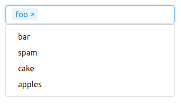
Maybe I'm missing something and am about to slip up, but AFAIK react-bootstrap-typeahead is now working absolutely fine with bootstrap 4.
version:
- react-bootstrap-typeahead: 2.0.0-alpha.6
- react: 16.0.0
- bootstrap: 4.0.0-beta.2
Looks like this and functionality all seems to be fine.
 samuelcolvin
on 26 Oct 2017
samuelcolvin
on 26 Oct 2017
@samuelcolvin: Yes, I'd say with the latest 2.0 release, support for Bootstrap 4 is probably 90% there. I think in most cases it should work pretty well. If I recall, there were some little interaction issues with the menu, as well as issues for other more minor use cases.
ericgio
on 26 Oct 2017
- Support input validation
ericgio
on 17 Nov 2017
Does anyone have an example of how to use this library with the latest beta release of Bootstrap 4? This is the best autocomplete library I have found up to now, but the lack of Bootstrap 4 support became a big problem for me, as I'm using its classes in almost every components of my project. If anyone can give me an example, it'll be very, very helpful!
 PedroVinicius
on 26 Dec 2017
PedroVinicius
on 26 Dec 2017
for me it just worked out of the box. What problem are you having?
samuelcolvin
on 26 Dec 2017
The problem I'm facing now is with the tokens rendering.

How you can see, the outline styles aren't being applied.
import React, { Component } from 'react';
import { FormGroup, InputGroup, InputGroupButton, Button } from 'reactstrap';
import { AsyncTypeahead as Typeahead } from 'react-bootstrap-typeahead';

export default class SearchClients extends Component {
  ...

  render() {
    return (
      <FormGroup>
        <InputGroup>
          <Typeahead
            labelKey='name'
            multiple={true}
            isLoading={this.props.loading}
            options={this.props.suggestions}
            minLength={2}
            onSearch={this._handleSearch}
            placeholder='Search customer to associate'
            className='form-control'
          />

          <InputGroupButton>
            <Button>Adicionar</Button>
          </InputGroupButton>
        </InputGroup>
      </FormGroup>
    )
  }
}
Another problem occurs when the suggestions are rendered:

The suggestions container width is not the same as its father element.
PedroVinicius
on 26 Dec 2017
@PedroVinicius: Be sure to include the provided CSS:
import 'react-bootstrap-typeahead/css/Typeahead.css';
You'll also want to remove the form-control classname from the component, since it's already included.
ericgio
on 26 Dec 2017
With the previously pointed Stylesheet added, I'm having the following result:

But an interesting thing is that when I remove all stuff around the Typeahead component, it works pretty well. But I really need that button at the right side of the search field 😞
PedroVinicius
on 27 Dec 2017
Another interesting thing is that if I place the "form-control" class at the Typeahead component, the result is almost perfect:

PedroVinicius
on 27 Dec 2017
Here's a workaround submitted by someone else: https://github.com/ericgio/react-bootstrap-typeahead/issues/74#issuecomment-353397843
ericgio
on 27 Dec 2017
Bootstrap is now officially at 4.0.0, so I'll look more into what it would take for complete support.
ericgio
on 21 Feb 2018
As of v3.0.0:
- [x] Multi-select state:
- [x] input size/height
- [x] disabled state
- [x] :focus state
- [x] clearButton position
- [x] dropup behavior
- [x] input groups
- [x] input validation
- [x] docs
- [x] navbar collapsing
- [x] checkboxes + radios
ericgio
on 21 Feb 2018
v3.0.0-alpha.1 of the component provides improved support for BS4:
- The single-select version should pretty much work out of the box; some CSS has been included with the package to make it work with input groups.
- The multi-select version uses a set of composite elements styled to look like a standard BS input, so that needs some more work.
- Dropup behavior isn't yet supported in BS4 unless you use
bodyContainer - Input validation is supported by adding the proper classnames, either to a parent element (for BS3) or to the input itself using
inputProps(for BS4)
ericgio
on 26 Mar 2018
As of v3.0.0, I believe the package now has pretty much full support for Bootstrap 4. As noted in the README, you should include the additional BS4-specific CSS file included with the package (or just copy the styles) if you're using BS4. This is necessary for the package to be backwards-compatible with BS3. The example page also now allows you to select which BS version you want, so you can try the typeahead with either v3 or v4.
I'm going to consider this issue closed. If you run across any further issues with BS4 and this component, please open a new issue.
ericgio
on 4 Apr 2018
Related issues
 alex84G
·
5Comments
alex84G
·
5Comments
 SerdarSanri
·
7Comments
ericgio
·
7Comments
SerdarSanri
·
7Comments
ericgio
·
7Comments
 jtmunn
·
4Comments
jtmunn
·
4Comments
 mflauer
·
4Comments
mflauer
·
4Comments
Most helpful comment
As of v3.0.0, I believe the package now has pretty much full support for Bootstrap 4. As noted in the README, you should include the additional BS4-specific CSS file included with the package (or just copy the styles) if you're using BS4. This is necessary for the package to be backwards-compatible with BS3. The example page also now allows you to select which BS version you want, so you can try the typeahead with either v3 or v4.
I'm going to consider this issue closed. If you run across any further issues with BS4 and this component, please open a new issue.