React-bootstrap-table2: Automatically set column width based on max cell text width?
Has anybody found a way to auto set the column widths?
I would love to see functionality for setting the column widths based on the size of whatever is inside the columns. Setting each column width by pixel is so inefficient to what I need to do, especially since the table size changes based on browser window size.
 mkwenzel
All 12 comments
@mkwenzel I think you can set the white-space:nowrap on column.
Do let me know if it not work. thanks
 AllenFang
on 21 Oct 2018
AllenFang
on 21 Oct 2018
I'm also looking for the same feature, I tried setting the style on column to what you suggested but it doesn't seem to work.
 knowbody
on 24 Oct 2018
knowbody
on 24 Oct 2018
Hi @AllenFang sorry it's taken me a long time to come back to this, I finally got the chance to try implementing this and was not able to get it to work. I tried all three variations below with no luck in getting this to work, and in my table, the longest content in the column is running over into the next column. I guess I'm not sure where I should be putting the 'white-space':'nowrap'?
const columns = [
{
dataField: '_id',
text: 'ID',
headerStyle: (colum, colIndex) => {
return { 'white-space' : 'nowrap' };
}
}
const columns = [
{
dataField: '_id',
text: 'ID',
headerStyle: { 'white-space' : 'nowrap' }
}
md5-a85c7c759ee8e06b1381fbe9dba4811e
const columns = [
{
dataField: '_id',
text: 'ID',
style: {
'white-space' : 'nowrap'
}
}
@mkwenzel this one work for me
{ dataField: 'id', text: 'Id', style: {'white-space': 'nowrap'} }
 anhthang
on 26 Nov 2018
anhthang
on 26 Nov 2018
Hi @AllenFang I have still not been able to get this to work!
It occurred to me that maybe I'm wording this incorrectly and that's why people are suggesting that I use "nowrap" when it does not achieve what I want.
When I use
{ dataField: 'id', text: 'Id', style: {'white-space': 'nowrap'} }
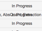
It renders and looks like this where the text of the column that I am using "nowrap" on runs over the text in the adjacent column.
What I am looking for is the ability to have the text not wrap or bleed into the next column, but also not have to set the width of the column manually via headerstyle.
mkwenzel
on 10 Dec 2018
Thats not an ideal solution but it worked for me ....
{
dataField: 'email',
text: 'Email',
sort: true,
headerStyle: (colum, colIndex) => {
return { width: '30%', textAlign: 'left' };
}
},
 pmogilev
on 28 Dec 2018
pmogilev
on 28 Dec 2018
Removing "table-layout: fixed" in react-bootstrap-table2.scss can stop the bleed. It worked for me.
 borihan-p
on 22 Jan 2019
borihan-p
on 22 Jan 2019
Tried @borihan-p 's recommendation and it did not work for me. Still no solution, I've just been working around it.
mkwenzel
on 28 Jan 2019
My solution is I created an css file for BootstrapTable and imported css file to js file. Then you can customize css file to fit your needs. I can customize a lot by using this method. See my example images below.


 TheShadow8
on 2 Feb 2019
TheShadow8
on 2 Feb 2019
Removing "table-layout: fixed" in react-bootstrap-table2.scss can stop the bleed. It worked for me.
This solution worked for me but I found it easier to create the rule on my css file:
.react-bootstrap-table table {
  table-layout: auto !important;
}
 fabriciopirini
on 3 Jun 2019
fabriciopirini
on 3 Jun 2019
You can also add class table-responsive to _BootstrapTable_ element. This will result in the table becoming scrollable horizontally but there will be no overlap between the columns.
 shubham-prasad
on 6 Mar 2020
shubham-prasad
on 6 Mar 2020
@shubham-prasad Thank you, that is exactly what I was looking for
 rgonca
on 18 Feb 2021
rgonca
on 18 Feb 2021
Related issues
 thevangelist
·
4Comments
thevangelist
·
4Comments
 primakashi
·
3Comments
primakashi
·
3Comments
 saifulss
·
4Comments
saifulss
·
4Comments
 epsyan
·
4Comments
epsyan
·
4Comments
 ethannkschneider
·
3Comments
ethannkschneider
·
3Comments
Most helpful comment
This solution worked for me but I found it easier to create the rule on my css file:
.react-bootstrap-table table {
  table-layout: auto !important;
}