Hey guys,
could you think over a re-make of the the "Overview" view of the movie list?
The movie description should not be shown there.
It should be a overview which replaces the table for better responsive support because tables are limited in space/width and oldschool.
The overview view is the "new" way of showing tables as its responsive and can show alot of important informations.
We got digital release date added, which makes the table bigger again.
But in radarr its completly useless and im pretty sure there is almost noone which uses it.
The important infos are too far away from the movie title, alot of infos are mising and the movie description there is useless as a movie managment and not an imdb tool.
My suggestion is to remove the decription, make the title a lil bit smaller and add all information (some of them are shown on the right already) from the table in the space under the title. Add bigger action buttons to the right (or only bigger on mobile).
BR
 reloxx13
All 7 comments
You've seen v3 exists with a total ui overall, right?
 ta264
on 20 Aug 2020
ta264
on 20 Aug 2020
You've seen v3 exists with a total ui overall, right?
i am on v3.
The style changed, but not the functionallity or usability of the movie views "table", "posters", "overview".
reloxx13
on 20 Aug 2020
OK, in that case could you perhaps mock up some screenshots of what you're suggesting? I don't quite get it from your description.
ta264
on 20 Aug 2020
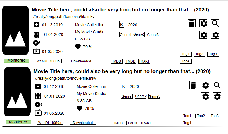
Just as example:
It could even expand on click as accordion and show search/file/crew etc tabs below
reloxx13
on 20 Aug 2020
I dont disagree with possibly adding more to it since there is real-estate to use, but i do not agree with removing the description. As an "overview" of the movie, the description is pretty well inline with that.
I'll tinker with it some unless @ta264 or @Qstick want to do it themself.
 austinwbest
on 20 Aug 2020
austinwbest
on 20 Aug 2020
I dont disagree with possibly adding more to it since there is real-estate to use, but i do not agree with removing the description. As an "overview" of the movie, the description is pretty well inline with that.
Would be nice to have it optional with a checkbox like some other optional things you can hide/show already.
Some long descriptions will blow up this layout and the "overview" will be gone.
E.g. german descriptions r much longer than the english one.
the poster could be too much already. the poster there doesnt matter since its not what the enduser sees (emby/plex etc do this) and teh poster in radarr is not part of managing.
but if there is space left the poster can be shown.
reloxx13
on 20 Aug 2020
In this concept, descriptions would truncate to leave room for other added items bud.
For me, the poster (maybe smaller) & description (truncated if necessary) would remain in tact. There is plenty of room for other things in this view :)
austinwbest
on 21 Aug 2020
Related issues
 codaamok
·
3Comments
codaamok
·
3Comments
 davidbonnici1984
·
4Comments
davidbonnici1984
·
4Comments
 HitsvilleUK
·
3Comments
HitsvilleUK
·
3Comments
 willmonahan
·
4Comments
willmonahan
·
4Comments
 alpinewinter
·
3Comments
alpinewinter
·
3Comments
Most helpful comment
Some long descriptions will blow up this layout and the "overview" will be gone.
E.g. german descriptions r much longer than the english one.
the poster could be too much already. the poster there doesnt matter since its not what the enduser sees (emby/plex etc do this) and teh poster in radarr is not part of managing.
but if there is space left the poster can be shown.