Rack: Finite top left edge of the rack window
Summary
One of the behaviours of 0.6.2c that I miss in 1.0.0 is the finite rack edges on the top and on the left edges of the rack window. Now that both the API and ABI is stable, and 1.0.0 is slated for official release any day now, this feature request might be more appropriately considered for a future version update.
Motivation
When using a track pad or the apple Magic Mouse, where scrolling of the window can accidentally be triggered, the window tends to move out of the desired position quite often. I like that the rack isn’t infinite anymore, but might suggest a finite top/left edge, or at least the ability to toggle this feature on and off.
Proposal
How will the UI offer this option? View > Something?
In the view menu, there might be an option like "Anchor window to top/left modules".
Will it saved per-patch or in settings.json?
This seems like a user preference so I think it should be saved int the settings.json file.
Will toggling this setting require Rack to relaunch? If not, how will it handle the current patch? How will it handle the current view position?
I don't really think a relaunch is necessary, unless I'm missing something. If any modules are placed awkwardly in the rack screen, then the top/left coordinates could be calculated based on the top/left edges of these modules. Then the screen wouldn't scroll past the top/left most edges of these modules. If a relaunch is needed to implement this, I don't see that as such a bad thing.
What if you load a patch (or autosave.vcv) that was saved while the setting was turned on?
I think taking a cue from the above answer might lend itself to a solution here. Again, by using the top/left most edges of the top/left most placed module, much like how the cable tension and screen zoom is remembered in the settings.json and not in the autosave.vcv or any patch.
Any issues/corner cases with turning it on? What if modules are already out of bounds?
As long as this is all governed by the edges of the modules in the top/left most positions. I can see a scenario where there are no modules in the Rack window, and in this case, where should Rack lock to? Maybe it's as easy as picking the top/left "hp" and use that as an anchor point. I can also see this affecting the "command+click and move a group of modules" behaviour. In which there would have to be boundaries specified, and therefore the user would have to slide a module or a group of modules to the right to make room.
Any issues/corner cases with turning it off?
No, I cannot. When disengaging this feature, the user would gain access to more rack space beyond this top/left edge.
If I'm not understanding the feature request well enough, what questions should I instead be asking?
You've laid out a good set of questions to consider here, as this will help to better understand how to tackle this feature, if you so wish to implement it. There is one question that should be asked at this time, and that is; What does the user lose if we revert to a similar behaviour, which was found in version 0.6.2c? I personally like that the rack doesn't scroll on forever in the right and bottom positions, and I think you've picked a good empty space "buffer" around the rack. I just think there should be some sort of top/left anchor point, much like the previous versions of Rack. So, does the user need these empty space "buffers" moving upwards and to the left? Maybe not. Maybe implementing this properly would mean permanently having this feature turned on. Maybe you might want to create a poll on the forum, and in the FaceBook group to ask people's opinions?
Should this feature request be extended, i.e. support limiting the top, left, and right?
No, I don't think this feature should be extended to limiting scrolling to the right (or even towards the bottom). Having the empty space buffer below and to the right of module position, shows the user that there is more rack space to use.
 circadiansound
All 27 comments
I have a magic mouse and i noticed this too, trying out the dev version. It's like a group of modules become slippery under your hands, sometimes even when dragging cables so i would love to see some sort of 'lock' too.
//edit: this being on an 27" imac with macos 10.12.6
 emmahasapetgiraffe
on 16 Jun 2019
emmahasapetgiraffe
on 16 Jun 2019
Agree. With a trackpad, it would be nice to be able to somehow "lock" the rack. Can still be infinite into the right and down direction, but an optional limit on the top left would be helpful.
 martin-lueders
on 16 Jun 2019
martin-lueders
on 16 Jun 2019
To me this sounds more like an issue with the sensitivity of trackpads. I use a 2D scrolling trackpad and have no problem with this because the sensitivity is not insanely high. Do you get this behavior with other scrolling areas, such as web browsers?
 AndrewBelt
on 16 Jun 2019
AndrewBelt
on 16 Jun 2019
@AndrewBelt: I would also love an option to get back to anchor window at top left and scroll only down and right from there as 0.6.2 did. As the current behavior drives me nuts. Also where a module gets added seems random now as often I have to go look for where it was added rather than where I clicked to open module browser or as close to there as possible if no space...
 fractalgee
on 18 Jun 2019
fractalgee
on 18 Jun 2019
@fractalgee You drag modules from the Module Browser directly into the rack. No chance of it being lost.
AndrewBelt
on 18 Jun 2019
Regarding the sensitivity topic. I wouldn’t say the trackpad on my MBP or the Magic Mouse in the studio suffer from sensitivity issues. I think it’s more a matter of having a finite top left edge to the rack. I’m sure I’m not alone with regards to workflow, in which I think a lot of us arrange the modules in our patch’s starting from the top left position, without any intention of placing modules outside those bounds. I am well aware that this is modular, and there are use cases where we’d might want to go outside these bounds, but 9 times out of 10, I think we might want to have this finite edge. So a toggle for the possibility of this feature is probably the best solution if you were to ever consider this suggestion. I do thank you for taking the time to acknowledge this issue post :-)
circadiansound
on 18 Jun 2019
@AndrewBelt: I would but it covers virtually 80% of my 1900/1280 workspace
(Rack window as large as it can be) so rarely do I see the spot I clicked
on when opening the module browser so no chance in hell to drag it
anywhere. Does it have to be that huge?
On Tue, 18 Jun 2019 at 14:42, Circadian Sound notifications@github.com
wrote:
Regarding the sensitivity topic. I wouldn’t say the trackpad on my MBP or
the Magic Mouse in the studio suffer from sensitivity issues. I think it’s
more a matter of having a finite top left edge to the rack. I’m sure I’m
not alone with regards to workflow, in which I think a lot of us arrange
the modules in our patch’s starting from the top left position, without any
intention of placing modules outside those bounds. I am well aware that
this is modular, and there are use cases where we’d might want to go
outside these bounds, but 9 times out of 10, I think we might want to have
this finite edge. So a toggle for the possibility of this feature is
probably the best solution if you were to ever consider this suggestion. I
do thank you for taking the time to acknowledge this issue post :-)—
You are receiving this because you were mentioned.
Reply to this email directly, view it on GitHub
https://github.com/VCVRack/Rack/issues/1341?email_source=notifications&email_token=AC7FMAEPTP5XL7FCSH4QP5TP3DJ35A5CNFSM4HYQ3BN2YY3PNVWWK3TUL52HS4DFVREXG43VMVBW63LNMVXHJKTDN5WW2ZLOORPWSZGODX6JDUA#issuecomment-503091664,
or mute the thread
https://github.com/notifications/unsubscribe-auth/AC7FMAHZKVQUXUSBMGLCL3LP3DJ35ANCNFSM4HYQ3BNQ
.
fractalgee
on 18 Jun 2019
@fractalgee The Module Browser disappears when dragging begins. Give it a try.
AndrewBelt
on 18 Jun 2019
@AndrewBelt: yep, just tried, that works, But the top left not being
anchored drives my Aspergers brain nuts, pretty please give me a way to set
it so, so it works for types like me who hate having to scroll around too
much and easily overshoot target as well, not just you 'normal' folk (not
that such a thing exists) ;) Clock being top left is how I like to rock ;)
No ambiguity where I am in my Rack then
On Tue, 18 Jun 2019 at 15:22, Andrew Belt notifications@github.com wrote:
@fractalgee https://github.com/fractalgee It disappears when dragging
begins. Try it out.—
You are receiving this because you were mentioned.
Reply to this email directly, view it on GitHub
https://github.com/VCVRack/Rack/issues/1341?email_source=notifications&email_token=AC7FMABEFCTW5E6CT6NIVCLP3DOQZA5CNFSM4HYQ3BN2YY3PNVWWK3TUL52HS4DFVREXG43VMVBW63LNMVXHJKTDN5WW2ZLOORPWSZGODX6TEYQ#issuecomment-503132770,
or mute the thread
https://github.com/notifications/unsubscribe-auth/AC7FMAFD6JIGX3G2NHQGLPLP3DOQZANCNFSM4HYQ3BNQ
.
fractalgee
on 18 Jun 2019
I was also going to add this issue. With the current .6 system I like the fact that with the right zoom level it automatically aligns right and there is no need to move anything to fit everything to the screen. I often zoom to an area and work on the patch there, but when finished I right click the zoom button and everything is right there to play... No need to fiddle with moving the patch around to maximize the working area. This is a massive change with little feedback from the user base... This is the UI... This is too important to force on all the users that have worked with the old method for so long. I predict I will hate the new way for reasons already mentioned in this thread.
 veryfungi
on 18 Jun 2019
veryfungi
on 18 Jun 2019
I agree, it feels a bit disorienting to me to not have a fixed boundary to scroll to. At the same time I think it's great to be able to expand to the top and left just as we've always been able to to the bottom and right. What about a menu option to extend the canvas?
 jacoblast
on 18 Jun 2019
jacoblast
on 18 Jun 2019
Going off previous comments (and my own opinion), the issue is not so much technical as it is UX-related. I can't think of any modular environments, DAWs, plugins or other music software... let alone spreadsheets, illustrators, etc that lack any sort of grid boundaries.
The flexibility is useful but at the same time, the current UX is just different enough as to make it disorienting.
 diemonster
on 18 Jun 2019
diemonster
on 18 Jun 2019
Unambiguousness in navigation is key to a solid UI. We are all conditioned
to top left being top left, and that is a good UI, as that is how we write
too, after all.
On Tue, 18 Jun 2019 at 18:44, Brandon Ivers notifications@github.com
wrote:
Going off previous comments (and my own opinion), the issue is not so much
technical as it is UX-related. I can't think of any modular environments,
DAWs, plugins or other music software... let alone spreadsheets,
illustrators, etc that lack any sort of grid boundaries.The flexibility is useful but at the same time, the current UX is just
different enough as to make it disorienting.—
You are receiving this because you were mentioned.
Reply to this email directly, view it on GitHub
https://github.com/VCVRack/Rack/issues/1341?email_source=notifications&email_token=AC7FMAGVCSPFNYIAJWQ3CDTP3EGIJA5CNFSM4HYQ3BN2YY3PNVWWK3TUL52HS4DFVREXG43VMVBW63LNMVXHJKTDN5WW2ZLOORPWSZGODX7HZYQ#issuecomment-503217378,
or mute the thread
https://github.com/notifications/unsubscribe-auth/AC7FMAHZRJXETX3CH6JCE5TP3EGIJANCNFSM4HYQ3BNQ
.
fractalgee
on 18 Jun 2019
I have revised the feature request template to give a better direction for users participating in feature request issues. Recommended reading especially for this issue.
AndrewBelt
on 18 Jun 2019
@AndrewBelt: This is surely more of a new feature criticism issue? I mean in all good faith, changing design that completely is rather harsh, and not a good UI metaphor. Euroracks don't expand in all directions, most DAWs neither, all those follow some sort of 'you are here when you reach the the anchor (Clock, timing device of choice). We write top left to right bottom in the western world, so why not keep things unambiguous, or at least an option to keep that behavior if wanted (like the by me hated scroll backwards that Apple foisted upon us Mac users many years back as a default)? That surely caused more support worries than just making it an optional feature and not disrupt the experience this harshly. Just my 0.002 cents having had similar discussions with many devs in the past
fractalgee
on 18 Jun 2019
@fractalgee You drag modules from the Module Browser directly into the rack. No chance of it being lost.
I'd remove the old "click to add behavior" then, as it worked this way before, muscle memory is strong here so I guess the rest of us tend to just click thus getting the random module placement.
Btw. ¡dragging the modules works way better!
 AScustomWorks
on 18 Jun 2019
AScustomWorks
on 18 Jun 2019
Hard for an old dog to learn new tricks ;)
fractalgee
on 18 Jun 2019
To me this sounds more like an issue with the sensitivity of trackpads.
Respectfully, forced changes in behaviour are your right, but sidestepping the feedback and making it a user problem forces a design language similar to the Windows 8 Start Menu. This GitHub Issue demonstrates there to be resounding feedback suggesting it's undesirable for several reasons, one of which may be poor mouse design on Apple's part.
I like the infiniRack scrolling, but I don't like it for several reasons, also. At minimum, a settable option defaulted to your preference, would be prudent in eliminating user friction? We'll all adapt eventually, but forcing change is often unwelcome.
 j-e-n-k-s-y
on 18 Jun 2019
j-e-n-k-s-y
on 18 Jun 2019
I'm disappointed in the responses here. Okay, you all want this feature, I get it, otherwise you wouldn't be posting here. You should instead use the :thumbsup: icon for that in the first post rather than making "me too" posts.
What I'm looking for is a full proposal of this feature, so it can move toward acceptance. That is how all VCV Rack feature requests work. I'll start with some thoughts myself. If I have to answer all these questions, the feature will take months for me to get around to it. If I can get a discussion instead of just useless demands, the feature might actually happen.
- How will the UI offer this option?
View > Something? - Will it saved per-patch or in settings.json?
- Will toggling this setting require Rack to relaunch? If not, how will it handle the current patch? How will it handle the current view position?
- What if you load a patch (or autosave.vcv) that was saved while the setting was turned on?
- Any issues/corner cases with turning it on? What if modules are already out of bounds?
- Any issues/corner cases with turning it off?
- If I'm not understanding the feature request well enough, what questions should I instead be asking?
- Should this feature request be extended, i.e. support limiting the top, left, and right?
AndrewBelt
on 18 Jun 2019
- How will the UI offer this option? View > Something?
>> sounds perfect - Will it saved per-patch or in settings.json?
>> settings.json - Will toggling this setting require Rack to relaunch? If not, how will
it handle the current patch? How will it handle the current view position?
>> makes not much difference, unless that becomes default and the other
one require a restart which would be how such a seriously changed UI
feature should be introduced in my humble opinion - What if you load a patch (or autosave.vcv) that was saved while the
setting was turned on?
>> no change with state as is currently, load with that in mind - Any issues/corner cases with turning it on? What if modules are
already out of bounds?
>> if that is case maybe say 'enabled on next restart' if so, but I
would still prefer this to be the optional state of the UI - Any issues/corner cases with turning it off?
>>same as one above - If I'm not understanding the feature request well enough, what
questions should I instead be asking?
>> you understand exactly - Should this feature request be extended, i.e. support limiting the
top, left, and right?
>> that would keep it ambiguous, not a good idea, all or nothing seems
much better of a choice
On Tue, 18 Jun 2019 at 21:32, Andrew Belt notifications@github.com wrote:
I'm disappointed in the responses here. Okay, you all want this feature, I
get it, otherwise you wouldn't be posting here. You should instead use the
👍 icon for that in the first post rather than making "me too" posts.What I'm looking for is a full proposal of this feature, so it can move
toward acceptance. That is how all VCV Rack feature requests work. I'll
start with some thoughts myself. If I have to answer all these questions,
the feature will take months for me to get around to it. If I can get a
discussion instead of just useless demands, the feature might actually
happen.
- How will the UI offer this option? View > Something?
- Will it saved per-patch or in settings.json?
- Will toggling this setting require Rack to relaunch? If not, how
will it handle the current patch? How will it handle the current view
position?- What if you load a patch (or autosave.vcv) that was saved while the
setting was turned on?- Any issues/corner cases with turning it on? What if modules are
already out of bounds?- Any issues/corner cases with turning it off?
- If I'm not understanding the feature request well enough, what
questions should I instead be asking?- Should this feature request be extended, i.e. support limiting the
top, left, and right?—
You are receiving this because you were mentioned.
Reply to this email directly, view it on GitHub
https://github.com/VCVRack/Rack/issues/1341?email_source=notifications&email_token=AC7FMACVIVKCJ2VVDJFFLPLP3EZ57A5CNFSM4HYQ3BN2YY3PNVWWK3TUL52HS4DFVREXG43VMVBW63LNMVXHJKTDN5WW2ZLOORPWSZGODX7W5NY#issuecomment-503279287,
or mute the thread
https://github.com/notifications/unsubscribe-auth/AC7FMAGLVJOC6H7UO46HML3P3EZ57ANCNFSM4HYQ3BNQ
.
fractalgee
on 18 Jun 2019
Thank you, Andrew -- These are good questions, and I appreciate the pain in having to source these requirements solo. Here's my take:
How will the UI offer this option? View > Something?
--> Could be a checkmark for "Fixed Rack", where unchecked is the default, new v1.0 behaviour.
Will it saved per-patch or in settings.json?
--> I would suggest this is a DAW feature, and not a Patch feature.
Will toggling this setting require Rack to relaunch? If not, how will it handle the current patch? How will it handle the current view position?
--> If it makes it easier to implement, restarting Rack is completely acceptable in my opinion... If it didn't require a restart, I'd anchor the Top and Left Margins to the topmost and leftmost modules, snapping those edges to the topmost and leftmost of the monitor. Depending on how you've implemented zoom, it could even be a 'hack' that just snaps the infinite scroll to the top/left, and changes as you move things around?
What if you load a patch (or autosave.vcv) that was saved while the setting was turned on?
--> Does snapping to topmost/leftmost modules resolve this issue?
Any issues/corner cases with turning it on? What if modules are already out of bounds?
--> Same Question as previous: is this an issue if "Fixed Rack" is enabled, but still allows for infinite right / down scrolling?
Any issues/corner cases with turning it off?
--> If implemented as a snapping of the left/topmost edges, I can't think of any that would allow it to free toggle, but again, mileage-may-vary depending on how you've approached the scrolling / zooming.
If I'm not understanding the feature request well enough, what questions should I instead be asking?
--> "Why is this an important feature to you?" ... Some people like Windows, some people like Mac, and some people like Linux... If some of us were able to explain our OCD, perhaps we'd be able to overcome it. I don't like patching Stereo cables in anything other than yellow and red, for no reason other than aesthetics. If aesthetics didn't matter, all modules would be the same color, but they do matter. I was made aware of project late -- 0.6.2c --- but the feeling of freedom to play with sound Rack has provided is unmatched. For reasons I can't fully explain, it feels "less freeing" to be forced to have these buffered spaces on the top and left corners. It's completely intangible and without really good reason - just, a forced change, that seems to have resonated negatively with some people. The fact that you've structured your development in a way that permits this kind of dialogue is enough to worry-not about what questions to ask. Receptiveness is enough for those who care to provide feedback; Negative feedback is the best way to improve software.
Should this feature request be extended, i.e. support limiting the top, left, and right?
--> I don't care about scrolling to the right, and I'm not sure others do. Toggling between 0.6 behaviour and v1.0 behaviour, I think was the intention of those posting, here. My two cents is it should be a "Snap Top _and_ Right", or "Infinity scroll", which hopefully simplifies the rules required to implement such an option.
j-e-n-k-s-y
on 18 Jun 2019
As per Andrew's request for discussion re: the design of this feature, my take:
How will the UI offer this option? View > Something?
View > Screen Lock
Will it saved per-patch or in settings.json?
settings.json
Will toggling this setting require Rack to relaunch? If not, how will it handle the current patch? How will it handle the current view position?
Great question as it uncovers the complexity of this feature. I think it should lock the screen upon changing the setting, similar to how the other settings in View work.
In terms of how to set the upper-left edge per a given patch? A couple ideas:
- the "auto-arrange" icons approach. modules are automatically moved if they are out of bounds, and will be placed to best adhere to the given view.
- iterate through current modules in a patch and discover upper-left boundary where there are no modules present; set accordingly.
What if you load a patch (or autosave.vcv) that was saved while the setting was turned on?
I think this feature should be a global setting.
Any issues/corner cases with turning it on? What if modules are already out of bounds?
see "auto-arrange" comment above.
Any issues/corner cases with turning it off?
People getting confused if they didn't realize the setting was changed.
If I'm not understanding the feature request well enough, what questions should I instead be asking?
tbh I think you understand the request better than anyone else in the thread ;)
Should this feature request be extended, i.e. support limiting the top, left, and right?
no, top + left corner appears to be what people are asking for.
diemonster
on 19 Jun 2019
I apologize if this has got out of hand, this was not my intension. I was only trying to suggest a feature, or improvement to the already improved behaviour of Rack's window scrolling.
I have edited my original post to accommodate for Andrew's Feature Request Template, as I've now included the Proposal portion.
All who are following or viewing this issue, if you agree with the outlined proposal in the initial post please give it a thumbs up. If you agree with one of the other proposals, then by all means give it a thumbs up instead.
circadiansound
on 19 Jun 2019
edit - I have been using the new UI and find it to be fine. Now issues using it.
veryfungi
on 19 Jun 2019
In Rack v1, the rack limits the view to include 33% of the width/height of the bounding box of all modules in the rack. As a result, there is a finite top-left position of the view, so this issue should be closed. The following screenshots display each of the four limits of the rack scroll view. As you can see, modules are visible in each limit.
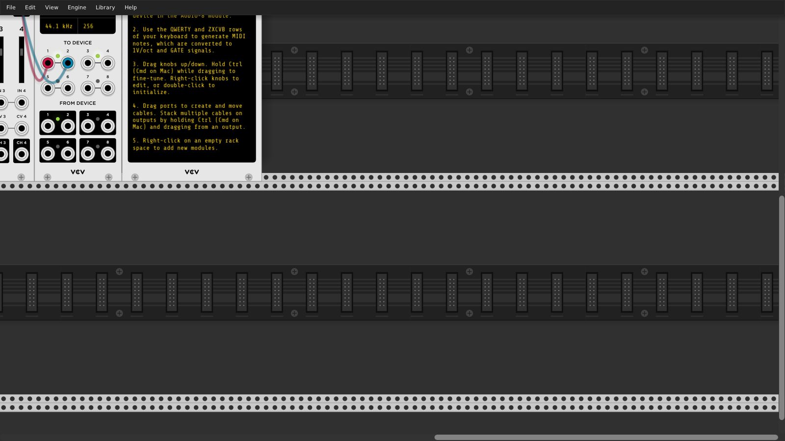
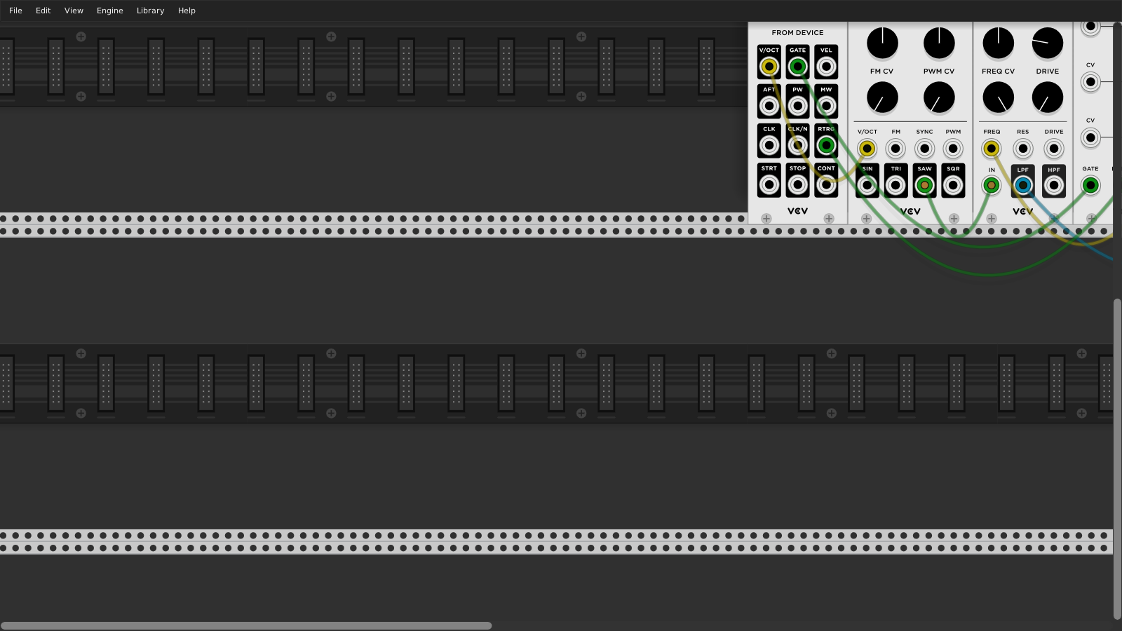
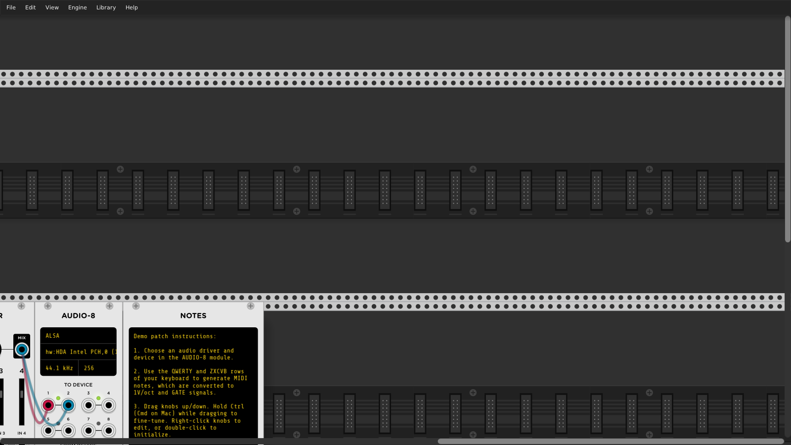
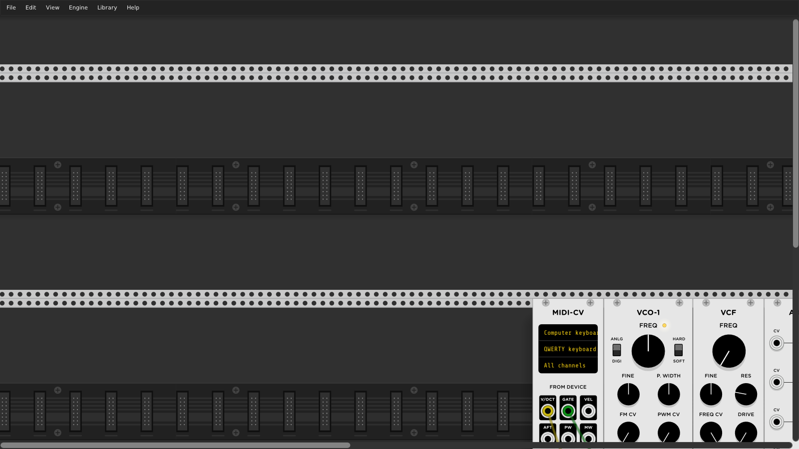
AndrewBelt
on 5 Dec 2019
While that is true while no module is added, as soon as a module gets added
without dragging it goes top left just left of what was the fixed left
before adding and then the view resets to be smack dab in the middle of the
'infinite' Rack space, so fixed top/left that stays fixed for us ADHD types
is still no where to be found, so I am a bit surprised this was closed.....
On Thu, 5 Dec 2019 at 21:50, Andrew Belt notifications@github.com wrote:
In Rack v1, the rack limits the view to include 33% of the width/height of
the bounding box of all modules in the rack. As a result, there is a finite
top-left position of the view, so this issue should be closed. The
following screenshots display each of the four limits of the rack scroll
view.[image: 2019-12-05-154651_1600x900_scrot]
https://user-images.githubusercontent.com/338179/70272764-cf511a00-1776-11ea-9339-7404d9a1da8a.png
[image: 2019-12-05-154647_1600x900_scrot]
https://user-images.githubusercontent.com/338179/70272766-cf511a00-1776-11ea-9413-f1ebda4840f9.png
[image: 2019-12-05-154644_1600x900_scrot]
https://user-images.githubusercontent.com/338179/70272768-cf511a00-1776-11ea-84ac-6fbefcfb0fcd.png
[image: 2019-12-05-154638_1600x900_scrot]
https://user-images.githubusercontent.com/338179/70272770-cf511a00-1776-11ea-9f23-6d84c3e0328f.png—
You are receiving this because you were mentioned.
Reply to this email directly, view it on GitHub
https://github.com/VCVRack/Rack/issues/1341?email_source=notifications&email_token=AC7FMAE4SCQNHD2LIIPB57TQXFSQDA5CNFSM4HYQ3BN2YY3PNVWWK3TUL52HS4DFVREXG43VMVBW63LNMVXHJKTDN5WW2ZLOORPWSZGOEGCDFNY#issuecomment-562311863,
or unsubscribe
https://github.com/notifications/unsubscribe-auth/AC7FMACVTAL2MXRVJCPZLI3QXFSQDANCNFSM4HYQ3BNQ
.
fractalgee
on 6 Dec 2019
@AndrewBelt
Further to my previous comment I think I need to clarify where I am coming from:
I am ADHD/Aspergers and since not having had an anchor in the Rack space (bad UI in my humble opinion, especially if Aspergers/ADHD) has cost me many a lost flow and idea (and cost a good deal of confusion when everything scooted left and up for some reason from where the anchor should be to my brain) as my brain needs some sort of sure anchor to know what is what in whatever space.
So an option to anchor top left (where I put my clocking device, whatever it may be) would seriously keep my sanity intact, as once in the flow, constantly zooming out and back in drives me batty. Hope that clarifies why I ever filed this in the first place.
fractalgee
on 6 Dec 2019
Related issues
 dilom
·
7Comments
AndrewBelt
·
4Comments
dilom
·
7Comments
AndrewBelt
·
4Comments
 gogobanziibaby
·
4Comments
gogobanziibaby
·
4Comments
 Eoin-ONeill-Yokai
·
4Comments
Eoin-ONeill-Yokai
·
4Comments
 jaffasplaffa
·
7Comments
jaffasplaffa
·
7Comments
Most helpful comment
I'm disappointed in the responses here. Okay, you all want this feature, I get it, otherwise you wouldn't be posting here. You should instead use the :thumbsup: icon for that in the first post rather than making "me too" posts.
What I'm looking for is a full proposal of this feature, so it can move toward acceptance. That is how all VCV Rack feature requests work. I'll start with some thoughts myself. If I have to answer all these questions, the feature will take months for me to get around to it. If I can get a discussion instead of just useless demands, the feature might actually happen.
View > Something?