All of the planned functionality for the new Module Browser is now in the master branch. If you'd like to try it and give feedback, post here.
The appearance, however, is not finalized. I will work on sizes, colors, and typography when I revise the Rack UI color scheme. Because of this, limit screenshots of the Module Browser to this thread only until then, or the ugly UI will end up on a magazine or whatever.
 AndrewBelt
All 60 comments
just recompiled on MAC OSX 12.6
it works
and I like it
(takes too much vertical space)
 antoniotuzzi
on 4 Mar 2018
antoniotuzzi
on 4 Mar 2018
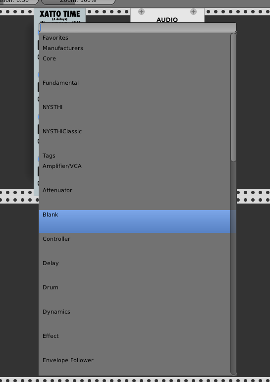
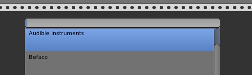
Yup, that's the new Module Browser.
AndrewBelt
on 4 Mar 2018
Looking generally good, on Linux (Ubuntu 17.10). Two regressions found:
- When editing and using SHIFT Left-arrow, the text is not marked as expected; the cursor simply moves to the left without marking any text.
- Same with CTRL Left arrow; supposed to jump to the beginning of the current word, but it just moves one character to the left.
Else great - will simplify finding modules.
 JoakimLindbom
on 4 Mar 2018
JoakimLindbom
on 4 Mar 2018
tested on windows 7. It works fine and looks good!
EDIT: I would like to suggest one thing: A different background-color on the headers (Favourites, Manufacturers, Tags, Modules) to make it a bit easier to read
 Phal-anx
on 4 Mar 2018
Phal-anx
on 4 Mar 2018
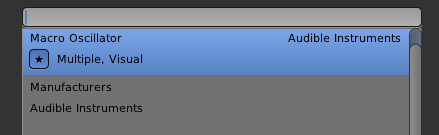
- no Favourites for manufactures? (at least pin Core folder to the top?)
- automatically populated "Recently used" folder would be good
- not sure whats the point of showing the manufacturer on the right
when in their folder? could be just at top - stars take too much space if in extra row
- personally i liked the finder-style multiple column structure
(no comment on cosmetics per request)
doesn't crash on Sierra
 gbrandt1
on 4 Mar 2018
gbrandt1
on 4 Mar 2018
no Favourites for manufactures? (at least pin Core folder to the top?)
Decided not since manufacturers are always shown on the "home screen", while modules are not. Also, there are fewer manufacturers than modules.
not sure whats the point of showing the manufacturer on the right
when in their folder? could be just at top
Agreed, but this keeps it generic, and removing the manufacturer name from module items will just leave empty space.
stars take too much space if in extra row
My intention was to put tags next to it. I suppose I'll do that.
automatically populated "Recently used" folder would be good
I don't know what modules you've "used" or not. Favorites should solve this mostly anyway.
AndrewBelt
on 4 Mar 2018
I don't know what modules you've "used" or not. Favorites should solve this mostly anyway.
Surely there's a way to keep track of instantiations and last folder visited?
gbrandt1
on 4 Mar 2018
@JoakimLindbom Those are more of TextField feature requests rather than ModuleBrowser feedback, but it needed a rewrite, so added in d392b42.
AndrewBelt
on 4 Mar 2018
@gbrandt1 ModuleBrowser instantiations would work, just wanted you to conclude on that. However, since recently-used and favorites are so related, they would either offer redundant information most of the time, or oddly omit certain modules which would surprise people. Can't think of a clean UI, so I'll leave Recent Modules out.
AndrewBelt
on 4 Mar 2018
Works on Win10 just built.
Is the default behavior for this going to be popup in the center of the application? (as is now)
 teotigraphix
on 4 Mar 2018
teotigraphix
on 4 Mar 2018
Is the default behavior for this going to be popup in the center of the application? (as is now)
It needs to be full-height, and it looks funky if it's horizontally offset.
AndrewBelt
on 4 Mar 2018
So is this not rendering correctly?
Edit > I guess this would happen since I haven't compiled the pluings yet.
teotigraphix
on 4 Mar 2018
That's correct.
AndrewBelt
on 4 Mar 2018
Works on my end. The new features are quite helpful. I would like to echo @Phal-anx 's comment: the headers would perhaps need to standout more if possible (Favourites, Manufacturers, Tags) to make them easier to read. Thanks!
 MarcBoule
on 5 Mar 2018
MarcBoule
on 5 Mar 2018
I like it. Great job! Reminds me of Sublime Text Editor (or others), where "Ctrl-P" opens a menu like that for file selection. It's definitely an improvement in terms of workflow. A keyboard shortcut for starring modules would be nice.
 cschol
on 5 Mar 2018
cschol
on 5 Mar 2018
Found a small bug:
When using the keyboard arrows to select a module, the module selection can go out of bounds:
 AScustomWorks
on 5 Mar 2018
AScustomWorks
on 5 Mar 2018
Works fine in Sierra. I wouldn't do the extra blank line between manufacturers or Tags.
I also mentioned in #761 that it would be great to have Arpeggiator and Portamento Tags
 dllmusic
on 5 Mar 2018
dllmusic
on 5 Mar 2018
@AScustomWorks Fixed in 9d4bce9
AndrewBelt
on 5 Mar 2018
Have not tried the new browser but perhaps if possible use the way the current browser is in 0.5.1 and add favourites via a right click context menu on the browser? I like it being sorted by manufacturer works perfectly imo. If given a choice I would probably keep this sorting. Adding favourites via right click would work better imo. A smaller star to the left of the name would probably look neater though.
Favourite via right click on the module/rack context menu would be pretty neat also.
 Coirt
on 5 Mar 2018
Coirt
on 5 Mar 2018
Some observations/suggestions. Btw, please note that I have currently 30+ entries by manufacturer, which definitely has a bearing on the browser's utility. The problems I note here are far less troublesome if you've only five or six manufacturer entries.
1) I agree++ that the empty space between manufacturer entries takes too much screen real estate. Can you eliminate it ?
2) Some manufacturers' module lists are now much longer due to the tag details. Make the them optional ?
3) Reopening the browser does not return to the last selected manufacturer, which then necessitates re-opening a manufacturer's list if I want more modules from it. Can this feature be re-enabled ?
4) The list by Tags adds more height to the display. Make that display optional ?
5) Overall it adds more scrolling and clicking to the process. At the least, every selection adds one more click than was previously needed, due to the need to reopen the manufacturer entry and/or clear the filter. That number adds up. However, I'll cheerfully admit user-error if I'm missing some acceleration factor.
Perhaps a "Select by" could be added so that the list displays by manufacturer and/or tags ?
HTH.
 davephillips
on 5 Mar 2018
davephillips
on 5 Mar 2018
Some manufacturers' module lists are now much longer due to the tag details. Make the them optional ?
I don't understand what you're saying here, rephrase?
Reopening the browser does not return to the last selected manufacturer, which then necessitates re-opening a manufacturer's list if I want more modules from it. Can this feature be re-enabled ?
Perhaps, but I think that over 50% of the time, you want to choose a module different than the current manufacturer. Others' thoughts?
The list by Tags adds more height to the display. Make that display optional ?
It doesn't matter how high the box is if it doesn't prohibit room for other things. Since tags are at the bottom of the main menu list, that's not a problem.
Overall it adds more scrolling and clicking to the process. At the least, every selection adds one more click than was previously needed
I need some way to convince the user to use the keyboard. I'd like to make all of Rack more keyboard-centric, except for knobs and patching.
AndrewBelt
on 5 Mar 2018
@AndrewBelt :
enter key, type keyword, arrow down/up keys, enter key, done!
Indeed using the keyboard is way faster, I guess the feature has to be highlighted in the manual as most of the time only hard core computer users go with shortcuts/keystrokes to deal with menus and stuff.
btw. I think the old color scheme worked nice, any chance to keep it on the new menu?
AScustomWorks
on 5 Mar 2018
I really liked the persistence of the search box and it being focused and highlighted when you reopened the plugin menu, that way if you were searching by manufacturer it would open at the same place without you having to reenter a search term or scroll and if you wanted a different search you could just keep typing and it would be replaced.
I've also just done a git pull as it looks like my build from yesterday doesn't have the Favourites, Manufacturers, Tags, Modules bit at the top and I've now got the black Rack bug.
Will wipe the installation and do a clean install.
 cunabula27
on 5 Mar 2018
cunabula27
on 5 Mar 2018
@cunabula27 Post a bug report for that.
AndrewBelt
on 5 Mar 2018
On Ubuntu 16.04 (9d4bce9), if the module list is bigger than can be displayed on the screen, the Module browser does not scroll when using arrow keys and going beyond the last item. The behavior is similar to what @AScustomWorks reported. The blue cursor disappears and the scrollbars don't update.
cschol
on 6 Mar 2018
For the separators ('Manufacturers, 'Favorites', 'Tags') could you change the color of the background so the eye can navigate around the menu a little easier and break up the monotony of the menu? Just a different (lighter?) shade of grey would be enough.
Also the Tags and Manufacturers entries in the menu take up too much vertical space. Thanks to wide-screen displays, we never have a problem for horizontal space, but vertical space is a problem.
I would put the module name in a bold font to highlight it a little.
'Clear filter' does not seem the right description of the action; at least I never felt that I was filtering anything, rather navigating a menu. Right-button context action are most likely considered as menus, especially if they look like a menu.
 jhoar
on 6 Mar 2018
jhoar
on 6 Mar 2018
So far there are 5+ suggestions on appearance. I am only requesting feedback for functionality.
'Clear filter' does not seem the right description of the action
This seems fine to be, so I can't think of something better. Can you?
AndrewBelt
on 6 Mar 2018
one thing that would be practical is to automatically jump to the folder of manufacturer of the last "used" module (last plugged cable / modified control) - makes it easier to work within eco-systems of manufacturers
gbrandt1
on 6 Mar 2018
Just trying it there. Find that the add menu not moving and staying put in the middle is a major work flow killer. Scroll to the spot you want the module, right click, scroll back to the module you want and click the one you want to add. As before 0.5.1 works better right click mouse is centred on the add window, where you clicked module will be added.
As mentioned the text box clearing on closing add window is also not very functional.
TBH and sorry for repeating the context/add menu in 0.5.1 is perfect. If it was my decision which way to implement favourites I would keep the current 0.5.1 add menu and add favourites by right clicking modules when in the context/add menu or by right clicking on a module. I don't think you need the star as it is already in a folder named favourites. I would probably use the star in the context menu for the add menu but would keep it away from the add menu itself or perhaps and easier and less impactful way would be to just add a simple asterisks at the end of a module name or italic the name if it is added to your favourites.
If you had multiple items in the favourites list it stops being quicker to navigate and can be a hindrance multiple favourites lists might help with that. But could be messy.
Or perhaps quiet simply put a folder called favourites in rack and give the ability for people to add their own folder names to this folder adding a module to these folders from the module context menu and add context menu of course. The ability to add the same module to multiple folders would be useful as some modules have multiple uses.
Edit: On second thought just under browse directory in the 0.5.1 add menu would be the perfect spot to add a module to favourites. Clicking favourites and a second menu popping up if you have multiple favourites.
Coirt
on 6 Mar 2018
Auto-scrolling now works with latest HEAD using arrow keys. Thank you.
One minor issue: when you scroll up using Up Arrow, the scrolling stops at the first module name.
Using the mouse I can still scroll up to see the category labels (Favorites, Manufacturers).
If I have a Favorite in the menu, it scrolls up to that menu entry, but the top header is not visible.
cschol
on 6 Mar 2018
Current build, Win10 : scrolling with arrows doesn't currently do a page-down, it scrolls up or down only by one line, such that getting to the bottom takes a while!
EDIT: to clarify, arrow keys correctly move up/down by one line, but when we get to the bottom of the page, it should automatically do a page down I believe, because now it just moves the scoller down by one. Hope this is clear!
MarcBoule
on 6 Mar 2018
Yes, page-up and page-down support are definitely needed.
davephillips
on 6 Mar 2018
Made the browser move to the mouse position in 0d17c1c. Not sure if I like it, might revert.
AndrewBelt
on 6 Mar 2018
What if you add an optional modifier like Ctrl-Right click for show in hover position?
I get you like it centered but muscle memory is tough to over come and pretty much all applications on the desktop show a context menu under the cursor.
teotigraphix
on 6 Mar 2018
What if you add an optional modifier like Ctrl-Right click for show in hover position?
Too much detail for the user. It's one or the other.
AndrewBelt
on 6 Mar 2018
What I meant is, do it your way(centered) and allow a simple backdoor of CTRL modifier for those that would like to have it popup under the hover position.
Is it that bad to have 1 branch if (isCtrl()) to allow for "undocumented extra". :) Just curious.
teotigraphix
on 6 Mar 2018
Is it that bad to have 1 branch if (isCtrl()) to allow for "undocumented extra". :)
Yes.
AndrewBelt
on 6 Mar 2018
Well then it looks like you know what you are going to do. :)
teotigraphix
on 6 Mar 2018
Well, it's either centered or at the mouse position. Centering is preferable to keyboard users, following is preferable to mouse users. It's a matter of what people expect, so I'm looking for votes or reasoning.
AndrewBelt
on 6 Mar 2018
Well my feedback is what I said about muscle memory but, the difference here is the full height panel. That impact gives a more solid consistent feel for placement.
IMHO Since you are making this "more than a context menu", you should keep it centered. If the height wasn't almost 100% of the app every time you open it, I would vote most definitely for mouse hover position.
teotigraphix
on 6 Mar 2018
So far there are 5+ suggestions on appearance. I am only requesting feedback for functionality.
Oh, right. So just one thing; make the search box case insensitive, vc0 should pull up VC0.
This seems fine to be, so I can't think of something better. Can you?
'Back'?
jhoar
on 6 Mar 2018
Following!
With 0.5.1 functionality
Coirt
on 6 Mar 2018
Moved back to center of screen, can't stand it when launches in different locations each time, even with a mouse.
@jhoar It should be case insensitive already. Is it not working for you?
VC0
Wait, you mean VCO, right? O is for oscillator.
AndrewBelt
on 6 Mar 2018
Would it be possible to add the ability to give custom aliases to modules? Some of the names the plugin makers choose are terrible.
 ham-steamer
on 6 Mar 2018
ham-steamer
on 6 Mar 2018
@ham-steamer No, deal with their terrible names.
AndrewBelt
on 6 Mar 2018
Pain to build alright big long name as slug, shame.
Coirt
on 6 Mar 2018
With 93d9aa9, scrolling down using arrows, the cursor resets to the beginning of the currently visible list whenever it rolls over the bottom, causing scrolling down to be super slow. It basically only scrolls down one line at a time. Scrolling up works correctly.
cschol
on 6 Mar 2018
Oh, I see. If the position changes and your mouse is hovering over a list item, scrolling the list changes the selected module because it trigger the onMouseEnter event. There's no easy way to solve this, so I'll just remove selection by mouse. You can still click it, it just doesn't highlight it. This is what Sublime Text does, for reference. 70f0449
AndrewBelt
on 6 Mar 2018
What is pressing Space Bar supposed to do? Insert a "space" in the search bar? If you just press Space Bar, the cursor does not move. You have to type a character and then subsequent spaces are inserted. The thing is, that the first Space Bar press does something. I am not quite sure what it is though as is seems to narrow down the module selection.
cschol
on 7 Mar 2018
I'm now persisting the filters after the Module Browser closes. Let's try this for a while and see if we like it. 1591892
AndrewBelt
on 8 Mar 2018
It looks like the tag indexing is a bit off:
AScustomWorks
on 9 Mar 2018
@AScustomWorks You have an ABI mismatch. Recompile all your plugins. (make allplugins)
AndrewBelt
on 9 Mar 2018
If a Filter is set, typing a search string results in the cursor defaulting to "Clear filter" instead of the first match. I wonder if it makes more sense to default to the first match and if I want to clear the filter I can go "Up arrow, Enter".
cschol
on 9 Mar 2018
@cschol The way favorites are ordered would make that weird behavior.
AndrewBelt
on 9 Mar 2018
OK, I see.
Another thought from playing with this some more: what if the state of the filter was kept by the content of the text field (the string entered). And there was a "Clear" button on the right of the text field.
If I start up, type the word "blank", I get a filtered list. The browser could keep the text entered across invocations as a filter state and if I would like to clear it, I press the "Clear" button. I would also see in the text field what my current filter is set to and the "Clear filter" entry in the list wasn't needed.
cschol
on 10 Mar 2018
I keep having a small annoyance with OSX High Sierra that I don't think was a problem in the old browser. When I right-click in VCV and start typing, I get the OSX error bleeps, which is kind of annoying. This tends to happen if I had previously clicked on another app, say, Chrome. But this seems like it's not the correct behavior because right-clicking in VCV should activate the VCV app for typing, no? The workaround for now is left-clicking on VCV before right-clicking, and even though it's a small annoyance, it just doesn't seem like the expected behavior. Is it just how OSX works?
 molluskderek
on 7 Jun 2018
molluskderek
on 7 Jun 2018
What happened to the persisting filters? Having to re-enter a search query in order to open multiple modules from the same plugin is a bit tedious.
 bubbleandsquawk
on 17 Jul 2018
bubbleandsquawk
on 17 Jul 2018
Have you considered having the module browser docked on the left of the rack window? It'd be nice if it was just there and you could click and drag modules out of it.
It might make it a bit more intuitive to new users too. Perhaps there could be a button to hide and unhide it to save screen space.
 graehu
on 28 Jul 2018
graehu
on 28 Jul 2018
I would like to have an option(tick-box) to hide certain modules in the module browser.
for example: if I only use 3 from a plugin which contains 10 modules. I would love to be able to hide the rest.
Maybe this is something which could be interesting for others aswell.
Phal-anx
on 17 Oct 2018
I find the plethora of modules really hard to deal with in the current browser since it's just one huge grey list/mess. To me, this is the most problematic area of VCV actually.
Some suggestions:
- Have a mouse-over tooltip with a short summary explanation what each module does/is (or a separate field somewhere, see below).
- Like Phal-anx above suggests, allow to hide modules.
- Have another layer of visual marking, like for instance a set of colours for entries, so users can come up with their own logic and sorting with more than just the current on/off favourite system.
- Like graehu above suggests, allow docking of the browser over the full height. This would also allow to keep it open and stay in a certain place while exploring modules (the submarine Module Browser does not solve this really, since it is limited to one rack unit vertically and follows the sub-optimal layout of the main browser).
- When the browser could be docked, don't "dive" into the developer folders, but instead open or close them with a triangle/+- icon like in a file browser, so I can quickly scroll between several open folders I'm working with.
- In the side Browser: Remember the open/close state of folders between sessions as well as the current scroll position, so I can re-open VCV and be exactly where I left off.
- In the side Browser: Show a thumbnail of the module on mouse over or show it (optionally) right away in the list or in a dedicated preview area of the interface. I am very visual and find the names of modules not helpful in a lot of cases, an image would help a lot. Could be together with a description at the bottom of the browser.
To me, having a really good module browser would make VCV twice as usable and userfriendly.
 ghost
on 2 Dec 2018
ghost
on 2 Dec 2018
Related issues
AndrewBelt
·
7Comments
Coirt
·
7Comments
 gogobanziibaby
·
4Comments
gogobanziibaby
·
4Comments
 dilom
·
7Comments
dilom
·
7Comments
 PixelBulb
·
4Comments
PixelBulb
·
4Comments
Most helpful comment
@ham-steamer No, deal with their terrible names.