Quasar: [v1] [Feature] QTabs - option to display arrows on mobile?
According to the QTabs doc page, if the QTabs content is larger than available space, arrows/chevrons are not displayed on QTabs side when on mobile.
QTabs can be scrolled horizontally when the width is longer than the container width. Adjust your browser accordingly to see this in action. On a desktop you will see chevons on either side that can be clicked. On a mobile, you can pan the tabs with your finger.
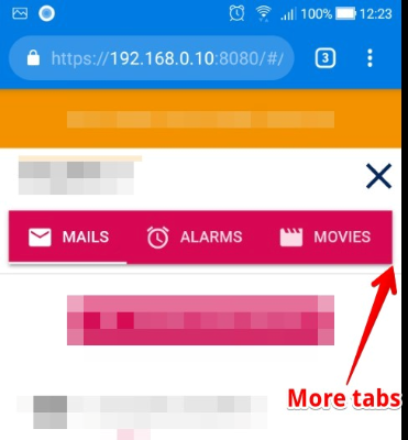
It turns to be a problem, because sometimes the right edge of QTabs is between two tabs (one tab is displayed, the next isn’t)
Therefore, a newcoming user has no way to tell if there is more tabs or not.
Would it be possible to have an option allowing to display a right arrow showing clearly to the user that more tabs are available?
 mpacary
All 9 comments
workaround
before all:
import {debounce, QTabs} from 'quasar';

QTabs.mixin({
    mounted() {
        if (this.$refs.content) {
            this.$refs.content.addEventListener('scroll', debounce(this.__updateArrows, 150));
        }
    }
});
css:
body.mobile
  .q-tabs__arrow
    display: inline-flex
  .q-tabs--not-scrollable .q-tabs__arrow
    display: none
 AjiTae
on 23 Aug 2019
AjiTae
on 23 Aug 2019
@AjiTae Does it still work for you ? For me it doesn't ... mind I don't even see the DOM element .q-tabs__arrow. They don't seem to render on a mobile.
 turigeza
on 5 Dec 2019
turigeza
on 5 Dec 2019
Yep, this commit brokes it.
We need official support for such behavior because monkey-patching is as unreliable as always.
AjiTae
on 5 Dec 2019
Has this change been incorporated into release yet? Arrows are not showing up for me on mobile.
 jblyberg
on 21 Dec 2019
jblyberg
on 21 Dec 2019
This feature should be incorporated into Quasar. Should this ticket get a feature request label?
 cristianomoraes
on 16 Mar 2020
cristianomoraes
on 16 Mar 2020
- same problem , no arrows ;-(
 nseb
on 9 Apr 2020
nseb
on 9 Apr 2020
Any updates on this issue?
 TG4LAaron
on 26 Jun 2020
TG4LAaron
on 26 Jun 2020
Apparently this is how it should work ...
https://forum.quasar-framework.org/topic/6102/no-arrows-in-q-tab-in-mobile-device/2
I don't get it though and from my experience people are missing the arrows.
turigeza
on 26 Jun 2020
Will be available in 1.12.9
 webnoob
on 10 Jul 2020
webnoob
on 10 Jul 2020
Related issues
 victorborgaco
·
3Comments
victorborgaco
·
3Comments
 jean-moldovan
·
3Comments
jean-moldovan
·
3Comments
 slowaways
·
3Comments
slowaways
·
3Comments
 wc-matteo
·
3Comments
wc-matteo
·
3Comments
 alexeigs
·
3Comments
alexeigs
·
3Comments
Most helpful comment
Will be available in 1.12.9