Quasar: About the time line component in small screen
The timeline is really amazing component!
Is there anyway to make it keep put the entry of timeline one left one right in the mobile device?
I know the design of it is to make more information showed, but sometimes, I think more user action will get user more fun
 Zhangshunyao
All 11 comments
What do you mean by one left one right? The line or text itself?
Scott
 smolinari
on 10 Aug 2018
smolinari
on 10 Aug 2018
the line entry, in the small size of screen, all will be list in the right side automatically, in the bigger screen, the entry can be set to right or left of the line.
Zhangshunyao
on 10 Aug 2018
That is what I thought you meant.
As I understand the QTimeline component, the CSS controlling the design is controlled by the screen size. Once the screen size goes below a certain breakpoint width, the timeline is formatted to "stick" to the right side version. To change that would take some major redesigning.
To be honest too, it doesn't look very good with the text on the left and the time line on the right, because the text is right justified. Alternating the sides would look even worse IMHO. I played around with the component to demonstrate what I mean.
To me, I think this is one of those things, where we are going to have to be happy with the design decisions made by the developers. 😄
Scott
smolinari
on 10 Aug 2018
Thank you Scott, it's really so nice of you :)
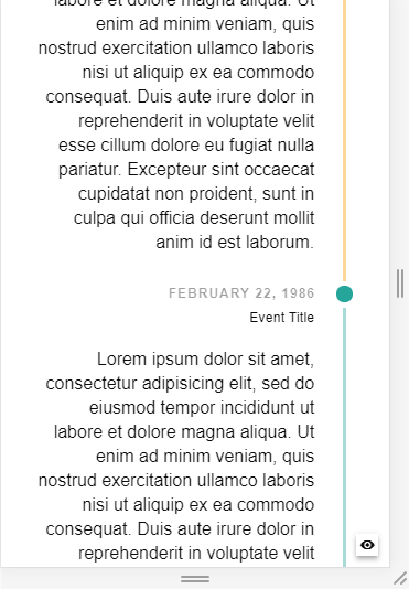
What I mean is that when use the Timeline in mobile device, it can be displayed as in the screenshot attached.
Even when user use a mobile phone, I don't want the window full of information, just leave some space with nothing, and user can scroll down to get more information.
Zhangshunyao
on 11 Aug 2018
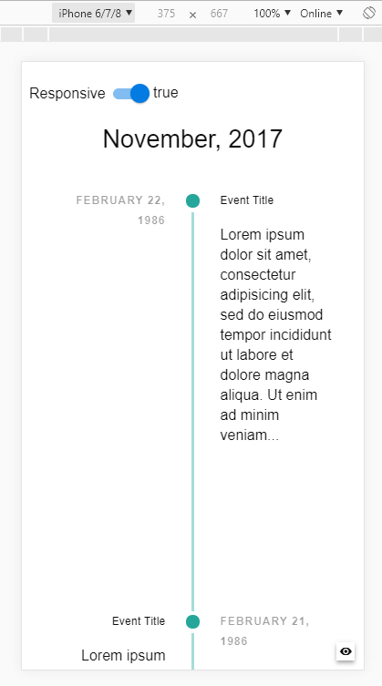
If you mean that you don't want the QTimeline to be responsive, just update to latest Quasar (currently v0.17.8). It's no longer responsive by default.
 rstoenescu
on 11 Aug 2018
rstoenescu
on 11 Aug 2018
If on the other hand you want the QTimeline items to be only on one side of the line only, then use the side prop (and if on Quasar v0.17.8 then also add the responsive prop). Then for second & third breakpoints all your items will be aligned on that specific side of the line.
Did I understand correctly?
rstoenescu
on 11 Aug 2018
Actually, I want the QTimeline items aligned that specified by the side prop, I want the first QTimeline item on the left of the line, the second is on the right of the line, the third is on the left...
I have noticed that the responsive is added into the version after 0.17.7, but I found that after I set _responsive=false_ the result is on the desktop screen, all the QTimeline items will be only on the right side of the line.
Below is what I wanted:
Under the mobile device (small screen)
the first QTimeline item on the left of the line
the second is on the right of the line
the third is on the left...
Is it possible?
Zhangshunyao
on 11 Aug 2018
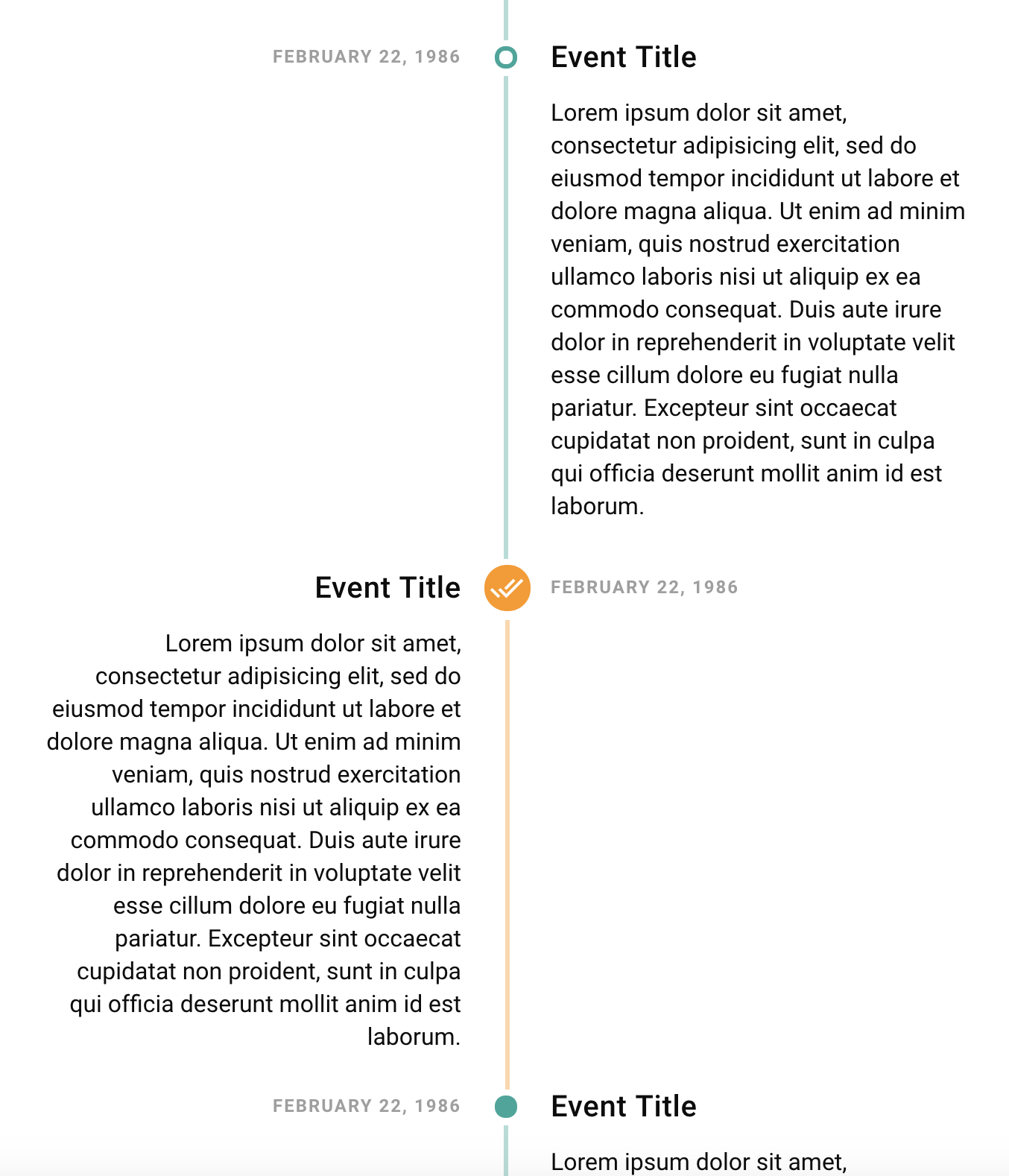
@rstoenescu - If you change @media (min-width $breakpoint-lg-min) to @media (min-width $breakpoint-xs-min) in the last media query in timeline.mat.styl, then you'll see what I believe he wants. He basically wants the side prop to work, even down to small screen sizes.
This is what I got playing around.
Notice the second timeline item is on the left. The first is on the right.
@Zhangshunyao - The height of the item can be controlled via CSS, so that the next item needs to be swiped up to be seen. I didn't make the item in the picture above that tall, so the switching of the side working at small screen sizes could be seen.
Scott
smolinari
on 11 Aug 2018
Many thanks!
Thank you so much!
@smolinari @rstoenescu
Zhangshunyao
on 11 Aug 2018
@Zhangshunyao - Thank you for the thank you. But, nothing has been done yet I believe. From my (not so extensive) knowledge of Quasar and front-end development with Vue in general, I highly doubt the changes I made above can be done in client-dev land, unless there is a way to override media queries in client-dev components. 😄 As I see it, this is a design decision within the QTimeline component.
I might be wrong with that though.... 😊
Scott
smolinari
on 11 Aug 2018
@smolinari I have tested it and it just as you said. But I believe that the way you point out is the right and the only way to get what I wanted. (change the setting of the default breakpoints)
Quasar is so powerful and really appreciated this great framework and great guys of you.
The request that '_when use mobile device but timeline prop side also worked_' maybe not very reasonable, so I will follow the design of quasar now
:

Zhangshunyao
on 11 Aug 2018
Related issues
 sskwrl
·
3Comments
sskwrl
·
3Comments
 victorborgaco
·
3Comments
victorborgaco
·
3Comments
 tombarfoot
·
3Comments
tombarfoot
·
3Comments
 green-mike
·
3Comments
green-mike
·
3Comments
 hctpbl
·
3Comments
hctpbl
·
3Comments
Most helpful comment
@rstoenescu - If you change
@media (min-width $breakpoint-lg-min)to@media (min-width $breakpoint-xs-min)in the last media query intimeline.mat.styl, then you'll see what I believe he wants. He basically wants the side prop to work, even down to small screen sizes.This is what I got playing around.
Notice the second timeline item is on the left. The first is on the right.
@Zhangshunyao - The height of the item can be controlled via CSS, so that the next item needs to be swiped up to be seen. I didn't make the item in the picture above that tall, so the switching of the side working at small screen sizes could be seen.
Scott