Quasar: [DESIGN/MATERIAL] 24h datetime picker has weird look
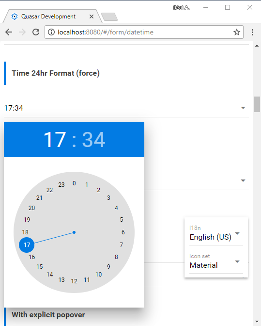
When using the datetimepicker with the format24h set, the hour-picker displays the hours in one circle going from 0 to 23. This is weird behaviour, since a clock only has 12 hours in a circle.
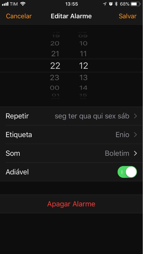
Android resolves this problem by using two concentric circles of numbers, one ranging from 1-12, the other ranging from 13-0.
See the image below.

 Marcel50506
All 10 comments
Can you post your code? Quasar version?
It works for me with V0.15 and the /form/datetime.vue demo/tests. See my screenshot below.
 realcarbonneau
on 26 Jan 2018
realcarbonneau
on 26 Jan 2018
Sorry, I miss-understood, and @rstoenescu clarified. I understand, and yes you are correct, my adroid does as you indicated.
realcarbonneau
on 26 Jan 2018
From a design point-of-view I find the Android-way even more weird because it's not really consistent: why should they put 00, 13 .. 23 on a visually different circle? Only because clocks usually have only 12h? Hours should have equal importance...
 zuck
on 26 Jan 2018
zuck
on 26 Jan 2018
Agreed, maybe it won't last!?
realcarbonneau
on 26 Jan 2018
From a design point of view, I think the android way tries to approach the clock as having 12 hours per circle. When I think of 13:00, my clock points to the same position as 01:00, so these positions should be similar. In the current timepicker, the 13:00 location is on the other side of the clock.
But besides design: Google/Android is using this 'two-circles' clock since Android L, which was introduced in 2014, about 3.5 years ago. I don't think they will change this pattern. IMHO, Quasar should follow that design, since users are already familiar with this pattern of time-picking.
Marcel50506
on 29 Jan 2018
I strongly agree with Marcel50506! Please consider change that weird design. Android solution is satisfactory! The interface's idea is to emulate a clock, and there is no clocks with 24hs....
 MoacirSchmidt
on 1 Feb 2018
MoacirSchmidt
on 1 Feb 2018
I'm posting the apple solution for your information. I think the solution for me is to use iOS theme only for this component. IMHO android's is better.
MoacirSchmidt
on 1 Feb 2018
Is there any update on this issue? Will this be picked up, and if so, in what timeframe?
Marcel50506
on 14 Feb 2018
This will get in. v1.0.
 rstoenescu
on 14 Feb 2018
rstoenescu
on 14 Feb 2018
Will be available in v0.17.12
rstoenescu
on 31 Aug 2018
Related issues
 victorborgaco
·
3Comments
victorborgaco
·
3Comments
 hctpbl
·
3Comments
hctpbl
·
3Comments
 jigarzon
·
3Comments
jigarzon
·
3Comments
 sskwrl
·
3Comments
sskwrl
·
3Comments
 mesqueeb
·
3Comments
mesqueeb
·
3Comments
Most helpful comment
From a design point of view, I think the android way tries to approach the clock as having 12 hours per circle. When I think of 13:00, my clock points to the same position as 01:00, so these positions should be similar. In the current timepicker, the 13:00 location is on the other side of the clock.
But besides design: Google/Android is using this 'two-circles' clock since Android L, which was introduced in 2014, about 3.5 years ago. I don't think they will change this pattern. IMHO, Quasar should follow that design, since users are already familiar with this pattern of time-picking.