Hi guys,
I have ask to my gf is she can make one for us.
I have explain her what our project do and use, i3, i3bar, python etc and she make this.
Here the first draft.
Do you like? Do you have comment?

Thanks :)
 cyrinux
All 33 comments
It's fun - and it scales nicely even at tiny sizes.
 tobes
on 23 Sep 2018
tobes
on 23 Sep 2018
Thanks a lot @cyrinux I've been willing to have a logo for so long...!
I like the idea of the logo tho I find it a bit "fat" compared to the i3wm one:

Maybe it's me and it's okay to not have the logo close to i3wm, but I always wanted to have something that shows they're bound together
On the color side, I'd be for diverging from official python colors and maybe get closer to i3wm colors as well
Thanks again!
 ultrabug
on 28 Sep 2018
ultrabug
on 28 Sep 2018
i3wm logo is kind of ugly
tobes
on 28 Sep 2018
@tobes that's why we can do better with :snake: !
ultrabug
on 28 Sep 2018
Thanks for your replies, gf will try to do another proposal.
cyrinux
on 29 Sep 2018
i3wm logo is kind of ugly
Maybe we need to be consistent here. Make our logo kind of ugly too. I used Comic Sans.
 lasers
on 4 Nov 2018
lasers
on 4 Nov 2018
Will reping my gf to see if she can find time for another try. Before this, do you have remark, you want someting special, change on the first version?
cyrinux
on 12 Feb 2019
@cyrinux Have you asked your lamb to work on this? If not, I can ask somebody else.
lasers
on 30 Mar 2019
@Tobaloidee
lasers
on 6 Apr 2019
Hi @lasers I can be of help here 👍
 Tobaloidee
on 6 Apr 2019
Tobaloidee
on 6 Apr 2019
will post here the design that I am going to came up with 💯
Tobaloidee
on 6 Apr 2019
Here's what i came up with @lasers @ultrabug ...I hope you like it..still open for suggestions.
-the logo design is minimal and clean..visible in small scales

Tobaloidee
on 6 Apr 2019
@Tobaloidee Very nice! Can we play with more things? I wonder how it would look like if it have more colors similar to Denver Nuggets logos and I also wonder how it would look like in non-Python colors (i.e. mockup violet color above).
Other thing. I wonder how it would look if we fill a partially filled square with a different color filler (i.e. darkblue) and still keep outer color square alone? Or add different color stroke/border? 2 vs 3 colors.
P.S. I like logo 2.
lasers
on 6 Apr 2019
Surely! will try some color combinations 👍
Tobaloidee
on 6 Apr 2019
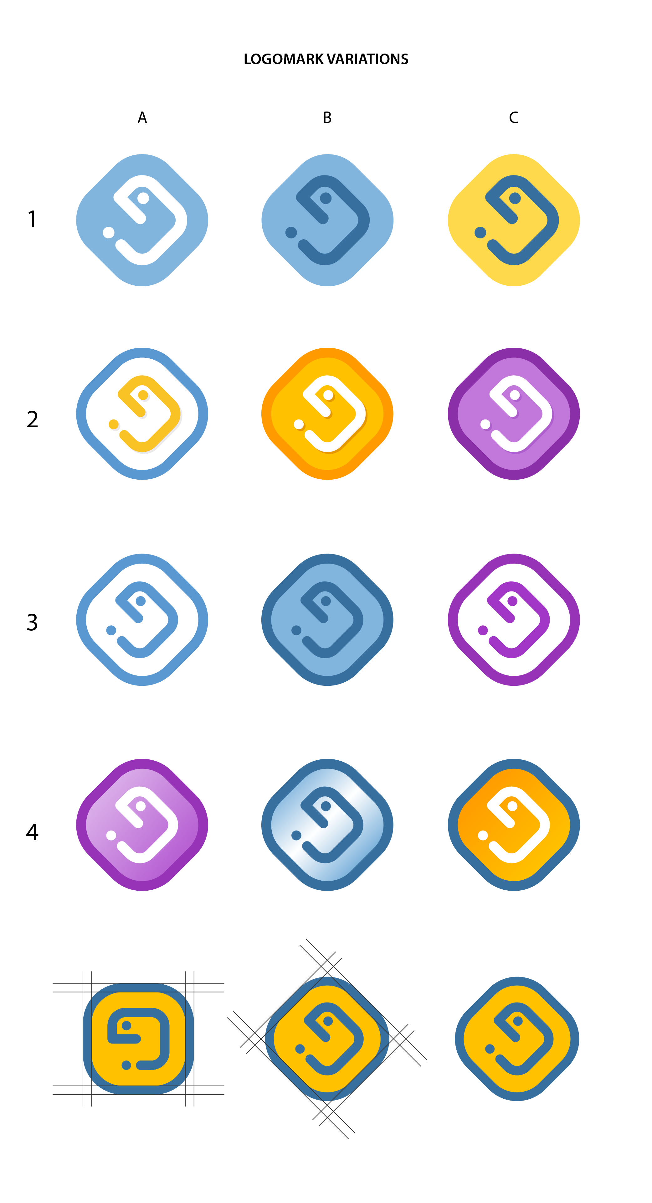
here
line 1 are the first draft
line 2 are 3 colored with shadow (denver nuggets 2A)
line 3 are outlines
line 4 are gradients
Tobaloidee
on 6 Apr 2019
Very, very nice job 👍 I like 1A the best, but regardless of the chosen colors, the concept is awesome!
 maximbaz
on 6 Apr 2019
maximbaz
on 6 Apr 2019
I didn't notice this before. The edges are wavy. I think it would look better straight and clean cut. Also, try B3 with inner yellow like A2 (and maybe add some white in there somehow). I like first line, C2 and denver nugget A2. Gradient A4 looks nice too. Not sure what color @ultrabug want to go with.
lasers
on 6 Apr 2019
So glad that you liked it @maximbaz 😃
@lasers when I finalize the logo it will be straighten up! 👍😃
Tobaloidee
on 6 Apr 2019
@lasers I have updated the display of the icons and made a straighten up version of the inner yellow that you said... It looks visually wavy but it is not..haha..
I'll wait for the final choice of @ultrabug to finalize it earliest tom!
Tobaloidee
on 6 Apr 2019
Also, try B3 with inner yellow like A2 (and maybe add some white in there somehow).
Sorry if I wasn't clear enough. See Sample 2. I made Sample 1 too. Sample 3, 4 is yours.


I'll wait for the final choice of @ultrabug to finalize it earliest tom!
I agree. Thank you for doing this! :smiley:
lasers
on 6 Apr 2019
Wow @Tobaloidee I'm speechless, the concept is just exactly what I had in mind and the result is stunning!
First of all, thank you so much!
I'm a big fan of both 1A and 2A, I just see them as two different declensions:
- 1A would be the basic / default one, the kind you can have a favicon out of
To take github as example, it's like having:

- 1B would be the colored one, the kind you can have your own variants of and play with
To take github as example again, would be like:

Does it make sense?
Thanks again!
ultrabug
on 6 Apr 2019
I really liked 4a or 1a, i like purple better than blue, but the concept dwarfs the importance of the color from my perspective.
 josefson
on 6 Apr 2019
josefson
on 6 Apr 2019
I finalized the files and uploaded & updated the readme file with this PR #1768
Also, you can download all the chosen (liked) versions of the logo HERE
if ever you want to use different color versions. I am glad to be of help to you guys! Whenever you need logo design just mention me in the future. :) Cheers!
*I am not sure if I did it right on the readme.rst codings.. peace! :)
Thanks and best regards!
-Tobaloidee
Tobaloidee
on 7 Apr 2019
Thanks a lot @Tobaloidee
Do you confirm all these versions are straighten ones? some of them look so to me while some others not... might be a visual effect tho
ultrabug
on 7 Apr 2019
Request a version of all logos rotated like A5 in case we don't like the visual effect / rotation / etc.
lasers
on 7 Apr 2019
Its all straighten up..i will upload to my drive the squared versions 👍 earliest tom @ultrabug @lasers
Tobaloidee
on 7 Apr 2019
Cheers @Tobaloidee will copy again when you confirm. Thanks again for your amazing work and reactivity :)
ultrabug
on 7 Apr 2019
I updated my DRIVE for the rotated versions @ultrabug 👍
Tobaloidee
on 8 Apr 2019
Thanks!
ultrabug
on 8 Apr 2019
@Tobaloidee hi, I forgot to ask you about the license you'd like the logo to be used upon please?
ultrabug
on 27 Apr 2019
It's 
This work is licensed under a Creative Commons Attribution 4.0 International License. 😃
Tobaloidee
on 27 Apr 2019
Thanks a lot @Tobaloidee :+1:
ultrabug
on 27 Apr 2019
I am just a mention away if you need help with logos in the future 👍👍👍😃
Tobaloidee
on 27 Apr 2019
Related issues
maximbaz
·
6Comments
maximbaz
·
7Comments
 FlorentDancy
·
6Comments
FlorentDancy
·
6Comments
 gmagno
·
6Comments
gmagno
·
6Comments
 CorruptCommit
·
5Comments
CorruptCommit
·
5Comments
Most helpful comment
I updated my DRIVE for the rotated versions @ultrabug 👍