Pwnagotchi: [BUG] webui zoom doesn't respect aspect ratio
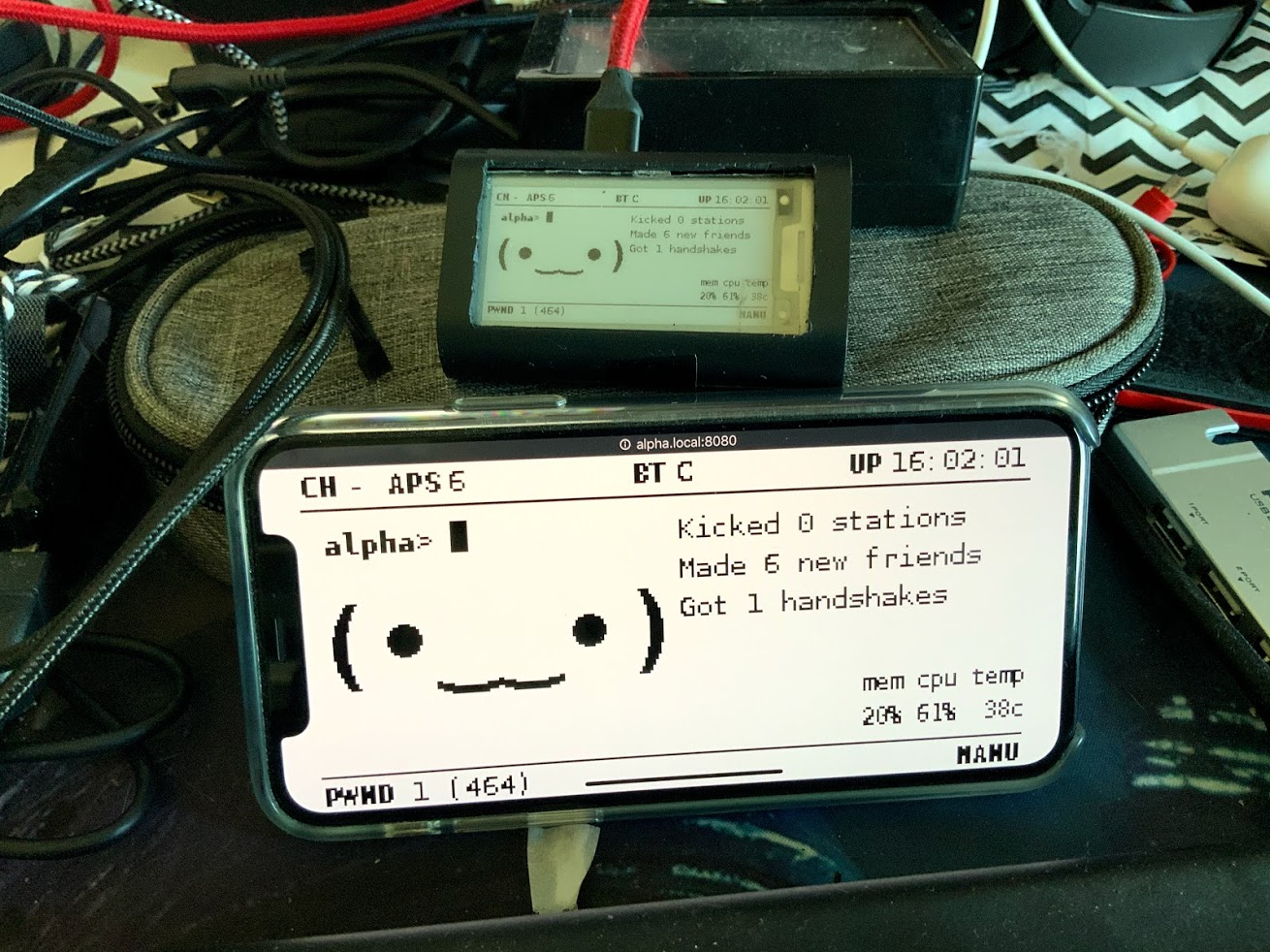
Given my noobiness in html and css, on some mobile devices the web ui is kind of crap in landscape mode, this is because the image width is just 100% and therefore its aspect ratio is taken into account instead of the display aspect ratio:
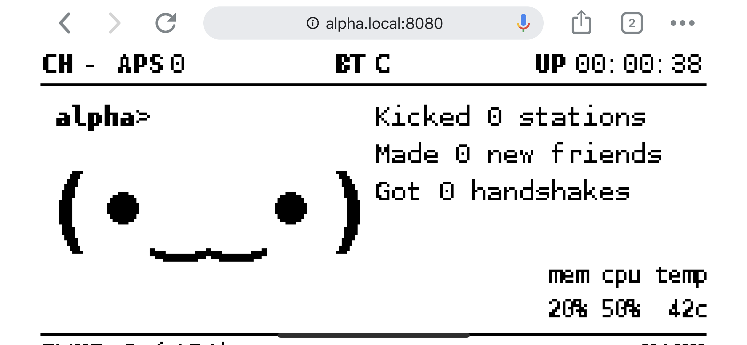
(notice the bottom part being not visible)
Ideally this should be fixed by something like https://stackoverflow.com/questions/42367898/css-image-full-screen-but-will-maintain-aspect-ratio
 evilsocket
All 15 comments
<div style="height: 100vh; width: 100vw;">
        <img src="http://zelda.local:8080/ui?1572971976843" id="ui" style="height:100%; max-width:100vw; object-fit: contain;">
</div>
I currently don't have a running unit with the current development version, so I can only test it with 1.1.0.
 deveth0
on 5 Nov 2019
deveth0
on 5 Nov 2019
it works!!!! :D
evilsocket
on 5 Nov 2019
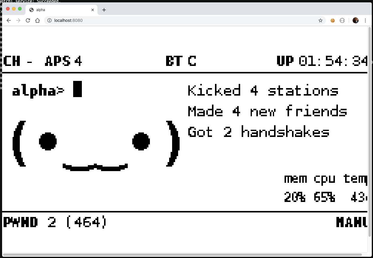
mmm it works on mobile ... but on desktop it takes full height, the picture is centered and buttons are not visible :/
evilsocket
on 5 Nov 2019
evilsocket
on 5 Nov 2019
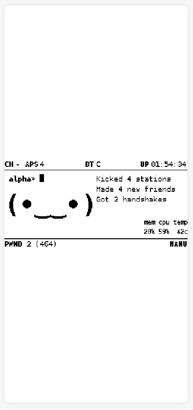
yep that only works for landscape :/
evilsocket
on 5 Nov 2019
ahh damn it, sorry :(
deveth0
on 5 Nov 2019
no worries, we'll figure this out ... somehow ...
evilsocket
on 5 Nov 2019
I'll give it a deeper look tonight with access to a computer
deveth0
on 5 Nov 2019
thanks a lot!
evilsocket
on 5 Nov 2019
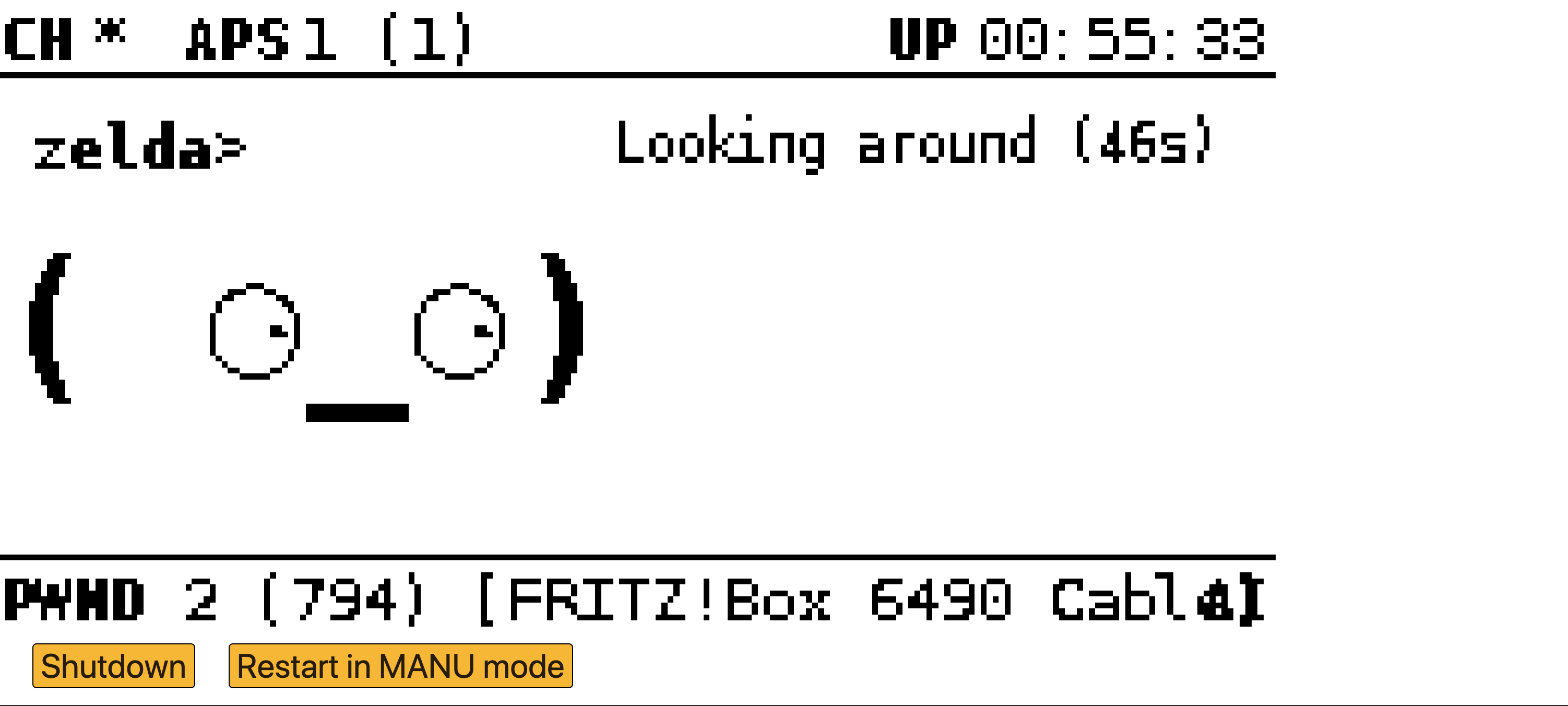
We really need to find a designer :D I just fixed the image issue and added some basic rules for the layout. Furthermore I increased the size of the buttons, they still look awkward but at least it's now possible to touch the right one ;)
deveth0
on 5 Nov 2019
PR: https://github.com/evilsocket/pwnagotchi/pull/535
hope this is ok now :)
btw: is there any easy way to run the web-ui locally do do some styling etc?
deveth0
on 6 Nov 2019
👍
evilsocket
on 6 Nov 2019
I would love to see that face on a big giant screen...
 mrseeker
on 6 Nov 2019
mrseeker
on 6 Nov 2019

evilsocket
on 6 Nov 2019
muahaha :D probably the buttons should be displayed in a flyout menu? but the aspect ratio of image and screen does not match, so this would only help a bit.
But hmm I'm again thinking of replacing the image with a html template which displays the stuff ... ;)
deveth0
on 6 Nov 2019
Related issues
 jeffedstrom
·
4Comments
jeffedstrom
·
4Comments
 dadav
·
4Comments
dadav
·
4Comments
 Baallrog
·
6Comments
mrseeker
·
7Comments
Baallrog
·
6Comments
mrseeker
·
7Comments
 myasn1k
·
7Comments
myasn1k
·
7Comments