Privacybadger: Replacement widget icons are outdated
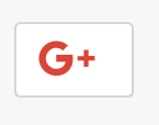
I mean this icon: https://github.com/EFForg/privacybadger/blob/master/src/skin/socialwidgets/GooglePlus.svg
What Privacy Badger is using:

The new one:
 theel0ja
All 15 comments
Also, at least FacebookLike, FacebookShare, Pinterest and Twitter buttons seem also be outdated.
theel0ja
on 4 Feb 2018
I created a fix for the google icon only: https://github.com/EFForg/privacybadger/pull/1926
I could not find SVGs of the other icons
 retiform
on 24 Mar 2018
retiform
on 24 Mar 2018
We could use PNGs too, SVGs just might be nicer (crisp at all resolutions).
 ghostwords
on 5 Apr 2018
ghostwords
on 5 Apr 2018
@ghostwords in that case, I might be able to fix the other icons too
retiform
on 5 Apr 2018
Hi, where can the "disabled by PB" icon be found? I'd be happy to help out if someone could point me in the direction of the PB icon asset.
 tashachin
on 16 Jun 2018
tashachin
on 16 Jun 2018
The icons are in src/skin/socialwidgets.
ghostwords
on 16 Jun 2018
It looks like that folder contains all the social media logos with the red disabled Badger added on.
I was wondering if there's just the red hexagon below somewhere in this repo?

tashachin
on 17 Jul 2018
Here is a higher resolution copy: https://github.com/EFForg/privacybadger/blob/9d8e273e35631d97d5ab6df5187559b4c44f843f/src/skin/badger-logo-revise-wide.png
ghostwords
on 17 Jul 2018
@ghostwords just looking into this. Before I start trying to help can I check a couple of things.
Where are these used?
Do they need to be exactly the same as others on the web or is this simply a case of making an updated version that looks more refined etc?
Thanks for the help
 RemakingEden
on 31 Jan 2019
RemakingEden
on 31 Jan 2019
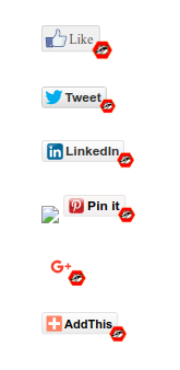
The icons are used by the placeholders that Privacy Badger uses to replace certain potentially-useful third-party page elements. We call these placeholders "replacement widgets".
The ones in this issue are specifically used for "social" buttons. You can see a bunch of them together on the ShareMeNot test page:
This issue is about updating the icons to the latest versions used by each corresponding service, with the Badger logo in the corner the same way it is now. The icon used for Google+ has already been updated: #1926
Let me know if this makes sense or not.
ghostwords
on 31 Jan 2019
@ghostwords that makes sense, thanks! I'll give it a go now and we can work out the details with the first pull request.
RemakingEden
on 1 Feb 2019
@ghostwords How would you feel about doing the share buttons like ShareMeNot do without the company logo. Just the privacy badger logo and then the word next to it? See the link you sent me
I feel like this may be more timeless and does not make the buttons look old as the companies contantly change their branding.
RemakingEden
on 1 Feb 2019
@ghostwords I have given it a go. I really struggled at making it SVG. For some reason even with the same size as the current the code makes my SVG images huge so I have moved to png. This shouldnt cause any problems unless the user zooms all the way in. I have changed a few things. Please see the pull request for a full list https://github.com/EFForg/privacybadger/pull/2287
RemakingEden
on 1 Feb 2019
I've also had a look at this and I have a few ideas.
It looks like there is potential for adding quite a few items to the sociallinks.json file so that the plugin covers more sites.
When it comes to using 3rd party logos, there are various rules that each third party has about how they want their logo used. We'd have to try and adhere to these standards so that we don't run into legal issues. A big no-no with all companies that care about their branding is allowing overlays on top of their logos.
I don't feel that SVG is the way to go here, since creation and maintenance is more challenging and the bandwidth saving is negligible in this case. I feel that the way to go is to create a set of standardized icons that can easily be generated from a master Photoshop file. From my quick testing, it seems like the icons are mostly just injected into the page and are not scaled, so I don't think that the trade-off between ease of use and scalability is warranted. We'd do fine with ~72px x 24px icons like the ones in the example below.
I've added some ideas here
In my mind, these icons exist simply to make the user aware that something has changed and that Privacy Badger has sanitized the buttons. So we don't need anything too obtrusive.
I've been tinkering with a few ideas, here are a couple of 'in the wild' screenshots of the 3 icons I've created so far to test with. I've took the brand guidelines for the major brands into account while designing the base icon.

If you folks think that this is useful at all and want me to send up a pull request with a full set of icons that replace the current set, just let me know.
Some considerations I had in mind while building these...
Buttons must:
- Be clean and easy to read
- Be styled to match the brand they are presenting
- Contain the logo
- Include Privacy Badger logo
- Look consistent
- Support white logos as well as color logos like the Google "G"
- Conform with most brand guidelines
- Not overlap logos
I think that absolute consistency in how the buttons look would help create a feeling of trust with users.
 sta55en
on 12 Apr 2019
sta55en
on 12 Apr 2019
Google+ is discontinued, so imo they should just be hidden.
theel0ja
on 3 May 2019
Related issues
 andresbase
·
4Comments
andresbase
·
4Comments
 cynddl
·
5Comments
cynddl
·
5Comments
 aphid
·
4Comments
aphid
·
4Comments
 hairetikos
·
3Comments
hairetikos
·
3Comments
 bitnik
·
5Comments
bitnik
·
5Comments
Most helpful comment
I've also had a look at this and I have a few ideas.
It looks like there is potential for adding quite a few items to the
sociallinks.jsonfile so that the plugin covers more sites.When it comes to using 3rd party logos, there are various rules that each third party has about how they want their logo used. We'd have to try and adhere to these standards so that we don't run into legal issues. A big no-no with all companies that care about their branding is allowing overlays on top of their logos.
I don't feel that SVG is the way to go here, since creation and maintenance is more challenging and the bandwidth saving is negligible in this case. I feel that the way to go is to create a set of standardized icons that can easily be generated from a master Photoshop file. From my quick testing, it seems like the icons are mostly just injected into the page and are not scaled, so I don't think that the trade-off between ease of use and scalability is warranted. We'd do fine with ~72px x 24px icons like the ones in the example below.
I've added some ideas here
In my mind, these icons exist simply to make the user aware that something has changed and that Privacy Badger has sanitized the buttons. So we don't need anything too obtrusive.
I've been tinkering with a few ideas, here are a couple of 'in the wild' screenshots of the 3 icons I've created so far to test with. I've took the brand guidelines for the major brands into account while designing the base icon.
If you folks think that this is useful at all and want me to send up a pull request with a full set of icons that replace the current set, just let me know.
Some considerations I had in mind while building these...
Buttons must:
I think that absolute consistency in how the buttons look would help create a feeling of trust with users.