Primeng: style default null value item on p-dropdown
I'm submitting a ...
[x] feature request => Please check if request is not on the roadmap already https://github.com/primefaces/primeng/wiki/Roadmap
Current behavior
The "Single" dropdown on the primeng dropdown page says "Select a city" with a value of null but the font color is black.
I think (especially in our case) it would make more sense from a UX perspective to have that default null value be grey. I haven't been able to figure out a way to style this in my application. I have a couple dropdowns where it says "select an item" with the value null, and i would like that item to be grey instead of black like the rest of the list items. That way it will match the other input fields surrounding it which have grey placeholders.
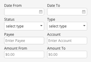
See this screenshot from a "Filters" button dropdown in my app (the date inputs also have grey mm/dd/yyyy placeholders, i fixed it right after i grabbed this shot):
 dhniels
All 8 comments
Was this added to 4.1.1? or has it been pushed off to another milestone?
dhniels
on 25 Jul 2017
For whatever reason, if the dropdown is set to editable=true, it has a grey placeholder. But none of the dropdowns in my app are or should be editable.
So I tried to set the color grey using the angular styles for .ng-pristine and .ng-untouched, it still doesnt work because they apply the grey color to ALL dropdowns even the dropdown has pre-filled or pre-selected an option.
I really dont see a way around this. The autocomplete and other input components all have grey placeholders, but Dropdown doesnt. hopefully this inconsistency is resolved soon as it causes some confusion in our app with all our input/date/autocomplete/etc placeholders being grey and the prime dropdown placeholders being black.
dhniels
on 16 Aug 2017
Status on this?
dhniels
on 26 Sep 2017
I have the same issue, color definition from .ui-placeholder is overridden by body .ui-inputtext (why it has .ui-inputtext class if it's not an input?).
Multiselect needs to be fixed as well (add ui-placeholder class to element when default label is displayed).
 bossqone
on 30 Sep 2017
bossqone
on 30 Sep 2017
I am facing the same problem. Is there a workaround which I could use 'til this issue is solved?
 cinnest
on 13 Oct 2017
cinnest
on 13 Oct 2017
@cinnest I'm using this rule in my global stylesheet. It works ok, but relies on angulars ng-pristine validation class.
p-dropdown.ng-pristine.null .ui-dropdown-label,
p-dropdown.ng-pristine.null .ui-dropdown-trigger {color: $color-grey-medium;}
@cagataycivici can you add this to the 5.2.5 milestone? for some reason its been assigned to 4.1.1
dhniels
on 19 Apr 2018
You can use .ui-placeholder to customize the placeholder value.
 cagataycivici
on 9 Jul 2018
cagataycivici
on 9 Jul 2018
Related issues
 Helayxa
·
3Comments
Helayxa
·
3Comments
Helayxa
·
3Comments
Helayxa
·
3Comments
 markgoho
·
3Comments
markgoho
·
3Comments
 pchristou
·
3Comments
pchristou
·
3Comments
 limjoonae
·
3Comments
limjoonae
·
3Comments
Most helpful comment
I have the same issue, color definition from
.ui-placeholderis overridden bybody .ui-inputtext(why it has.ui-inputtextclass if it's not an input?).Multiselect needs to be fixed as well (add
ui-placeholderclass to element when default label is displayed).