Prestashop: Subcategories menu is anarchic in default classic theme
Describe the bug
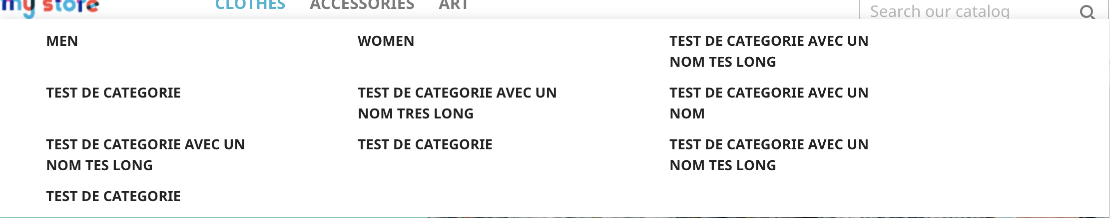
In a shop with default classic theme with a lot of subcategories, menu is unreadable because sub-categories are not aligned.
Expected behavior
A clear alignment of subcategories in menu.
Steps to Reproduce
- Create a lot of subcategories for a category
- Go to FO menu, subcategories are not aligned
Screenshots

Bootstrap is included in PrestaShop, so why don't use columns/grid system ?
Additional information
- PrestaShop version: 1.7.6.4
- PHP version: 7.1
 Klemart3D
All 11 comments
Thanks for opening this issue! We will help you to keep its state consistent
![prestashop-issue-bot[bot] picture](https://avatars3.githubusercontent.com/in/60395?v=4&s=40) prestashop-issue-bot[bot]
on 30 Apr 2020
prestashop-issue-bot[bot]
on 30 Apr 2020
Hi @PrestaShop/prestashop-product-team,
Is that something we can implement ? 😃
Thanks !
 florine2623
on 30 Apr 2020
florine2623
on 30 Apr 2020
@Klemart3D, thanks, indeed it'd be great, especially for stores with large catalogs.
 LouiseBonnard
on 30 Apr 2020
LouiseBonnard
on 30 Apr 2020
Every solutions would introduce breaking changes on this one, but it looks necessary, should we improve it anyway ? (and document the BC) @PrestaShop/prestashop-maintainers ?
 NeOMakinG
on 26 Oct 2020
NeOMakinG
on 26 Oct 2020
Every solutions would introduce breaking changes on this one, but it looks necessary, should we improve it anyway ? (and document the BC) @PrestaShop/prestashop-maintainers ?
Can we not aim for the "Aligning sub-categories" by just adding the right bootstrap CSS classes ? I'm wondering if we can achieve a 70%-correct result without BC breaks.
 matks
on 26 Oct 2020
matks
on 26 Oct 2020
I'm gonna take a look, but I doubt about it since even adding bootstrap classes means "adding different style than before", then it's a BC break as theme developers may had to deal with the past style and that won't work in next release!
NeOMakinG
on 26 Oct 2020
Even with a grid system, this is so ugly/no understandable. It should be a column layout, not a row one.
But this is a BC anyway
NeOMakinG
on 26 Oct 2020
wdyt @PrestaShop/product-team @PrestaShop/ux-team ?
NeOMakinG
on 26 Oct 2020
Hello everyone!
Thank you @Klemart3D for your report.
As we can see, subcategories aren't well aligned. This is why it becomes difficult to read it even with a row layout. Plus, we see a lot of space loss and that doesn't help.
I tried to add more subcategories on the menu to cover a maximum of use cases and I was surprised to see that there isn't any depth limit by creating new subcategories. Currently, there is no indication when a subcategory has reach the 4th depth level, so users can't visually understand it.
I will submit 2 design propositions showing at least a maximum of 4th depth level. And if users want to add a 4th subcategory, they will unfortunately do some customizations. I changed the capital letters because it seems to be aggressive.
Design proposition 1:

To avoid bad UX, I will also add a hover delay of at least 300ms so users won't struggle reaching and clicking the right subcategory.
This design allows users to easily add/show more than 3 subcategories but it will get uglier and difficult to reach.
Design proposition 2:

This second design will allow users to quickly reach the subcategory that they are looking for and add/show more than 3 subcategories, but it will also get uglier and difficult to reach.
Wdyt?
 prestascott
on 10 Nov 2020
prestascott
on 10 Nov 2020
Hi @prestascott, thanks for your work!
A menu with 3 depth level seems a very good beginning.
When we are looking for e-commerce mega menu trends, left column is very often used as first or second level element of hierarchy: https://www.lafabriquedunet.fr/creation-site-ecommerce/articles/mega-menu-ecommerce-tendances/
May be a third solution can be good by mixing the left column of your 1st proposition and the grid of 2nd proposition for deeper levels like on Amazon, Fnac, Priceminister (now Rakuten) or B&Q websites?
Klemart3D
on 10 Nov 2020
Hi @Klemart3D, your welcome :)
I'm aware of the e-commerce mega menu trends, but the thing is that the Theme Classic's purpose is to cover a maximum of use cases with basic and essential features.
There is already plenty of modules available on PrestaShop Addons Marketplace depending on what you want for your e-commerce that you can install.
I was also thinking about mixing both design but it's becoming complicated...
Also keep in mind that the more complicated the feature, the more breaking changes there will be.
prestascott
on 12 Nov 2020
Related issues
 rGaillard
·
3Comments
rGaillard
·
3Comments
 sandra2n
·
3Comments
matks
·
3Comments
sandra2n
·
3Comments
matks
·
3Comments
 esistgut
·
3Comments
esistgut
·
3Comments
 prestonBot
·
3Comments
prestonBot
·
3Comments
Most helpful comment
@Klemart3D, thanks, indeed it'd be great, especially for stores with large catalogs.