Powertoys: [Read Me] Visually improve the ReadMe
The other day, I was referring to PowerToys and try to explain FancyZones to a colleague. He mentioned that the ReadMe file didn't contain any images to show off some of the features (so he had to look for the right link to bring him to the FZ readme).
And I think he's right: the ReadMe looks quite 'boring', and still uses the old app icon. With //Build/ around the corner, I can imagine traffic going up so having an appealing ReadMe might be good to have in place.
I think in terms of content we're fine, but maybe adding some images?
- Update icon
- Add some sort of 'hero image' at the top?
- Add screenshot per feature.
The Microsoft MRTK repo is a nice example:
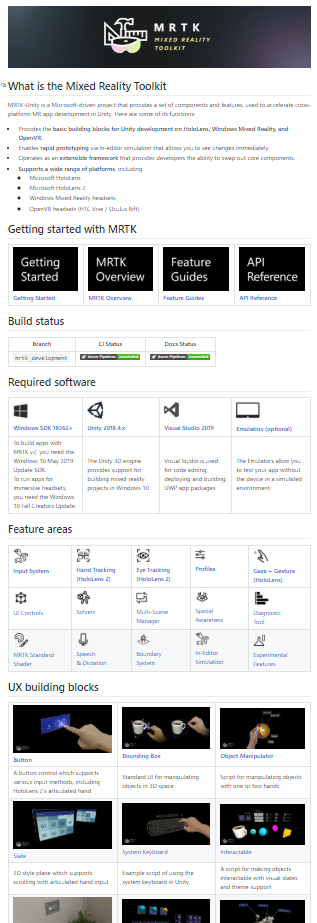
Maybe some of the designers around here could pitch in with a nice hero image :)?
 niels9001
All 16 comments
Also the link to the devdocs is broken.
I miss a description for the steps between install visual studio an opening PowerToys.sln in the devdocs. This is a needed information for poeple start developing/building the first time.
 htcfreek
on 7 May 2020
htcfreek
on 7 May 2020
We can change the first sentence of the Contributing section.
Original
This project welcomes contributions of all times.
Proposal
The PowerToys are developed from a large community of different Poeple.
Our goal is making them great for you.

We welcome contributions of all times.
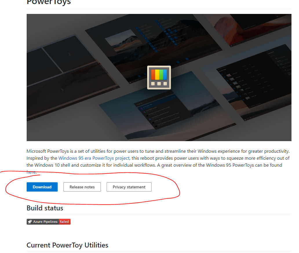
I gave it a first shot here: https://github.com/niels9001/PowerToys/
It's mostly about adding some images here and there to make it visually more appealing :).

Thoughts @crutkas?
niels9001
on 9 May 2020
I love especially the header image.
htcfreek
on 9 May 2020
I like it a lot. Maybe a quick link horizontal section for quick links to like download / release notes / privacy policy?
 crutkas
on 10 May 2020
crutkas
on 10 May 2020
One q, why list vs grid of items?
crutkas
on 10 May 2020
One q, why list vs grid of items?
I was trying to do a grid, similiar to the MRTK sample. However, we have long feature descriptions. If we reduce those to e.g. a single sentence, that could work.
niels9001
on 10 May 2020
@crutkas For the shortcuts, would something like this work?
niels9001
on 11 May 2020
@niels9001
I known that this is a first test and I like it. ♥️
I have seen that the text rendering on small device should be optimized. The text wrap around images and the buttons is incorrect.
Sory that I can't provide a screenshots.
htcfreek
on 11 May 2020
@niels9001 is that possible to do those style buttons in markdown?
crutkas
on 11 May 2020
@niels9001 is that possible to do those style buttons in markdown?
Nope. Maybe with some HTML (but I think md support is pretty basic)?
These buttons are just images (screenshots of the Fluent/Fabric UI web toolkit) with a link. Not perfect, but should do the trick.
niels9001
on 11 May 2020
Let’s do links at first and then improve later. Needs to be accessible and work if someone wants to translate.
crutkas
on 11 May 2020
Could we use css styled html buttons?
htcfreek
on 11 May 2020
Could we use css styled html buttons?
Doubtful. Rather do a first pass then investigate updates.
crutkas
on 11 May 2020
Yeah, look into that. Let's stick to default links for now.
@crutkas What links do we need at the top? And can I open a PR to get this in?
niels9001
on 11 May 2020
@crutkas
Do we need a link to notice.md in the Read Me? (Maybe next to the Release Notes link.)
htcfreek
on 13 May 2020
Related issues
 Kazamario
·
3Comments
Kazamario
·
3Comments
 xfirf
·
3Comments
xfirf
·
3Comments
 enricogior
·
3Comments
enricogior
·
3Comments
 aminya
·
3Comments
aminya
·
3Comments
 Satanarious
·
3Comments
Satanarious
·
3Comments
Most helpful comment
I gave it a first shot here: https://github.com/niels9001/PowerToys/
It's mostly about adding some images here and there to make it visually more appealing :).
Thoughts @crutkas?