Powertoys: [FancyZone] - Editor v2
FancyZone Editor v2
Current list of like-to-have improvements
- Improved Multi-monitor awareness and editing
- Easier renaming
- Better initial screen. Currently it is all about creating versus what i have done in the past. This would allow for easier hot swapping of layouts. One unified screen showing predefined templates and custom layouts.
- A single, holistic way for customizing layout. (hinted in #582)
- I can edit a base template where it only splits but a custom only does custom size windows
- even a "custom" base only does split
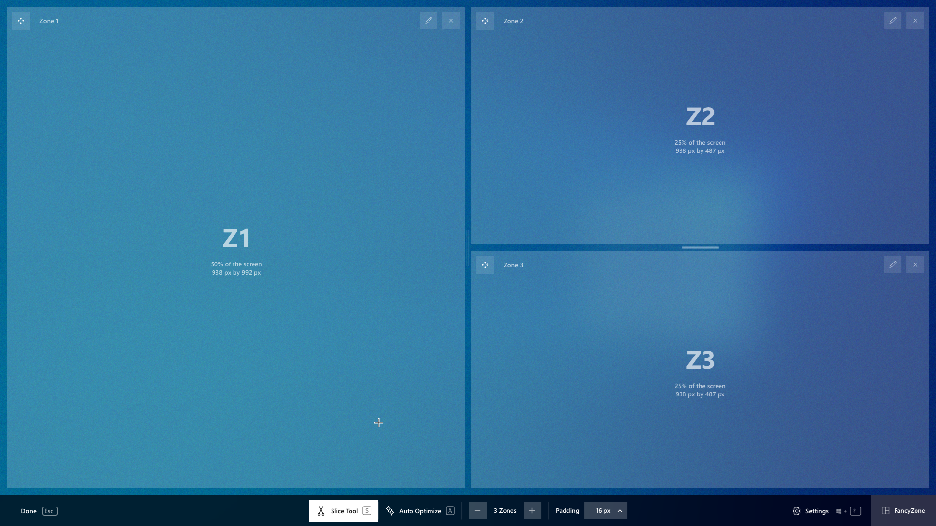
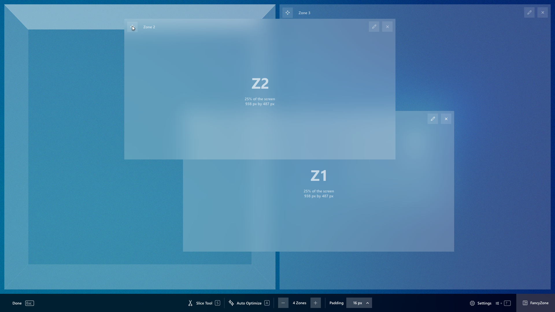
- Zone numbering (zones overlays need numbering as well for snapping)
- Fine control for size zone adjustment (x/y, z-index, height / width)
- Straight forward way to add / delete splitters (#581, #750)
- Support for dark mode and high contrast. (#326)
- Have different setups for different configurations (#177) (at work vs home)
- Disable layouts that don't fit the screen orientation (landscape vs portrait) or don't have the same screen ratio
- Default space around zones value is the last value used
Things to think about:
- Possibly think about 'magnetic / dock sides'
- Percentages versus hard numbers. This will allow me to move a custom layout instantly to a different resolution monitor
- how a zone can cross monitor boundaries
FAR from done / perfect but doing a first stab at a spec.
https://github.com/microsoft/PowerToys/blob/dev/crutkas/FzEditor2Spec/doc/specs/FancyZoneEditorV2.md
 crutkas
All 54 comments
Another vote for for the importance of Zone-Numbering.
Before I could only come up with rather implausible theoretical situations, why it's needed, but now I actually stumbled over it in actual use:
Here's a reencatment of the scenario:
https://www.youtube.com/watch?v=R5hBqY5GZz4&feature=youtu.be
Also notice that there was a very clear user expectation (well my own, but I think it was plausible) that directly contradicted with the "hidden numbers".
So instead of only showing me what Zones 1, 2, 3 are, I think there should also be the option of telling the editor what 1,2, and 3 are.
Right-clicking into a Zone is currently treated the same as a left-click (which is frankly irritating, since a Windows-user naturally expects more options when right-clicking).
If I click somewhere into Zone 1, it could instead show a variable-size context menu that says:
swap with Zone 2
swap with Zone 3
...
swap with Zone n
And having a right-click menu for a Zone is also a good home for Zone-specific functionality, that hasn't been thought of yet. Or for Layout-specific settings, too.
 DavidGretzschel
on 31 Dec 2019
DavidGretzschel
on 31 Dec 2019
It'd be nice if the zones could display their coordinates and size in the editor. Also, it'd be great if there was a way to snap a zone to a specific size easily like 1920x1080.
 hawkerm
on 30 Jan 2020
hawkerm
on 30 Jan 2020
it'd be great if there was a way to snap a zone to a specific size easily like 1920x1080.
@hawkerm As in presets or would just having txt fields be enough where you could input the numbers
crutkas
on 31 Jan 2020
@crutkas input fields minimum, presets nice to have.
hawkerm
on 31 Jan 2020
I've been using DisplayFusion's monitor splitter for a long while. So far I really like what I see in FancyZones, and it seems quite a bit faster overall than DisplayFusion, but I am missing some of the features from DisplayFusion in terms of both configuration and runtime behavior:
- Explicit configuration of zone dimensions - I'd like to be able to click on a zone and say that it should be (0, 0) - (1719, 1439), add another that's (1720, 0) - (2579, 719), etc. That would allow me to VERY carefully configure my zones so that they're non-overlapping and each takes up the exact proportion of the screen that I prefer for the app(s) that I'll place there.
- Explicit numbering of zones - Others have already mentioned this, but it's very useful when combined with Win+Left/Right for a sort of "tab ordering" behavior when moving windows, both within a screen's zones and across multiple screens' zones.
- Snapping to zones when dragging windows - In DisplayFusion when I start dragging a window, the various zones highlight. If I drop a window, it snaps to the highlighted zone for both size and position. I can hold a modifier key to suppress this behavior and allow arbitrary drag-and-drop movement of windows as well.
- (Stretch goal) Zones for the task bar - This is another thing that DisplayFusion allows. I have two UWHD screens, so having the task bar extend across the full width isn't very helpful. In DisplayFusion I can designate zones that should have the task bar and those that shouldn't. I only add the task bar to the two "innermost" zones of the side-by-side screens.
Anyway, just adding to the wish list that's developing here...what you guys have done so far is pretty fantastic! Keep up the great work!
 SCWells72
on 25 Feb 2020
SCWells72
on 25 Feb 2020
FAR from done / perfect but doing a first stab at a spec.
https://github.com/microsoft/PowerToys/blob/dev/crutkas/FzEditor2Spec/doc/specs/FancyZoneEditorV2.md
crutkas
on 26 Feb 2020
@SCWells72
- Could do magnet snapping to solve the overlapping issue.
- called out in the rough spec
- don't we do that already w/ shift key?
crutkas
on 26 Feb 2020
@crutkas I didn't realize that shift+drag would constrain to defined zones. That's great! I guess I need to pay better attention to the documentation.
SCWells72
on 26 Feb 2020
We need better OOBE :)
crutkas
on 26 Feb 2020
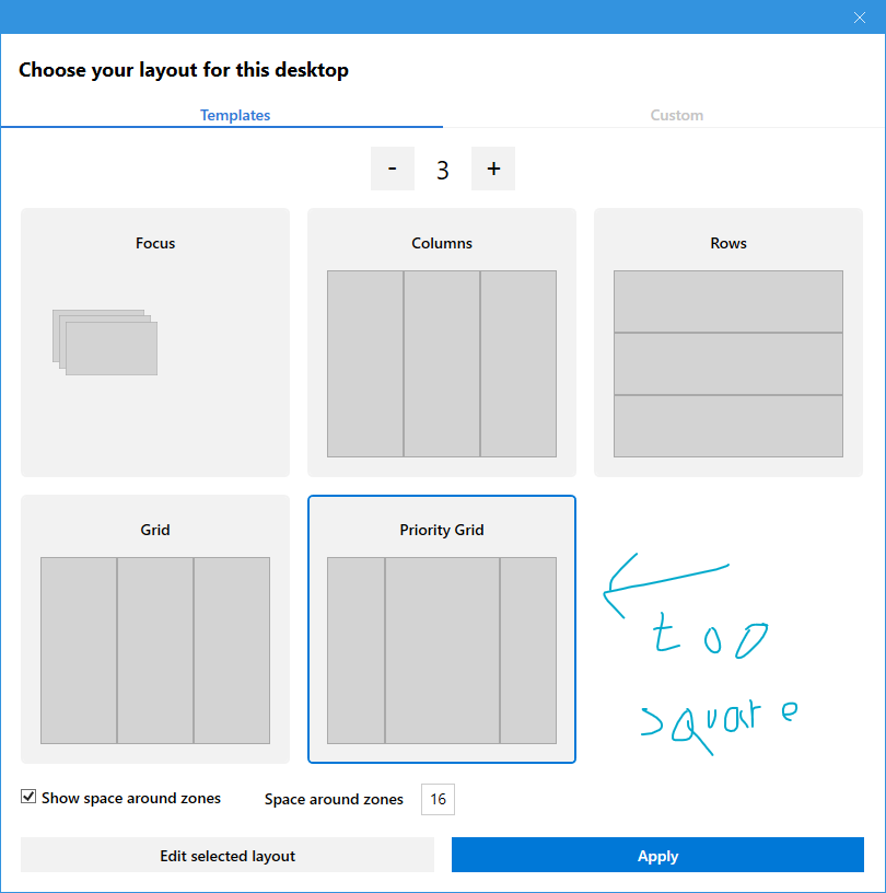
I found inconsistent that there is an icon to delete a custom template (one click) and a general button to edit a selected template that requires to click in two places that can be very apart from each other. Let's just get rid of the Edit selected layout and add an edit icon beside the delete icon. Also the delete command doesn't prompt for confirmation and it doesn't have an undo option, we need at least one of them, better to have both.
Using the same logic, it would be nice to remove the Apply button as well, and allow to apply a template with just one click.

 enricogior
on 28 Feb 2020
enricogior
on 28 Feb 2020
When adding new zones in a custom template, the new zone should be of the same size of the last added zone.
enricogior
on 28 Feb 2020
Yes times 1000 for both edit, delete, apply
Using the same logic, it would be nice to remove the
Applybutton as well, and allow to apply a template with just one click.
crutkas
on 29 Feb 2020
Linking user's feedback on current limitations/problems when creating layouts for multiple monitors
https://github.com/microsoft/PowerToys/issues/941#issuecomment-595161508
enricogior
on 5 Mar 2020
It'd be neat if one could color Layouts in the window. Just right-clicking a layout and giving it a pink/red/green/teal background. Grey is overrated.
Also this would make night-mode less depressing, once it gets implemented.
If that burns the eyes too much, then maybe pastel colors?
If that was implemented, one step further would be to make the Layout use its own individual "Zone Highlight Color", instead of that being a global setting. Would make orientation easier.
Text + some abstract line-drawing looks similar to....... all the other text and other line drawings next to it. Not so much an issue with five Layouts. Definitely starting to slowly become an issue with 20.
I tried to use icons already to solve that, but then this happened https://github.com/microsoft/PowerToys/issues/1719.
Also the icons were monochrome. If you ever manage to make icons not crash and delete all Layouts, please don't make icons show as monochrome.
If monochrome icons are part of the Windows-guidelines these days, please ignore them.
Monochrome icons are incredibly joyless. Like toast. Except not toasted. And with no butter.
DavidGretzschel
on 26 Mar 2020
@DavidGretzschel
we are adding more and more configuration options, in 0.16 you will be able to choose the color for the non-active zones and also the border color and choose if you want the dragged window to be transparent while moving it, see https://github.com/microsoft/PowerToys/pull/1666#issuecomment-603159189
enricogior
on 27 Mar 2020
@enricogior
excellent! Forgive me, if my suggestion was redundant or somewhat uninformed. Figuring out what's already planned or which bug is already reported or fixed in some late release is difficult to figure out sometimes. Everything is in seperate issues and Github is a bit of a sprawl.
DavidGretzschel
on 27 Mar 2020
I know, it's not easy, especially because we are in technical preview mode and our plans are changing quickly. In time we will have more stable planning and better communication with the community, that, btw, has been amazing so far, all the input is appreciated!
enricogior
on 27 Mar 2020
I would like to share a few implementation details so we are all on the same page.
At present, the FZ editor is not multi monitor aware when editing/saving custom layouts.
When opening the editor on a specific monitor, the editor loads all the existing custom layouts regardless if they were created on a different monitor with a different resolution/DPI scaling.
Custom layout are saved with coordinates and size that may not make sense on a different monitor. (We do save the screen size of the monitor on which the layout was first created).
We may consider to use % (but it can't be on a 0-100 scale since it would not allow for precise positioning). But my question is if it does make sense to have it in the first place.
Who's gonna use a layout designed for a landscape monitor in portrait mode, or a layout for a ultra wide screen on a regular screen?
It may make sense to support different scaling when the monitors have the same aspect ratio, but also in that case I'm not sure it does have a practical application.
In order to design the UI for supporting multi-monitor in the editor, we first have to decide if we want to only show the existing custom layouts that match the current monitor aspect ratio/screen size.
I my opinion we should do so, because it also make sense for features like switching layout on the fly: it should only cycle through layouts that are designed for that screen size.
For the templates we support any screen size, since they are saved using %, but as soon as they are edited to split the predefined zones, they also may stop making sense on different monitors.
Feedback?
enricogior
on 29 Mar 2020
In editor v2 we should also allow to turn off zones on a screen https://github.com/microsoft/PowerToys/issues/192
enricogior
on 31 Mar 2020
Supporting different scaling options for monitors with the same aspect ration does have an application. Namely when you change the scaling on the same monitor, the Layout should still behave the same way. On my 4k monitor I often change the scaling between 100%, 125% and 150%.
100% when my eyes are still fresh and I want to see a lot of info at once.
Once it gets darker, the contrast in the room gets worse, my eyes get tired and/or I don't want to be so close to a screen anymore, I naturally will have to reduce the info density and will need to increase the size of UI elements a little. I severely dislike that it takes so many button presses to change it, but I do it often nevertheless.
If https://github.com/microsoft/PowerToys/issues/1052 should get implemented and I could control DPI via a hotkey, I'd use it a whole lot more.
Also anyone with a flexible VESA arm, where you can quickly change the viewing distance likely changes their DPI a lot.
edit:
I really dislike having to DPI-scale. But as long as high-res e-ink monitors or cheap AMOLED monitors aren't on the market, eye fatigue will mean, you just can't stay at peak visual acuity to efficiently drive all those pixels.
DavidGretzschel
on 5 Apr 2020
Would it be possible to edit zones using a text editor, so we could exactify things?
 JerseyGryphon
on 6 May 2020
JerseyGryphon
on 6 May 2020
Would it be possible to edit zones using a text editor, so we could exactify things?
It is a JSON file so you can right now :). What I think would be better is to enable the UX to do that
crutkas
on 6 May 2020
@crutkas Where is the JSON file located? Sounds like that's exactly what I've looked for in the past but couldn't find. Thanks!
SCWells72
on 6 May 2020
C:Users{UserName}AppDataLocalMicrosoftPowerToysFancyZoneszones-settings.json
JerseyGryphon
on 6 May 2020
Here's a wild thought on the UX, let me know what you think!
https://youtu.be/3t8Ss06HyBc
 tonyshixd
on 9 May 2020
tonyshixd
on 9 May 2020
@tonyshixd
I think it's lovely. I enjoy the redundant (in a good way!) presentation of the Zone number, that it shows you the % of space used as well as the exact pixels. And that you also see all those things when you're outside of the editor.
Not sure what "drag here to reposition" means. I'd hope it's about determining which Zone gets which Zone number?
DavidGretzschel
on 9 May 2020
@tonyshixd
I think it's lovely. I enjoy the redundant (in a good way!) presentation of the Zone number, that it shows you the % of space used as well as the exact pixels. And that you also see all those things when you're outside of the editor.
Not sure what "drag here to reposition" means. I'd hope it's about determining which Zone gets which Zone number?
That’s a really good point! It is supposed to let you drag the zones to another location and reorganize the screen without having to edit/delete other zones. But I think I will reconsider that aspect with more clarity. Thank you for the feedback!!
tonyshixd
on 9 May 2020
Would it be possible to edit zones using a text editor, so we could exactify things?
It is a JSON file so you can right now :). What I think would be better is to enable the UX to do that
Okay, I've managed to load and edit the JSON, so my windows are all exactified now.
JerseyGryphon
on 9 May 2020
@tonyshixd
I really like the concept, but it seems like it requires space between zones to be always present.
It would be better to not have that requirement.
enricogior
on 11 May 2020
some more screenshots from @tonyshixd
crutkas
on 2 Jun 2020
Tony's idea here also was to configure stuff all at the same time, all monitors at once
crutkas
on 2 Jun 2020
Discussion: layout selection and management
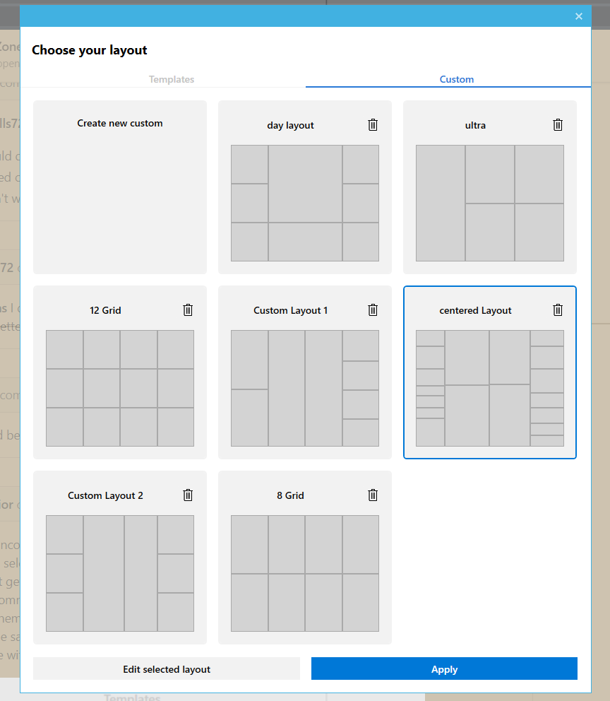
Managing grid/canvas layouts is a bit cumbersome at the moment. The following usability issues are tracked (in various issues already):
- No standardized way to create a new grid/canvas zone. To create a new grid layout, users need to
| Issue | Description|
|---------|----------|
| 1. Tabs: templates vs. tabs | Duplicating 'templates' will create a new 'custom' layout. This is somewhat confusing, and it would be nice to treat all layouts equal: some come with FZ out-of-the-box but can be removed by the user. Removing tabs would provide a better overview and simplify the overall UX and quick layout selection. It would also improve the overall accessibility (e.g. keyboard interaction). |
| 2. Creating new layouts | There's no standardized way to create new layouts: grid layouts need to be cloned, canvas layouts can be created with a 'create new layout' button. From a technology point-of-view it's the same, but from a user perspective it's not. Which is confusing. |
| 3. Deleting layouts | Currently, only 'custom' layouts can be deleted.
| 4. No ability to duplicate | There's no uniform way of duplicating layouts to make e.g. small tweaks |
UX proposal
These are some (very!) draft UX proposals of what a simplified layout could look like.
Layout management and hot swapping
Removing the tabs, and having 1 gridview that contains both canvas and grid layouts. Selecting a layout would enable the edit / apply buttons.
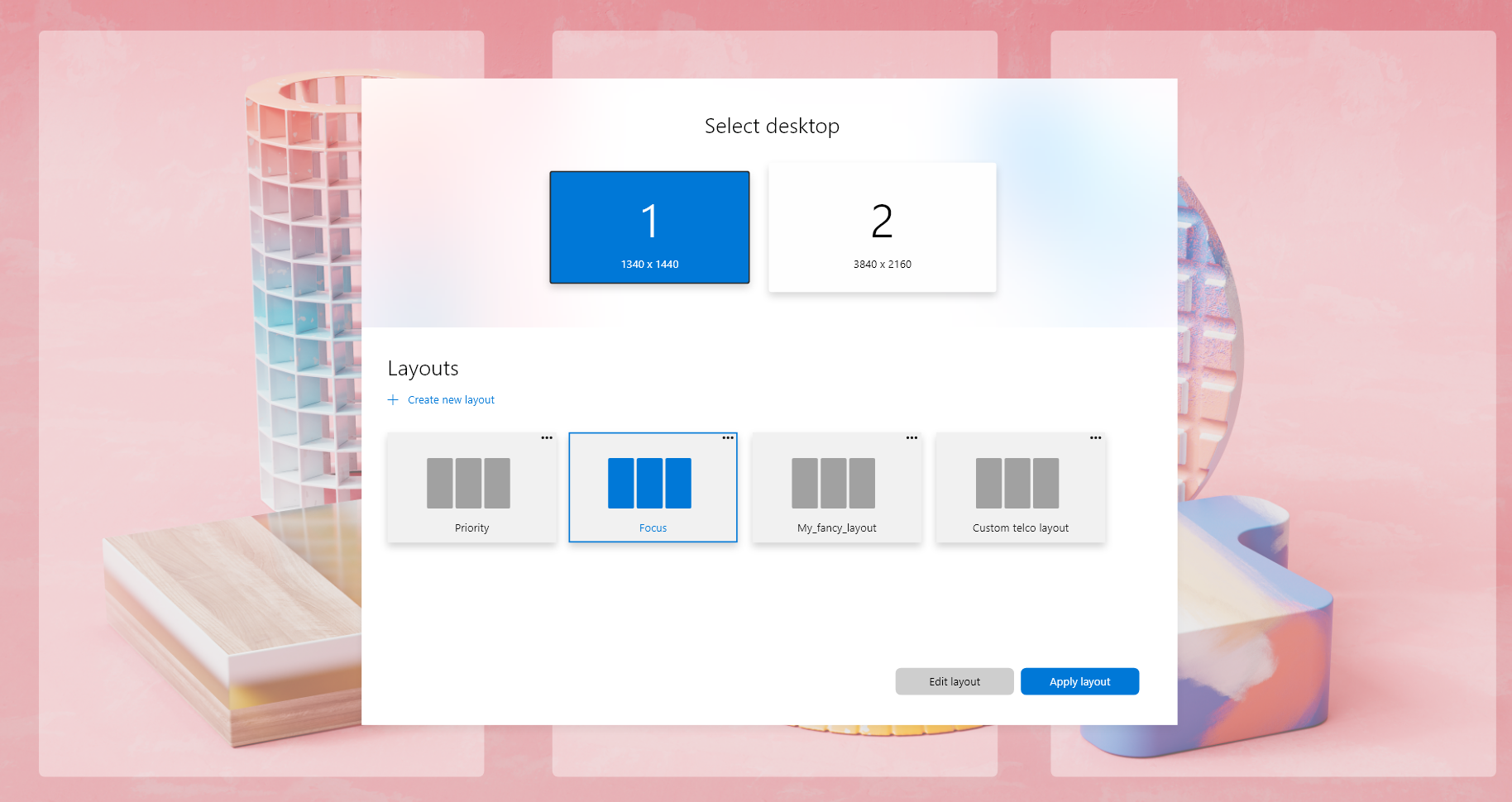
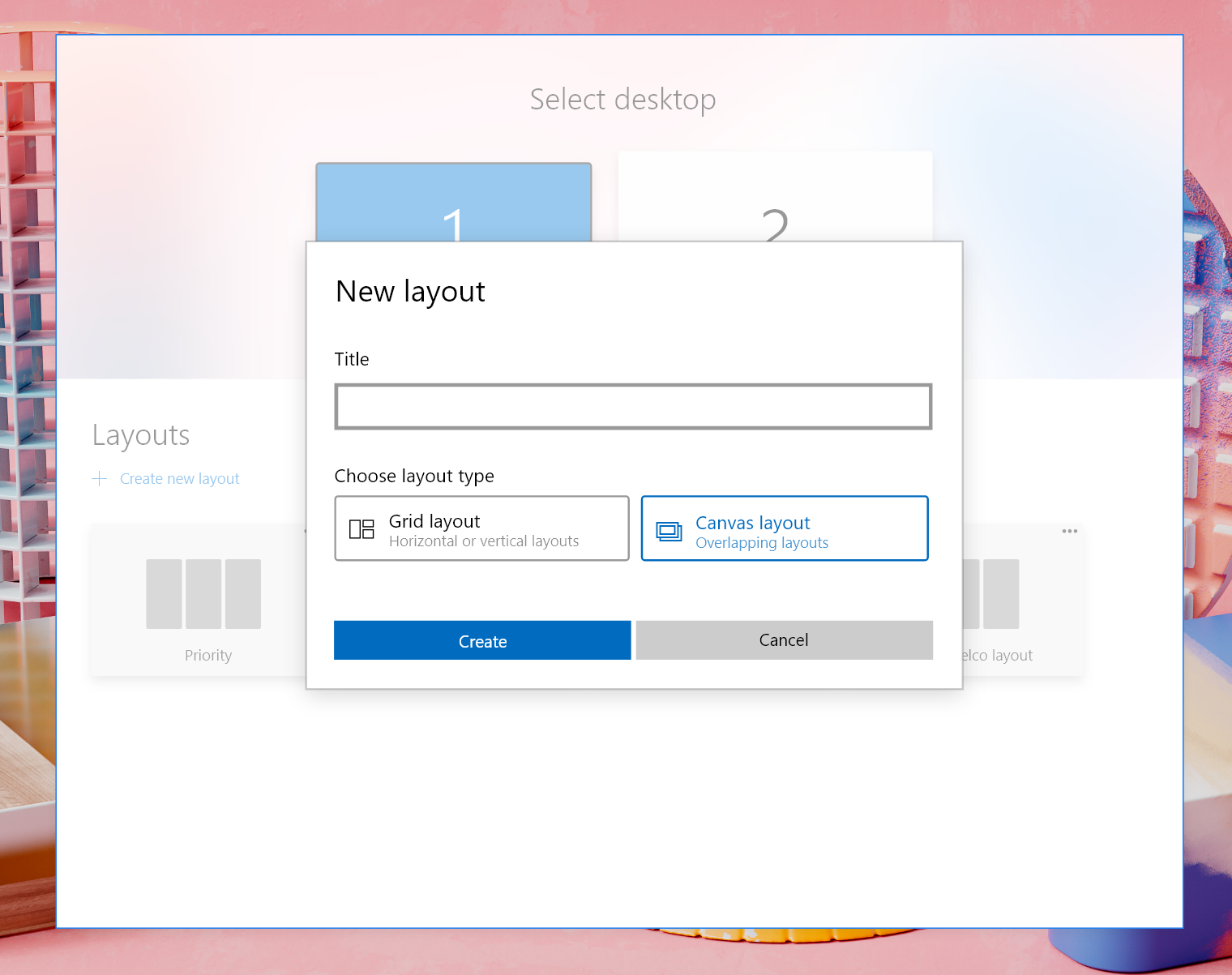
Creating new layouts (addressing #2207 #2208)
Simplifying the create new layouts UX: a single button brings up a dialog that allows the user to enter a name and to select a grid-based or canvas-based layout. It will then bring the user to the grid or canvas editor
Secondary actions
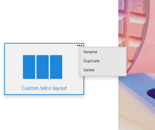
Right-clicking / long-pressing the layout will bring up a context menu that allows to duplicate or remove the layout.
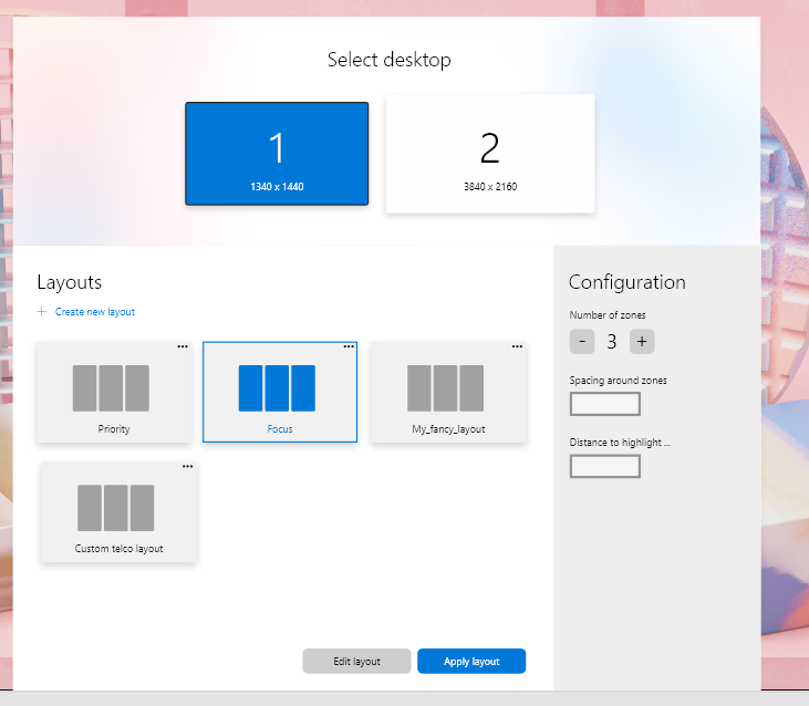
Layout "configuration"
Currently, it's possible to make tweaks to all grid based layouts.
Question 1: is this something we would move to the grid layout editor itself or keep in the layout selection screen?
Question 2: can users tweak these per layout or are these applied to all layout types? (like it's now)
Looking forward to feedback on these concepts.
 niels9001
on 30 Sep 2020
niels9001
on 30 Sep 2020
My suggestion is to have all actions (rename, duplicate, delete) and configuration on the right panel. No individual drop down menu on each layout.
We should also consider making all layouts custom layouts.
That will bring these benefits:
- allow users to create their own "default" templates
- remove the existing templates if not of interest
- unify the configurability of all templates
We will also provide the possibility to restore/recreated the default templates if deleted.
Number of zones, space around zones and distance will be a per-layout setting, we will provide default values and then use the last used value for brand new grid layout if they are not derived from existing one.
enricogior
on 1 Oct 2020
Is anyonce considering of changing the aspect ratio of the Layout preview from the current ~1.25 to 1.77 [which corresponds to the 16:9 format] in the new editor?
Reading out the pixel-values, I'm getting something like 1:25, anyway.
Most monitors are 16:9, so the preview differs greatly what the Layout will actually show up on screen.
I'm talking about this:
The preview is appropriate for users of 5:4-monitors, and I'm sure all five of them are very happy about this, but the majority isn't well-served.
Most people run either 16:9. And 16:9 is much closer to other more common alternatives like 16:10, 21:9 etc.
It would be great, if there was a setting to control the preview-rectangle.
I've had a lot of difficulty distinguishing recognizing Layouts a glance, because they're massively distorted by this format choice.
Here you can see the difference in format visualized:
http://www.displaywars.com/20-inch-16x9-vs-20-inch-5x4
DavidGretzschel
on 1 Oct 2020
@enricogior
My suggestion is to have all actions (rename, duplicate, delete) and configuration on the right panel. No individual drop down menu on each layout.
I like the idea with the individual drop down menu. With this menu thes simple commands are near by the template.
@niels9001
Will the new UI be compatible to older Win10 versions too or do we need to have two editors supported?
 htcfreek
on 2 Oct 2020
htcfreek
on 2 Oct 2020
@htcfreek
I like the idea with the individual drop down menu. With this menu thes simple commands are near by the template.
It makes more complicated to have a good accessibility for keyboard and for touch.
We need to simply things, we are a small team, first goal should be "less complexity".
enricogior
on 2 Oct 2020
The preview is appropriate for users of 5:4-monitors, and I'm sure all five of them are very happy about this, but the majority isn't well-served.
Most people run either 16:9
@DavidGretzschel You're making assumptions/generalizations here. Some people also have monitors in the vertical orientation. To show horizontal rectangles, as wide as 16:9, in the Editor would be horrible if they don't match your personal orientation. So in this case, displaying a square holds a nice balance between horizontal and vertical.
A better thing would be if the Editor shows the size/ratio (because some people have ultra-wide 32:9 monitors and some may have a tablet that is 5:4) and also the orientation of each monitor, but that also requires more coding and a more dynamic UI.
 Jay-o-Way
on 9 Oct 2020
Jay-o-Way
on 9 Oct 2020
@niels9001 Graphics are looking pretty. Do have a few idea's.
~Good thing to include the resolution in the top. Will the ratio and orientation also apply to the preview of the layouts? (see above comment)~ yes, see #6562
The new context menu (for every layout) could also house the Edit and Apply* buttons. But I think it's better to move them all to the side, as Enrico said earlier. #accessibility
Both the current and the concept UIs have an Apply button. This button applies the setting and also closes the window. In the FZ wiki (https://github.com/microsoft/PowerToys/wiki/FancyZones-Overview) we can read the line "Pressing the save and close button sets that layout to the monitor". This sounds more like the actuals actions. Would it be better to update the text on the button, or to update the action (just apply, don't close) to correspond with the button?
In the drafts there is no title bar, therefore no X and no Cancel buttons: no possibility to exit without saving?
Would be correct to show the unit (px) along with the "Show space around zones" settings.
"Distance to highlight..." doesn't fit.
When creating/editing a Grid layout: I think it would be handy to have the ability to input/adjust the width and height, in stead of just the total amount.
Detail at New layout window: a layout is a collection of _zones_, not layouts.
Jay-o-Way
on 9 Oct 2020
I've been using DisplayFusion's monitor splitter for a long while. So far I really like what I see in FancyZones, and it seems quite a bit faster overall than DisplayFusion, but I am missing some of the features from DisplayFusion in terms of both configuration and runtime behavior:
- Explicit configuration of zone dimensions - I'd like to be able to click on a zone and say that it should be (0, 0) - (1719, 1439), add another that's (1720, 0) - (2579, 719), etc. That would allow me to VERY carefully configure my zones so that they're non-overlapping and each takes up the exact proportion of the screen that I prefer for the app(s) that I'll place there.
Yes, this! I really need my zones to be precise (e.g. 1920x1080, 2560x1440, 3840x1440, etc..)
 nammmers
on 11 Oct 2020
nammmers
on 11 Oct 2020
@nammmers It's not in the UI, but you can edit the settings file directly to get precise zones. The settings file is %APPDATALOCAL%\Microsoft\PowerToys\FancyZones\zone-settings.json. I did that and have this working very, very well now, plus it's easily portable across machines which was useful recently when I had to replace my laptop.
With the PowerToys app closed, I used a JSON formatter (IntelliJ IDEA which is my primary IDE anyway) to make the contents of that file easier to edit, set the zones exactly as desired, saved the file, and started PowerToys again.
Hopefully this will be brought front-and-center in the UI at some point, but for now this is mostly a one-and-done type of thing once you know how you want to slice up your screen(s).
SCWells72
on 11 Oct 2020
@DavidGretzschel You're making assumptions/generalizations here. Some people also have monitors in the vertical orientation. To show horizontal rectangles, as wide as 16:9, in the Editor would be horrible if they don't match your personal orientation. So in this case, displaying a square holds a nice balance between horizontal and vertical.
A better thing would be if the Editor shows the size/ratio (because some people have ultra-wide 32:9 monitors and some may have a tablet that is 5:4) and also the orientation of each monitor, but that also requires more coding and a more dynamic UI.
Well yeah, but 5:4 is also not a square. But I agree that having it be the correct aspect ratio somehow would be best. Doesn't have to be dynamic, could just be a global setting for all layouts even. That would already be better.
Individually setting it manually per layout could also be an option.
Most people might just ignore this and that's fine.
DavidGretzschel
on 11 Oct 2020
Well yeah, but 5:4 is also not a square. But I agree that having it be the correct aspect ratio _somehow_ would be best. Doesn't have to be dynamic, could just be a global setting for all layouts even. That would already be better. Individually setting it manually per layout could also be an option. Most people might just ignore this and that's fine.
Work is on its way, see #6562
Jay-o-Way
on 12 Oct 2020
- Detail at New layout window: a layout is a collection of _zones_, not layouts.
@niels9001
Addition on @Jay-o-Way's comment: I would write "Horizontal and vertical zones" instead of "Horizontal or vertical zones", because you can have a mix of both in one layout.
htcfreek
on 13 Oct 2020
@htcfreek
I like the idea with the individual drop down menu. With this menu thes simple commands are near by the template.
It makes more complicated to have a good accessibility for keyboard and for touch.
We need to simply things, we are a small team, first goal should be "less complexity".
@enricogior
We should have in mind that without individual menu the user always has to select (switch focus) a layout before it can be duplicated, deleted, ...
And in addition we then should have two different indicators for selected (for editing) and applied layout.
_!image comming soon!_
htcfreek
on 14 Oct 2020
Thanks all for the input. Thinking about this a bit more, I'm wondering if we'd need the sidebar at all. Here's my reasoning:
- 90+% of the time, users will see this UI to switch between layouts, not to edit zones. Having the sidebar always available increases cognitive load with a lot of options. For layout selection, I'd keep it as simple as possible.
- Moving layout specific options (number of zones, spacing, margins) would be more logical to be available in the grid/canvas layout. If we do so, a user would actually see the outcome of changing these values in the editor itself.
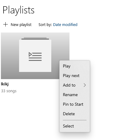
- I'd put secondary layout/management actions under a right-click menu. These actions are (probably) hardly used at all - we would then also follow Windows UX conventions. Here's an example of Groove Music.
- Having the sidebar, and all the options available, is not more accessible per se. For example, if you have the first layout selected you'd need to use the arrow keys 3 times to get to the sidebar. With a right-click button (e.g. Ctrl+Shift+F10) would open up the context menu where you are working with.
niels9001
on 14 Oct 2020
@htcfreek
I like the idea with the individual drop down menu. With this menu thes simple commands are near by the template.
It makes more complicated to have a good accessibility for keyboard and for touch.
We need to simply things, we are a small team, first goal should be "less complexity".@enricogior
We should have in mind that without individual menu the user always has to select (switch focus) a layout before it can be duplicated, deleted, ...And in addition we then should have two different indicators for selected (for editing) and applied layout.
_!image comming soon!_
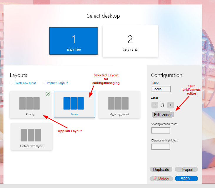
_This is the concept image with my ideas. It's based on the concept of @niels9001._
- Additionally I have added some other feature suggestions.
- The buttons Delete and Apply should name "Delete Layout" and "Apply Layout". It is a mistake.
- Maybe we need to renaim the "Apply Layout" button to "Select Layout" to avoid misunderstandings. I think "Apply Layout" can be misunderstand as save layout changes.
htcfreek
on 14 Oct 2020
@niels9001
I'd put secondary layout/management actions under a right-click menu.
We should discuss this because it adds extra steps to do actions that I personally (and I guess I'm not the only one) use quite often.
This is an editor, its main purpose is to edit not to switch layouts (for that we are adding other features to not not require to open the editor), so all the edit actions should be one click away, and easy to be used from keyboard as well.
enricogior
on 14 Oct 2020
@enricogior, your last comment let me think about something: Are the layouts have to be linked to a desktop/monitor because of the zone dimensions/sizes?
I yes, it makes sense to show only the Layouts which can be used for the selected monitor.
htcfreek
on 15 Oct 2020
If I understand correctly Niels his preference would be a simple and clean UI and Enrico wants the buttons on the side. I would like to add one more thing in the balance: touch screens. They are very common there days and when using them it is nice to have buttons on screen and within reach. Context menus need (one) more action.
Jay-o-Way
on 23 Oct 2020
I think we should add a Bug reporting window like in PT Run to the new editor. Then the user can better check for duplicate issues and we don't have to open logs to the what the problem is.
The message we have in the old editor says only we have a crash and where the log is saved.
htcfreek
on 30 Oct 2020
@htcfreek Already tracked in #6984
niels9001
on 30 Oct 2020
I would just like to get some attention back to this post, that was marked as closed, but not actually fixed:
https://github.com/microsoft/PowerToys/issues/1359
It is not clear, or really stated at all, how to use the subtractive editor.
Click on a template -> hit edit -> use subtractive editor -> save as custom
I think there should be a switch in the create custom, or some other way to use the subtractive that is easier to find.
 CDeLeon94
on 7 Dec 2020
CDeLeon94
on 7 Dec 2020
@CDeLeon94 We are working on a UX overhaul. See screenshots here: https://github.com/microsoft/PowerToys/pull/8148
Would that solve that specific issue?
niels9001
on 7 Dec 2020
@CDeLeon94 @niels9001
let's not discuss that here, this issue is not for general problems.
enricogior
on 7 Dec 2020
Related issues
 ivadham
·
3Comments
ivadham
·
3Comments
 Martin-Hausleitner
·
3Comments
Martin-Hausleitner
·
3Comments
 saahmedm
·
3Comments
saahmedm
·
3Comments
 amorenew
·
3Comments
amorenew
·
3Comments
 Marrib
·
3Comments
Marrib
·
3Comments
Most helpful comment
Here's a wild thought on the UX, let me know what you think!
https://youtu.be/3t8Ss06HyBc