Polls: UI: Emphasize WHERE user input is and how it works
Steps to reproduce
- create a poll
- let "aunt Sally" users try to use the app
(no matter whether on PC or mobile)
Expected behaviour
User ideally should be able to intuitively use the UI to select her/his preferred choice(s).
Proposal: The app should GUIDE the user where to ACT, like emphasize where the actual SWITCHES are, e.g. with a mildly pulsating mirror at the position where the "switch all" button is now. I know that a "switch all" button is handy, too, but the indicator is more important. Or you might want to add a fourth 'initial' state (empty checkbox) indicating that interaction is possible there.
Actual behaviour
Users are baffled how to use the UI at all, some users don't grasp that they have to actually save/send their choice, some complain that -while trying to find out how to use it- they "accidentaly" hit the "switch all" "button" and thereby reset their choices.
 nursoda
All 9 comments
Suggestions:
- What about immediately saving the vote after klick? So the vote button can be removed.
Especially on mobile views an easier handling. Less klicking on desktops - Empty options if a user enters a poll, he didn't vote in before. Empty votes get the "no" state and will be a red creoss, if he enters the poll again.
Additinally some shadow could be added, to give the switch a little more button style - Remove switch all button.
I vote again for removing it. The intention of a poll is, to get feedback of the user of his opinions or availability. Switching all options at once is no optinion in my view, it is just lazy or a matter of "I don't care".
@v1r0x @splitt3r
Opinions?
 dartcafe
on 22 Dec 2017
dartcafe
on 22 Dec 2017
BTW: What do you think about https://gitter.im/nextcloud-polls
dartcafe
on 22 Dec 2017
What about immediately saving the vote after klick? So the vote button can be removed.
Especially on mobile views an easier handling. Less klicking on desktops
IMO this can be confusing. At least without visual feedback. And sending each single vote to the server should disable all others, so there is no async sh*t which leads to wrong results or something else.
Remove switch all button.
I'd keep it. It is good for larger polls. Let's say you want to order pizza and someone starts a poll with all possible toppings (of course no pineapple) and you like all of them. Or you don't care about most of them (yellow), but definitely want cheese and onions.
Or if you want to find an appointment for training or a movie night and all dates work for you.
This might not be the regular poll, but it is great to have such an option for the 1 in 100 polls you need it. And I'd curse you, if I need this feature and it is no longer there 😁
 v1r0x
on 22 Dec 2017
v1r0x
on 22 Dec 2017
@v1r0x no onions but pineapples please 👍
 splitt3r
on 22 Dec 2017
splitt3r
on 22 Dec 2017
@splitt3r You are a monster....
v1r0x
on 22 Dec 2017

splitt3r
on 22 Dec 2017
I vote for the "save each click" since it's the way NC works all over, so it's consistent.
But there should be an easy way to edit or remove a poll since such a click is easily made.
Plus, clicking or tapping a checkbox should report an error if no name is given first.
MAYBE even that might be "guided" by graying out things I cannot select YET (w/o name).
Please do the 80% case first. That's w/o "switch all". "Switch all" might be opt-in on CREATING a poll ...
nursoda
on 22 Dec 2017
About gitter.im : To me it's "yet another messenger (and channel to look into). Personally, I'd rather not install even another one. I'd keep it on one platform or use a well-established messenger such as Telegram or Signal.
nursoda
on 22 Dec 2017
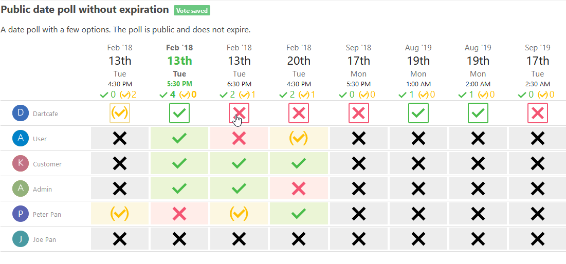
Votes are saved instantly in https://github.com/nextcloud/polls/tree/dev-1.0
Unvoted options are displayed as a black cross.
dartcafe
on 7 Sep 2019
Related issues
 andriusign
·
6Comments
andriusign
·
6Comments
 rubo77
·
4Comments
dartcafe
·
4Comments
rubo77
·
4Comments
dartcafe
·
4Comments
 khayman123
·
3Comments
khayman123
·
3Comments
 johnnydvc
·
6Comments
johnnydvc
·
6Comments
Most helpful comment
Suggestions:
Especially on mobile views an easier handling. Less klicking on desktops
Additinally some shadow could be added, to give the switch a little more button style
I vote again for removing it. The intention of a poll is, to get feedback of the user of his opinions or availability. Switching all options at once is no optinion in my view, it is just lazy or a matter of "I don't care".
@v1r0x @splitt3r
Opinions?