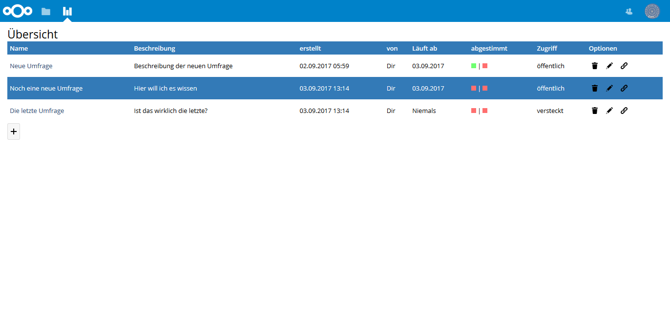
I made some changes to the polls list, so it is more looking like the standard design. Orientation was the files app.
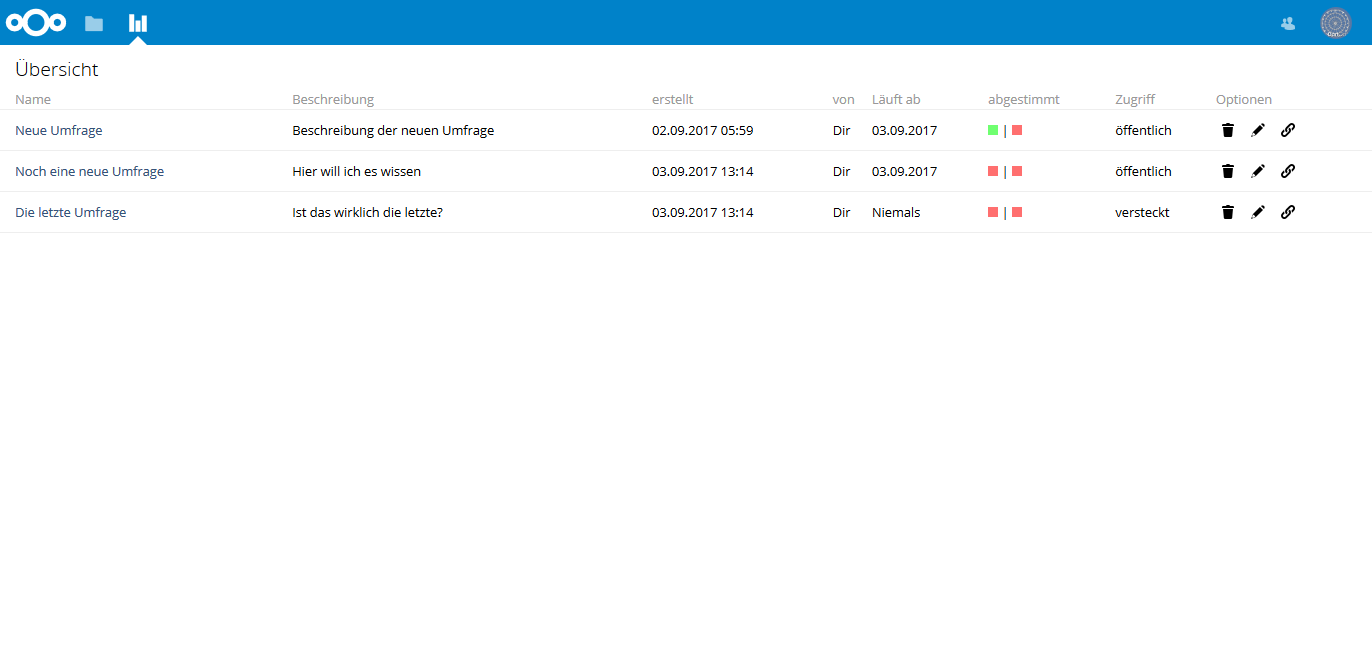
Comparing to the old design:
 dartcafe
All 53 comments
Very nice, looks much cleaner! Maybe you could have a look at #104, so _mayor_ UI changes are in one PR. Maybe we could also finish #104. :)
 v1r0x
on 4 Sep 2017
v1r0x
on 4 Sep 2017
I looked at #104 and tried the branch, but I got server arrors, which I could not identify. That's why I asked @amittel, if he is working on it a few weeks ago (#103). And it is not easy for me to understand the changes, he made, since I am no programmer and not famliar with the nextcloud API.
For the moment I am continuing with the UI optimazions locally. After that, we can try to adopt or continue with working on #104.
So I played a little with the UI for myself. And by the way I am learning (Git, PHP, nextcloud API, ...).
dartcafe
on 4 Sep 2017
Seems I missed your comment in #103, sorry!
Ok, keep going and have fun learning :) If you need anything, just mention me. Will have a look at #104 to figure out what's wrong.
v1r0x
on 4 Sep 2017
I commited my changes so far. Not yet finished and I am still not happy with all of it, but curious about your thoughts and suggestions.
dartcafe
on 5 Sep 2017
clear, more intuitive, people who can't discern red&green are able to see the choices!
What about text polls? Do they work?
 joergmschulz
on 5 Sep 2017
joergmschulz
on 5 Sep 2017
As far as I see, I have no issues.
dartcafe
on 5 Sep 2017
It looks nice and i think the overfew is better, too.
 happyreacer
on 5 Sep 2017
happyreacer
on 5 Sep 2017
maybe a separator between the options would be helpful: when all is yellowish, the options can be found easier for very short headers on text polls (a, b, c, d, e...)
joergmschulz
on 5 Sep 2017
Really like the new UI. Great job!
@joergmschulz yes, some pixel padding is a good idea
v1r0x
on 5 Sep 2017
I will try a few options the next days.
dartcafe
on 5 Sep 2017
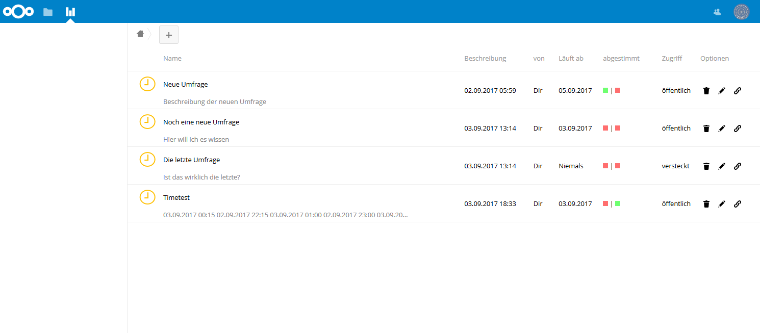
Just quick-testing the release of today.
Generally I am amazed - looks good now!
Findings:
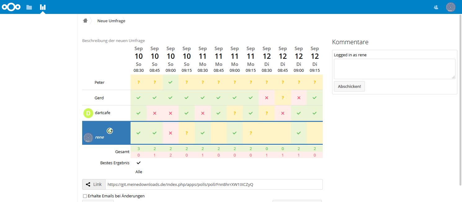
when a user wants to select a poll out of the list of polls, he must hit the text or description of the poll; clicks on the whitespace between the lines don't open the poll. Beginners will be confused.
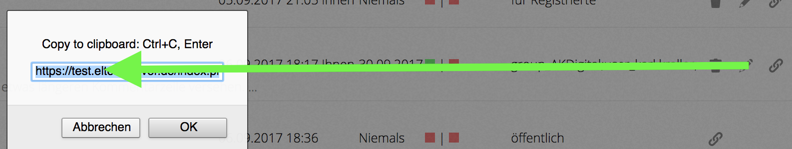
description text for copy-to-clipboard: CTRL-c is not correct for apple Users. ENTER doesn't work, only 'ok' and CMD-C
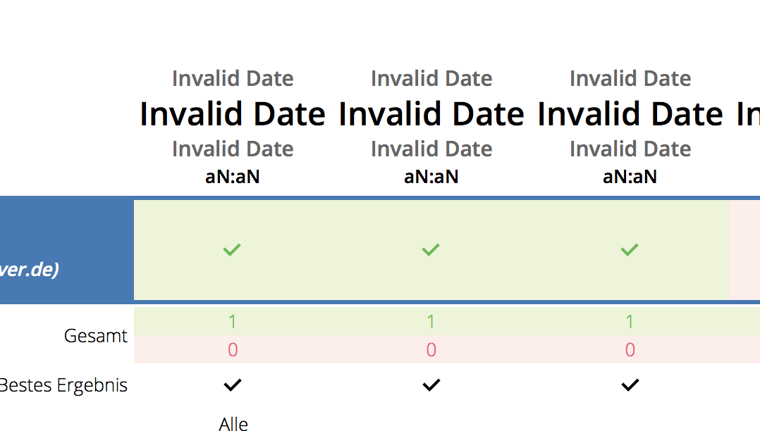
a date poll view display shows the 'NaN' error again, like #144 in Safari
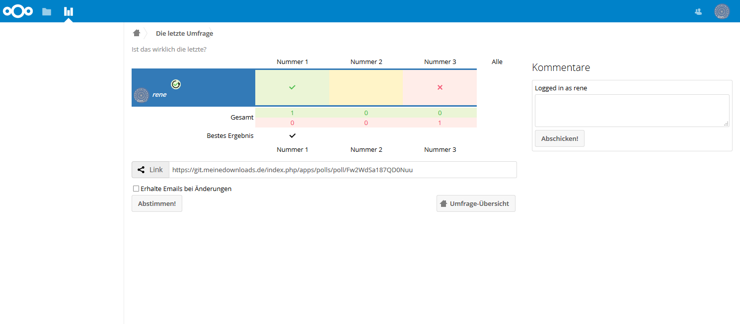
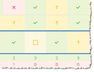
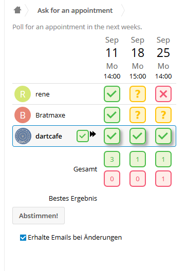
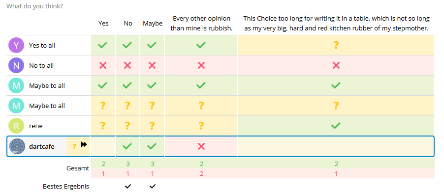
the 'all' option is not visible in date polls, and it is visible but not clickable in text polls:
there are nice and fine horizontal lines between the rows, but no lines between the columns
Links seem to be working where I found them; notification emails didn't arrive but that may have local reasons
Keep on rocking!
If you wish I can do the same tomorrow night. The more testers we have the sooner you can publish your fine work!
joergmschulz
on 6 Sep 2017
Great. Thank you. I am not finished with the text polls right now. I will inspect your issues the next days. Have something to do in my other jobs. :-)
dartcafe
on 6 Sep 2017
@v1r0x: Do you have an idea of calculating the right localized times without JS?
dartcafe
on 6 Sep 2017
@joergmschulz
description text for copy-to-clipboard: CTRL-c is not correct for apple Users. ENTER doesn't work, only 'ok' and CMD-C
Didn't get you. Which functionality are you referring to?
dartcafe
on 7 Sep 2017
Well, on Apple keyboards it is CMD-C. And, the ENTER key didn't copy the text into the clipboard. Only the OK button and CMD-C.
joergmschulz
on 7 Sep 2017
Ah. OK. I will look after it.
dartcafe
on 7 Sep 2017
regarding the NaN - can't you reuse the fix https://github.com/nextcloud/polls/pull/138/commits/7018f56d5c8e0c461478489961360b948af2fd97 ?
joergmschulz
on 7 Sep 2017
@joergmschulz I'm getting mad with the different interpration of js date functions in the browsers. I need some time to test the compatibility. I think, I will go to it next week. Maybe I have time in the weekend.
Regarding your findings:
- The poll should now be clickable via the whole table cell
- Ctrl-C of the description should be resolved in another way. I think the solution with a dialig is not very state of the art.
- The line you see is between two table bodies. I will play a little with the design in the weekend. We will see, what is possible.
- For small columns I added another icon for unchecked votes as a small fix. Not very beautiful...
Oops. Just reviewed the date problem and saw, that I didn't adopt my own fix. Tested on iPad and seems to work.
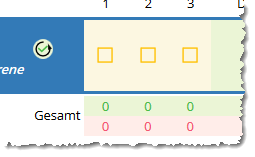
Because of the "all" toggle: I moved the function to the users cell. I think we need some more attractive solution than that.
dartcafe
on 7 Sep 2017
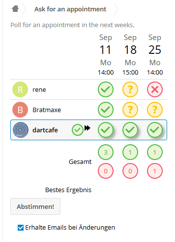
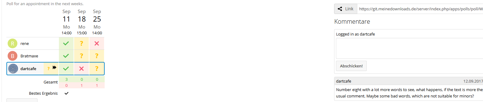
A suggestion. @joergmschulz: What do you think?
dartcafe
on 8 Sep 2017
Honestly, I think this is unintuitive. Personally, I prefer the 'All' column.
joergmschulz
on 8 Sep 2017
Referring the toggle item, i agree. This solution is not intuitive. I prefer the solution, which states, that the action changes the row, of the current user. Reserving a complete cloumn for a row action is a waste of spare, especially, when we are on mobile devices.
I will make some more inuitive suggestions for the toggle. I dislike this one, too. and in fact it is horribel to arrange divs inside a table cell.
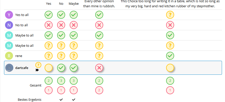
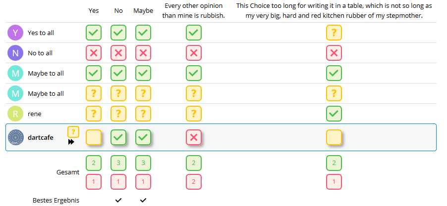
I wanted to know, if you were talking about a space between the cells like the way in the last picture.
Can you confirm elimination of the date issue?
dartcafe
on 8 Sep 2017
Yes, a quick patch yesterday using your old fix fixed the date issue. I'll pull the state of the branch tonight (if I don't go mountaineering - else it takes me some days.)
And, yes, the space between the cells looks good.
joergmschulz
on 8 Sep 2017
A walk-through showed no additional glitches; currently the behaviour seems to be consistent and functional using all my browsers including Safari, Chrome, Firefox on Macos and Edge and IE on W10K and Firefox /Android .
For small android screens (phone), firefox and Chromium fail to render the right menu options in the list - This might be out of scope. I don't know whether it's a good idea to edit/modify polls with such a device anyway.
Talking about screen real estate: Why not leave away the clock at the left side / or add menu functionality to it?
joergmschulz
on 8 Sep 2017
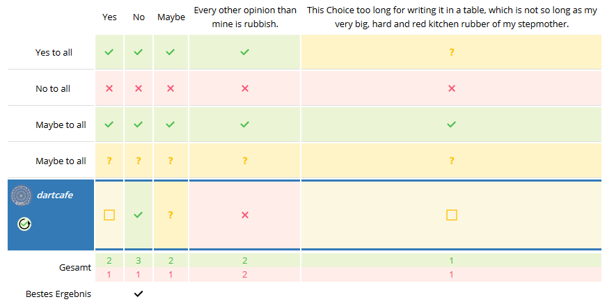
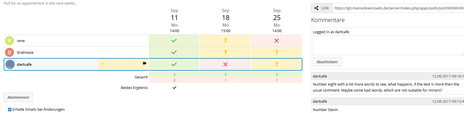
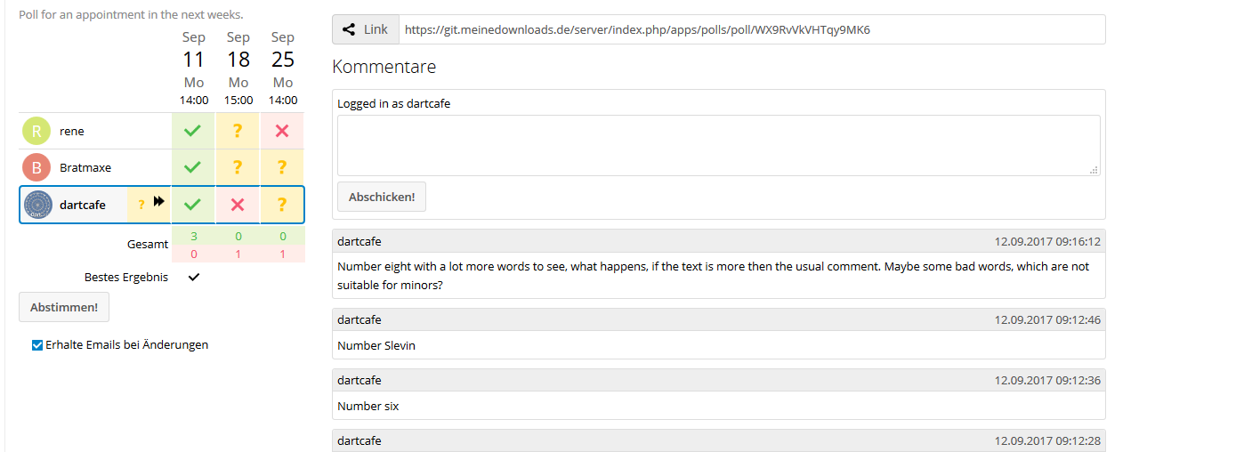
What about this variant?
Or this?
Or the above one?
dartcafe
on 12 Sep 2017
I like the one with rounded icons more. But the variant with colored background is my favorite.
v1r0x
on 12 Sep 2017
I am not sure, which is my favorite. I like the round ones more too. But with wide options, I think the colored table cells makes it a little bit unsmoothy.
In this variant the colors are not that "mighty"
And again comparing to the border-radius: 20%;
Hmmmm... Some more opinions?
dartcafe
on 12 Sep 2017
@dartcafe it is cool, too. I wish a option to have this or that design. ;-)
happyreacer
on 12 Sep 2017
I try to make it configurable via css class. The recent commits first switched back to the default style. @v1r0x Is it possible to add a configurable switch in the per user settings?
There is still a bug with the create page, which I will fix later.
@v1r0x Some bugs I found:
- The "best score" doesn't work with text polls which have spaces in the text. Can you investigate?
- On the create page, the selecting of users/groups doesn't work properly. Maybe it should be disabled until it got fixed!?
dartcafe
on 13 Sep 2017
We should have a good default instead of a configurable UI. Maybe @jancborchardt can help here :wink:
Edit: I had a look at both dudle and doodle. They use colored background and icons as well. IMO the "readability" is better with colored backgrounds. But would be great to have some more opinions. :)
v1r0x
on 13 Sep 2017
@v1r0x Some bugs I found:
The "best score" doesn't work with text polls which have spaces in the text. Can you investigate? On the create page, the selecting of users/groups doesn't work properly. Maybe it should be disabled until it got fixed!?
is this a general problem or in your branch? If it is a general problem: Could you open an issue? Would be better to track further problems/progress there. Thanks!
v1r0x
on 13 Sep 2017
Yep, colored full background and icons are great. No configuration options as that is all stuff we need to test and will break.
@dartcafe great work! I will also test later, and add you to the Nextcloud design team. :) You are also very welcome in our #nextcloud-design IRC channel.
Also cc @nextcloud/designers for review.
 jancborchardt
on 13 Sep 2017
jancborchardt
on 13 Sep 2017
By the way, to really conform to Nextcloud design, the poll overview should be very much simplified as to which info is shown and put in the left navigation as a list.
Simply the name of the poll, and left of it an icon about the state (running, finished, etc) is enough. Then to the right the usual share / 3-dot-menu.
Look at how we do it in the Deck app and Calendar for example, that will also give you hints towards using h2 for a nice main text heading, and the right #app-sidebar for options. :)
jancborchardt
on 13 Sep 2017
Less configuration is less work and test of course, so I don't complain. I am almost satisfied with the current branch. Waiting for issues to plan.
@jancborchardt You already added me to the design team a few weeks ago. :-)
dartcafe
on 13 Sep 2017
The app navigation is indeed a todo.
dartcafe
on 13 Sep 2017
@dartcafe yeah – my second comment about the navigation and sidebar is something for a separate pull request I’d say. :)
@dartcafe can you open a pull request for this? Then I’d say we can merge this, right @v1r0x? It’s important we keep pull requests manageable and not too big. :)
jancborchardt
on 13 Sep 2017
If this PR doesn't introduce any bugs or unfinished stuff: yes. And after I had a look at it :wink:
v1r0x
on 13 Sep 2017
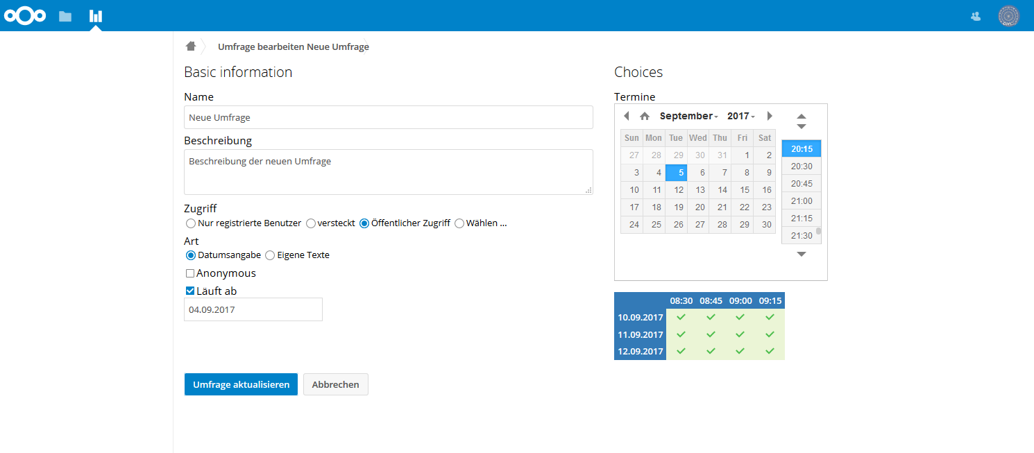
@v1r0x What is your opinion. I changed the divs col-30 and col-70 from
.col-70 {
    width: 65%;
    float: left;
    padding: 0px 15px;
}
.col-30 {
    width: 35%;
    float: left;
    padding: 0px 15px;
}
or (table-width 100%)
to
.col-70, .col-30 {
    float: left;
    padding: 0px 15px;
    min-width: 350px;
    max-width: 900px;
}
dartcafe
on 13 Sep 2017
just walked through the current state of new-design. Amazing. This is something that should be released with a proper incrementation in the release#.
joergmschulz
on 15 Sep 2017
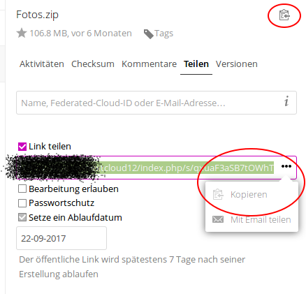
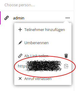
if it is still valid, just a small hint regarding the copy-url-topic...
Ctrl-C of the description should be resolved in another way. I think the solution with a dialig is not very state of the art.
for a consistent UX maybe something like in the files-app (2 times) or in the VideoCalls-app should used:
 DJCrashdummy
on 15 Sep 2017
DJCrashdummy
on 15 Sep 2017
@dartcafe I think the layout of the second screenshot is my favorite. Wide table and comments. The last one looks very squeezed.
v1r0x
on 15 Sep 2017
Agree with @v1r0x the second layout is best. Also works best when you have a left navigation, and comments in the right sidebar (like in Files).
jancborchardt
on 16 Sep 2017
Agreed too!
@dartcafe would you consider using flex? It would greatly increase the responsiveness of the app :)
 skjnldsv
on 16 Sep 2017
skjnldsv
on 16 Sep 2017
@DJCrashdummy Just open a new issue with this suggestion.
dartcafe
on 16 Sep 2017
For me, I have no more issues open regarding #151. If no more issues occur, I would like to merge #151 brand and close this issues. Any further comments, issues, suggestions?
dartcafe
on 16 Sep 2017
@skjnldsv Referring to flex: I would like to see going away from the table layout to a flex or grid layout, at least for the vote page. The problem is, that grids are not supported by MS right now, and when, they will be supported by Edge, but not IE, as far as I understood. So flex would possibly be the best option.
dartcafe
on 16 Sep 2017
@dartcafe Try to have a look at this PR again this weekend. Then we can merge it :)
v1r0x
on 16 Sep 2017
@skjnldsv I tried to use flex, but the problem is, that it is nessecary to have dynamical height in rows and width in columns. I think, with grid it is possible, but I didn't find a way to have both with flex. Although I will try to build the overview with flex, because, we have a pure row layout.
dartcafe
on 18 Sep 2017
Do you need my help? :)
skjnldsv
on 18 Sep 2017
Not now, but if I go into it. I want to finish #151 first. I will call you. :-)
dartcafe
on 19 Sep 2017
@dartcafe what happened? Accidental close or is there a follow-up pull request? :)
jancborchardt
on 20 Sep 2017
@dartcafe what happened? Accidental close or is there a follow-up pull request? :)
The PR was merged ;)
 MorrisJobke
on 20 Sep 2017
MorrisJobke
on 20 Sep 2017
I think, I used the wrong merge command. :-)
Follow up follows.
dartcafe
on 20 Sep 2017
Aaah I confused this as being the pull request. :D PR at https://github.com/nextcloud/polls/pull/151 of course
jancborchardt
on 21 Sep 2017
Related issues
dartcafe
·
4Comments
 Dubidubiduu
·
5Comments
Dubidubiduu
·
5Comments
 brtptrs
·
4Comments
brtptrs
·
4Comments
 xeiss
·
4Comments
xeiss
·
4Comments
 andriusign
·
6Comments
andriusign
·
6Comments
Most helpful comment
@v1r0x What is your opinion. I changed the divs col-30 and col-70 from
.col-70 {
    width: 65%;
    float: left;
    padding: 0px 15px;
}
.col-30 { width: 35%; float: left; padding: 0px 15px; }or (table-width 100%)
to

.col-70, .col-30 {
    float: left;
    padding: 0px 15px;
    min-width: 350px;
    max-width: 900px;
}