Polaris-react: [Page] Access to Page layout while using embedded app
I love the polaris Page layout and would love to use this throughout my app to display header, breadcrumbs, primary + secondary actions.
However, because the application is an embedded app (and I do need some app-bridge functionalities ie. modal, toast), the Page component default to embedded app view that add breadcrumbs in the same line with app name.
I have temporarily resolved the issues by copy & pasting the current Page component and calling
this.context.easdk.Bar.update({icon: 'icon_url'}); myself.
Ideally, I can also pass the icon once as part of AppProvider, and have this icon persist throughout the entire app.
 michenly
All 25 comments
moved from https://github.com/Shopify/polaris-react-deprecated/issues/2468
cc @tmlayton
michenly
on 22 Nov 2018
👋 Hey @michelleyschen, thanks for the issue. As with other feature requests, I'm going to close this issue and allow voting on the original comment using the 👍 emoji to indicate support for making this change. We'll evaluate the demand for such a feature and prioritize accordingly.
Also, I'd like to loop in @davekilljoy and @markiiikram as they may have opinions on whether this is something the App and Partner Platform team would like to see done.
 danrosenthal
on 26 Nov 2018
danrosenthal
on 26 Nov 2018
Oh hai @danrosenthal , @davekilljoy and @markiiikram ! We were also surprised by the removal of this title. Were previously using it and then upgraded our polaris to use app-bridge directly and it went away. Thoughts?
 jennaleeb
on 27 Nov 2018
jennaleeb
on 27 Nov 2018
Prior to Polaris v3 there was an Embedded page component. I added it in this PR Add embedded page section. As you can see from this PR, I do think it's important. @danrosenthal is updating the documentation for the Page component with this PR https://github.com/Shopify/polaris-react/pull/653#issuecomment-441799804
 markiiikram
on 27 Nov 2018
markiiikram
on 27 Nov 2018
This issue may have to re-write. Because really I documented an approach, where there may be other things we can do here rather than separating the component.
Mainly the question here is: if an embedded app want to use the visual style of Page
but also secondary navigation.
Is this possible to do in Polaris without forking?
michenly
on 27 Nov 2018
@michelleyschen From my understanding there is no way to use the standalone page component inside an embedded app. I think the approach would be as Dan said, for us to vote on the original comment for Polaris to make a change. Maybe everyone on your, my and @jennaleeb's teams could up 👍?
markiiikram
on 27 Nov 2018
In my app, we 🍴 the Page component just for the visual style.
@ry5n was award of the 🍴 and had commented that there wasn't any UX conern
https://github.com/Shopify/facebook-marketplace/pull/553#issuecomment-430802046
michenly
on 27 Nov 2018
Re-opening this issue after chatting IRL with @danrosenthal and @markiiikram !
Historically, the embedded page was different from the polaris/core-web component due to some technical constraints and design decisions.
Given the need to support 1P apps (e.g., those developed by Shopify), it would be great if, when possible, components in embedded apps had parity whenever possible. It also makes dev life less confusing when devs/designers are searching for components to use but then are not _actually_ available, or, even worse, are _slightly_ different.
Going to shop this around other projects and see if the issue of the <Page/> component is affecting anyone else.
On a higher level note, given A&PP's focus on 3P developers, and other teams developing within core, there is a gap in understanding of who owns the full stack used by 1P Shopify app developers.
jennaleeb
on 28 Nov 2018
Removed the Feature request label as this is a more complex problem than a simple feature request. Thanks @jennaleeb for the context. We encourage all first party app developers within Shopify to weigh in on this problem here, even if that's just with a 👍 on the original comment to show support.
danrosenthal
on 28 Nov 2018
There are 5 components which, instead of rendering, delegate to App Bridge when in an embedded context: Page, Modal, Toast, Loading, and ResourcePicker. Of those, Page is the only component which could potentially be used in both the renders and delegated state simultaneously. ResourcePicker is only for embedded apps and Toast and Loading require a Frame. And Modal should never be used in a rendered state in an embedded app.
That being said, does a forceRender prop on Page do the trick? That would cause it to delegate to the App Bridge _and_ render. Or do you need control to pick and choose?
 tmlayton
on 29 Nov 2018
tmlayton
on 29 Nov 2018
I have to agree with @jennaleeb, we should be striving for as much parity as possible.
 amooz
on 29 Nov 2018
amooz
on 29 Nov 2018
Hey @danrosenthal ! I think this comment is where the 👍 are landing. @tmlayton I will give it a shot and get back to you!
jennaleeb
on 29 Nov 2018
I agree we should be striving for parity here, and as we start making more and more 1p react apps its important to have visual consistency. The challenge I see is that there has been a lot of work done in by @katbuilt and her team in the App bridge header to clearly identify to a merchant they are in an app and it is not Shopify who is providing this functionality.
It's an interesting problem because for 1p apps we don't want any special identifiers like app icon or developer name, because this app should feel like a native extension of Shopify. However for 3p we need to make the delineation between Shopify and app developer strong so the merchant knows who to contact for help.
Is there a way to provide the Page component just to internal teams vs external 3p teams? Or maybe some sort of toggle where if its 3p we augment with app icon and developer/contact options, but if its 1p we suppress those visual indicators.
 davekilljoy
on 29 Nov 2018
davekilljoy
on 29 Nov 2018
I am a bit confused of what the Page component actually renders, because IIRC when I switched over to app provided through polaris, not directly app-bridge, the header, secondary nav and By Shopify stuff still remained. It was just the title within the Page itself that disappeared.
jennaleeb
on 29 Nov 2018
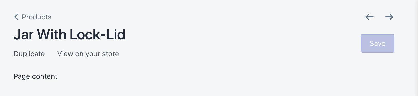
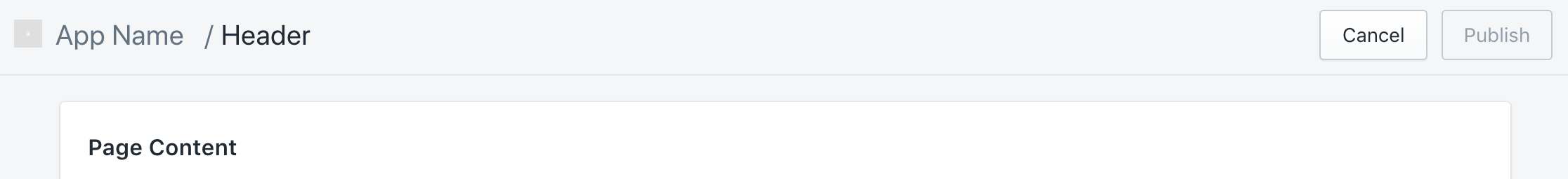
Before:
After:
jennaleeb
on 29 Nov 2018
cc: @davekilljoy is there something I am missing in terms of the App bridge header not showing it is an app?
jennaleeb
on 29 Nov 2018
Right I understand, I thought we wanted to replace the App Bridge header with the Page component vs having the Page coexist with the App Bridge header.
davekilljoy
on 29 Nov 2018
Ah ok, understand the confusion! No, just about the way it renders within the frame.
jennaleeb
on 29 Nov 2018
Chiming in here from another 1-P app developer perspective.
When we started building our app, we defaulted with the embedded app view that adds breadcrumbs in the same line with app name, without realizing there was a secondary option. It is a bit of an interesting disconnect having two different page layouts. I would love to see parity between these Page components, but also having the option to choose between each option would be nice
 keyfer
on 29 Nov 2018
keyfer
on 29 Nov 2018
I put up an PR for a possible solution
https://github.com/Shopify/polaris-react/pull/695
michenly
on 29 Nov 2018
@jennaleeb It looks like the title is there at the top next to the app name instead of being rendered within the page

I don't think this has been mentioned but App Bridge does not render Pagination. @tmlayton, do you know what happens when someone uses the Page component with Pagination? I think the expected outcome is that pagination will be rendered inside the app page.
 vividviolet
on 29 Nov 2018
vividviolet
on 29 Nov 2018
We ran into this issue for Flow.
When I added the api key to AppProvider which enabled appBridge for the Page component the layout "broke" as it switched to using AppBridge for rendering.
My current workaround for this problem was to create a AppBridgeProvider that passes appBridge on context so I can use AppBridge functionality in other places.
I don't want to use this long term but it makes it so that I can use app-bridge Actions (Redirect, History).
 <AppProvider linkComponent={Link as LinkLikeComponent}>
    <AppBridgeProvider apiKey={apiKey()}>
        <App />
    </AppBridgeProvider>
</AppProvider>
 vsumner
on 29 Nov 2018
vsumner
on 29 Nov 2018
@vividviolet if you look at the first image is also has the title at the top next to the app name.
Yeah @vsumner that is also our current workaround.
jennaleeb
on 29 Nov 2018
@jennaleeb Yeah, I see the title in both screenshots. I think the title was actually provided twice before - through the easdk and then again on the Page component. Were you manually calling the easdk previously to set the title?
vividviolet
on 29 Nov 2018
So the Page component render two things.
The Header component and some css that setup the page margin.
When the Page component see the app-bridge context (if you have apiKey prop in AppProvider), instead of rendering Header, it passes the title, breadcrumbs and actions to app-bridge to have those things render inside Shopify admin top bar.
Out of all the components that interact with app-bridge. This is the only one have has such drastic visual difference. I have set up https://github.com/Shopify/polaris-react/pull/695 so you can pass two props to opt out of this visual difference.
michenly
on 29 Nov 2018
Related issues
 nemoeric
·
3Comments
nemoeric
·
3Comments
 MateusJabour
·
3Comments
MateusJabour
·
3Comments
 cgenevier
·
3Comments
cgenevier
·
3Comments
 greghesp
·
3Comments
greghesp
·
3Comments
 andrewpye
·
3Comments
andrewpye
·
3Comments
Most helpful comment
Re-opening this issue after chatting IRL with @danrosenthal and @markiiikram !
Historically, the embedded page was different from the polaris/core-web component due to some technical constraints and design decisions.
Given the need to support 1P apps (e.g., those developed by Shopify), it would be great if, when possible, components in embedded apps had parity whenever possible. It also makes dev life less confusing when devs/designers are searching for components to use but then are not _actually_ available, or, even worse, are _slightly_ different.
Going to shop this around other projects and see if the issue of the
<Page/>component is affecting anyone else.On a higher level note, given A&PP's focus on 3P developers, and other teams developing within core, there is a gap in understanding of who owns the full stack used by 1P Shopify app developers.