How do you specify height/width, or at least an aspect ratio? It seems to force a default aspect ratio, which can cut things off that don't conform. This cropping exists in full screen, too (at least from Firefox).
Specifically, I'm using a Vimeo embed (the empty div method).
 danicholls
All 40 comments
Anyone at all? This seems like it should be simple, but...
danicholls
on 23 Aug 2016
I also need this information.
 mirzaawais
on 23 Aug 2016
mirzaawais
on 23 Aug 2016
Is it possible that Plyr is grabbing the wrong value? My video is 640px wide and 480px high, but it's setting the iframe as 480px _wide_ and 360px high.
danicholls
on 23 Aug 2016
No, that'd be the same aspect ratio, which would seem right, but somehow it _is_ cropping things off. Especially top and bottom.
danicholls
on 23 Aug 2016
The way it works currently is to allow for the <iframe>'d players to be responsive, they use the padding-bottom: 56.25%; height: 0 method to create a responsive 16:9 container. I'd have to look into some sort of class hook to support 4:3 as it'd be a little tricky. HTML5 videos should work as-is.
 sampotts
on 25 Aug 2016
sampotts
on 25 Aug 2016
Vimeo makes life even trickier as they don't technically support hiding the controls so we have a larger container to hide them off screen.
sampotts
on 25 Aug 2016
Still testing browsers, but here's a workaround (using jQuery b/c reasons). Note the custom .video-play-container element, which is active in CSS and JS.
HTML/CSS
<div class="video-play-container" style="max-width: 640px; max-height: 480px;">
<div data-type="vimeo" data-video-id="XXXXXXXX"></div>
</div>
.video-play-container {
display: block;
margin: 0 auto;
max-width: 100%;
}
JS
var vids = plyr.setup();
$(document).ready(function(){
$(".plyr__video-embed").each(function(){
var $t = $(this),
$cont = $t.closest(".video-play-container"),
h = parseInt( $cont.css("max-height") ),
w = parseInt( $cont.css("max-width") ),
ratio = h / w,
percent = ratio * 100,
origH = $t.innerHeight(),
origW = $t.innerWidth(),
oldRatio = origH / origW,
oldPercent = oldRatio * 100,
diff = ( percent - oldPercent ) / 2;
$t
.css("padding-bottom", function(){
return ( percent - diff ) + "%";
})
.css("padding-top", function(){
return diff + "%";
});
});
});
Obviously this is better if it's baked in, in whichever way makes sense.
danicholls
on 25 Aug 2016
Note that the above fix still leaves videos cropped to the original ratio when full-screened.
danicholls
on 2 Sep 2016
Instead of started a separate topic "my videos height is getting cropped", I think it's related to this topic as well to this closed one https://github.com/Selz/plyr/issues/438, I followed your suggestion about this articles
but it does not seem work yet.
https://css-tricks.com/NetMag/FluidWidthVideo/Article-FluidWidthVideo.php
Here is the current CSS
// 20170318
// https://github.com/Selz/plyr/issues/438
// https://css-tricks.com/NetMag/FluidWidthVideo/Article-FluidWidthVideo.php
.PlyrvideoWrapper {
position: relative;
padding-bottom: 56.25%; /* 16:9 */
padding-top: 0px;
height: 0;
}
.PlyrvideoWrapper iframe {
position: absolute;
top: 0;
left: 0;
width: 100%;
height: 100%;
}
here is the extra div suggested in above article
<div class="PlyrvideoWrapper">
<section id="js-plyr">
<!--data-video-id="LKKO3yLErqg"-->
<div data-type="youtube"></div>
</section>
</div>
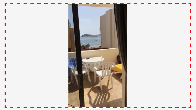
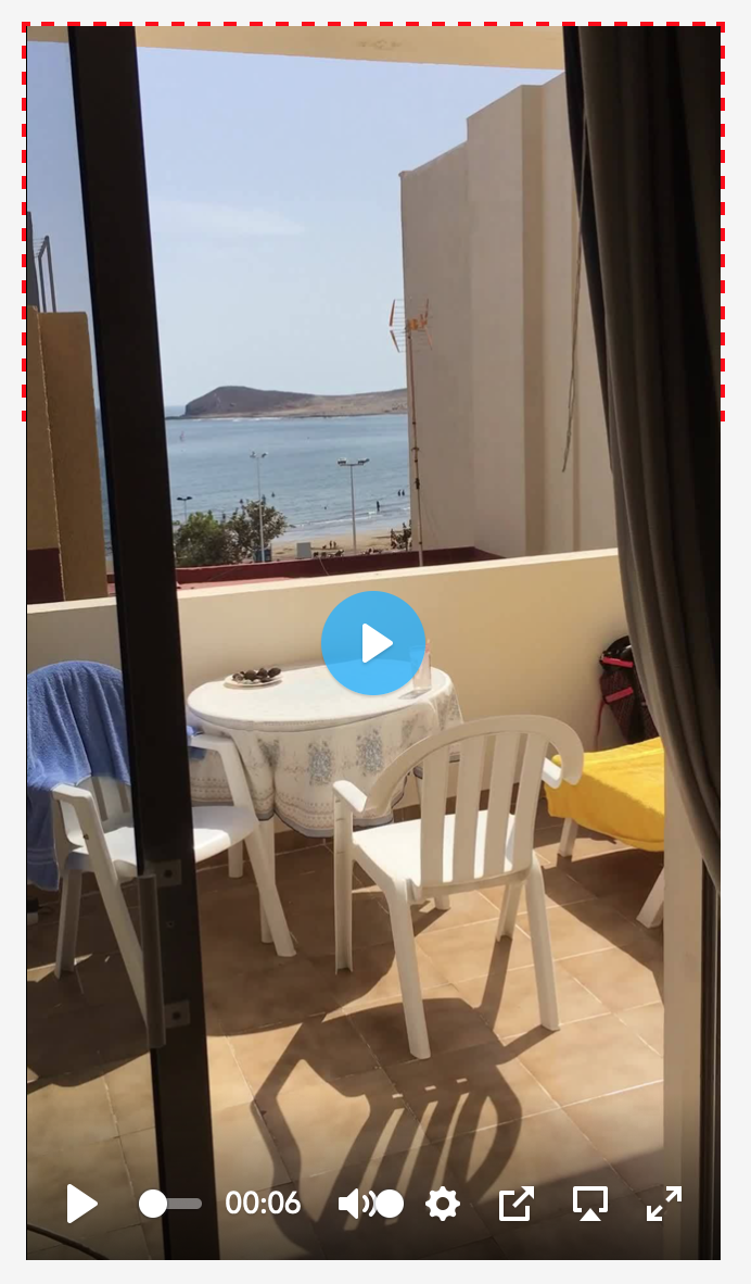
Here is what I am seeing in Chrome when I shrink the height (simulating landscape on a phone) without necessarily going full-screen. I guess the solution is that I would like to see more black border such that the full height of the movie is visible.

I am way behind on learning CSS and how things get precedence. I think I see plyr.css taking over and has similar setting to above.

my CSS above is compiled into main.css by ionic2
let me know if I post more info

I put together a 4:3 movie with some guides, it might be helpful https://youtu.be/HWc8-HS1njE for anyone debugging.

I will take any CSS suggestions that would get me closer to the goal.
Thanks
 AlGantori
on 19 Mar 2017
AlGantori
on 19 Mar 2017
You realise this exact CSS is already built in for the embedded players. Plyr uses the same 16:9 assumption so your code won't change anything?
sampotts
on 19 Mar 2017
Ok Sam, good to know, I will undo that wrapper then. Like I said I don't know enough about CSS regarding how classes (re)declarations take precedence, I will probably hit 6 foot under before I cross-out that TODO. When I saw that post https://github.com/Selz/plyr/issues/339 I thought I hit jackpot :)
Per your comment above PLYR handles 16:9 ratio fine. Most of my vids start as 4:3 PowerPoint documents, however I reference lots and any types of videos on YouTube (nothing on Vimeo at this time).
So, I will wait for this issue to get resolved for 4:3 ratio, in the meantime could you suggest perhaps a work-around/kludge to force the PLYR controls to stay visible? Is there any tricks with setting the width to 100vmin or such?
Thanks for a great component, I will work on other issues not related to plyr in the meantime.
AlGantori
on 19 Mar 2017
I hacked a bit more at this issue and here are my finding (far from final)
In the following prototype code I am checking if we are in Landscape and we can fit a 16:9 video than use of styling class PlyrVideoWrapper169 otherwise class PlyrVideoWrapper169.
If we are in Portrait W < H than assume we can always fit a 16:9

Here is the current rendering cases in landscape and portrait, the way I understand them.
Case 1: LANDSCAPE: player can occupy the whole width without cropping height

Case 2: LANDSCAPE: player should NOT occupy the whole width otherwise it will crop its height

Case 3: PORTRAIT: player should always be able to occupy 100% of the width without cropping its height.

The HTML template with the conditional class assignments follows

In the following CSS I need to make the hard-coded width : 80% take on the value of Height / 9 * 16

Can the above logic be incorporated into PLYR or am I missing other cases?
I still need to resolve how to hook into viewport size changes and react to it for a "Responsive" layout.
But again you must be doing that already, there is no point for to re-invent the wheel, if it something that could be handled in PLYR.
Thanks again!
PS. my logic might be similar to the JS code shared above but I had a hard understand it nor do I know how to incorporate into my typescript/javascript/Angular2/Ionic2 zoo :)
AlGantori
on 19 Mar 2017
When I get around to it, I'll just be changing the 56.25% value to change the aspect ratio rather than add extra divs etc (certainly not with camel case classnames! 😄). You can't explicitly set the width/height as then it's not responsive. That's the whole point of the 56.25% solution.
For 16/9 it's calculated like so:
100 / 16 = 6.25
6.25 * 9 = 56.25%
So, for 4/3 it'd be:
100 / 4 = 25
25 * 3 = 75%
Vimeo allows getting the height and width of the video so this could be done dynamically. YouTube doesn't so it would be a little more tricky. The best solution would for it to be dynamic like it is with the HTML5 video.
I'll get around to it once I've finished the current improvements. Things have calmed down a bit now since my boy's birth so I should get some time after work this week and next weekend to get that lot wrapped up then I can look at this.
sampotts
on 19 Mar 2017
I've added an option in v3 for this for the embeds. Feel free to re-open if you have issues 👍
sampotts
on 22 Mar 2018
Same issue with the latest plyr release: plyr sets video width to that of the parent container and lets the height overflow (if the video is higher than 16:9). This conflicts with how browsers display html5 video natively and how most other players render it.
Considering how many users shoot their video with their phones in vertical orientation, fitting a 9:16 video into 16:9 container should be a common practice these days. I haven't found a way to do that with plyr. The "ratio" option seems to be ignored.
 ninze
on 27 Feb 2019
ninze
on 27 Feb 2019
Pointless -1's @AkgunFatih and @lofcz.
@systemist That ratio option was for the embedded players as the docs show. It's now automatic based on data from the YouTube and Vimeo APIs so should probably be removed. Do you have an example of a HTML5 player experiencing the issue?
sampotts
on 27 Feb 2019
The red-dashed container has fixed size of 320x180px for this test.
Video size is 202x360px.
First image shows how browser renders html5 video tag without initialising plyr. This is also how most players would render it.
Second image shows the same video tag after initialising plyr. The calculated size becomes 320x568. As you can see the video overflows the container. If I set overflow: hidden, then the rest of the video becomes cropped.
ninze
on 27 Feb 2019
Could we still have the ratio option for background videos that actually need to fit a specific size? Currently the ratio option does nothing for Vimeo videos... See issue #1366.
 meinhard-meintjes
on 4 Mar 2019
meinhard-meintjes
on 4 Mar 2019
@systemist did you establish a workaround for this?
 samhibberd
on 8 Apr 2019
samhibberd
on 8 Apr 2019
@systemist I'm also having this issue. did you manage to get a fix or workaround?
 hesperanca
on 16 Apr 2019
hesperanca
on 16 Apr 2019
@sampotts do you know what could be causing the issue described by systemist above?
hesperanca
on 16 Apr 2019
The ratio option now works for all video types. Give the latest version a try. There’s also a getter and setter.
sampotts
on 16 Apr 2019
I switched to another player without being able to get plyr working at the time. Will give the latest version a try, thanks.
IMHO a standards compliant player should behave like the native video tag and fit the parent container instead of just matching width.
ninze
on 16 Apr 2019
@systemist Feel fee to submit a pull request. Plyr is a responsive player - one could argue that's more important these days. This can't be achieved with fixed dimensions. Given Plyr is a very lightweight wrapper over the HTML5 element, a responsive native HTML5 player would suffer the same issue.
sampotts
on 16 Apr 2019
Isn't the native video element responsive? Checking the height of the video and adjusting the size accordingly would not make plyr unresponsive.
ninze
on 16 Apr 2019
I'm still having a problem with the latest version. If we set the ratio it respects the size but it zooms the video to fit the size instead of displaying the video with borders at each side. Let me see if I can get you an example.
hesperanca
on 16 Apr 2019
It's responsive if you make it responsive, otherwise it will render at the size of the source media. Styling with CSS to max-width: 100% will make it responsive but then will also run into the issue you highlighted originally. I've never seen HTML5 video render a vertical video like that but it could vary per browser I guess. Here's an example of what I mean, for me this just displays a long vertical video, now locked to 16:9 as you're suggesting...
https://jsfiddle.net/2dzn09Lw/
It's possible to access the video dimensions via the videoWidth and videoHeight properties but the player would still need to know the target video ratio to lock down how to display it.
sampotts
on 16 Apr 2019
@hesperanca OK so perhaps what we also need to do is check the dimensions of the video itself and if a ratio is set we determine which dimensions should be 100%. I'll have a play now.
sampotts
on 16 Apr 2019
@sampotts You should be able to see what I mean here:
https://codepen.io/HugoE/pen/QPMbON
Before the video starts you can see that it gets displayed with the black bar at each side which is what I would expect (given that the original format of the video is not 16:9). But when plyr get initialised it zooms the video and chops the bottom and top.
hesperanca
on 16 Apr 2019
@hesperanca Ahhhh Vimeo. OK we have to do some special jiggery pokery for Vimeo. I'll double check. That's a lot for the codepen. That'll help me debug.
@systemist HTML5 seems to be working as expected which is good... https://jsfiddle.net/04e8xybj/
sampotts
on 16 Apr 2019
@sampotts This would be a typical scenario where HTML5 video works and plyr fails:
https://jsfiddle.net/qxtpm5hg/
or a more advanced one, with parent container height being a percentage of width:
ninze
on 16 Apr 2019
@systemist The advanced example is the equivalent of setting a ratio. That's exactly what setting a ratio does.
I can't see a use case for the first example but it's possible with some basic CSS:
https://jsfiddle.net/928db3rg/1/
sampotts
on 16 Apr 2019
@sampotts we have a requirement for the above but with a Vimeo embed, can't seem to get it playing ball, am i missing something obvious, or is there more work required to support portrait video with Vimeo?
https://jsfiddle.net/samhibberd/zgx9rdvn/2/
needs to behave in the same way as your example: https://jsfiddle.net/928db3rg/1/
Any thoughts?
samhibberd
on 17 Apr 2019
@samhibberd You probably need to provide the "ratio" option as sampots mentioned previously. Although my personal opinion is that if a player is designed to enhance html5 video tag, it should position itself in the same way as the video tag does natively. This way if there is a javascript error on the page, the browser can easily fallback to the native player without affecting the layout. As I said this is just my personal opinion, at this time I don't plan to submit any pull requests for it :)
ninze
on 17 Apr 2019
@systemist As I pointed out yesterday in my last comment, it's possible to achieve what you're after with some basic CSS. You'll be using CSS for styling the player to make it responsive anyway.
sampotts
on 17 Apr 2019
@systemist passing the ratio doesn't help.
samhibberd
on 17 Apr 2019
the issue is still happening, even though I'm using ratio option, the video takes few seconds without being affected by the ratio option and the ideal dimensions, unfortunately, the option is not stable enough, and I have to ignore loading problem if I want to use the ratio option !!!
 abdulrahmankhaled1
on 29 Oct 2019
abdulrahmankhaled1
on 29 Oct 2019
I have an issue with Vimeo too where I'm trying to make it run inside a fullscreen element (modal popup). The issue is, it fits the width to 100% but because of the padding it crops the bottom of the video. So far I've fixed this using the aspect ratio and setting the width of the video regarding on the height. But I think it would be better if there was some sort of contain mode. This doesn't happen with youtube, but I think youtube automatically contains.
 TomS-
on 18 Feb 2020
TomS-
on 18 Feb 2020
this worked for me:
<div id="videoContainer" style="
    position: absolute;
    top: 50%;
    left: 50%;
    transform: translate(-50%, -50%);
    width: 100vw;
    height:100vh;
">
 Hanoosh
on 10 Jun 2020
Hanoosh
on 10 Jun 2020
I have an issue with Vimeo too where I'm trying to make it run inside a fullscreen element (modal popup). The issue is, it fits the width to 100% but because of the padding it crops the bottom of the video. So far I've fixed this using the aspect ratio and setting the width of the video regarding on the height. But I think it would be better if there was some sort of contain mode. This doesn't happen with youtube, but I think youtube automatically contains.
I have more or less the same issue: I want to play my video in a jQuery UI Dialog modal window.
Using the following I have the native HTML5 player well constrained inside the modal:
.ui-dialog-content video {
    width: auto;
    height: auto;
}
But if I enable the Plyr player it gets a bigger height and thus is not completely visible inside the modal (a scroll bar appears).
Do you have some code to share on how you got to fix it?
 C-Duv
on 7 Dec 2020
C-Duv
on 7 Dec 2020
Related issues
 nam-co
·
4Comments
nam-co
·
4Comments
 thang-nm
·
4Comments
thang-nm
·
4Comments
 onigetoc
·
3Comments
onigetoc
·
3Comments
 Skwai
·
4Comments
Skwai
·
4Comments
 michaelmano
·
3Comments
michaelmano
·
3Comments
Most helpful comment
When I get around to it, I'll just be changing the 56.25% value to change the aspect ratio rather than add extra divs etc (certainly not with camel case classnames! 😄). You can't explicitly set the width/height as then it's not responsive. That's the whole point of the 56.25% solution.
For 16/9 it's calculated like so:
So, for 4/3 it'd be:
Vimeo allows getting the height and width of the video so this could be done dynamically. YouTube doesn't so it would be a little more tricky. The best solution would for it to be dynamic like it is with the HTML5 video.
I'll get around to it once I've finished the current improvements. Things have calmed down a bit now since my boy's birth so I should get some time after work this week and next weekend to get that lot wrapped up then I can look at this.