Plots2: Bug in the search input form in the navbar.
Please describe the problem (or idea)
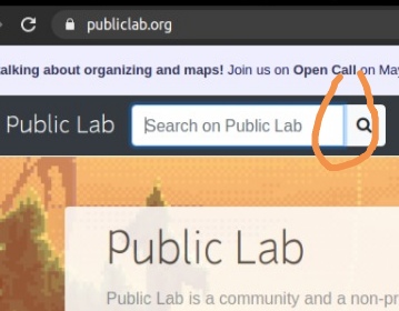
Whenever we focus on the search input. A vertical blue line appears at the right. Take a look at this image to understand the problem
What did you expect to see that you didn't?
The line should be removed.
Please show us where to look
https://publiclab.org/
Focus on the search box.
What's your PublicLab.org username?
This can help us diagnose the issue:
priyaraj_17
Browser, version, and operating system
Many bugs are related to these -- please help us track it down and reproduce what you're seeing!
chrome
Version 90.0.4430.85
Ubuntu 20.04
Thank you!
Your help makes Public Lab better! We deeply appreciate your helping refine and improve this site.
To learn how to write really great issues, which increases the chances they'll be resolved, see:
https://publiclab.org/wiki/developers#Contributing+for+non-coders
 Priyaraj17
All 31 comments
Thanks for opening your first issue! This space is protected by our Code of Conduct - and we're here to help.
Please follow the issue template to help us help you 👍🎉😄
If you have screenshots or a gif to share demonstrating the issue, that's really helpful! 📸
Do join our Gitter channel for some brainstorming discussions.
![welcome[bot] picture](https://avatars.githubusercontent.com/in/4141?v=4&s=40) welcome[bot]
on 2 May 2021
welcome[bot]
on 2 May 2021
Can I work on this @Priyaraj17 ?
 Elukoye
on 2 May 2021
Elukoye
on 2 May 2021
@Elukoye sure go ahead. Let me know if you face any problem.
Priyaraj17
on 3 May 2021
@Priyaraj17 thanks ,I will
Elukoye
on 3 May 2021
Hi @Priyaraj17,
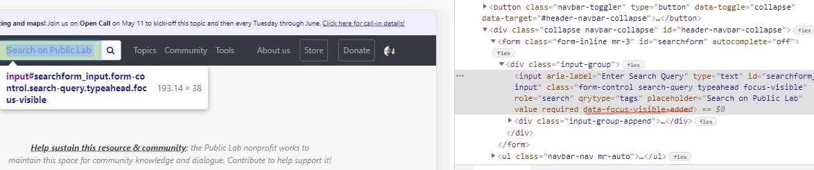
I had a look at this and realized that the blue line is coming from the data-focus-visible-added class
 .
.
Elukoye
on 3 May 2021
Therefore, i don't think it is a bug, let me know your thoughts. 🙂
Elukoye
on 3 May 2021
Ohh, I see. Give me a couple of minutes @Elukoye
Priyaraj17
on 3 May 2021
You are right, thank you for the effort. I apologise for this. I hope you didn't spend a lot of time on this.
Priyaraj17
on 3 May 2021
No problem @Priyaraj17 🙂👍,maybe we could request for this issue to be closed by the mentors ?
Elukoye
on 3 May 2021
Yeah sure. I will ask for their opinion.
Hey @cesswairimu should we close this issue?
Priyaraj17
on 3 May 2021
hi everyone, the above image I believe consists of two elements, the search field, and the search icon as a clickable button....I wouldn't say its a bug because we meant it to be like that...what you could do @Elukoye @Priyaraj17 you could come up with a mockup of how you would like to improve that section and then we can discuss from there...in the meantime I will label this as "enhancement" ..what do you both think?
Thanks all
 cesswairimu
on 4 May 2021
cesswairimu
on 4 May 2021
Yeah sure. I will ask for their opinion.
I think it's a nice idea. We can definitely come up with a solution.
Priyaraj17
on 4 May 2021
How about changing the focus state border box shadow style to reflect inside the input field 🙂...That way the user is able to see the border focus shadow clearly which the current search box is unable to achieve due to a dark background around the input field:
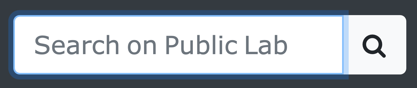
This could be achieved by simply adding the inset keyword for box shadow under focus state.
 waridrox
on 4 May 2021
waridrox
on 4 May 2021
@waridrox hey, I prefer this over the current one. Let's see what the mentors have to say and also @Elukoye what do you think?
Priyaraj17
on 4 May 2021
@Priyaraj17 ,@waridrox ,I like what @waridrox suggested but I think the box shadowing should be around the border of the input ,like below 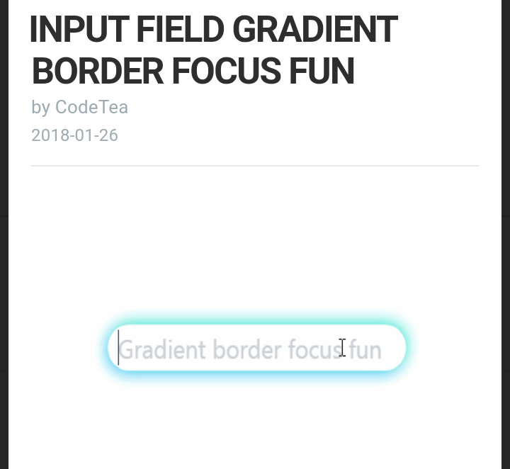
Elukoye
on 4 May 2021
Both of them are good. But, I prefer @waridrox's suggestion. Let's see what others have to say.
Priyaraj17
on 4 May 2021
Ok then shall I implement @waridrox 's suggestion?
Elukoye
on 5 May 2021
@cesswairimu ? @jywarren ?
Elukoye
on 5 May 2021
@Elukoye Hey, I think they are busy. Maybe you can start working on it. In fact, you can try your suggestion.
Priyaraj17
on 6 May 2021
Hi all sorry for the delay 😅, I thought we were just brainstorming here for the ideas...maybe we could try implementing both the ideas and see which one suites better ? It's just a matter of applying the styles to the search box once we find where it lies in the codebase 👍
waridrox
on 6 May 2021
Hi all sorry for the delay , I thought we were just brainstorming here for the ideas...maybe we could try implementing both the ideas and see which one suites better ? It's just a matter of applying the styles to the search box once we find where it lies in the codebase
Yeah. Sure. I like this idea. We can compare which one looks better.
Priyaraj17
on 6 May 2021
@Priyaraj17 ,@waridrox I already started playing around with it and I realized that what I suggested was the default Bootstrap style. Also as @cesswairimu said ,the bootstrap implementation involves 2 buttons. I have seen that some of the files ,they have used inline styling. So was wondering if I could override the default style with inline css.
What do u think @waridrox ,since u suggested adding keyword inset to the box shadow property.
Am going to work on this and hopefully have a sample by tomorrow.
Elukoye
on 6 May 2021
@Priyaraj17 ,the code is in the views folder , layouts sub folder ,header partial ,line 20.
Elukoye
on 6 May 2021
@Elukoye, I think it's not possible to deal with pseudo classes like :focus using inline CSS 😅. Either we need to use the <style> tag or we can apply the styles in the file app/assets/stylesheets/styles.css and see if that works.
waridrox
on 6 May 2021
@Elukoye Thank you. I will also take a look into it. I think @waridrox it's better if we apply the styles in app/assets/stylesheets/styles.css.
Priyaraj17
on 6 May 2021
@Priyaraj17 ,@waridrox what about simply adjusting the color of the navbar ? To make it lighter or blend in nicely with bootstraps light blue focus on the input's border ?
Elukoye
on 8 May 2021
@Elukoye this sounds good. It think it will look nice.
Priyaraj17
on 8 May 2021
@Priyaraj17 @Elukoye, any updates ?? I tried my option -

What do you think ? @Elukoye pls share your solution as well so that we can finally come upon a decision...
waridrox
on 13 May 2021
@waridrox Thanks for sharing your approach. This looks good. I think we should close this issue today, @Elukoye what do you think?
Priyaraj17
on 13 May 2021
@Priyaraj17 ,@waridrox looks good . Thanks for sharing ,yes we can close this
Elukoye
on 13 May 2021
@waridrox Can you please make the PR?
Priyaraj17
on 13 May 2021
Related issues
 keshavsethi
·
3Comments
keshavsethi
·
3Comments
![first-timers[bot] picture](https://avatars.githubusercontent.com/in/4832?v=4&s=40) first-timers[bot]
·
3Comments
first-timers[bot]
·
3Comments
 shapironick
·
3Comments
first-timers[bot]
·
3Comments
shapironick
·
3Comments
first-timers[bot]
·
3Comments
 jywarren
·
3Comments
jywarren
·
3Comments
Most helpful comment
@Priyaraj17 ,@waridrox looks good . Thanks for sharing ,yes we can close this