Plots2: Form UI Change in different screens
Please describe the problem (or idea)
What happened just before the problem occurred? Or what problem could this idea solve?
In mobile view, there is no space between the two forms which makes the overall UI look bad.
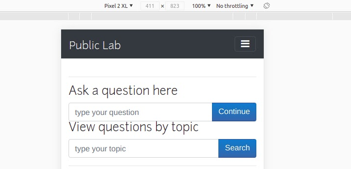
When the user is not logged in, the two forms are not perfectly aligned.

What did you expect to see that you didn't?
Improve the alignment and overall UI of the forms.
Please show us where to look
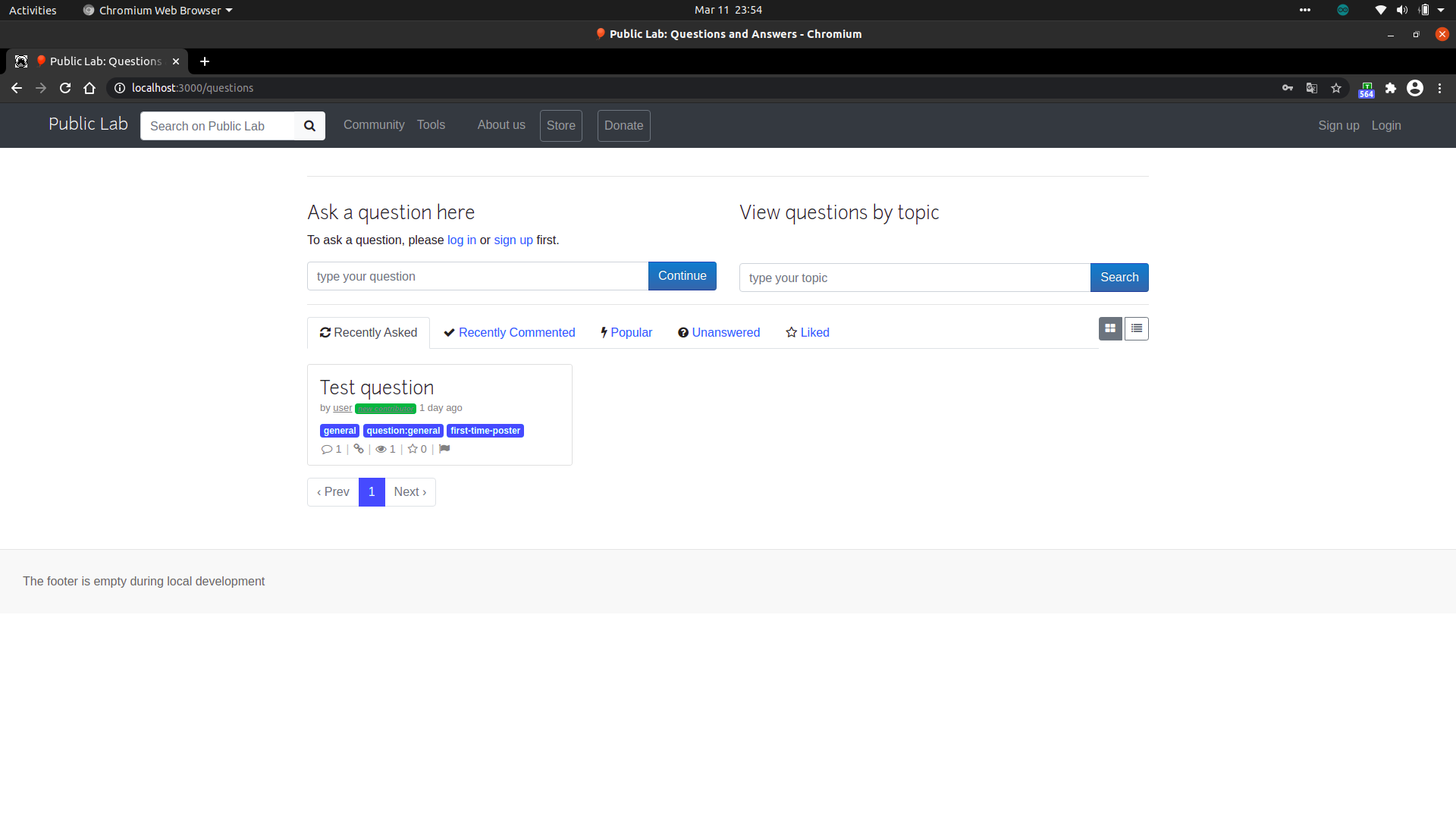
https://publiclab.org/questions
Browser, version, and operating system
Many bugs are related to these -- please help us track it down and reproduce what you're seeing!
- Browser: Chromium Version 89.0.4389.82 (Official Build)
- OS: Ubuntu 20.04.1 LTS
Thank you!
Your help makes Public Lab better! We deeply appreciate your helping refine and improve this site.
To learn how to write really great issues, which increases the chances they'll be resolved, see:
https://publiclab.org/wiki/developers#Contributing+for+non-coders
 sahilsaha7773
All 5 comments
Thanks for opening your first issue! This space is protected by our Code of Conduct - and we're here to help.
Please follow the issue template to help us help you 👍🎉😄
If you have screenshots or a gif to share demonstrating the issue, that's really helpful! 📸
Do join our Gitter channel for some brainstorming discussions.
![welcome[bot] picture](https://avatars.githubusercontent.com/in/4141?v=4&s=40) welcome[bot]
on 11 Mar 2021
welcome[bot]
on 11 Mar 2021
Thanks for opening this up @sahilsaha7773 .
Can you please tell your proposed UI change?
 pydevsg
on 11 Mar 2021
pydevsg
on 11 Mar 2021
Thanks for opening this up @sahilsaha7773 .
Can you please tell your proposed UI change?
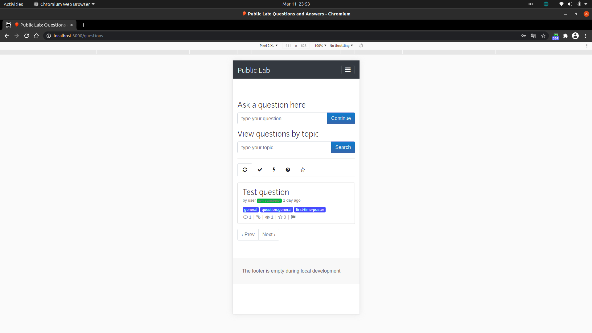
This is how it should look after fixing. These changes will make the UI look better for all devices.
sahilsaha7773
on 11 Mar 2021
Go ahead @sahilsaha7773 and fix this issue.
pydevsg
on 11 Mar 2021
This is great :tada: thanks @sahilsaha7773 and @pydevsg :tada: :tada:
 cesswairimu
on 12 Mar 2021
cesswairimu
on 12 Mar 2021
Related issues
 milaaraujo
·
3Comments
milaaraujo
·
3Comments
 ebarry
·
3Comments
ebarry
·
3Comments
![first-timers[bot] picture](https://avatars.githubusercontent.com/in/4832?v=4&s=40) first-timers[bot]
·
3Comments
first-timers[bot]
·
3Comments
 RuthNjeri
·
3Comments
RuthNjeri
·
3Comments
 keshavsethi
·
3Comments
keshavsethi
·
3Comments
Most helpful comment
This is great :tada: thanks @sahilsaha7773 and @pydevsg :tada: :tada: