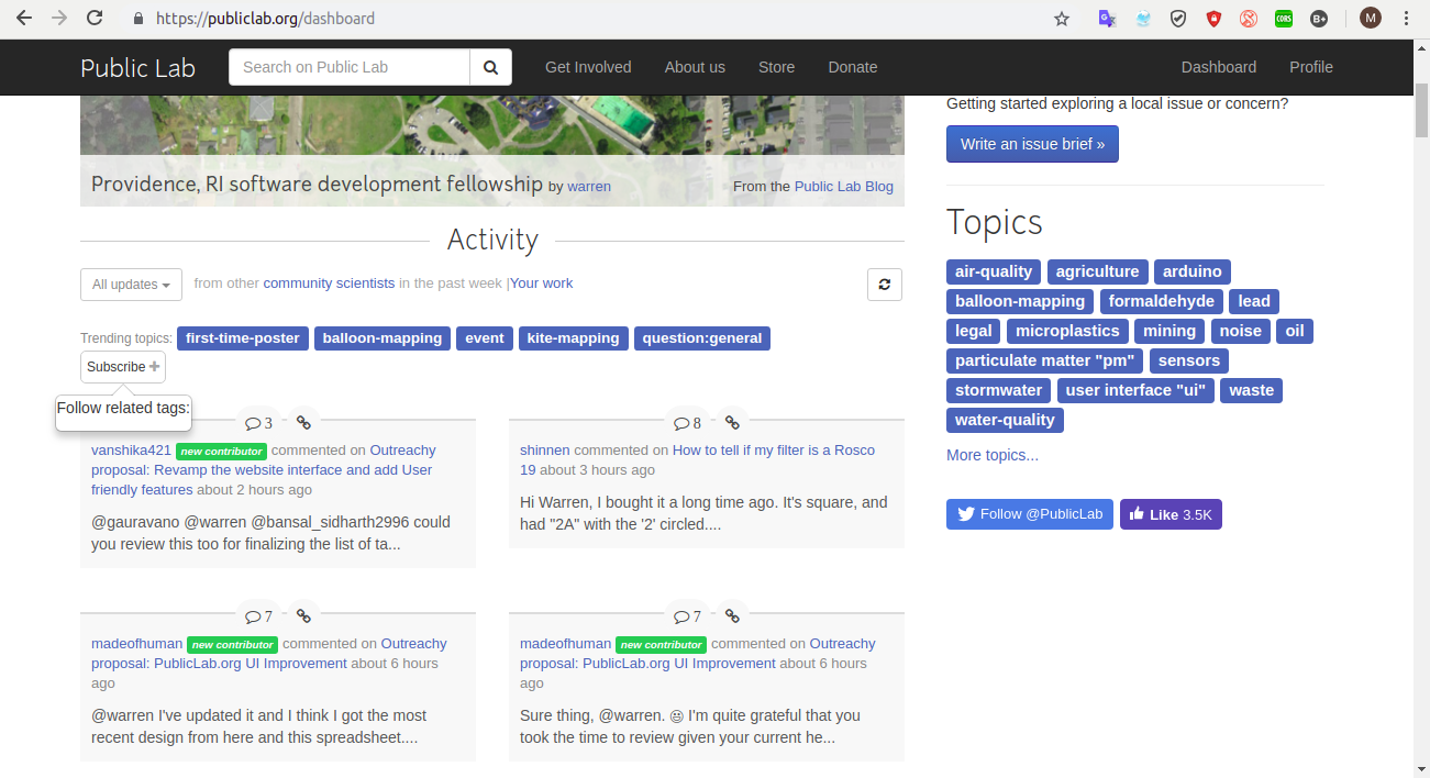
Description
Fix the tooltip UI.
currently the tooltip text isn't in a good position, too much towards the boundary, it will be nice to have some margins from the side and also keeping the UI consistent for the tooltips, make it black
like other tooltips

I need reviews from mentors regarding this issue.
Thanks !
All 5 comments
I'm interested in working in this :)
Hey @CleverFool77 actually that's not the problem here. There's a problem in the popover only and I am trying to fix it, it's not exactly a border-margin issue. This button was made for multiple tag subscription.
Thanks for mentioning this out @IshaGupta18 :)
So, if you don't mind, can I close this issue? I'll reopen it when I find a fix to it. There's actually some problem with rendering partials inside popovers!
Sure :+1: @IshaGupta18