Plots2: Consider how to show clusters of people “active over past 6 months”
Hey @jywarren, could you make it clearer what you're thinking about this?
 milaaraujo
All 14 comments
I think this may need some input from @ebarry and
possibly @sagarpreet-chadha -- the idea is to brainstorm if there is a way
to highlight which regions of the world are seeing lots of activity. If we
feel the API can efficiently provide data for longer periods of time (and
we understand the limits if lots of people begin to post) perhaps this
could be achieved simply through the /people page but showing many many
people on the map. If that's the case, then this could in theory be
addressed through optimization, rather than through a unique API endpoint.
But I wanted to hear from others as to the possibilities and options here.
Thanks!
On Mon, Jan 7, 2019 at 3:05 PM Camila Araújo notifications@github.com
wrote:
Hey @jywarren https://github.com/jywarren, could you make it clearer
what you're thinking about this?—
You are receiving this because you were mentioned.
Reply to this email directly, view it on GitHub
https://github.com/publiclab/plots2/issues/4560, or mute the thread
https://github.com/notifications/unsubscribe-auth/AABfJ6hvscmjHMG_MnHDRWZs57ZRY8ynks5vA6h-gaJpZM4Z0Oj2
.
 jywarren
on 8 Jan 2019
jywarren
on 8 Jan 2019
Ok! Waiting @ebarry and @sagarpreet-chadha thougths then. :relaxed:
milaaraujo
on 8 Jan 2019
I am going to jump in with a suggestion. If there is a concern about how many people from certain regions if the site becomes larger maybe instead of showing the differential based on the number of individuals it could be shown as percent of currently active users? For example, if there are 2000 active users in the past six months and 200 was from one region it could be indicated with 10%. Maybe on hover it could show the actual number of people.
 mardelvalle
on 9 Jan 2019
mardelvalle
on 9 Jan 2019
Cool idea @mardelvalle!
How do we decide regional boundaries? Maybe just continents to begin with?
 ebarry
on 10 Jan 2019
ebarry
on 10 Jan 2019
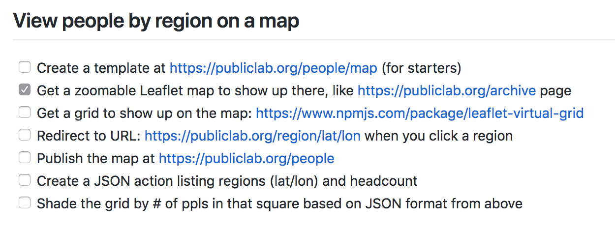
Just for context, a long time ago, we imagined overlaying a grid on the map on /people, and shading squares based on number of contributors: https://github.com/publiclab/plots2/issues/1070#issue-193899340
I am not attached to this idea at all, just sharing prior thoughts. I really like where you all are going regarding showing "clusters of active people"
ebarry
on 10 Jan 2019
Hi everyone ,
If i am getting this right , i would like to see the most active people (which would be calculated via an algorithm using their last 6 months contributions) with RED marker on /people map (instead of current normal black marker) .
Again just an idea , Liz may have something more interesting in her mind :)
Thanks !
 sagarpreet-chadha
on 10 Jan 2019
sagarpreet-chadha
on 10 Jan 2019
That sounds great @sagarpreet-chadha ! Do you like this idea?
ebarry
on 10 Jan 2019
If we want rough idea of regions with most active contributors , then it seems like a good option .
If we want exact maths , then it makes more sense as to yours and @mardelvalle suggestions above . Thank you :)
sagarpreet-chadha
on 10 Jan 2019
Hi, I think perhaps we should look to examples on other sites for how we'd
like this to be represented. Can folks try sharing some screenshots? Thank
you!
On Thu, Jan 10, 2019 at 11:32 AM Sagarpreet Chadha notifications@github.com
wrote:
If we want rough idea of regions with most active contributors , then it
seems like a good option .
If we want exact maths , then it more sense as to yours and @mardelvalle
https://github.com/mardelvalle suggestions above . Thank you :)—
You are receiving this because you were mentioned.
Reply to this email directly, view it on GitHub
https://github.com/publiclab/plots2/issues/4560#issuecomment-453160878,
or mute the thread
https://github.com/notifications/unsubscribe-auth/AABfJ30oAO6okf653TL2b0Dft4O2vO6tks5vB2rzgaJpZM4Z0Oj2
.
jywarren
on 10 Jan 2019
Hey @jywarren, have you thought about adding a "last activity" column in the user table? Looking at the API code, several times we have to use a join (:revisions) only to get this information...
milaaraujo
on 12 Jan 2019
Hmm, i think this would have to be synced... but we could do it... do you think overall it'd simplify our codebase?
jywarren
on 15 Jan 2019
I guess so! But it is just a suggestion, we can think about it in the future. :)
milaaraujo
on 15 Jan 2019
From Jeff:
Let's say: optimization (#4561) will make this much easier, and we could set the default # of people to display much higher on /people.
milaaraujo
on 17 Jan 2019
We'll close this out for now! I believe this is solved in the LEL people layer but we'll see as it grows!
jywarren
on 18 Nov 2019
Related issues
 noi5e
·
3Comments
noi5e
·
3Comments
 shapironick
·
3Comments
shapironick
·
3Comments
 grvsachdeva
·
3Comments
grvsachdeva
·
3Comments
 keshavsethi
·
3Comments
keshavsethi
·
3Comments
 divyabaid16
·
3Comments
divyabaid16
·
3Comments
Most helpful comment
I am going to jump in with a suggestion. If there is a concern about how many people from certain regions if the site becomes larger maybe instead of showing the differential based on the number of individuals it could be shown as percent of currently active users? For example, if there are 2000 active users in the past six months and 200 was from one region it could be indicated with 10%. Maybe on hover it could show the actual number of people.