Plots.jl: [BUG] Fill between lines using `ribbon` doesn't work on GR, Plotly
Details
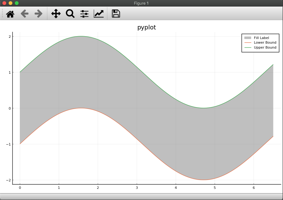
I've been trying to replicate thefill_between in PyPlot using the ribbon argument in Plots.plot. It works great (actually I like the fill_between API where the user specifies the upper and lower lines, not a center line and delta above and below it, but that's a side point). For GR and Plotly, however, the fill doesn't show up in the legend of a plot. I think this is a bug.
using Plots

function make_plot(backend_fn)
    backend_fn()
    x_plot = 0:0.05:6.5
    lb = sin.(x_plot) .- 1
    ub = sin.(x_plot) .+ 1
    fake_middle = lb + (ub - lb) / 2
    p = plot(
        x_plot,
        fake_middle,
        ribbon=[ub .- fake_middle, fake_middle .- lb],
        alpha=0,
        color=:gray,
        label="Fill Label",
        title="$backend_fn",
    )
    # these work
    plot!(p, x_plot, lb, label="Lower Bound")
    plot!(p, x_plot, ub, label="Upper Bound")
    return p
end

plots = [make_plot(b) for b in [gr, pgfplotsx, plotly, plotlyjs, pyplot]]
Backends
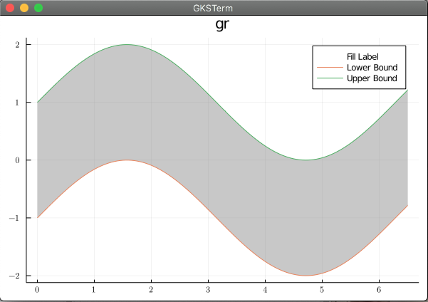
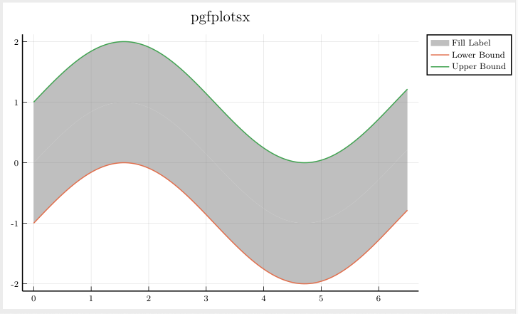
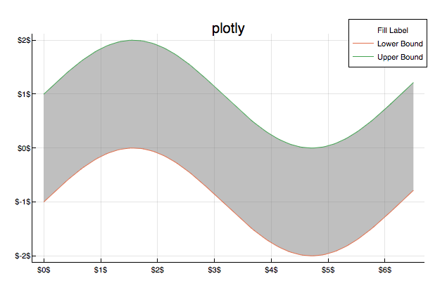
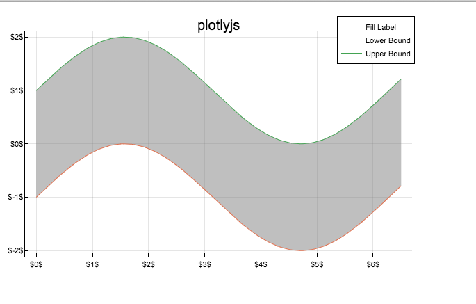
This bug occurs on ( insert x below )
Backend | yes | no | untested
-------------|-----|-----|---------
gr (default) | x | |
pyplot | | |
plotly | x | |
plotlyjs | | |
pgfplotsx | | x |
inspectdr | | | x
Versions
julia> versioninfo()
Julia Version 1.5.3
Commit 788b2c77c1 (2020-11-09 13:37 UTC)
Platform Info:
  OS: macOS (x86_64-apple-darwin18.7.0)
  CPU: Intel(R) Core(TM) i5-5287U CPU @ 2.90GHz
  WORD_SIZE: 64
  LIBM: libopenlibm
  LLVM: libLLVM-9.0.1 (ORCJIT, broadwell)
Plots 1.6.7
Output
 jdossgollin
All 2 comments
If you want to specify upper and lower curve you should use fillrange
x_plot = 0:0.05:6.5
plot(x_plot, sin.(x_plot) .+ 1, fillrange=sin.(x_plot) .- 1, fillcolor = :gray)
plot!(x_plot, sin.(x_plot) .- 1)
 BeastyBlacksmith
on 24 Nov 2020
BeastyBlacksmith
on 24 Nov 2020
Cool, that works and shows up on the legend!
(At least using GR, haven't tested plotly)
jdossgollin
on 24 Nov 2020
Related issues
 tbreloff
·
58Comments
tbreloff
·
58Comments
 juliohm
·
29Comments
juliohm
·
29Comments
 floswald
·
53Comments
floswald
·
53Comments
 mkborregaard
·
34Comments
mkborregaard
·
34Comments
 tanmaykm
·
66Comments
tanmaykm
·
66Comments
Most helpful comment
If you want to specify upper and lower curve you should use
fillrange