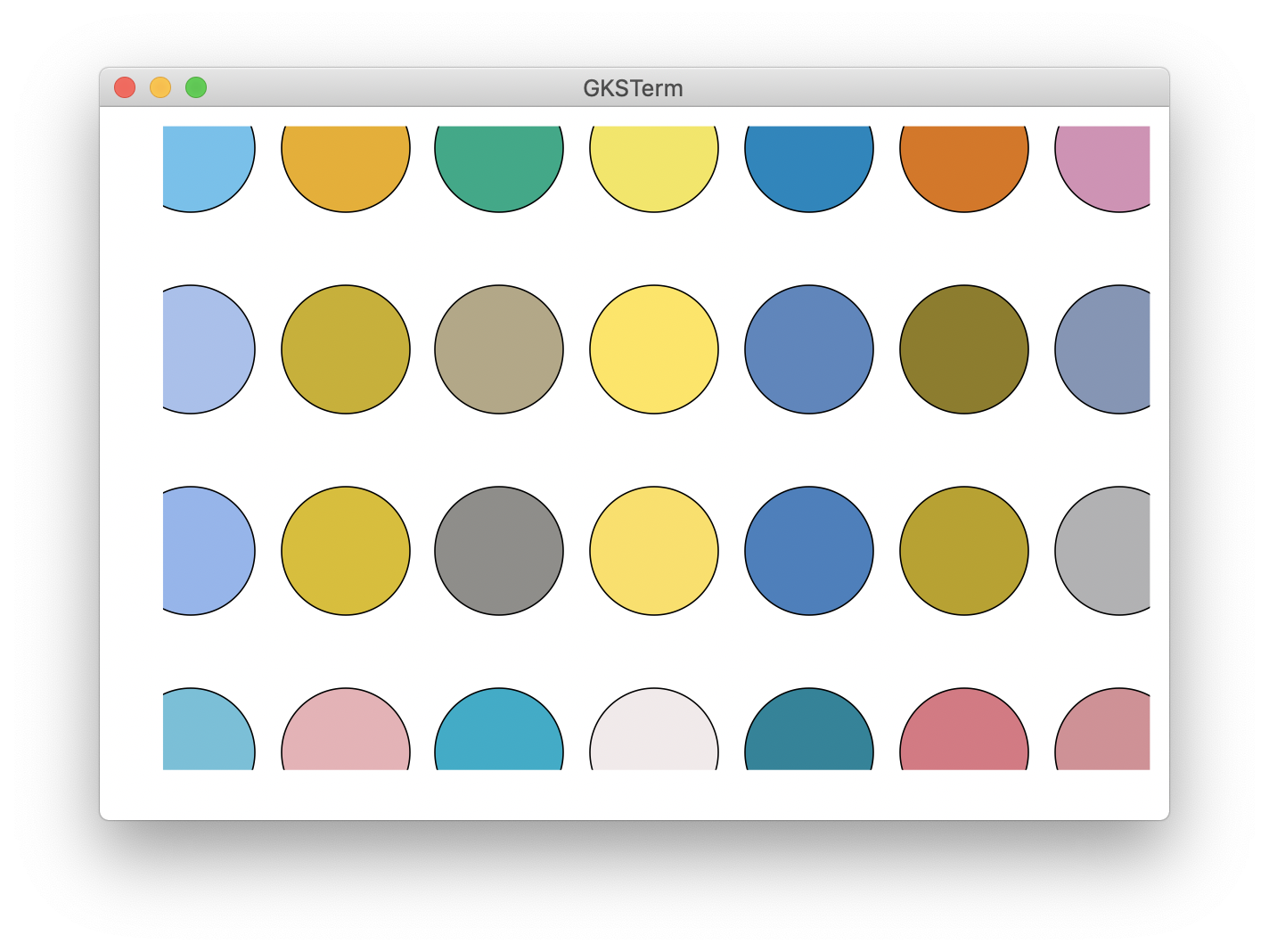
I wonder if we should switch to :wong (https://www.nature.com/articles/nmeth.1618?WT.ec_id=NMETH-201106) as the default color palette on Plots 1.0.
Current default
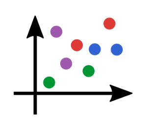
Wong
Other suggestions are also welcome. cc @BeastyBlacksmith @mkborregaard
 daschw
All 68 comments
I don't feel strongly, except, of course, that this is massively breaking, so must come out before Plots 1.0.
I actually prefer the :Dark2 palette if we had to choose one, but there are many better than the current one is for sure.
(with https://github.com/JuliaPlots/PlotUtils.jl/pull/73)
 mkborregaard
on 28 Mar 2020
mkborregaard
on 28 Mar 2020
If we do change, maybe have a community vote on discourse?
mkborregaard
on 28 Mar 2020
That's a good idea!
daschw
on 28 Mar 2020
Personally, I don't like :wong. I would rather take :wong2. One point I pay attention to is the the default color of the first series. I don't think orange looks good on its own, :wong2 has black, which I think is good, but then it has yellow as second which is not very good to print on white.
I also like the inferno heatmap more than viridis, but maybe we should provide jet as default.
Defaults are so controversial ^^
Maybe we should compute colors that have good contrast to the background.
 BeastyBlacksmith
on 28 Mar 2020
BeastyBlacksmith
on 28 Mar 2020
That's what's done with the current default theme.
daschw
on 28 Mar 2020
Maybe we should just stick to the current defaults. Users can use PlotThemes and PLOTS_DEFAULTS anyway to tweak appearance to their taste. Starting a community vote would also mean that we probably have to further delay a release a couple of days.
daschw
on 28 Mar 2020
I'm fine with that
BeastyBlacksmith
on 28 Mar 2020
I'm essetially fine with anything that doesn't involve taking the low-quality "jet" as a default :scream: Of course there are questions of taste, but there is also color perception theory and all the gradients in utils (essentially) follow that.
The default already computes colors for maximal difference from the background, at least it's supposed to.
I think asking widely could be fun and lead to some interesting discussions. The current palette really isn't very good IMHO.
mkborregaard
on 28 Mar 2020
The current palette really isn't very good IMHO.
Agreed. If you want to open up a vote on discourse, I'm also fine with that. I don't feel strongly about any theme - wong vs. dark2 or other suggestions - either.
daschw
on 28 Mar 2020
My two cents:
I would prefer wong/wong2 over dark as the default theme.
On Jupytper notebooks, the dark theme sort of sticks out whether you have Jupyter lab theme set to dark or light. On the other hand, the wong theme (or any other theme with a white background) only sticks out when the Jupyter lab theme is set to dark. I really like the fact that when you plot in Jupyter notebooks, the plots look like they belong in the notebook. If your default had a non-white background, then some of the notebook flow would get lost in my opinion.
Also, plots with a white background tend to look much nicer in documents (publications, notes, etc...).
I really like the fact that dark themes are easy on your eyes for prolonged screen time or for working after sunset. However, having a color palette that reduces eye strain feels like more of an opt in thing since different people have different needs with regards to eye strain.
 JackDevine
on 29 Mar 2020
JackDevine
on 29 Mar 2020
I suggest implementing a new colorscheme based on http://seaborn.pydata.org/examples/index.html
I think seaborns pallet looks very good while resembling Wong
 isentropic
on 30 Mar 2020
isentropic
on 30 Mar 2020
@isentropic if you make a PR with that to PlotUtils (the colors) and incorporate in a PlotThemes theme we will merge it for sure (and it could join the competition to become the default). Looks really nice.
mkborregaard
on 31 Mar 2020
@JackDevine I only meant the colorbrewer :Dark2 pallette, not the dark theme from PlotThemes. Agree with your points there.
mkborregaard
on 31 Mar 2020
@mkborregaard Yes, I will try doing it, maybe this is the time to do my first PR to Plots instead of actively critisizing it
isentropic
on 31 Mar 2020
Additionally, seaborn has a very neat feature of scaling the plots based on the context of plotting. See http://seaborn.pydata.org/tutorial/aesthetics.html#seaborn-figure-styles
Scaling plot elements
isentropic
on 31 Mar 2020
Seaborn has many color palettes, many of them look very nice to me. Maybe someone has a better idea to incorporate all of them without creating new themes for each one
isentropic
on 31 Mar 2020
I think in the long term the better solution would be adding new palettes to https://github.com/JuliaGraphics/ColorSchemes.jl and we integrate this in Plots.
daschw
on 31 Mar 2020
I agree that the seaborn qualitative palettes do look nice.
daschw
on 31 Mar 2020
I agree @daschw . I think we can shift to ColorSchemes without changing the user-facing interface right?
mkborregaard
on 31 Mar 2020
Yes, I think so too.
daschw
on 31 Mar 2020
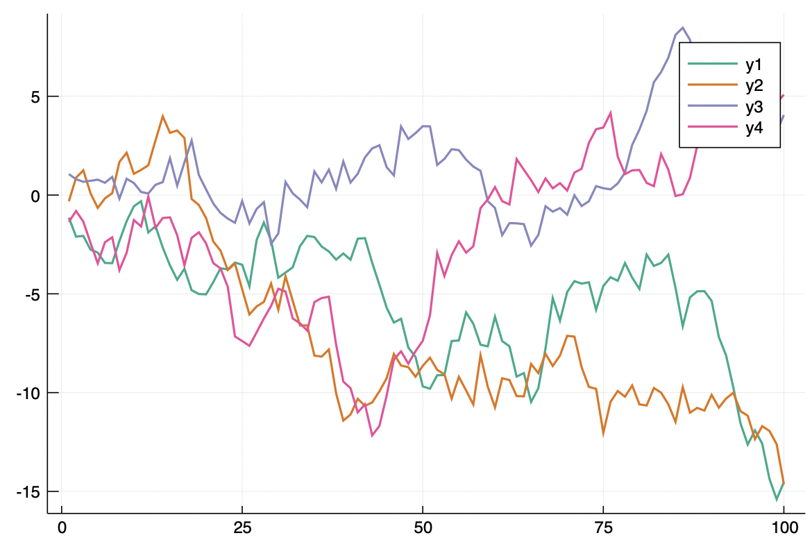
I have added the default seaborn color theme (deep) along with all others it offers (PR sent to PlotThemes)
Here is what it looks like,
Plots.showtheme(:seaborn_deep)
Additional example:
theme(:seaborn_deep)
plot(Plots.fakedata(50,10), w=3)
I used matplotlibs viridis theme for gradient (afaik seaborn does not change this).
which I think looks better than the original I think:
isentropic
on 31 Mar 2020
think in the long term the better solution would be adding new palettes to https://github.com/JuliaGraphics/ColorSchemes.jl and we integrate this in Plots
If needed I can send a PR with seaborn color palettes (similar to https://github.com/JuliaPlots/PlotThemes.jl/pull/48)
isentropic
on 31 Mar 2020
While at this, would somebody also consider it a good idea to increase the default scale of the plots? By default, Plots' font is smaller compared to other plotting packages. I would personally much prefer if the default scale was higher.
It is easily illustrated with pyplot backend (but equally valid for others):
theme(:seaborn_deep)
plot(rand(10,3))
plot(rand(10,3), dpi = 130, margin=7mm) # Althogh the customization is minimal here, this looks much better

For example, matplotlib pyplot's default dpi looks this,
plt.plot(rand(100))
Gnuplot also follows a higher scale:
https://commons.wikimedia.org/wiki/Category:Gnuplot_diagrams
base R plotting also uses a somewhat higher font scale
https://www.r-graph-gallery.com/13-scatter-plot.html
On a personal side, I very much like what Plots.jl already is, but I think that we can make better-looking defaults (for most users). Back when I started doing Julia I was repelled by default plot style parameters of Plots and could not get to use it because of it. Now I use it because I learned to make it look like I want to.
isentropic
on 2 Apr 2020
I would love to contribute but I am struggling to at least reproduce upscaling with GR() backend. I could perhaps present more examples and common use cases with this proposed by me new default theme if you would like it.
isentropic
on 2 Apr 2020
You could open a new issue on Plots if you like, but I'd personally prefer keeping the current settings.
mkborregaard
on 2 Apr 2020
I think we could also make PlotThemes a lot more visible in the docs. I think that would help new users see that they can get it like they want. @isentropic @daschw another option could be to have different style defaults (font sizes, line widths, frame styles etc) in PlotThemes as well, rather than just colors? That's the design I'm going for in MakieThemes.
mkborregaard
on 2 Apr 2020
Sure, I think ideally themes like wong should not even be a theme. It's just the default theme with a different color palette. If our color palette support would be better (JuliaPlots/PlotUtils.jl#73) we would not need wong, dark2, seaborn themes in PlotThemes.
daschw
on 2 Apr 2020
It's pretty easy to avoid too much breakage by reordering the Wong colormap. Here, the top is the reordered Wong, and the second, third and fourth rows represent its transformation to protanopic, deuteranopic and tritanopic color space.
 asinghvi17
on 2 Apr 2020
asinghvi17
on 2 Apr 2020
I think we could also make PlotThemes a lot more visible in the docs. I think that would help new users see that they can get it like they want. @isentropic @daschw another option could be to have different style defaults (font sizes, line widths, frame styles etc) in PlotThemes as well, rather than just colors? That's the design I'm going for in MakieThemes.
I could help with this if there are some specific things you want. If it is something along the lines of creating a page for theming in https://github.com/JuliaPlots/PlotDocs.jl/tree/master/docs/src I can definitely help.
isentropic
on 2 Apr 2020
Can we get the default tick direction to be out? That would make a big difference, and be much less Matlab-like and more like Python/Matplotlib and R
 drbenvincent
on 5 Apr 2020
drbenvincent
on 5 Apr 2020
I think that's another argument for allowing more styling options here in PlotThemes. I'm starting to realise the Pandora's box of different people's preferences is opened once you talk about tinkering with defaults. In conclusion I think we should decide to stick with the current defaults.
Both, are you aware you can set your own defaults using the config/startup.jl file? @daschw we didn't deprecate this, did we?
mkborregaard
on 5 Apr 2020
@isentropic yes, that would be awesome
mkborregaard
on 5 Apr 2020
No, we did not. It's a tip in http://docs.juliaplots.org/latest/install/ We should update .juliarc.jl to .julia/config/startup.jl though.
´
daschw
on 5 Apr 2020
Both, are you aware you can set your own defaults using the
config/startup.jlfile? @daschw we didn't deprecate this, did we?
I didn't know this. I'm relatively new to Julia, so feeling my way. Will look into it.
drbenvincent
on 5 Apr 2020
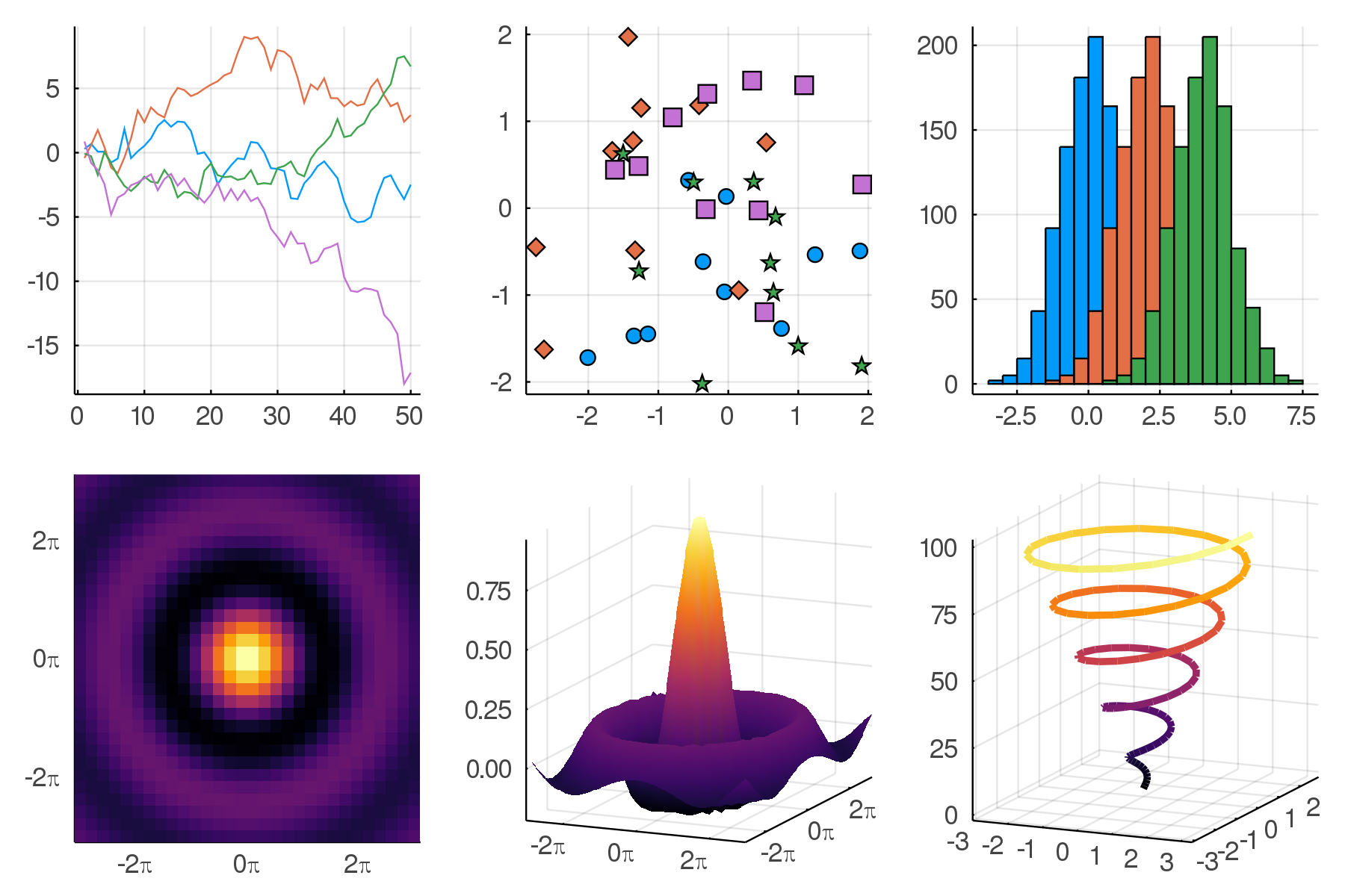
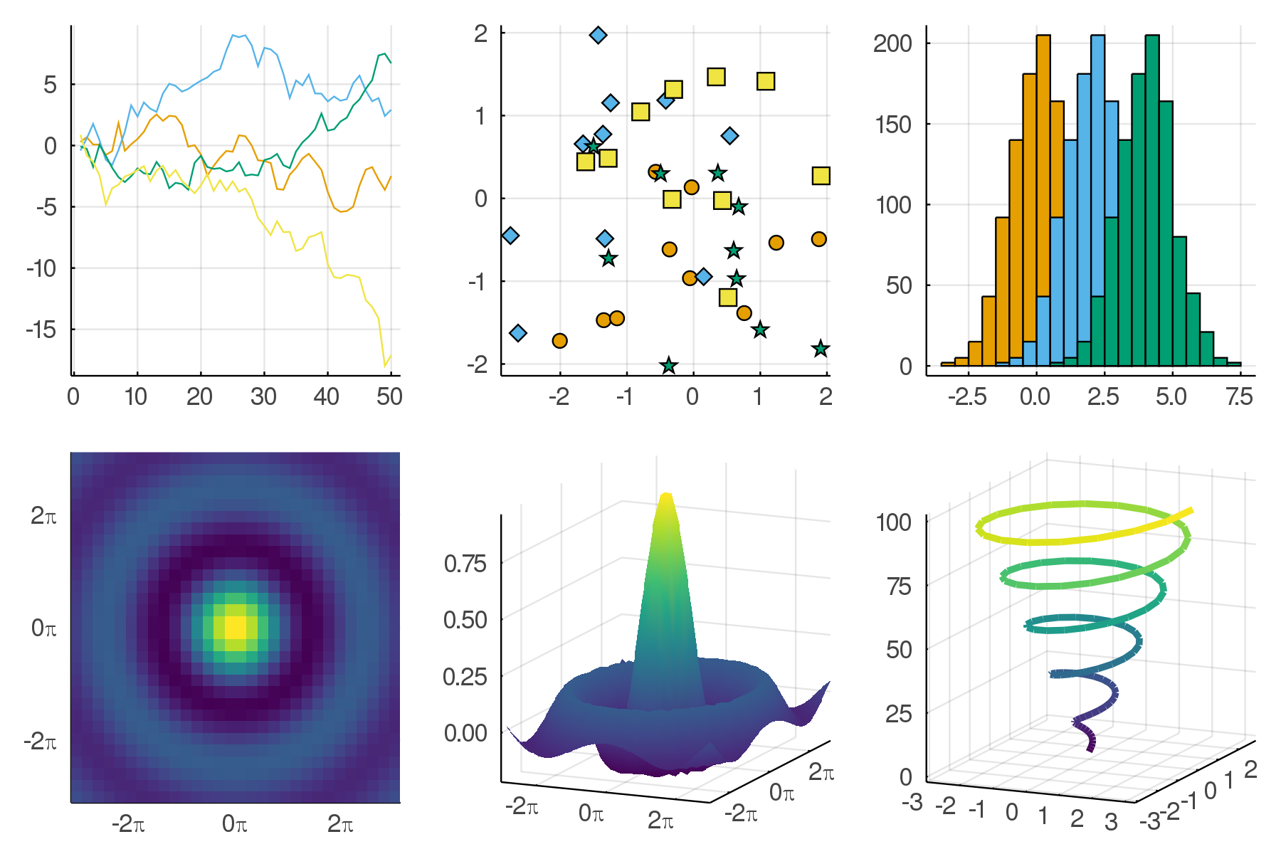
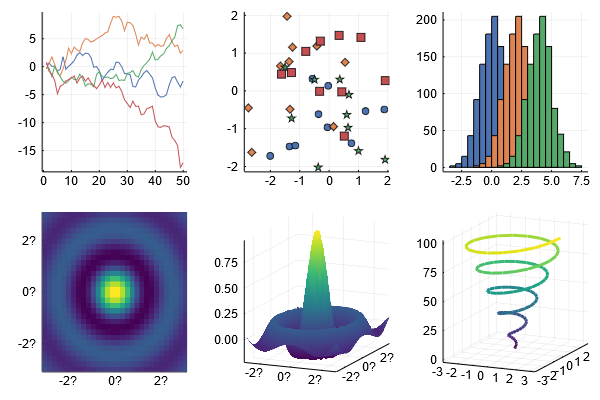
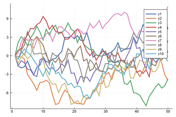
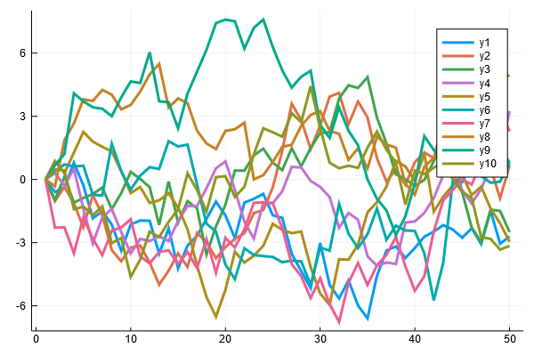
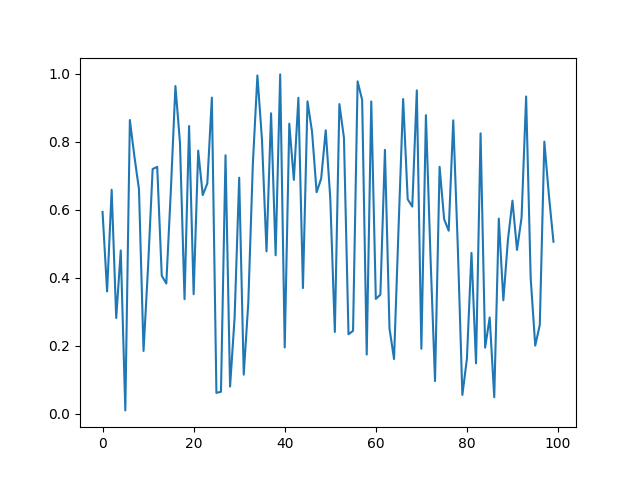
:+1: to changing the default color scheme. I think particularly with filled areas the current one doesn't look great to me. I get that it's hard to get everyone to agree on the best default, but it seems like there are options that everyone would probably agree are better than the current default (though maybe I'm being optimistic). I actually thought the current default colorscheme was designed to be the Julia colors - is it not?
Current default colors:
wong:
 ssfrr
on 6 Apr 2020
ssfrr
on 6 Apr 2020
@isentropic yes, that would be awesome
Now that I thought about it, could we somehow include https://github.com/JuliaPlots/PlotThemes.jl Readme.md file as a section in Plots.jl documentation?
isentropic
on 6 Apr 2020
Yes, if we depend on PlotThemes in PlotDocs, we can copy its README.
asinghvi17
on 6 Apr 2020
Is it perhaps possible to somehow include https://github.com/JuliaPlots/PlotThemes.jl/blob/master/README.md directly into PlotDocs? I've never used documenter personally, but instead of making copies each time PlotThemes updates, maybe there is a direct way of inclusion?
isentropic
on 6 Apr 2020
Yes there is a way of doing that but I'm not a documenter shark either. Anshul should be the expert here though
mkborregaard
on 6 Apr 2020
@ssfrr no the default theme is simply (more or less) the result of Colors.distinguishable_colors when you start with :steelblue.
mkborregaard
on 6 Apr 2020
You can't include it directly, but you can automate it, as I've done for GeoMakie (same principle, at least) here: https://github.com/JuliaPlots/GeoMakie.jl/blob/4f79946a615db5fcb27c849a42a4a67ea89c60d8/docs/make.jl#L4
Ignore the stuff after that line, I had to remove some HTML 😁
asinghvi17
on 6 Apr 2020
But how would I copy the readme from another repo?
You can't include it directly, but you can automate it, as I've done for GeoMakie (same principle, at least) here: https://github.com/JuliaPlots/GeoMakie.jl/blob/4f79946a615db5fcb27c849a42a4a67ea89c60d8/docs/make.jl#L4
Ignore the stuff after that line, I had to remove some HTML grin
isentropic
on 7 Apr 2020
If we depend on PlotThemes in the docs,
using PlotThemes
cp(joinpath(dirname(pathof(PlotThemes)), "..", "README.md"), joinpath(@__DIR__, "src", "plotthemes.md"); force = true)
should do it.
asinghvi17
on 7 Apr 2020
Ah, I forgot I already had a PR up for that: http://docs.juliaplots.org/previews/PR181/plotthemes/
asinghvi17
on 7 Apr 2020
While this discussion is still on, perhaps Plots could use a new logo? Maybe something along these lines?
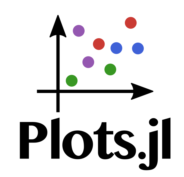
isentropic
on 7 Apr 2020
I like it, simple and julian. Personally, I don't mind dropping the batman logo, not sure how others see that.
daschw
on 7 Apr 2020
Yeah why not, though it feels subtly wrong to have a logo not made by @cormullion :-)
mkborregaard
on 8 Apr 2020
(i love seeing other people do logos...) I really like the upper half of isentropic's logo (but not the the "julia" font).
 cormullion
on 8 Apr 2020
cormullion
on 8 Apr 2020
we should also make it less Plots specific, if it is going to be used for the JuliaPlots organisation.
BeastyBlacksmith
on 8 Apr 2020
I think this would be a Plots logo, not a JuliaPlots org logo - both would be nice to have.
daschw
on 8 Apr 2020
The part without the Plots.jl is not Plots specific though
mkborregaard
on 8 Apr 2020
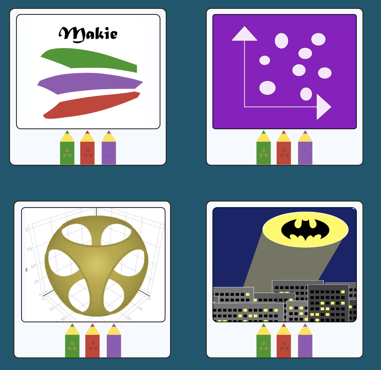
What you could do is have some kind of overarching family design, then use individual graphics for various packages... Here's a sketch of the idea:
cormullion
on 8 Apr 2020
So I drew some more possible logos, but a logo for JuliaPlots is difficult to come up with
Maybe choose one for each sub organization?

Or, use these for as one logo as @cormullion suggested?
Top left is still my preference, as it is the most basic plot.
Top right suggests some statistical connection
Bottom left is like analog signal
Bottom right is closer to some pdfs
Maybe have a vote on possible logos?
I think JuliaPlots and Plots.jl should have one logo (as currently is). As Plots is still the main repo
isentropic
on 9 Apr 2020
These logos are looking fabulous.
It will be sad to see the batman logo go, since I am a big fan of it, although I think that the ideas being proposed here do look a lot more professional. Bear in mind that the original selling point for the batman logo was that it could be generated by Plots.jl itself. Is there any scope for the current logos to be generated by Plots.jl?
Top left is still my preference, as it is the most basic plot.
This is my preference too, using circles drives the Julia logo pun home quite clearly.
Is it possible for you to have the coloured lines in bottom left infront of the black axes? That is how Plots.jl works by default.
I think JuliaPlots and Plots.jl should have one logo (as currently is). As Plots is still the main repo
Plots.jl is the original repo, but in the future Makie (or something completely different) could become the "main" repo. Whatever we do, I think that we should go with something simple that emphasizes the cohesion of all of the major packages.
JackDevine
on 9 Apr 2020
I thought it about it too, but it does not look as well (I think)
I think, for now, it would be okay for JuliaPlots to share the logo with Plots. If another package becomes the main way to go (Makie?), Plots.jl can just retain the logo (for historical reasons).
isentropic
on 9 Apr 2020
Makie already has a really great logo - no need to tamper with that
mkborregaard
on 9 Apr 2020
Maybe use the top left logo for the organisation, and let Plots itself keep the batman logo?
mkborregaard
on 9 Apr 2020
@SimonDanisch (the above ~10 comments)
mkborregaard
on 9 Apr 2020
I like for JuliaPlots:
Although the arrows go out the square a bit far for a logo, that will be displayed in a very small square ;)
 SimonDanisch
on 9 Apr 2020
SimonDanisch
on 9 Apr 2020
Yes what resolution will it be displayed in? I find it unlikely we could pick out anything if all 4 subplots were included
mkborregaard
on 9 Apr 2020
Ah I actually meant only one..Somehow thought they were 4 pictures I could link separately :D
SimonDanisch
on 9 Apr 2020
So many good ideas are discarded when you look at a 128x128 github icon. 😂
cormullion
on 9 Apr 2020
Nice I agree (with both :-) )
mkborregaard
on 9 Apr 2020
@SimonDanisch
Although the arrows go out the square a bit far for a logo, that will be displayed in a very small square ;)
I can't understand what do you mean exactly? Do you mean, perhaps, arrow heads are too large?
isentropic
on 10 Apr 2020
I sent a PR https://github.com/JuliaPlots/PlotDocs.jl/pull/182 with the logo. Let me know if there need be any changes.
isentropic
on 16 Apr 2020
Thanks to @daschw now that colorschemes is in plotutils, should we perhaps rethink the default colorscheme?
isentropic
on 25 Apr 2020
No, I think we had a chance for this with the release of 1.0. We should not make such a breaking change now.
However, choosing a different color palette is as easy as plot(rand(10, 4), palette = :Dark2) now.
daschw
on 25 Apr 2020
So I think its fine to close now, with the decision of not changing the default theme until 2.0.
And as a side goodie JuliaPlots has a new logo now :) Thanks @isentropic .
BeastyBlacksmith
on 25 Apr 2020
Related issues
mkborregaard
·
3Comments
 cortner
·
4Comments
asinghvi17
·
3Comments
cortner
·
4Comments
asinghvi17
·
3Comments
 Cody-G
·
3Comments
Cody-G
·
3Comments
 tbenst
·
3Comments
tbenst
·
3Comments
Most helpful comment
While this discussion is still on, perhaps Plots could use a new logo? Maybe something along these lines?
