Plots.jl: Axis label (guide?) needs padding
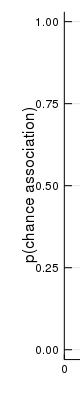
The y-axis label (in GR) is too close to the axis tick labels, and there doesn't appear to be an attribute to modify this.
 BioTurboNick
All 5 comments
The same issue exists in plotlyjs, at least for logarithmic scales (which have tick labels that are wider than usual).
 steinQF
on 13 Apr 2019
steinQF
on 13 Apr 2019
@jheinen could this be an artifact of https://github.com/JuliaPlots/Plots.jl/commit/61d13b9b2d783f2ffa8cebb2518843951c25f20e ?
 mkborregaard
on 15 Apr 2019
mkborregaard
on 15 Apr 2019
@mkborregaard : Yes, we need a solution that takes the effective/maximum length of the labels into account. Otherwise, we will always "waste space".
 jheinen
on 15 Apr 2019
jheinen
on 15 Apr 2019
I think wasting space is a lot better than overlap, though, if we have to choose. I think it should be possible to calculate the the labels from the ticks and tickfont, which are available in the plotattributes object at backend time.
mkborregaard
on 15 Apr 2019
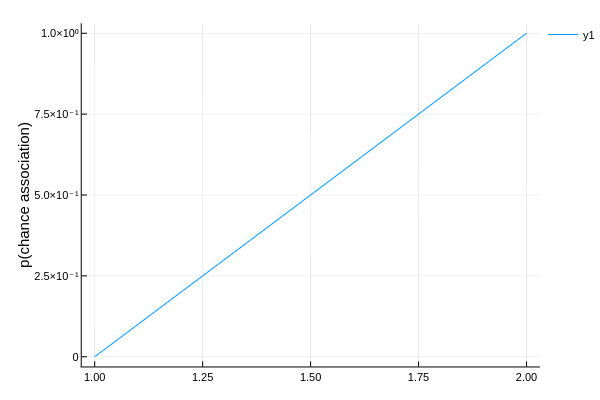
I think that's fixed for GR in #2018:
using Plots
plot([0, 1], yguide = "p(chance association)")

I agree that PlotlyJS with scientific format could use a little more space.
 daschw
on 15 Jun 2019
daschw
on 15 Jun 2019
Related issues
 jebej
·
4Comments
jebej
·
4Comments
 kleinschmidt
·
3Comments
kleinschmidt
·
3Comments
 kersulis
·
5Comments
kersulis
·
5Comments
 Cody-G
·
3Comments
daschw
·
3Comments
Cody-G
·
3Comments
daschw
·
3Comments
Most helpful comment
I think wasting space is a lot better than overlap, though, if we have to choose. I think it should be possible to calculate the the labels from the
ticksandtickfont, which are available in theplotattributesobject at backend time.