Plotly.js: Traces inside rangeslider do not stack vertically for stacked subplots
Here's an example:

The rangeslider here should have its own 5 "subplots" so that the traces are ordered vertically in the same way.
This is going to very nice combined with vertical line hover spanning subplots:
https://github.com/plotly/plotly.js/issues/2155
All 5 comments
So should it _always_ do that? (not obvious to me)
So should it always do that? (not obvious to me)
The only case I can see for not doing it is if the y axis ranges for all of the subplots are the same, so maybe it should be optional.
I feel like the range slider should always mirror exactly the y layout of the subplots it's controlling - seems like it would be nonintuitive to see traces overlaid there but not on the main plot.
The only case I can see where you might not want the y ranges in the range slider to match what's on the main plot is if we implement autorange to visible data (see https://github.com/plotly/plotly.js/issues/1876#issuecomment-314913229) - then you might want the range slider to keep the full y autorange (because that's the visible data there) even as the main plot zooms in to smaller y ranges.
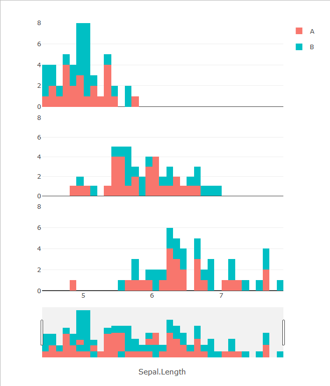
I have another example to add, this time with histograms. Consider this arrangement made with the iris dataset (using R & plotly):

The rangeslider below shows a weird mix between the subplots. In fact, if you examine it closely, it's just the superposition of the three plots, resulting in this kind of things:

Compare this to the same data in one stacked histogram:

IMO, the rangeslider for the multiple stacked-histogram plot should look either like the one in the last example or simply a histogram of the whole dataset with just one color.
Even when there's only 1 color, the histogram shown in the rangeslider should stack the bars of the subplot instead of simply putting one over the others.