Planner: Design a new icon for a new section.
I would like to add multiple sections in a project, but the '+' button at the right of the project title (described in the tutorial) is missing.
This problem exists for local projects and ToDoist synchronized projects.
OS : elementary 5.1.7 Hera / Version [2.4.6]
 romdef
All 19 comments
You can create a section using the button as shown in the screenshot.
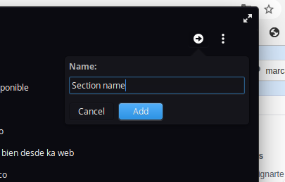
 alainm23
on 4 Sep 2020
alainm23
on 4 Sep 2020
Hi Alan,
It could be better to change in the french tutorial (maybe in original tutorial too ?) the sentence for creating sections :
"- En haut à droite d'un projet, cliquez sur l'icône +."
Because it's not a plus sign, it's an right arrow ...
I thought it will change the name project. I didn't try to fill and add. Sorry ! :-/
romdef
on 4 Sep 2020
Sure :)
alainm23
on 4 Sep 2020
In this context, I wonder to what extent an arrow pointing to the right tells users that the action is here to add something.
I just looked again, elementary Greeter shows me a similar arrow. But the action in this case is to log into the desktop. I find this way more coherent. Would it be possible to actually change the right arrow to a plus? As far as I am aware, Planner uses the plus symbol to express this action in other parts of the UI. From my perspective with this change it would be less confusing and much more coherent.
 4jNsY6fCVqZv
on 7 Sep 2020
4jNsY6fCVqZv
on 7 Sep 2020
It is true, the icon to create a new section is a bit confusing, I would like to design or if anyone has any idea for the design of this icon I would be very grateful.
alainm23
on 9 Sep 2020
Hi!
Before I get to the icon, I think the header in the popup that you get when clicking on the icon should say "Section name" not just "name" so a user that clicks on the button without hovering over it can discover what it does more easily.
I started working on some icons for this. This is a symbolic icon so it should be 16x16, right?
I found the 16x16 constraint to be very hard to work with, especially if we wanna keep the circle. I think there should be a circle as well as that can suggest that this is a creation task just like the plus in a circle on the bottom right.
Here are some of the buttons I came up with so far:
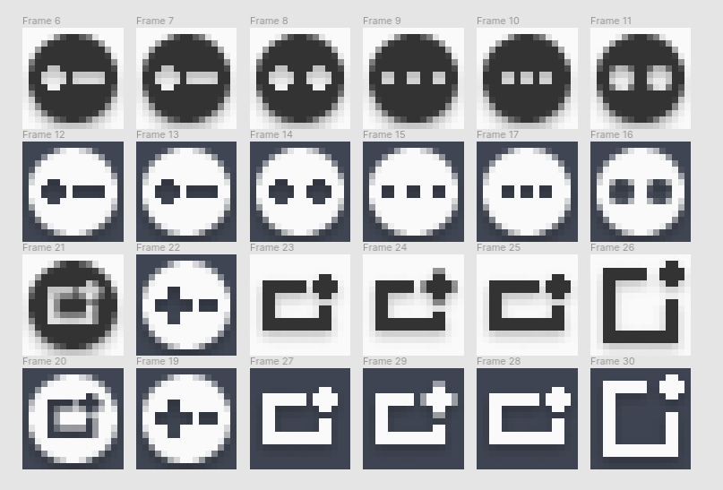
I have a few more ideas for what kind of designs I could do and I'll try to tackle them during the week.
A few screenshots of mockups with the new icons:
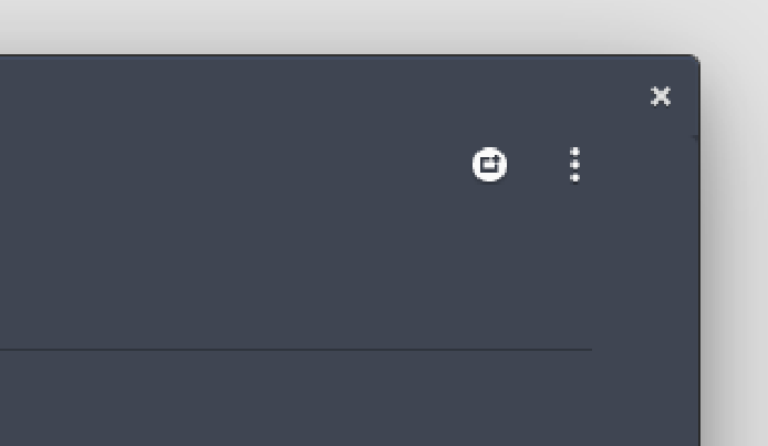
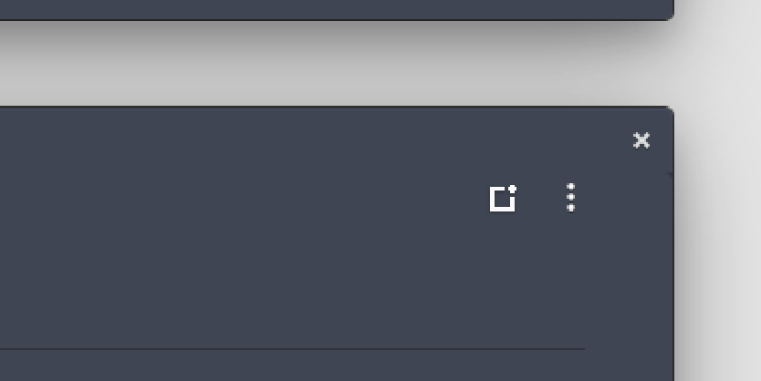
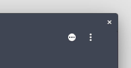
I would highly suggest checking out the Figma file, there are more icons and mockups here so it's easier to get an idea of the whole thing.
https://www.figma.com/file/NlknnlTAWnfLsdQbVKhtvd/FOSS-Projects?node-id=0%3A1
 Brin-o
on 20 Sep 2020
Brin-o
on 20 Sep 2020
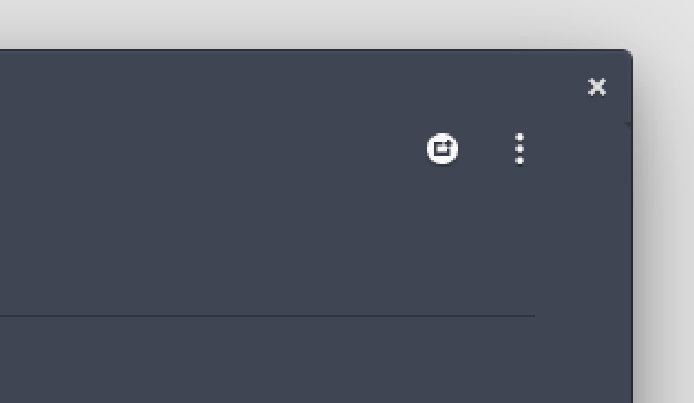
@Brin-o Thank you very much for helping with the development of Planner. I like the design of image 1, Is it possible that you can send me the icon in svg format?
alainm23
on 22 Sep 2020
Hey!
Sorry, it's been a busy week.
I'm glad you like the icon! Here are the SVGs for it, I would however like to ask if you know where the original icons are coming from? I kind of eyeballed the drop shadow and I'd like to make sure it is consistent with the rest of the icons.
I have also played around with a version that has a more prominent "+" symbol, which might work better.
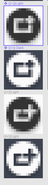
Here are the SVGs, let me know if you need anything else :)
Planner Icons.zip
Brin-o
on 25 Sep 2020
Thank you very much, I'm using the official elementary OS icons
alainm23
on 25 Sep 2020
What does the rectangular box with the little plus in the upper right corner mean to you? An icon should be self-explanatory, right?
4jNsY6fCVqZv
on 2 Oct 2020
What does the rectangular box with the little plus in the upper right corner mean to you? An icon should be self-explanatory, right?
To me it means "new square" and i'm interpreting square here as a section. What's your take on it?
Brin-o
on 2 Oct 2020
If you associate a square, the four sides should be the same length, otherwise it is a rectangle ;)
When I look at the suggested iconography, I imagine that a box or container opens. However, when I add a section in Planner, no box opens, as it does when I edit a task, for example. What Planner does is create a heading for the section and a continuous horizontal line below it. This does not look like a box to me.
4jNsY6fCVqZv
on 2 Oct 2020
In other parts of the app a simple plus is used. I wonder when it makes sense to introduce another symbol. But I have no experience with that either. I just want to bring in my feelings and my critical questions at this point. Thank you for thinking and working on it!
4jNsY6fCVqZv
on 2 Oct 2020
That's a fair point!
I tried associating it with a line first since that's what planner does however, I felt like I couldn't make the icon stand in coherently with the rest of the UI.
Inside of the circle it always ended up looking like a + and - due to the limited amount of horizontal space.
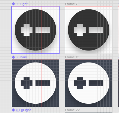
I'll take a look at it one more time when I have the time to work on it, maybe I can come up with a solution now that I had some time for it to rest.
Brin-o
on 2 Oct 2020
I've been playing around with different ideas with @Brin-o's designs as starting point, having in mind what was mentioned previously here. After quite some time, this is the best I've been able to come up with:
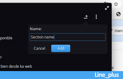
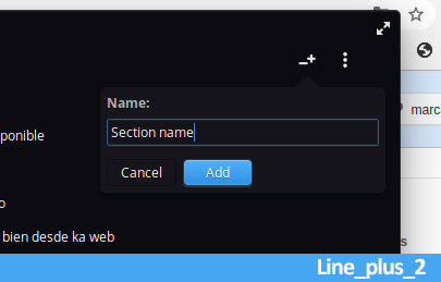
Personally, I think a filled icon (e.g. https://github.com/alainm23/planner/issues/504#issuecomment-695836533) pops out too much, especially with the kebab menu icon next to it.
(PS: @alainm23 hope you don't mind I used your screenshot as base picture)
 dmlls
on 2 Nov 2020
dmlls
on 2 Nov 2020
@dmlls
I think "Line_plus_2" looks great in terms of representing what it does. And maybe you are right about the filled icon, my train of thought was to try keeping it consistent with the + icon on the bottom right. It may be just the screenshot but your icon does appear to be a bit blurry?
Did you make it on a 16x16 grid?
Brin-o
on 5 Nov 2020
@Brin-o
The pictures I uploaded were just mockups, I didn't take care of resampling or anything when scaling down the icon.
Here's how the "Line_plus_2" icon would look rescaling it to 16x16:
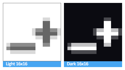
However, since what we need is the .svg file, as long as this file is 16x16, rescaling/resampling is not something we should care about right?
dmlls
on 5 Nov 2020
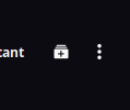
My design
alainm23
on 26 Nov 2020
I love it!
 BeatLink
on 27 Nov 2020
BeatLink
on 27 Nov 2020
Related issues
4jNsY6fCVqZv
·
7Comments
 marbetschar
·
4Comments
marbetschar
·
4Comments
 joe733
·
7Comments
joe733
·
5Comments
joe733
·
7Comments
joe733
·
5Comments
 williamd1k0
·
7Comments
williamd1k0
·
7Comments
Most helpful comment
My design
