Planner: Ideas for a new icon for Planner 2
The current icon is fine, it just does not look good when the badge is activated.

 alainm23
All 60 comments
Ah, good call, I'll see what I can do
 Alecaddd
on 20 Dec 2018
Alecaddd
on 20 Dec 2018
Maybe you can just reverse it ?
 NathanBnm
on 14 Jan 2019
NathanBnm
on 14 Jan 2019
As I am rebuilding Planner 2 with a super new UI we could release a new icon too.
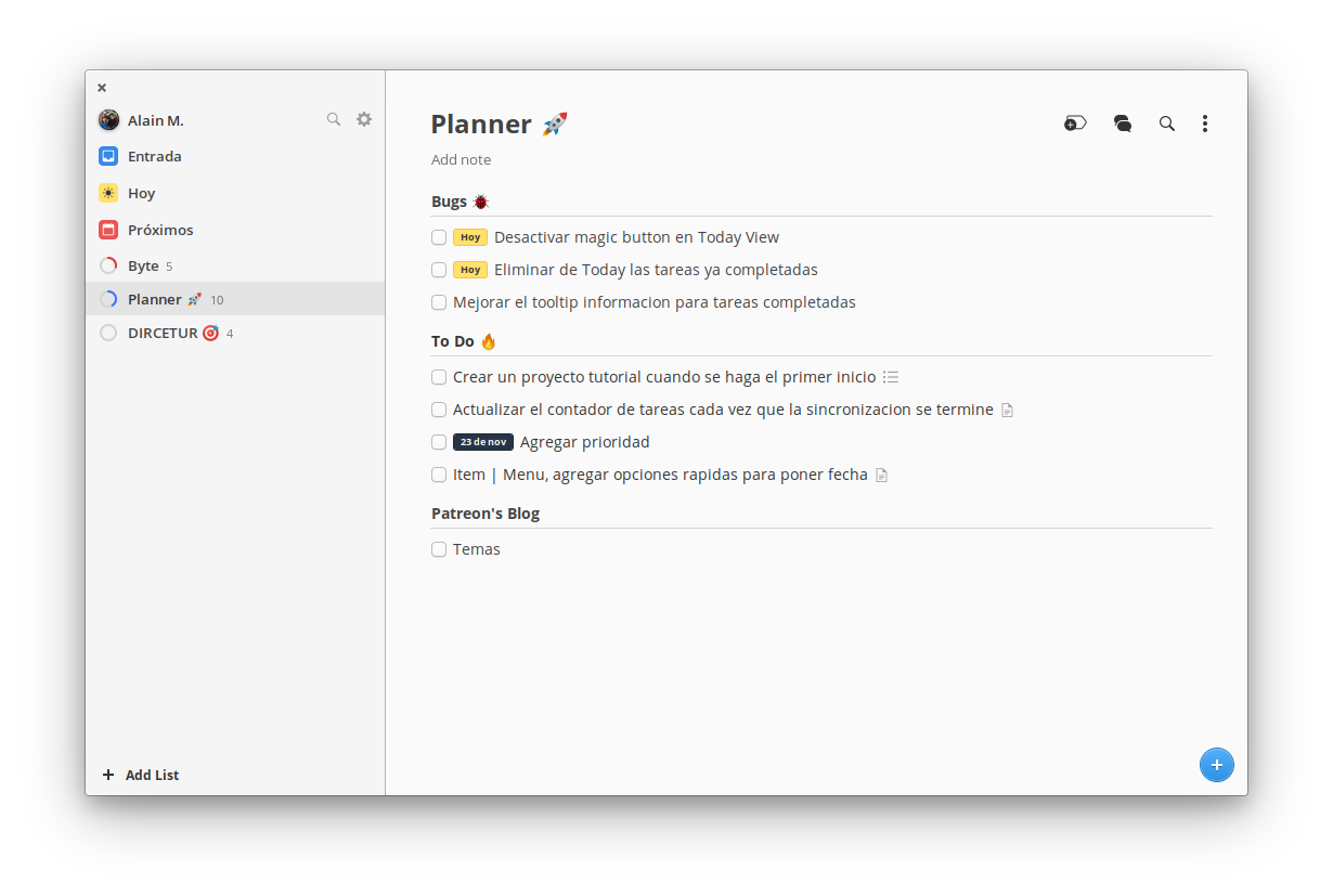
I am attaching an image to see how Planner 2 is looking
alainm23
on 8 Nov 2019
Let's start some brainstorming on this new icon.
I created a buck on dribbble for inspiration: https://dribbble.com/alecaddd/buckets/1711647-Planner
I personally think this concept might be the right one: https://dribbble.com/shots/3704554-Studyguide-Student-planner
Obviously, updated to reflect the elementary OS style guide and to not create a copycat of this design.
Alecaddd
on 4 Dec 2019
I like the concept of the backpack with a calendar and an agenda, personally I think this is also the right way.
alainm23
on 4 Dec 2019
All right, I'll see if I can create something this weekend
Alecaddd
on 4 Dec 2019
I'll see what I can do
 ghost
on 4 Jan 2020
ghost
on 4 Jan 2020
What do you think about this?
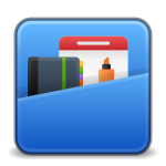
Here's the SVG
planner2.svg.zip
Alecaddd
on 5 Jan 2020
Great, this looks pretty cool. thanks for your time.
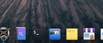
I only have some suggestions:
- We could make the icons inside the backpack look bigger. The icon in Plank looks good but the icons inside it can't be noticed.
alainm23
on 5 Jan 2020
That's only the 48px version, I made that because it's the default size for plank icons.
You'd need to create variations and adapt those for the different sizes as you shouldn't use one size for all.
Unfortunately I don't have time to create the variations, sorry.
Alecaddd
on 5 Jan 2020
nicely done, Could I suggest matching the corner radius to that of the terminal, current radius looks more of a moka icon theme? i will play with the file a bit and see what I can do.
ghost
on 5 Jan 2020
@bertob Could you imagine supporting the redesign of this icon with your experience?
 4jNsY6fCVqZv
on 5 Jan 2020
4jNsY6fCVqZv
on 5 Jan 2020
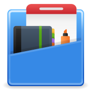
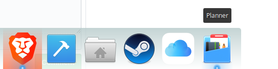
For me, the icon would be more appealing if the tools were more showcased and the bag less.
4jNsY6fCVqZv
on 5 Jan 2020
 ghost
on 5 Jan 2020
ghost
on 5 Jan 2020
@inputbim Thank you for your work! How does it look in combination with a badge?
As far as I understood, this was the starting point to rework the design of the current icon.
Does your current design support HDPI resolutions?
Of course it would be exciting to see how the design fits into elementary OS HIG.
https://elementary.io/docs/human-interface-guidelines#iconography
4jNsY6fCVqZv
on 5 Jan 2020
@4jNsY6fCVqZv no problem I've done almost nothing though it was @Alecaddd that did the design. I had more of a backpack idea or a simple square calender with a pencil.


ghost
on 5 Jan 2020
@inputbim Would you like to share a realization of your thoughts for the new Planner icon with us as well?
In the current version, the badge in the Applications menu does not look very sharp, is that possible? Or is it because of the screenshot?
With the current design in Plank, I notice that the pen is completely hidden as soon as the badge is there.
4jNsY6fCVqZv
on 5 Jan 2020
@inputbim Great job, it definitely looks better.
Personal opinion:
- I feel that the color blue is very soft, maybe if we play with #0d52bf instead of #3689e6, I would like to see the result.

- The design in general is a backpack, but I don't feel it was, maybe if we could add the cover part.
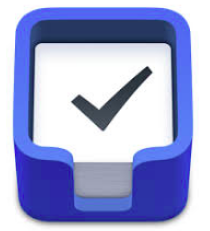
- Or maybe we could change the focus and make a toolbox, in the same way as Things 3
alainm23
on 5 Jan 2020
i will do some mock ups, i also like the idea of similar to the "things".
as for colour i think its important to try use the elementary os colours.
@4jNsY6fCVqZv yes the blur part is due to me doing a quick edit, not pixel perfect, don't have the time for that right now.

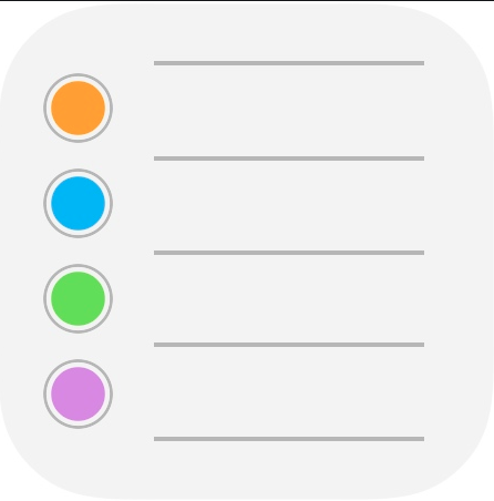
take a look at apple. simple and makes sense
ghost
on 5 Jan 2020
I would like to hear the opinion of @Fatih20 The Byte icon designer.
alainm23
on 5 Jan 2020
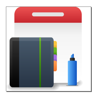
thoughts?

ghost
on 5 Jan 2020
@alainm23 My concern about the backpack one is that the detail wouldn't be recognizable on low monitor PPI. I have tried making icons in the past with small details like that and it's unable to convey the meaning because the reason I stated. Also, it would be a pain to pixel fit it for smaller icon sizes.
Your icon should not be overly complicated. Keep in mind that since there are smaller sizes, the elements that make up your icon should be distinguishable when at those sizes.
-Quoted from the official guidelines.
As for the original problem, why not just flip the icon horizontally so that the badge doesn't cover the eyes?
 Fatih20
on 5 Jan 2020
Fatih20
on 5 Jan 2020
@Fatih20 I understand, the icon does not flip horizontally because the idea of the original design is a "P" by Planner.
alainm23
on 5 Jan 2020
@inputbim Idea is nice if you get rid of the calendar and the marker. Only need the actual planner book.
Fatih20
on 5 Jan 2020
What do you think of this icon, is an alternative to things 3.
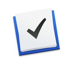
https://www.deviantart.com/jasonzigrino/art/Things-For-OS-X-Yosemite-497758700
alainm23
on 5 Jan 2020
Seems good. But doesn't really shows the app capabilities in my opinion.
Fatih20
on 5 Jan 2020
@Fatih20 I think it looks to similar to other apps, also that badge hides the "tabs" in the notebook when used on the dock
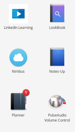
I'm going to do some brainstorming and propose some images, need to look at the app as a holistic entity
ghost
on 5 Jan 2020
I think it's fine that it hides it.
Fatih20
on 5 Jan 2020
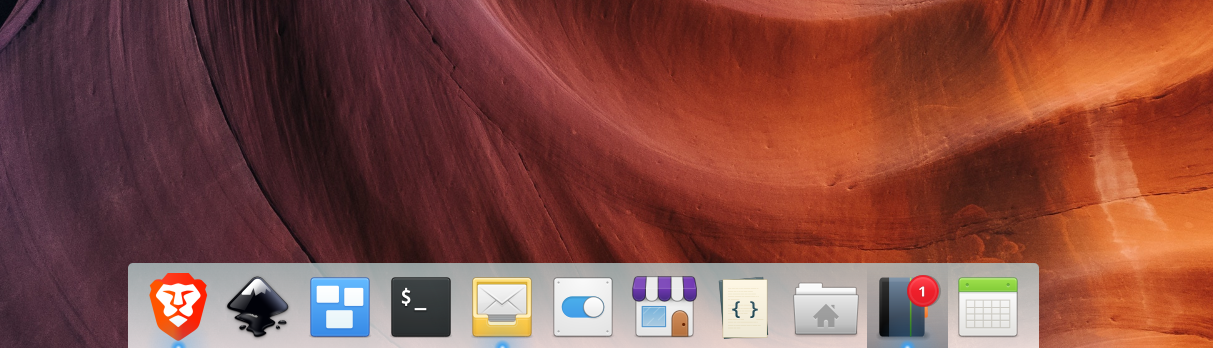
happy @alainm23 ?
ghost
on 5 Jan 2020
I think it would be wonderful if we kept simplicity in mind. Especially when we look at HIG. It would be a pity if the fine details just don't come out and cause uncertainty rather than recognition about the function of the app. Maybe it could also be an umbrella metaphor?
By the way, it would also be great if we could use/combine colors from the elementary color palette.
A simple checklist on a notepad reminds me too much of Agenda or GNOME To Do. And for me this does not correspond to the complexity of projects/project management. Agenda is more like a shopping list where I cross out what I could get. The variant with the note box seems too close to the elementary Mail/Geary icon.
4jNsY6fCVqZv
on 5 Jan 2020
@inputbim Your last icon looks quite good, I really like it. And it really has a strong resemblance to other apps, as your screenshot shows. I do not know to what extent an indication is to choose another way of implementation? Maybe we can think a little bit more around the corner, but not too far?
4jNsY6fCVqZv
on 5 Jan 2020
@4jNsY6fCVqZv "Maybe we can think a little bit more around the corner, but not too far?" don't think I follow, yes like i mentioned earlier it looks to much like other icons, i will propose new icons
ghost
on 5 Jan 2020
@inputbim That was just an impulse. Just like Nimbus. https://appcenter.elementary.io/com.github.danrabbit.nimbus/ A cloud that symbolizes weather and then directly results in a great icon, which can have a high recognition value without many details.
Right now I am also just grateful that so many creative ideas are in the room and people who support the design process. I am looking forward to the wonderful new icon!
4jNsY6fCVqZv
on 5 Jan 2020
Thank you all for your comments and time. I have been thinking and I think we could use the agenda icon as a base but with some modifications:
- We could use a color palette based on blue, black and white, the same ones that are in the Planner 2 UI.
- We could add a check on the cover of the agenda implying that this is a task app.
- I think we should keep the color labels, this gives a more natural touch.
alainm23
on 5 Jan 2020
I think you just described the Agenda app?
ghost
on 5 Jan 2020
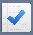
Did a quick study of Elementary icon design guidlines and here is my proposal.
Thoughts?



ghost
on 5 Jan 2020
@inputbim I kind of miss the planning part.
So in the spirit of Getting Things GNOME! icon https://wiki.gnome.org/Apps/GTG or https://icons8.com/icon/117510/color-hand-drawn
Otherwise it looks like a copy of the Agenda app icon to me.
Planner should also express "Planner" for me, not just "To-do list".
@alainm23 What do you mean by "I think we should keep the color labels, this gives a more natural touch"?
The bigger question for me is also, is the idea of Planner to develop further towards a more complex project management app in the future? Or should it remain with the simplicity of a task list? Both visions can simply be there and are wonderful! But it would help me to decide what the icon should transport.
The question also goes to Alain, of course. What are your dreams and utopias for the future development of your app?
4jNsY6fCVqZv
on 6 Jan 2020
@4jNsY6fCVqZv I was referring to this little detail:

Regarding the future of Planner, I see it as a personal application of tasks. However, thanks to Todoist (and in a future update) we can use Planner to work with a team, assign tasks and communication (Premium Todoist User).
But in the more distant future, maybe Planner 3, I think about developing a product with its own synchronization cloud and maybe an app on Android and iOS (I am currently working as a developer of mobile apps).
alainm23
on 6 Jan 2020
@alainm23 not sure where this leaves us in terms of the icon. can I ask for a clear icon reference and ill propose more elemental :) icon

ghost
on 6 Jan 2020
@alainm23 I also like the small detail of the notebook icon variant very much. How can this interact with the base of the Agenda icon?
4jNsY6fCVqZv
on 6 Jan 2020
@alainm23 @4jNsY6fCVqZv
I am getting quite confused as to what this icon needs ;(
@4jNsY6fCVqZv
is this what you had in mind?
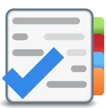
just stating the end project of this can still be tweaks in terms of gradients, colours, shading, emboss etc.
we just need to settle on the actual icon.
sketched images would be better than trying to describe a graphical intention. :)
ghost
on 6 Jan 2020
@inputbim Thanks for your designs! I'm just as confused.
Alain wrote that he'd like to include that detail. And he wrote that the basis could be the Agenda icon. I was also wondering in what direction it should go. That's why I asked how the two can come together.
Because of the description about the future of Planner, I personally feel that an icon that shows more complexity than a simple task list makes still sense.
But I am a user and not a designer.
4jNsY6fCVqZv
on 6 Jan 2020
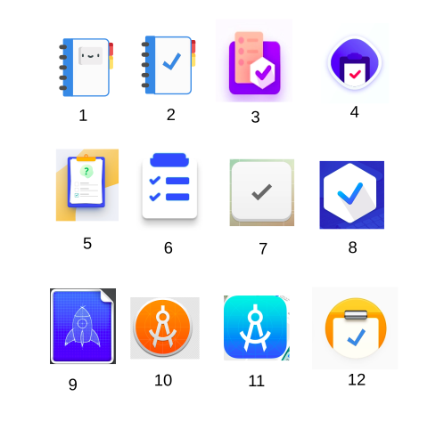
Sorry for not being clear. The idea that I gave you above is the image number 2.
These are some designs that I have been saving for some time (Planner is about 2 years old)
- I lean towards numbers 2, 5 and 12.
alainm23
on 6 Jan 2020
I like number 2 and 5, lean more to 2 due to 5 being bit to detailed I think for icon, and small scale might loose clarity.
@alainm23 Can I take number to and elementify it for you? just send the svg if you have.
ghost
on 7 Jan 2020
Goes well with the discussion, I think:
https://blogs.gnome.org/tbernard/2019/12/30/designing-an-icon-for-your-app/
4jNsY6fCVqZv
on 9 Jan 2020
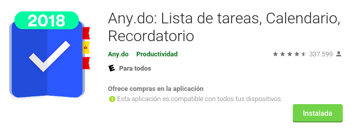
Apparently Any.do already thought about it.
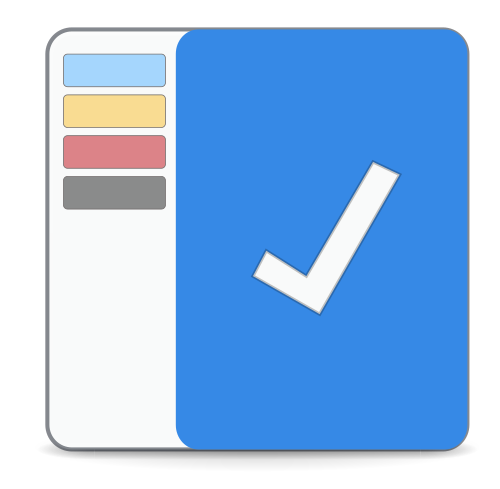
Based on the UI, could it be a viable icon?
alainm23
on 13 Jan 2020
think they look very different, im not sure what the big icon is that you posed? can you send the svg of number 2, so I can implement Elementary style?
ghost
on 13 Jan 2020
Sure.
diary.svg.zip
alainm23
on 13 Jan 2020
@alainm23 , thanks I;m very busy lately, will try to sneak it in
ghost
on 13 Jan 2020
@inputbim Don't worry, rather thanks to you 🙌️.
alainm23
on 13 Jan 2020
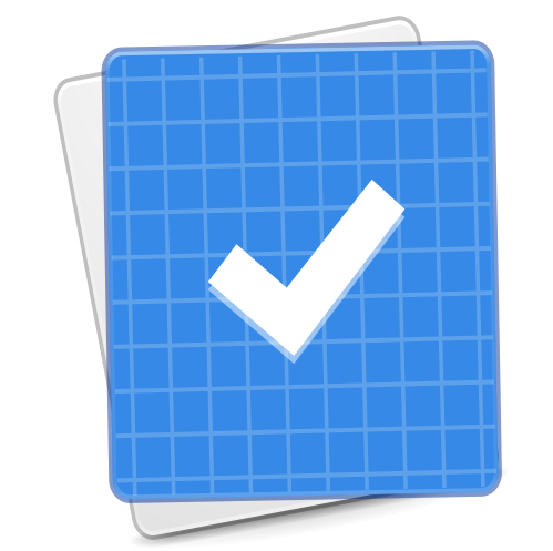
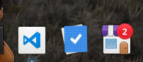
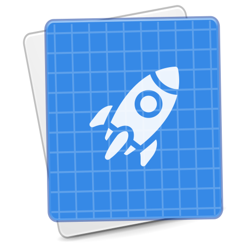
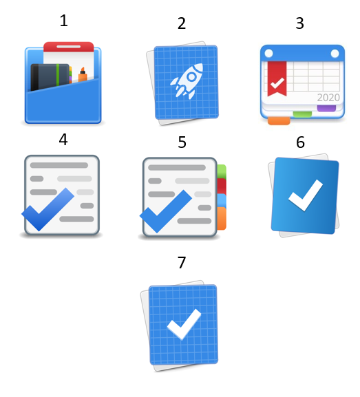
Well folks, I think we just need the icon to launch Planner 2. These are some ideas I've been thinking about.
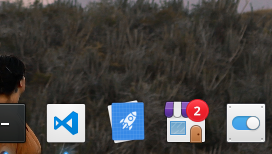
alainm23
on 14 Jan 2020
@alainm23 hold on there, :) I'm working on the icon today
ghost
on 14 Jan 2020
@alainm23
I lost focus... but this works nicely with notification.
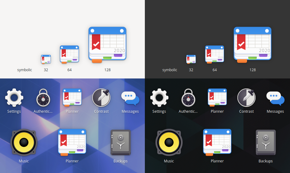


ghost
on 14 Jan 2020
I like the idea. what do you think of my design?

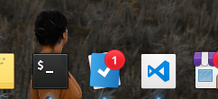
alainm23
on 14 Jan 2020
@alainm23 nice, i like it, but might come down to previously discussed, does it resemble what the app does, think its more what people prefer now, I will post on twitter and tag planner and elementary, if you can go rewteet,
Think it will be best way to close this issue
ghost
on 15 Jan 2020
I really like your design, and I think it complies with all the indications mentioned above. However, I feel that this design is more oriented to a calendar application. It is true that Planner supports calendar events but with very basic functionality.
I like number 1 but I don't know, I feel that something is missing.
I designed the number 2 taking into account a blueprint (with the intention of planning or designing something) and the image of the rocket with the meaning of a project.
The numbers 4, 5 and 6 are super simple and I believe that they show the basic functionality of Planner.
I tilted at number 6, I believe that design is more detailed and without much complexity. As an example there are many task managers and I think everyone has the same idea. Things 3, Microsoft ToDo, Google Task, etc.
alainm23
on 15 Jan 2020
Perfect, online it also seemed to be 5 or 6 leaning more to 6. I'm just glad that this issue can be closed :)
ghost
on 15 Jan 2020
Thank you all for your ideas and time. With this problem solved, only a few details are missing before you can launch Planner 2.
alainm23
on 15 Jan 2020
Hi, I was playing around with Inkscape, trying to learn how to use it. I began to modify some of my icons, and I added an edge highlight as recommended here : https://elementary.io/docs/human-interface-guidelines#composition
I thought you may like it.



 Bronislas
on 6 Apr 2020
Bronislas
on 6 Apr 2020
@Bronislas Thank you very much, you could create a PR in this repository to improve the icons.
alainm23
on 7 Apr 2020
Related issues
 zkmrgirish
·
5Comments
zkmrgirish
·
5Comments
 safareli
·
6Comments
safareli
·
6Comments
 marbetschar
·
4Comments
marbetschar
·
4Comments
 Philip-Scott
·
4Comments
Philip-Scott
·
4Comments
 ie900
·
5Comments
ie900
·
5Comments
Most helpful comment
As I am rebuilding Planner 2 with a super new UI we could release a new icon too.
I am attaching an image to see how Planner 2 is looking