Pkp-lib: Improve visualisation of review stage status
As an editor
I want to get a rough sense of a submission's progress through peer review _at-a-glance_
so that I can more easily manage and track a large number of submissions, and compare their progress quickly.
This issue builds on UI/UX feedback and discussions in https://github.com/pkp/pkp-lib/issues/4103 and https://github.com/pkp/pkp-lib/issues/1662, which highlight the desire for more fine-grained status reporting from the submissions list.
Most of this feedback focuses on the Review stage and it is the stage with the fewest technical obstacles to providing more fine-grained status. Within the review stage we have the following indicators we can use to signal progress:
- How many reviewers are assigned in the current round
- How many reviewers have accepted/declined in the current round
- How many reviewers have completed their review in the current round
- Has a request revisions editorial decision been made since the current round was initiaited
- Have revisions been submitted since the last editorial decision was made
- How many review rounds have been initiated
- How many days a submission has been in a review round or the whole review stage
Figuring out how best to represent progress will require some experimentation. We discussed the possibility of using a progress bar, which would give a very quick comparison but lacks detail about why a particular progress level is calculated. This could maybe be compensated with information it the dropdown display. A dot-system has been proposed at https://github.com/pkp/pkp-lib/issues/4103 with the caveat that interpretation of the dots be difficult without specific training.
I have assigned this to the 3.2 milestone because it was considered a high priority for UI/UX improvements. However, because that milestone is already overloaded this shouldn't be taken as a promise that it will make the deadline.
 NateWr
All 7 comments
@NateWr I'd be happy to help try and spec this with you (I'm coming from a non-tech perspective). The need for having higher resolution overview of submissions in review from the submission dashboard has been flagged as the top priority from our editors. The key feedback we have had is that a) they want to see the stage of the review process from an overview dashboard, not have to go into each submission, b) they don't want to have to click drop-down/additional menu to see the information on a submission level (as they'd have to do it for every submission), and c) they would like the system to highlight relative urgency/delayed tasks in this overview.
One thing that we have found very useful for editors is a 'days at stage' metric, so that editors can easily see from this dashboard whether the submission has got a little stuck. e.g. Having 2 reviewers submitted looks ok, but if they have sat there for a long time then there is an urgency for the editor to act, which is invisible from the currently submission list.
We customised OJS 2 to do something similar, and your list above seems spot on in the stages that we log. In the old OJS 2 table view, we added a stage name as a column where each stage had set parameters, with a column next to it showing the number of days that it had been at that stage.
For the review stages, something like the below may be useful:
- Ready for review: in the review queue, but a minimum number of reviews have not been invited (the minimum reviewers required could be a journal setting)
- Reviews invited: the minimum number of reviewers have been invited, but not yet accepted
- Reviews outstanding: the minimum number of reviewers have accepted an invitation to review but not yet submitted the review
- Reviews complete: the minimum number of reviews have been provided
- Awaiting Revisions: the editorial decision for revisions has been logged but the author has not yet submitted a revised file
- Revisions submitted: the author has provided the revisions and the editor needs to make a decision or start a new round of review (which brings us back to 'Ready for Review')
If such parameters could be well defined, could the current stage/filter button show the higher resolution stage? e.g. 'Reviews outstanding' rather than 'Review'. This would have the added benefit of allowing senior editors/Managing Editors to filter so that they can focus on specific aspects of the workflow.
 twakeford
on 26 Oct 2018
twakeford
on 26 Oct 2018
This is all very nice and very welcome.
We did a customization at the SciELO install in which we used a color system and some instructions at the bottom of the page explaining what each color meant. It has proven to be quite helpful and journals tend to rely and get used to what each color means.
_One thing that we have found very useful for editors is a 'days at stage' metric, so that editors can easily see from this dashboard whether the submission has got a little stuck._
In the past I have asked whether it would be possible to set deadlines for each task individually. It seems that this would require a lot of development so this solution -- days at stage, instead of days to become overdue -- seems to be a good solution.
I fully agree that having a days count (increasing or decreasing) would be very helpful.
 alexxxmendonca
on 26 Oct 2018
alexxxmendonca
on 26 Oct 2018
Thanks @twakeford! That's really helpful and it sounds like we're looking for the same things. I'll be circling back to this probably sometime early next year to work on it in earnest. In the meantime, here are a few quick thoughts.
Text labels can be difficult to design around because they can vary significantly from language to language, but figuring out a reliable way to signal the review steps, and where it's currently at, will be very important, and will almost certainly require text.
I'd like to breakdown the steps you describe into two categories: the editor needs to do something and the editor needs to wait. We can then highlight those which fit the first category and (hopefully) help editors hone in on the things awaiting their attention.
I fully agree that having a days count (increasing or decreasing) would be very helpful.
We're planning a filter to view the submissions by those last modified more than X ago (https://github.com/pkp/pkp-lib/issues/4168). I hope that will work as a catch-all to help discover those languishing in review as well as other stages for too long.
NateWr
on 29 Oct 2018
thanks @NateWr, happy to be of help.
Good point on the text labels and language issues. Perhaps a universal/language non-specific stage icon would be an option, with a key located elsewhere?
Breaking the steps into editorial action / no editorial action seems ok, but that context may change without system changes - e.g. awaiting review = no editor action if they have only recently been accepted, but there would be editor action is the reviewers had missed their deadlines.
The 'last modified' filter sounds like a good start.
Give me a shout when you're nearer to looking into this and happy to discuss.
twakeford
on 2 Nov 2018
Feedback from the UI/UX group in the Pittsburgh sprint, when we were able to talk to an editor at a high-volume journal:
- Revise and resubmit decisions should be clearly separated from other review tasks. About 50% of revise and resubmit never come back, so these pile up over time.
NateWr
on 5 Aug 2019
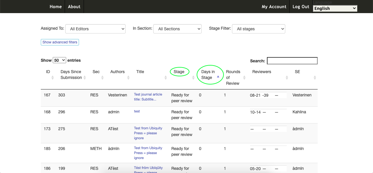
Hi @NateWr, @asmecher - In our custom forked OJS2.x platform, we have developed a display that shows the sub-stages of the articles in the 'Review' stage (see image), and importantly, the number of days each article has been in that stage (both circled in green in this screenshot). The list can be both filtered and ranked according to these metrics.
The 'sub-stages' that we identified, were presented by Tim Wakeford earlier in this thread, but I will list them again here for completeness:
- Ready for review: editor has been assigned but the minimum number of reviewers have not been invited
- Reviewers invited: the minimum number of reviewers have been invited, but they have not yet responded/accepted
- Reviews outstanding: the minimum number of reviewers have accepted review invitations but have not yet completed their task
- Reviews complete: the minimum number of reviewers have submitted their review feedback
- Awaiting revision: the editorial decision of 'Request revisions' or 'Resubmit for Review' has been made but the revisions have not yet been provided
- Revision submitted: the author has submitted their revisions after the 'revisions' decision was made
When an 'accept' or 'reject' decision is recorded, the article leaves the Review stage and appears in the 'Editing' stage. This display allows editors to visualise the article list according to those needing the most urgent attention and gain a quick understanding of the actions required for each article, without leaving the submission list to further investigate the status articles.
 PeterfordUP
on 22 Jun 2020
PeterfordUP
on 22 Jun 2020
Thanks @PeterfordUP! There's a whole bunch to unpack here -- I'm going to keep the comments here focused on improving the review stage data. But I'd like to have a broader conversation with you about the submission lists.
First, I want to review what we've got so far in the submissions lists and then discuss what we're missing and how best to add that in.
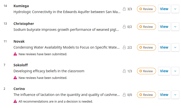
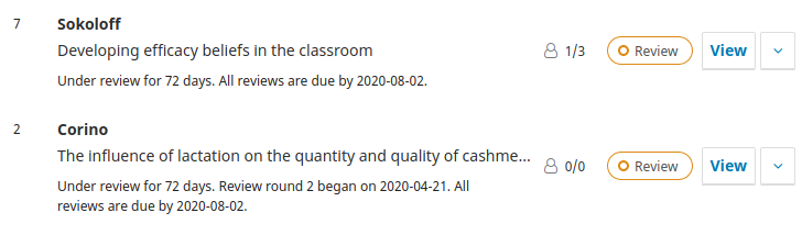
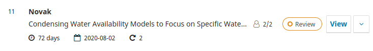
Each submission in the review stage has an indicator, such as 3/3 in the first submission. This says that 3 reviews have been assigned and 3 reviews have been completed. The second submission (0/2) shows that 2 reviews have been assigned but 0 have been completed.
In addition, we show an alert message when we determine that there is work outstanding for the editor. This is shown when no reviewers are assigned, when new reviews have been submitted, when all reviews have been submitted and a decision is needed, and when revisions have been submitted.
When authors are viewing their own submission, they see similar messages when revisions are requested.
These messages cover much of the same ground as the sub-stages. But we have had community requests for a more explicit description following the sub-stage model that you have implemented -- in part, I suspect, because when the alert messages don't appear editors feel uncertain about the status.
One way to address this that we've considered is to add filters for these sub-stages. We've tried to reduce the number of different stages to a more easily digestible set, and have suggested the following:
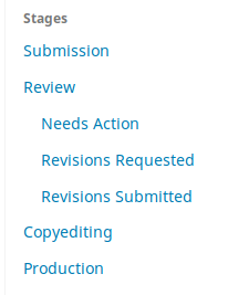
This would provide a quick way for an editor to keep tabs on what seem to be the key task breakdowns during the review stage.
So the question is whether you think these approaches might satisfy some of your requirements and what additional information or tooling needs to be implemented to support your other requirements. Looking at what you've provided, I think we're still missing the following:
- An indicator of how many days a submission has been in the review stage.
- We have no concept of "minimum required reviewers". This strikes me as an interesting feature that might be worth adding (probably configured on a per-section basis).
- Information about review assignment due dates and completion dates.
- Information about review round.
- If you think the filters won't satisfy your needs for sub-stage indications, then some info on a review sub-stage.
- Ordering the list by these parameters.
The challenge will be providing some of this information in a dense format that is not a table. It is our ambition to some day make submission lists usable on mobile devices, so we're avoiding table layouts which have minimum width requirements. (This is something to maybe talk about.)
One option is to include some of this information in a brief description.
Another option is to use icons to display the information. I have to admit I'm not very confident in the legibility of this approach and would prefer to avoid using stuff like this to display dense information.
If a setting for minimum required reviewers was added I think this could be integrated with the notices to highlight when enough reviewers have been added. That just leaves out ordering the list, which has some bigger challenges in regards to the list's UI architecture. We probably need to be talking more broadly about the submission lists before we can tackle that.
In the meantime, maybe have a think about this and then we can discuss further where your work could fit in. We'd probably want to do some mockups and UI/UX tests on any major revisions to the submission lists, but we have some experience doing that and would benefit from having a committed development partner willing to work through the delicate parts of the application like these lists. :+1:
NateWr
on 23 Jun 2020
Related issues
 Ph-We
·
3Comments
Ph-We
·
3Comments
 alexdryden
·
4Comments
alexdryden
·
4Comments
 asmecher
·
3Comments
asmecher
·
8Comments
asmecher
·
3Comments
asmecher
·
8Comments
 marcbria
·
5Comments
marcbria
·
5Comments
Most helpful comment
@NateWr I'd be happy to help try and spec this with you (I'm coming from a non-tech perspective). The need for having higher resolution overview of submissions in review from the submission dashboard has been flagged as the top priority from our editors. The key feedback we have had is that a) they want to see the stage of the review process from an overview dashboard, not have to go into each submission, b) they don't want to have to click drop-down/additional menu to see the information on a submission level (as they'd have to do it for every submission), and c) they would like the system to highlight relative urgency/delayed tasks in this overview.
One thing that we have found very useful for editors is a 'days at stage' metric, so that editors can easily see from this dashboard whether the submission has got a little stuck. e.g. Having 2 reviewers submitted looks ok, but if they have sat there for a long time then there is an urgency for the editor to act, which is invisible from the currently submission list.
We customised OJS 2 to do something similar, and your list above seems spot on in the stages that we log. In the old OJS 2 table view, we added a stage name as a column where each stage had set parameters, with a column next to it showing the number of days that it had been at that stage.
For the review stages, something like the below may be useful:
If such parameters could be well defined, could the current stage/filter button show the higher resolution stage? e.g. 'Reviews outstanding' rather than 'Review'. This would have the added benefit of allowing senior editors/Managing Editors to filter so that they can focus on specific aspects of the workflow.