Pkp-lib: [Sprint/UIUX] Improve the Submission Dashboard
Result of the UI/UX group from the Heidelberg Sprint 2018 (@stranack @NateWr).
The current dashboard is--from our perspective--not yet perfect. The idea was to think about how to adjust and extend the dashboard. Currently the dashboard is very clean, but for some tasks much too clean. We came up with a set of meta information we would like to have, and a idea to make the dashboard customizable (let the journal manager, but also the user decide what will be displayed).
Brief Display (the clean version):
- Submission ID
- Author Lastname
- Title
- Submitted Date
- Last Modified Date
- Stage
- And sub-stage
- Galley icon (not important)
- Review icon
- Warnings (distinct icons/colours for different messages)
Extended Display (well, the extended version):
- Section Editor
- Section
- Review Round (1, 2, etc.)
- Ask Date
- Due Date (X when declined)
- Done Date
- Ruling Date
- Galleys (not so important)
- Discussions (not so important)
Logic behind Brief Display and Extended Display: the JM can set a default (brief or extended). The user can (i) set his preferred settings on his profile page or (ii) press a button on the dashboard to switch to the alternative version. At the moment there is an expander for each individual row. This option would work as an expander for all rows (all submissions). The figure below shows a screenshot how this is adressed in one of the journals of our group members.
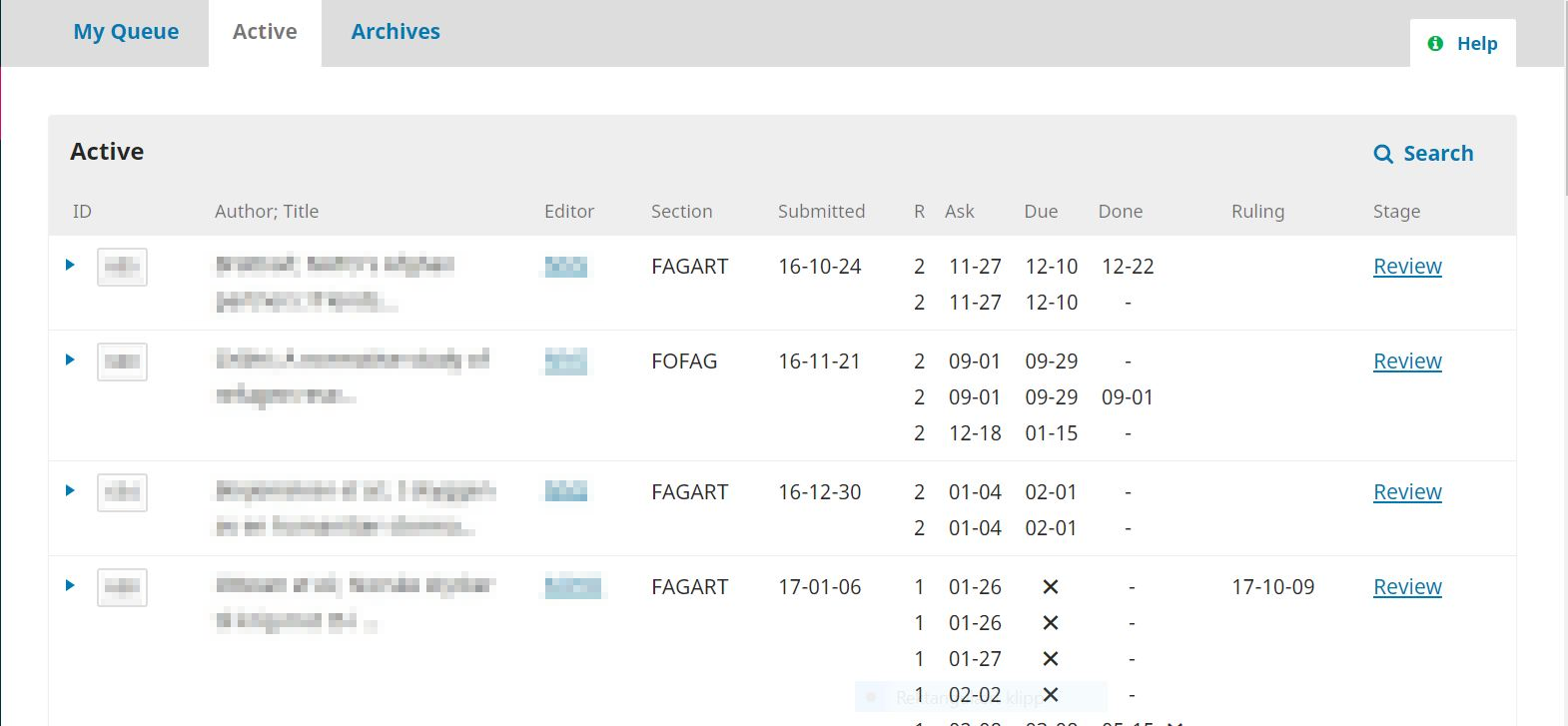
Figure: Screenshot of a customization of our Norwegian friends (foodandnutritionresearch.net). To a certain extent mimiking OJS2 but in a quite nice way, indeed room for improvement, but a good base to discuss/imagine what we were discussing.
 retostauffer
All 18 comments
(Tagging @stranack as the PKP lead on the UI/UX group, and @natewr because he's probably interested!)
 asmecher
on 27 Sep 2018
asmecher
on 27 Sep 2018
Thanks @retostauffer! I missed this one in my pass through last week.
This is the toughest component to design in the whole application, because it is the most critical and because the needs our users face are so diverse. Every piece of information we add for one set of editors increases the cognitive load for the rest of the editors. And whatever we do has to be intuitive enough that it won't require too much hands-on training, since a large portion of editors using our platform do not get the hands-on training that they would from a large, well-resourced journal.
I'm in favour of the multi-view approach: having 2-3 different view modes will be one way to accommodate different use-cases. It will create a significant maintenance burden for us, but it's worth it since this is such a critical UI component.
To break this down, it's helpful to think first in terms of user profiles. For example, a Journal Manager's needs are probably different from a Section Editor's needs. Likewise, a small journal with an editorial team of 2-3 is going to want different things from a large journal with an editorial team of 10-15. To match user profiles with needs, we try to formulate user stories, which are structured like this:
As a journal manager
I want to see which editors are assigned to this submission
so that I can contact them when they're falling behind.
A single piece of data displayed in the list might have multiple user stories, for different outcomes or different user profiles. Would you or someone (or several of you) from the UI/UX group of the sprint be able to brainstorm some user stories to go along with the information requests that you've made? I'm particularly interested in hearing user stories for the following:
- Section Editor
- Section
- Review Round
- Ask/Due/Done (presumably this is the date when a review was assigned, the date the review is due, and the date the review was actually finished?)
- Ruling Date (presumably this is just desired for the review stage?)
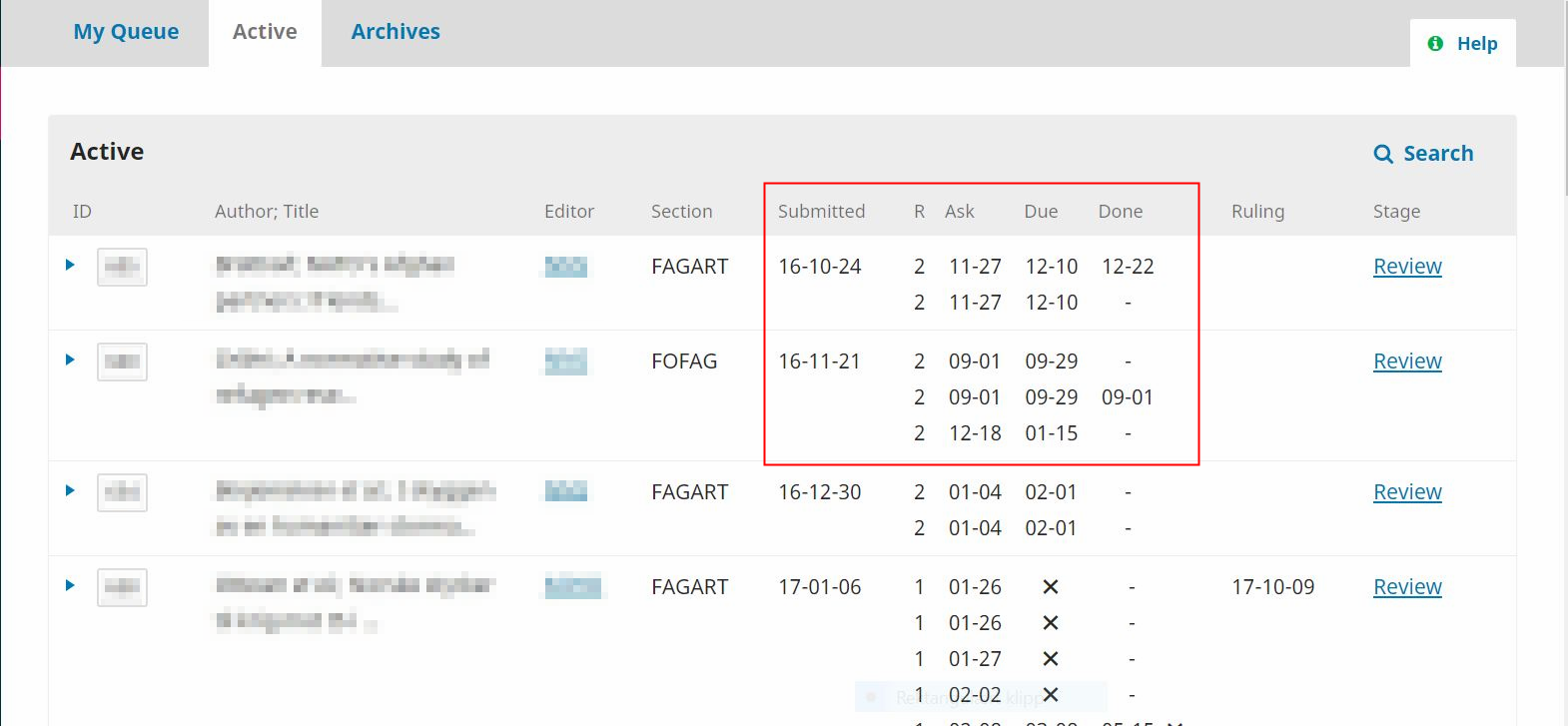
Also, can you explain to me what's happening in the columns highlighted in the screenshot below? I'm having trouble interpreting the data. What's the "R" column? And below, with the Xs, what do they signify?
 NateWr
on 1 Oct 2018
NateWr
on 1 Oct 2018
Hy @NateWr
I understand that this task is specifically difficult. I've already sent a message to some of the UIUX group handling large-volume journals who might jump into the discussion and provide their story.
The screenshot is from their operational system, a user plugin they developed for OJS3 and shows (If I remember correctly)
- Submitted: article submission date
- R: review round
- Ask: when the reviewer got asked do do a review
- Due: the X: not yet responded, else the due-date is shown
- Done: review submitted by the reviewer
- Ruling: ...?
A new review round updates R (_R+1_) and new Ask/Due/Done dates will be shown. As they told this was a first attempt to provide more insights for their editorial team but also that the plugin is not (yet) perfect. Could be improved by highlighting critical elements, hide unnecessary information (e.g., hide "_Ask_" when "_Due_" has been logged), ... . However, this kind of view gives quite a lot of important information needed when screening the articles to identify those where action is required in a very "standardized" form.
Hope Emma and Veronica can give some more insights soon, thanks in advance!
retostauffer
on 1 Oct 2018
Leaving this comment here for @openacademia
retostauffer
on 1 Oct 2018
Hi all,
The example above is actually from NOASP/Cappelen Damm and it looks very, very similar to what the dashboard looks like in OJS 2, see screenshot.
screenshot.docx
I think that A LOT of information on the dashboard would be welcomed by some, but not by others - that is, this might be a tricky thing to sort out in a way that is useful for all OJS journals. Maybe just a few modifications to the current dashboard will be enough?
I think the modifications already suggested, such as the icon indicating the number of reviewers who have accepted the invitation/task and the great quick filters suggested here https://github.com/pkp/pkp-lib/issues/4101 goes a LONG way.
A submission date and a ruling date would be good to get in there somewhere!
screenshot.docx
 openacademia
on 1 Oct 2018
openacademia
on 1 Oct 2018
Hi @retostauffer @NateWr @openacademia,
As @openacademia writes the example above is from the NOASP dashboard. We did this customization when we upgraded to OJS 3 at the request of several of our editors. An important feedback from the editors after the upgrade was that they lacked an ‘at-a-glance’ overview of all articles in process. They are dealing with many articles and need to quickly get an overview of the status for all of them without having to move around between pages.
The solution we had in OJS2 (Co-Action install) gave an overview of the number of submissisons in each of four stages (Unassigned, In review, In editing, Archives) on the first page, and more detailed information about the articles in review and in editing on subsequent, corresponding pages.
Our solution for OJS3 has been to customize the ’Active’ tab under the ‘Submissions’ view for editors. We have added the following information to this view: Editor, Section and information about the peer review process.
The information about the peer review process includes (as you have seen) more details:
Submitted: article submission date
R: review round _(the number will change when you start a new round)_
Ask: when the reviewer got asked do do a review
Due: due-date, the X is shown when the reviewer has declined the assignment
Done: review submitted by the reviewer
Ruling: date of ruling, the field is empty until the editor have made a decision (accept, decline, resubmit)
Our editors have been pleased with this customization. However, some of them have been asking for a more detailed display of articles in editing. On the OJS2 Co-Action install, submissions were divided into “Unassigned”, “In review”, “In editing” and “Archives”. Having separate lists for “In review” and “In editing” made it possible to display more information about the articles in the different stages. This has been an important tool for our editors and journal managers.
The submissions dashboard is a critical component in OJS (as @NateWr writes) and different users have different needs. I think we had some good discussions about this in UIUX-group in Heidelberg, and that the multi-view idea can be a good approach. When it comes to different user profiles/stories we can do some work on this in NOASP and see if we can provide you with some useful cases (hopefully next week).
 marteery
on 11 Oct 2018
marteery
on 11 Oct 2018
Thanks @marteery and @openacademia for your comments. They're much appreciated, and cataloguing these requests in the open helps us build up a public knowledge of the different use-cases we need to cater to.
When it comes to different user profiles/stories we can do some work on this in NOASP and see if we can provide you with some useful cases (hopefully next week).
This would be really appreciated. Thank you! :+1:
Having separate lists for “In review” and “In editing” made it possible to display more information about the articles in the different stages.
If you can detail in the user stories any of the differences in what you'd like to know for different stages, that'd be helpful. Review is the most obvious one, and the one that attracts the most interest. But what information do you want to know during Copyediting/Production? What about Submission?
NateWr
on 11 Oct 2018
Is it worth mentioning the comments at https://github.com/pkp/pkp-lib/issues/4172, as they are also referring to the ‘at-a-glance’ overview that @marteery mentions above (we get v similar comments)?
I realise that they are slightly different, as the above is about surfacing existing data whilst https://github.com/pkp/pkp-lib/issues/4172 is possibly more of a new feature, but perhaps worth considering in tandem...
 twakeford
on 16 Nov 2018
twakeford
on 16 Nov 2018
@twakeford I spun off #4172 as one of three high-priority changes we're going to try to get into 3.2 (along with #4168 and #4101).
These more general issues are great for capturing wide-ranging discussion, so I'd recommend we keep things going here. The other issue is likely to see more implementation-focused discussion. I'd encourage you to follow both, but I'll keep #4172 pretty tightly scoped so that it has a better chance of getting into a release before too long.
NateWr
on 16 Nov 2018
Hello
@openacademia, @marteery :
do you think it is possible for your colleagues to share the source code of the modification of OJSv3 ?
Our editors would like a similar dashboard, like the OJSv2.
Thank you !
 forgive38
on 19 Dec 2018
forgive38
on 19 Dec 2018
Hello
@forgive38 :
Sorry for the delayed response. The dashboard on the OJS2 CO-action install had customized features that were impossible to keep when we did the upgrade to OJSv3, so we don't have those features on our current install.
We are currently sending feedback on the dashboard to PKP to help develop the dashboard on OJS3 to better cover the needs of editors in bigger journals, and I think this probably will be the best solution going forward. It would also be interesting to get feedback from your editors on their needs, since they seem to have some of the same needs as we do.
marteery
on 9 Jan 2019
Hi! We've recently had several of our journal editorial teams ask for some filters/searching options for the submission dashboard I'm not currently seeing in the OJS program, or potentially in development on this list.
A tab/function that will allow users to search all content, in both archives and active submissions
Ability to sort by submission date: allow editors to sort any submission list within the queue by both ascending and descending dates
Do either of these options seem possible?
Thanks,
Jenny Hoops
Indiana University Libraries
 JenHoops
on 6 Mar 2019
JenHoops
on 6 Mar 2019
A tab/function that will allow users to search all content, in both archives and active submissions
It's possible but unlikely short of a more significant change to how we're handling the submission lists -- ie, if we ever condensed them all down to one list with each current list a view into it.
That said, I'd very much like to explore a global search field in the backend that would bring up not just submissions but also issues, users, discussions, etc. A kind of google search for anything in the system you're looking for. I don't expect that to be a near-term goal but it's out there...
Ability to sort by submission date: allow editors to sort any submission list within the queue by both ascending and descending dates
No plans for this at this time, but doesn't mean we won't consider it in the future. Submissions are already sorted by submission date, with most recently submitted first. In the near future (probably 3.2 but can't promise) we'll switch to pagination for the lists. Then it might be easier to find oldest submissions to, by jumping to the last page. The current UI makes that kind of a pain for large lists.
NateWr
on 6 Mar 2019
I want to add my support for displaying (or having the option to display) the section of a submission in the submission list. An editor commented she would like it to be displayed prominently because the section determines whether or not the submission will be peer-reviewed.
 amandastevens
on 12 Aug 2019
amandastevens
on 12 Aug 2019
Piggybacking on @amandastevens comment, I just wanted to add my support, too. We have had several editors comment that it is a little weird that they have to go into the metadata tab to see which type of submission (original article, case report etc.) they are dealing with. Ideally, that information should be visible on the submission URL, in my opinion.
In term of filters, it would be a huge improvement if you could sort the list by editor/section editor. I have the task of assigning new submissions to a group of 7 editors for one of our journals. I have currently no way of knowing who already has a bunch of submissions to deal with vs. who is currently only assigned to a few and would therefore be a good candidate to assign another paper to. I have to proxy/login as each and every one of the editors to see how many submissions they are currently handling. This makes assigning a new submission quite a big hassle.
openacademia
on 13 Aug 2019
sort the list by editor/section editor
This is commonly requested and filed as part of https://github.com/pkp/pkp-lib/issues/2612#issue-237775690. I'm sure this one is high up our list.
NateWr
on 13 Aug 2019
Adding support from a hosted client to display the submission ID prominently when a submission is open in the dashboard. You can see the ID in the URL but users don't necessarily know to look there.
amandastevens
on 11 Oct 2019
Hi @amandastevens, this is fixed for v3.2. The submission ID will be up there with the title at the top of the page.
NateWr
on 11 Oct 2019
Related issues
 mhvezina
·
7Comments
mhvezina
·
7Comments
 jonasraoni
·
6Comments
jonasraoni
·
6Comments
 ajnyga
·
7Comments
asmecher
·
8Comments
ajnyga
·
7Comments
asmecher
·
8Comments
 librariam
·
5Comments
librariam
·
5Comments