Pengwin: Original Logo for WLinux Concepts Discussion
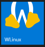
WLinux needs an original logo. What we have right now is used under license but is not original.
Designers are encouraged to submit your rough concepts for a new original logo here. I am looking for something that fits the Windows 10 minimalistic aesthetic but clearly identifies WLinux _as_ Linux. Please include the best way to reach you, such as Telegram, e-mail, etc.
Users are invited to submit feedback on the concepts submitted. I will review the concepts and select one to be developed based on the feedback here.
Bounty terms:
- If your logo concept is selected to be developed you must provide a color logo on a transparent background in SVG at least 400x400px, a white logo on a transparent background in SVG at least 400x400px, a color .ICO file, and the raw files (.PSD, .XCF, etc.) for inclusion in the project.
- You agree to assign ownership of the logo and copyright to Whitewater Foundry, Ltd. Co. and for the files to be distributed under the MIT license.
- I will retain discretion over the selection of the logo and payment of the bounty.
- You agree to be paid electronically.
Please direct any questions regarding this bounty to hayden at whitewaterfoundry.com or at WLinuxApp on Twitter. This is not a binding contract or an offer of employment.
Edit: PNG->SVG (thank you @Biswa96) and Twitter contact details.
 sirredbeard
All 16 comments
Don't convert PNG files. Use SVG file as source then convert them to PNG files. See wsltty.appx repository. When Visual Studio (or others) converts PNG to lower resolution PNG it makes the picture blurry.
 Biswa96
on 24 Sep 2018
Biswa96
on 24 Sep 2018
Thank you @Biswa96. I will make that change in the proposal.
sirredbeard
on 24 Sep 2018
It has been proposed that the logo potentially pay homage to Xenix. I like that idea.
Here are some examples of that artwork:
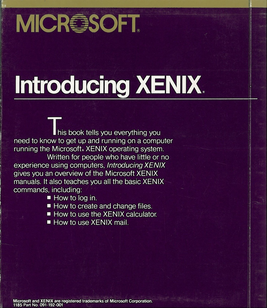
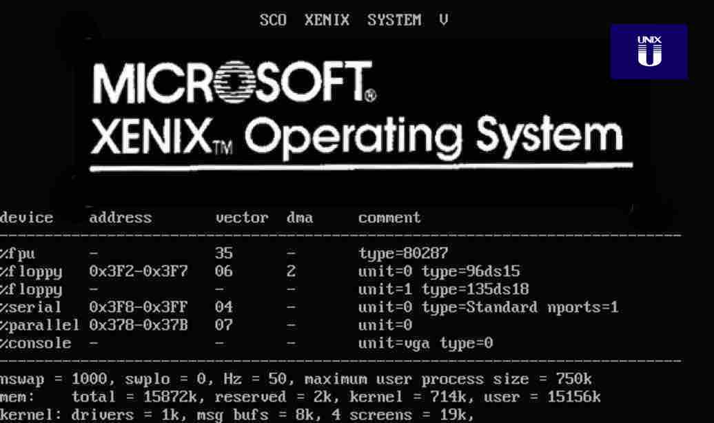

Maybe a transparent Tux or "W" with the some of the retro horizontal lines in the "O" from the old Microsoft logo?
sirredbeard
on 25 Sep 2018
Something Like this?

 danlin
on 26 Sep 2018
danlin
on 26 Sep 2018
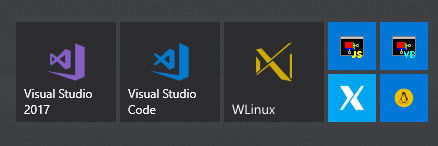
How about two L's for Linux, combined to make an X for Un*X and reminiscent of X11, merged with a W for Windows, all in a mix of 80's and MDL/Metro styles ?
It even ends up looking like it was designed as part of the Visual Studio family, making it look nice next to your other dev tools.

 PhMajerus
on 26 Sep 2018
PhMajerus
on 26 Sep 2018
Square version, doesn't fit as nicely next to Visual Studio, but makes the letters and inspirations more obvious, and better shows the alignments.

Which one do you prefer?
PhMajerus
on 26 Sep 2018
The Problem with the Retro lines is it gets really blurry on small Icons.
So i try some other one. Simple with and with Tux reference ;)

danlin
on 26 Sep 2018
I agree that the lines can get a bit fuzzy when the size of the icon becomes too small. I went with another simple design, keeping the same font of the 1982 Microsoft logo, and adding a bit of flourish to go in the direction of a water theme that the name of your company inspired me with. Though maybe a stylized W would be more fitting in the case of such a simplistic logo that doesn't need to spell anything.

 Wulfre
on 27 Sep 2018
Wulfre
on 27 Sep 2018
Today i add a litte more Tux to the font ;)

danlin
on 27 Sep 2018
Some more Xenix for inspiration, basically the closest thing to a logotype I saw so far.
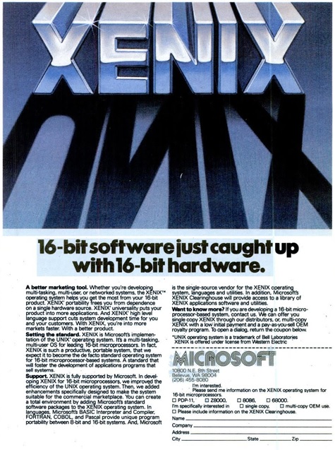
(from Computerworld 12 Oct 1981)
PhMajerus
on 27 Sep 2018
So many good options.
I think we are going to keep the discussion going, keep these concepts up, and going to go ahead and split the current bounty between existing submitters.
If we later move forward with one of them we will work with (read: pay) the selected designer to polish and submit to app.
@danlin @Wulfre and @PhMajerus: Please DM me at WLinuxApp on Twitter or hayden at whitewaterfoundry.com with your PayPal details.
sirredbeard
on 27 Sep 2018
Rough shadow icon inspired by the Xenix ad:

PhMajerus
on 27 Sep 2018
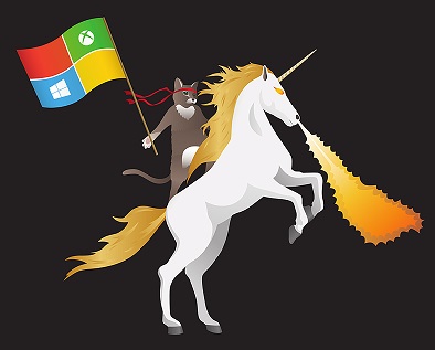
We should also consider our options the option of keeping the existing Tux. It is libre licensed and I have not heard many complaints about it.
The designers name is Erik Ragnar Eliasson and his work is featured here.
Tux is also freely licensed and was actually part of a tutorial for GIMP.
sirredbeard
on 27 Sep 2018
At least give Tux a 🐱👤 ninja cat red headband, and maybe a Microsoft flag :p
PhMajerus
on 27 Sep 2018
I developed my idea a bit further to give a better show of the image in my head. I think that this flows better than the first iteration I posted. Maybe water isn't the theme we are going for, but I decided to keep going so that the option is there.

Wulfre
on 28 Sep 2018
only Tux better sizing and color:


danlin
on 28 Sep 2018
Related issues
 Photonico
·
5Comments
Photonico
·
5Comments
 rdmueller
·
3Comments
rdmueller
·
3Comments
 laurin1
·
4Comments
laurin1
·
4Comments
 ghost
·
5Comments
ghost
·
5Comments
 ozzcodes
·
3Comments
ozzcodes
·
3Comments
Most helpful comment
Today i add a litte more Tux to the font ;)


