Paypal-checkout-components: How to disable the new "Standard Card Fields" behavior in my PayPal Smart buttons integration
Description
The recent updates on PayPal Smart Buttons have introduced a new feature called "Standard Card Fields". So now, if a user tries to make a payment with a card, it renders an iframe to collect card and billing info of customer inline on the page instead of a guest checkout popup. However, there is no way to change the appearance/style of the card form to match with the rest of my checkout form and the behavior is inconsistent since, for some, it still opens up in a guess checkout modal.
What I want is a way to disable the standard card fields and this new inline behavior and want my integration to follow the old behavior which opens up a guest checkout modal on clicking on a card option. Looking at the sample code here https://developer.paypal.com/docs/checkout/integration-features/standard-card-fields/#best-practices, there is a parameter passed enableStandardCardFields: true, and I have tried to pass it has enableStandardCardFields: false, but it still follow the new inline checkout behavior.
Please lemme know if there is a way to completely disable this new behavior without disabling the card options itself–I don't want to disable the card options but wanna keep the old guest checkout behavior for card payments until there comes a way to style the checkout fields to match rest of my form.
 mukulchawla43
All 13 comments
I have the same problem but only in specific environments. It is working at my computer on Chrome and Firefox. It is also working on my Android using Chrome but not using "Internet" app nor on iOS Safari. Did you manage to find a workaround for it?
 samighawi
on 17 Oct 2019
samighawi
on 17 Oct 2019
I am having the same problem, did you guys found any workaround? @samighawi @mukulchawla43
 umair-brainx
on 21 Oct 2019
umair-brainx
on 21 Oct 2019
Unfortunately not @umair-brainx
samighawi
on 21 Oct 2019
nope! couldn't find any workaround :(
mukulchawla43
on 21 Oct 2019
I see. Thanks for replying.
umair-brainx
on 21 Oct 2019
FYI, I got an answer from paypal that it cannot be changed
Yes, PayPal has introduced new user interface for credit card sections in smart buttons. and based on the location PayPal will load the new user interface and it cannot be changed.
samighawi
on 22 Oct 2019
I switched to Stripe to solve this issue
 marcomarsala
on 15 Apr 2020
marcomarsala
on 15 Apr 2020
@samighawi where did you get the answer from? Besides the inconsistent style/behaviour the problem with debit/credit card is that you cannot go back to choose another option..
 webdeb
on 6 Jul 2020
webdeb
on 6 Jul 2020
I contacted their customer support at that time and they provided me with this answer so it can't be changed
samighawi
on 6 Jul 2020
That's a pity. This issue should be reopened as a feature suggestion. I think we can all agree that this functionality is extremely annoying.
My platform has a dark theme. Not only do the inputs contrast too much, but the dark text (because the iframe is transparent and the background is this of my dark website) is barely readable, obscuring important to the client information!!!
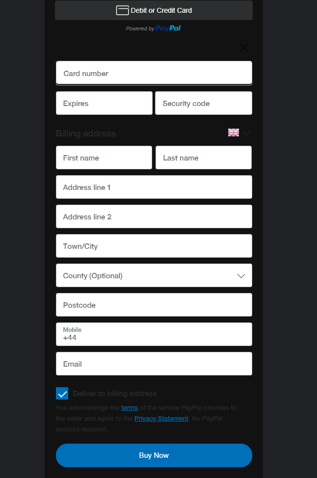
Can you see the X (close) button? Precisely my point.
 williamd5
on 31 Oct 2020
williamd5
on 31 Oct 2020
@williamd5 Thank you everyone for bringing this up and sorry you haven't gotten an answer that is meeting your needs. As you saw, you can now close this section and go back. This was recently implemented from a suggestion given by someone like you. Given that, it IS hard to see on a dark theme. There is another option for you to use besides standard card fields to give you more control, hosted fields. I will send some information shortly.
 mnicpt
on 31 Oct 2020
mnicpt
on 31 Oct 2020
@williamd5 Here is the JS SDK Reference: https://developer.paypal.com/docs/business/javascript-sdk/javascript-sdk-reference/?mark=hosted%20fields#hosted-fields
mnicpt
on 31 Oct 2020
not sure if anyone still having this issue,
but I was able to fix it by adding
paypal.Buttons({
    fundingSource: paypal.FUNDING.PAYPAL
})
ref: https://developer.paypal.com/docs/checkout/integration-features/standalone-buttons/#render-a-set-of-buttons
 kishan93
on 24 Feb 2021
kishan93
on 24 Feb 2021
Related issues
 PhilibertDugas
·
5Comments
PhilibertDugas
·
5Comments
 deejbee
·
5Comments
deejbee
·
5Comments
 AashutoshPrashar
·
5Comments
AashutoshPrashar
·
5Comments
 gastonyelmini
·
3Comments
gastonyelmini
·
3Comments
 Wr4i7h
·
4Comments
Wr4i7h
·
4Comments
Most helpful comment
I switched to Stripe to solve this issue