Paypal-checkout-components: Unable to start paypal flow without button
We are trying to upgrade from the v3 checkout. We used something close to this example
https://developer.paypal.com/docs/integration/direct/express-checkout/integration-jsv4/upgrade-integration/#in-context-with-ajax
Where we started the flow off, from our own buttons.
We run an ember.js app, so we having the hooks for onAuthorize and onCancel would be much better than redirect, but can't see a way to manually trigger the payment method without having a button.
Do you have any documentation on how to keep a javascript flow we trigger manually?
 aaronbhansen
All 9 comments
Hi @aaronbhansen -- sorry to say we don't provide a way to invoke the checkout flow programmatically without rendering the button, in the v4 integration. There are a few reasons for this:
- The button is now considered part of the checkout experience
- Future updates to the button will allow users to check out without ever leaving your page or being directed to the popup
- Owning the button helps us to guarantee that popup blockers won't affect the experience
- We tailor the button to each user who views it (for example, venmo users will see a split paypal/venmo button)
I wrote a little on the topic here if you're interested: https://medium.com/@bluepnume/less-is-more-reducing-thousands-of-paypal-buttons-into-a-single-iframe-using-xcomponent-d902d71d8875
We do expose a lot of options to customize the button here: https://developer.paypal.com/docs/integration/direct/express-checkout/integration-jsv4/customize-button/ -- is there some specific style you're going for that we're missing?
Thanks!
 bluepnume
on 26 Oct 2017
bluepnume
on 26 Oct 2017
Thanks for the quick response. I'll try to provide a little more info on what we are trying to achieve on v4.
Conceptually i'm fine with PayPal rendering a button, we could work around it if there was some more options for styling or text, but at the moment the options available are fairly limited.
How our UX works, we have multiple screens, and at the end of each screen is the same button style and in the same position. This allows a consistency for moving through each page. To complete the checkout / survey at the moment, the user would select PayPal as the payment option (or another payment method), and then click the same styled button as the previous pages to finalize their checkout. Each button might have different text depending on the page the button was located on, but it provided uniformity in color, position, and size.
Since our current style and color don't match PayPals new button, we only have two options at the moment.
- Remain on v3.5 until its removed.
- Add a button thats styled differently and positioned differently than the previous screens buttons.
The problem with option 2, is we break the current UX flow.
We could work around it if we had more options. For reference, recently Stripe updated their credit card custom checkout form with their own widget, but its very customizable and we were able to fit it in, almost exactly like our previous implementation. For PayPal, if we could customize better the text, style, and color of the button we could dynamically replace our main button with PayPals button and still have the same workflow roughly.
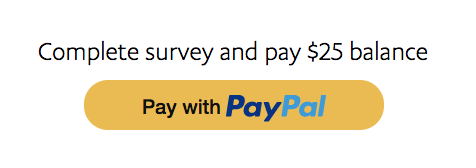
Some examples
Our button today shows this

But if we wanted to use PayPal on v4 we can slightly customize the color and size, but no real text. I don't feel like users would understand that they are completing the survey by just clicking the PayPal button.

They are already on a review page and its the last step of the process. We try to minimize clicks. We could potentially have it auto complete after using the onAuthorize callback, but they wouldn't know it was going to do that until after the payment processed successfully and was finished.
The other option is take the payment, then show the confirm button after the payment is successful, but it leads to an extra click that could be removed with a better workflow.
If we had the option to have a split button (something that had PayPals logo on the left, and some custom text on the right), we could find a good solution to let them know they are paying and finalizing. But until we can customize it more, it leads to a disconnected UX.
Hopefully that makes sense. Do you have any suggestions?
aaronbhansen
on 26 Oct 2017
Would it make sense to position some text above the button? Like so:
bluepnume
on 30 Oct 2017
We could, thats one of the options we are considering. My comments above were just that by doing that it breaks the UX. If we had more control over the button styling / text we could find a solution that fit better into the entire workflow rather than having the exception with PayPal. Thats why liked the legacy version of opening the popup directly so that the UX remained the same.
aaronbhansen
on 31 Oct 2017
Makes sense -- but for future use-cases we have planned, we're reserving that space. For example, we're planning a "one-touch" version of the button which detects remembered users and allows them to pay with a single click on the button. In those cases we may need to change the text to something like "One-touch pay with PayPal". So unfortunately we have no current plans to allow the level of customizability you described -- but we're hoping the future benefits in extra conversion should outweigh that.
bluepnume
on 31 Oct 2017
Thanks for the response. How long is the legacy version supported. Do you have an end of life date?
aaronbhansen
on 2 Nov 2017
The legacy integration won't be EOL'd -- it'll continue to work for existing integrations, but at this point it's not supported by us, and no bug fixes are made for it other than security fixes.
bluepnume
on 9 Nov 2017
This sucks, the reasons listed above do not make a valid argument for the reason PayPal needs to own the entire button and need to initiate the checkout.
When will PayPal finalize a integration and matching documentation to make it a simple product to use.
PayPal has a terrible developer experience, you should take some notes from Stripe, simple and easily customizable with a simplistic SDK. Everytime you need to do anything with paypal, there is 100 Deprecation messages throughout their docs leading to a very confusing experience when it comes to implementation.
 dan003400
on 5 Mar 2020
dan003400
on 5 Mar 2020
I have had a bad experience every way possible with PayPal. Terrible merchant support, terrible customer support, and their tech is probably the worst in the industry.
Every page in their documentation has deprecations, they are constantly changing the way to use PayPal and making it extremely hard to follow and even understand how it works.
Their dashboards switch between different versions as you navigate, while waiting 15 seconds for page loads.
Worst developer experience on the web. There is a reason even Elon looks down on PayPal as a product.
dan003400
on 30 Apr 2020
Related issues
bluepnume
·
3Comments
 gastonyelmini
·
3Comments
gastonyelmini
·
3Comments
 AashutoshPrashar
·
5Comments
AashutoshPrashar
·
5Comments
 hosseinfs
·
6Comments
hosseinfs
·
6Comments
 VivekVikranth
·
6Comments
VivekVikranth
·
6Comments
Most helpful comment
I have had a bad experience every way possible with PayPal. Terrible merchant support, terrible customer support, and their tech is probably the worst in the industry.
Every page in their documentation has deprecations, they are constantly changing the way to use PayPal and making it extremely hard to follow and even understand how it works.
Their dashboards switch between different versions as you navigate, while waiting 15 seconds for page loads.
Worst developer experience on the web. There is a reason even Elon looks down on PayPal as a product.