Papirus-icon-theme: Proposal: New Firefox Nightly Icon
Firefox Nightly has a gorgeous new icon. Would be nice to see Papirus reflect this.
![]()
 lokesh-krishna
All 22 comments
If Firefox devs redesign icon on stable release - we change this too.
 varlesh
on 19 Aug 2017
varlesh
on 19 Aug 2017
They have and it will be launching with v57 in November. It too looks gorgeous :)

lokesh-krishna
on 19 Aug 2017
Concept:
varlesh
on 24 Aug 2017
Also i think need add more red color and delete сontinents element on Earth
varlesh
on 24 Aug 2017
Love your take on it, especially the redder variant. Any chance we could see a concept for the nightly too?
lokesh-krishna
on 24 Aug 2017
@varlesh [email protected] looks great :+1:
 SmartFinn
on 24 Aug 2017
SmartFinn
on 24 Aug 2017
Why not a bit of gradient to match with the new original colors?

 jEsuSdA
on 24 Aug 2017
jEsuSdA
on 24 Aug 2017
we not use gradients
varlesh
on 24 Aug 2017
Yes. I know. But maybe some other solid yellow element.
I mean, the Firefox's tail is yellow (it means fire) and it will be fine not to loose this characteristic detail.
jEsuSdA
on 24 Aug 2017
@jEsuSdA And how doing this?
Yes i can draw layering style version with yellow color, but it's not looking as original 2017:

varlesh
on 25 Aug 2017
For compare:

varlesh
on 25 Aug 2017
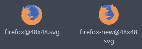
Not only does [email protected] look gorgeous in its own right, it is also a really interesting new direction for Papirus to take. It stays true to the flat philosophy while letting it better express gradients in the original app icons.
However, the layers are quite difficult to make out at smaller sizes. Maybe use only red and orange and drop the yellow?
Can we please see your take on the Nightly icon?
lokesh-krishna
on 25 Aug 2017
However, the layers are quite difficult to make out at smaller sizes. Maybe use only red and orange and drop the yellow?
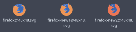
Yes, it's not good looking for tiny icons. I think [email protected] better for support. See, all icons сlearly visible and understandable:

Also old original Firefox-2013 icon use gradient too, but this not reproduced on Paper or Papirus:

Can we please see your take on the Nightly icon?
After test and сonfirmation new design on team
varlesh
on 25 Aug 2017
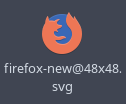
firefox-layer icon added:

varlesh
on 25 Aug 2017
on dock:

varlesh
on 25 Aug 2017
Anyway I like second variant:
varlesh
on 25 Aug 2017
For what it's worth, I too like the second variant more, especially at smaller sizes.
After test and сonfirmation new design on team
Looking forward to it :)
lokesh-krishna
on 25 Aug 2017
I agree with @varlesh. I think firefox-new is much more better, firefox-layer doesn't look good and doesn't match with Papirus Style also doesn't fit well with other icons.
 amrmsaraya
on 25 Aug 2017
amrmsaraya
on 25 Aug 2017
Changes on Master branch.
firefox-new > firefox
firefox-layer > firefox-alt
new firefox-trunk & firefox-trunk-alt

varlesh
on 25 Aug 2017
Good decision. Two version to allow users to decide. Thank you! You are great, @varlesh ;)
jEsuSdA
on 25 Aug 2017
How do you choose a particular Nightly icon?
 clasick
on 29 Sep 2017
clasick
on 29 Sep 2017
@clasick just change Icon=firefox-trunk to Icon=firefox-trunk-alt in your /usr/share/applications/firefox-trunk.desktop file.
SmartFinn
on 29 Sep 2017
Related issues
 thirtysat
·
4Comments
thirtysat
·
4Comments
 JoshStrobl
·
7Comments
JoshStrobl
·
7Comments
 rauldipeas
·
5Comments
rauldipeas
·
5Comments
 Chamrosh
·
6Comments
amrmsaraya
·
5Comments
Chamrosh
·
6Comments
amrmsaraya
·
5Comments
Most helpful comment
Changes on Master branch.

firefox-new > firefox
firefox-layer > firefox-alt
new firefox-trunk & firefox-trunk-alt