Orchardcore: Implement new admin UI everywhere
In every admin page that has a list with Filters and/or Bulk Actions, use the same UI:
- One row with quick search (and potentially quick filters if available) and Add button on the right.
- One row above the list with Filters and Sort selects.
- Auto submit filters on change.
- Show the number of items currently displayed and the total number.
- 'Select all' checkbox and display bulk actions when >2 items are selected.
- Pager at bottom.
Here is the list of the admin pages to unify the UI:
- [X] Contents: #4359
- [X] Tenants: #4746
- [X] Queries: #4822
- [X] Lucene indices: #4823
- [X] Templates #4824
- [X] Roles: #4814
- [X] Users: #4864
- [X] Workflows: #4771
/cc @hishamco
 agriffard
All 12 comments
If you want to implement the UI in one of these admin pages, please create an issue and paste the #number in the issue (by editing it) next to the corresponding checkbox so we know you are working on it or add a comment.
agriffard
on 6 Nov 2019
I think I will start with Roles & Users
 hishamco
on 6 Nov 2019
hishamco
on 6 Nov 2019
I will work on Workflow page.
agriffard
on 9 Nov 2019
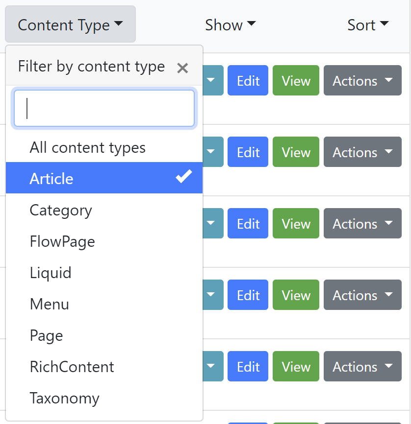
As @awyl explained here: https://github.com/OrchardCMS/OrchardCore/pull/4759#issuecomment-551988066 , I change the display of the filters by adding the attribute data-selected-text-format="static"
the drop downs now shows
Content Type, Show, Sortinstead ofCategory Page, Latest, Recently published
The goal is to look like more to what is done on github issues.
The 'inconvenient' is that the selected items in the list are only displayed when you expand the filter.
It would not be an issue if the search box was displaying the corresponding filters in text, as it is done on github.
So what decision should we take:
- Keep the static display and find a way to add the select filters in the search box. Ex:
type:Article - Or, Come back to the previous display with the selected filter as a title of the dropdown?
agriffard
on 9 Nov 2019
So what decision should we take:
Keep the static display and find a way to add the select filters in the search box. Ex: type:Article
Or, Come back to the previous display with the selected filter as a title of the dropdown?
So are the filters multi selectable, like github, or are they single select (I think single, yes?)
It makes sense if they are multi selectable to show them in the filters box like github, as on github you can then edit the box to change the filters.
But that is a lot more work to achieve.
If they're single selectable then I think it makes sense to show the selected filter on the dropdown where it has been selected.
We could always add multi select later
 deanmarcussen
on 11 Nov 2019
deanmarcussen
on 11 Nov 2019
Will do Roles as part of https://github.com/OrchardCMS/OrchardCore/issues/4814
unless you have already started roles @hishamco ?
deanmarcussen
on 15 Nov 2019
No problem @deanmarcussen, your already started :smile:
hishamco
on 15 Nov 2019
@hishamco Will you work on Users UI?
agriffard
on 21 Nov 2019
Hey @agriffard I found one small issue with the "New" button in the content list where if your list of content types is quite long the pop-up menu will be quite strange. I suggest we use the same kind of pop-up menu that allows to search for an option. That way, we can display only 10 first items. Other suggestion is to use a fixed height on that pop-up menu and use a vertical slider but not sure about how it will look like.
 Skrypt
on 21 Nov 2019
Skrypt
on 21 Nov 2019
@hishamco I will start working on Users UI.
agriffard
on 23 Nov 2019
@hishamco I will start working on Users UI.
Ok this is the remaining thing I'd like to start on :), but I'm busy these days, thanks a lot @agriffard
hishamco
on 23 Nov 2019
FYI I updated the https://github.com/OrchardCMS/OrchardCore/issues/3614
hishamco
on 15 Dec 2019
Related issues
 jeffolmstead
·
4Comments
jeffolmstead
·
4Comments
 khoshroomahdi
·
4Comments
khoshroomahdi
·
4Comments
 JanSichula
·
3Comments
JanSichula
·
3Comments
 superluminalK
·
4Comments
superluminalK
·
4Comments
 mobinzk
·
4Comments
mobinzk
·
4Comments
Most helpful comment
As @awyl explained here: https://github.com/OrchardCMS/OrchardCore/pull/4759#issuecomment-551988066 , I change the display of the filters by adding the attribute
data-selected-text-format="static"The goal is to look like more to what is done on github issues.
The 'inconvenient' is that the selected items in the list are only displayed when you expand the filter.
It would not be an issue if the search box was displaying the corresponding filters in text, as it is done on github.
So what decision should we take:
type:Article